INTRODUCTION
When it comes to dividing a page into key areas or specifying the relationship between components of a control constructed from HTML primitives, CSS Grid Layout excels. Grid layout lets developers align objects into columns and rows similarly to tables. But with CSS grid, many more layouts are either feasible or simpler than they were with tables. For instance, like CSS positioned components, the child elements of a grid container could position themselves so that they truly overlap and layer.
Instead of requiring the usage of floats and positioning, the CSS Grid Layout Module provides a grid-based layout system with rows and columns.
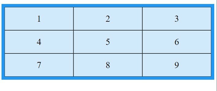
📌Grid Elements: A parent element and one or more child elements make up a grid layout.
Example;
<!DOCTYPE html>
<html>
<head>
<style>
.grid-container {
  display: grid;
  grid-template-columns: auto auto auto;
  background-color: blue;
  padding: 10px;
}
.grid-item {
  background-color: rgba(255, 255, 255, 0.8);
  border: 1px solid rgba(0, 0, 0, 0.8);
  padding: 20px;
  font-size: 30px;
  text-align: center;
}
</style>
</head>
<body>

<div class="grid-container">
  <div class="grid-item">1</div>
  <div class="grid-item">2</div>
  <div class="grid-item">3</div>
  <div class="grid-item">4</div>
  <div class="grid-item">5</div>
  <div class="grid-item">6</div>
  <div class="grid-item">7</div>
  <div class="grid-item">8</div>
  <div class="grid-item">9</div>
</div>

</body>

</html>
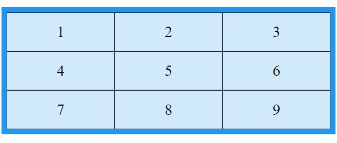
📌Display Property: When an HTML element's display attribute is set to grid or inline-grid, it transforms into a grid container.
Example;
<!DOCTYPE html>
<html>
<head>
<style>
.grid-container {
  display: grid;
  grid-template-columns: auto auto auto;
  background-color: #2196F3;
  padding: 10px;
}

.grid-item {
  background-color: rgba(255, 255, 255, 0.8);
  border: 1px solid rgba(0, 0, 0, 0.8);
  padding: 20px;
  font-size: 30px;
  text-align: center;
}
</style>
</head>
<body>


<div class="grid-container">
  <div class="grid-item">1</div>
  <div class="grid-item">2</div>
  <div class="grid-item">3</div>
  <div class="grid-item">4</div>
  <div class="grid-item">5</div>
  <div class="grid-item">6</div>
  <div class="grid-item">7</div>
  <div class="grid-item">8</div>
  <div class="grid-item">9</div>
</div>

</body>

</html>
IMPORTANT TERMINOLOGIES
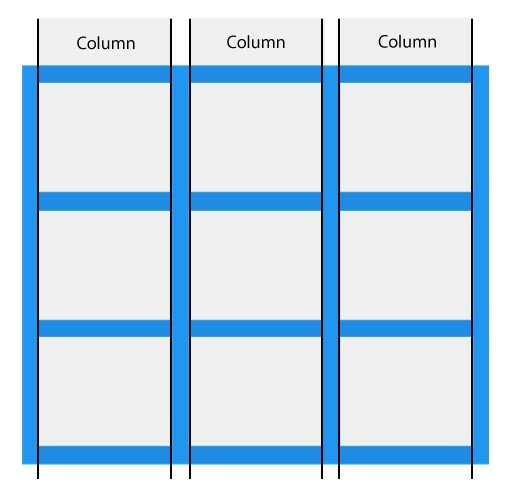
📌Grid Columns: Columns are the vertical lines that make up grid elements.
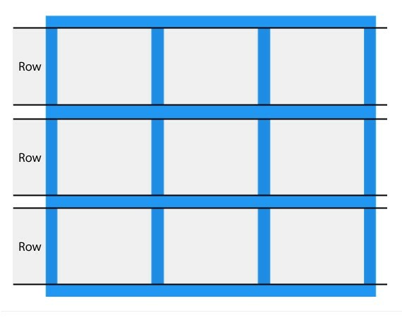
📌Grid Rows: Rows are the horizontal lines that make up a grid's elements.
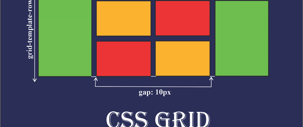
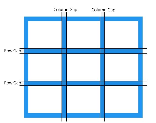
📌Grid Gaps: Gaps are the spaces that exist between each column or row.
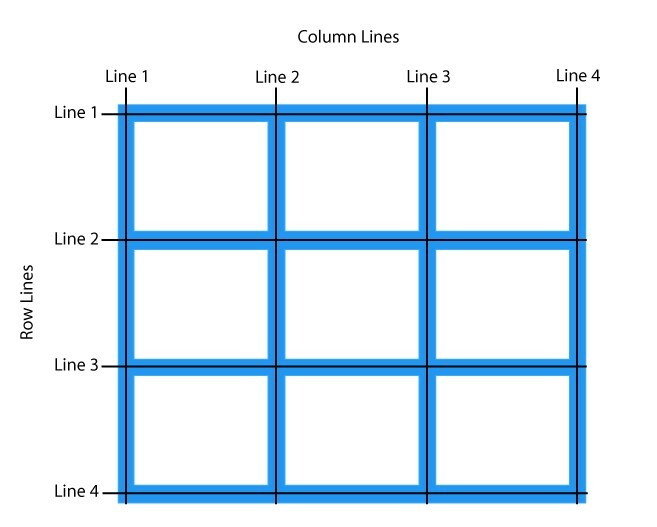
📌Grid Lines: Column lines are the lines that separate columns. Row lines are the lines that separate rows.
CSS GRID CONTAINER
You must set the display property of an HTML element to grid or inline-grid in order for it to function as a grid container.
Grid containers are made up of grid elements that are arranged in columns and rows.
GRID TEMPLATE COLUMN
The grid-template-columns parameter can specify the width of each column as well as the number of columns in your grid layout. Each value in the value, which is a space-separated list, specifies the length of a particular column. Specify the width of the four columns in your grid layout if you want it to have four columns, or choose "auto" if you want all the columns to be the same width.
Example (a grid with four columns);
<!DOCTYPE html>
<html>
<head>
<style>
.grid-container {
  display: grid;
  grid-template-columns: auto auto auto auto;
  grid-gap: 10px;
  background-color: #2196F3;
  padding: 10px;
}

.grid-container > div {
  background-color: rgba(255, 255, 255, 0.8);
  text-align: center;
  padding: 20px 0;
  font-size: 30px;
}
</style>
</head>
<body>

<div class="grid-container">
  <div>1</div>
  <div>2</div>
  <div>3</div>
  <div>4</div>
  <div>5</div>
  <div>6</div>
  <div>7</div>
  <div>8</div>
</div>

</body>

</html>
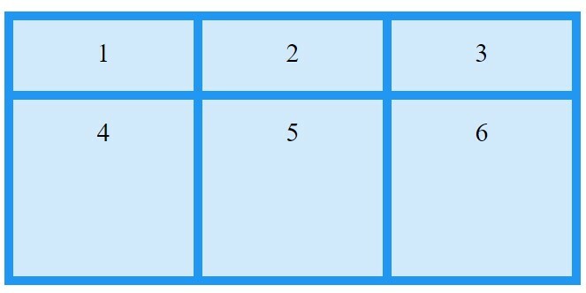
GRID TEMPLATE ROW
The height of each row is determined by the grid-template-rows attribute.
Example;
<!DOCTYPE html>
<html>
<head>
<style>
.grid-container {
  display: grid;
  grid-template-columns: auto auto auto;
  grid-template-rows: 80px 200px;
  grid-gap: 10px;
  background-color: #2196F3;
  padding: 10px;
}

.grid-container > div {
  background-color: rgba(255, 255, 255, 0.8);
  text-align: center;
  padding: 20px 0;
  font-size: 30px;
}
</style>
</head>
<body>

<div class="grid-container">
  <div>1</div>
  <div>2</div>
  <div>3</div>
  <div>4</div>
  <div>5</div>
  <div>6</div>
</div>

</body>

</html>
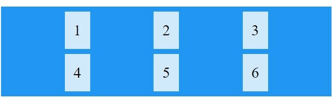
JUSTIFY CONTENT
The entire grid inside of the container is aligned using the justify-content attribute. For the justify-content property to have any impact, the overall width of the grid must be smaller than the width of the container.
Example;
<!DOCTYPE html>
<html>
<head>
<style>
.grid-container {
  display: grid;
  justify-content: space-evenly;
  grid-template-columns: 50px 50px 50px;
  grid-gap: 10px;
  background-color: #2196F3;
  padding: 10px;
}

.grid-container > div {
  background-color: rgba(255, 255, 255, 0.8);
  text-align: center;
  padding: 20px 0;
  font-size: 30px;
}
</style>
</head>
<body>

<div class="grid-container">
  <div>1</div>
  <div>2</div>
  <div>3</div>
  <div>4</div>
  <div>5</div>
  <div>6</div>
</div>


</body>

</html>
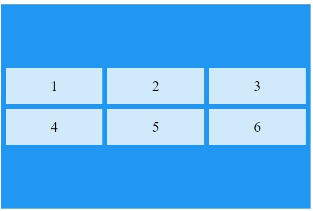
ALIGN CONTENT
The entire grid inside the container is vertically aligned using the align-content property.
Example;
<!DOCTYPE html>
<html>
<head>
<style>
.grid-container {
  display: grid;
  height: 400px;
  align-content: center;
  grid-template-columns: auto auto auto;
  grid-gap: 10px;
  background-color: #2196F3;
  padding: 10px;
}

.grid-container > div {
  background-color: rgba(255, 255, 255, 0.8);
  text-align: center;
  padding: 20px 0;
  font-size: 30px;
}
</style>
</head>
<body>

<div class="grid-container">
  <div>1</div>
  <div>2</div>
  <div>3</div>
  <div>4</div>
  <div>5</div>
  <div>6</div>
</div>


</body>

</html>
CONCLUSION
CSS Grid is incredibly responsive and adaptable. Layouts in two dimensions are simple to construct thanks to it. Additionally simple to use, most web browsers support CSS Grid. With the CSS grid, you have far more flexibility and cleaner markup (in your HTML code). Thanks for reading!


Top comments (2)
Great read, thank you!
❤️👍