
Created by Vercel, Next.js is a JavaScript framework based on React. With its ability to offer static and server rendering, its popularity quickly shot up amongst developers.
What's less known is that Next.js offers many ways to support CSS in your application. Whether you prefer utility CSS with its classes or prefer CSS-in-JS, Next.js has you covered. In this tutorial, you will discover a few ways to implement styling in your Next.js application. Let’s implement a styled text that turns red when the user hovers it:
Using global CSS styling in Next.js
The easiest way to write CSS in a Next.js application is through its global stylesheet). Every newly created Next.js project comes with a styles folder and inside it, a global.css stylesheet.
As a result, you can start writing CSS right away with no setup required. For example, in styles/global.css, you can add this:
    .paragraph {
      font-size: 16px;
      text-align: center;
    }

    .paragraph:hover {
      color: red;
    }
The styles created in global.css will then apply to your entire application.
To do so, this stylesheet can only be imported in _app.js, as the App component initializes all the pages in your Next.js pages.
In a new Next.js project, it is done for you, but if you don't already have an _app.js file in your pages folder, create one. Once done, import your new global stylesheet:
//In _app.js, import your global stylesheets
    import '../styles/globals.css'

    function MyApp({ Component, pageProps }) {
      return <Component {...pageProps} />
    }

    export default MyApp
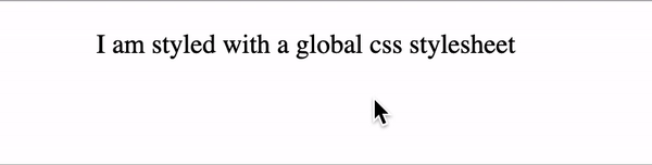
You can then use those classes in your application. For example, on your homepage in pages/index.js:
    export default function Home() {
      return (
        <p className="paragraph">I am styled with a global css stylesheet</p>
      )
    }
Pros to using global styling in CSS
- No setup required
- Perfect for small projects like POC
Cons
- All styling is contained in a single file
- It’s difficult to scale as your project grows
Using CSS modules with Next.js
As convenient as a global stylesheet can be when just starting, this file can become less manageable as your application grows.
Also, Next.js is a component-based framework, meaning it is easier to split styling for respective components. For instance, if you have a component for your footer, it would be easier to import a stylesheet containing the styling of this component, but nothing more. Enter CSS modules!
If you are not familiar, CSS modules allow you to isolate your CSS by creating files for style-specific components. They are very easy to use, as they are simple CSS but have the module.css extension instead. Like the previous method, it requires no setup and can be used in addition to a global stylesheet.
Here is an example of a Home.module.css:
    //Home.module.css
    .paragraph {
      font-size: 16px;
      text-align: center;
    }

    .paragraph:hover {
      color: red;
    }
In your component, pages/index.js, you can then import your stylesheet and use it:
  import styles from '../styles/Home.module.css'
   export default function Home() {
      return (
        <p className={styles.paragraph}>I am styled with CSS modules</p>
      )
    }
Pros to using CSS modules for styling
- No setup required
- Components can split styling
- Can be used with global styling
- Unlike global styling, conflicts between classes are avoided
Cons
- No dynamic styling (e.g., based on a status like loading, error, success, etc.)
Next.js styling with Sass
If basic CSS is not enough and you find yourself in search of a CSS framework, look no further than Sass. Describing itself as "CSS with superpowers", it is a popular framework compatible with CSS and offers lots of cool features like variables, nesting, and mix-ins. Here’s a GitHub repo for our example project.
Using Sass with Next.js is straightforward. All you have to do is install the library:
   npm install sass
    # or
    yarn add sass
Once done, you can start writing Sass code. Don't forget the .scss or .sass file extensions! Here is an example of Sass code in styles/Home.module.scss:
    //Home.module.scss
    $hover-color: red;

    .paragraph {
      font-size: 16px;
      text-align: center;
    }

    .paragraph:hover {
      color: $hover-color;
    }
Similar to using CSS modules, we’ll import the new file to style our application once we finish writing our CSS.
  import styles from '../styles/Home.module.scss'
    export default function Home() {
      return (
        <p className={styles.paragraph}>I am styled with SASS</p>
      )
    }
Pros:
- Easy setup with Next.js
- CSS compatible
- Interesting features for complex styling needs like variables, nesting, etc.
Cons:
- Time lost learning new functionalities of SASS
More complex than CSS Styling with Styled-JSX
The previous three methods covered the best styling options if you prefer Utility CSS. But perhaps you are more of a CSS-in-JS kind of person. In which case, Styled-JSX might be up your alley.
Built by Vercel, the founder of Next.js, Styled-JSX allows developers to write CSS in their JavaScript code. There is no setup necessary, and it works out of the box.
Here is an example of Styled-JSX:
    export default function Home() {
      return (
        <div className="paragraph">
          <style jsx>{`
            .paragraph {
              font-size: 16px;
              text-align: center;
            }

            .paragraph:hover {
              color: red;
            }
          `}</style>
          <p>I am a component styled with Styled-JSX</p>
        </div>
      )
    }
Pros to using Sass with Next.js
- No setup required
- Dynamic styling
- Portability: your code (CSS and JS) is contained in one file and can therefore be moved easily
Cons
- Not as much support as other CSS-in-JS libraries (7k stars on Github vs. 36k for styled-components)
- Code readability can be more difficult when mixing CSS and JS
Using styled-components
Styled-JSX can be convenient to start with, but hard to debug as your application grows. As a result, you might be tempted by styled-components.
Styled-components is very practical, as it was created for React. It allows developers to create components with style automatically injected. You can also make use of props for dynamic styling (i.e., for disabled or hover state). Check out a sample project here.
To use it in Next.js, start by installing the library:
    npm i styled-components
    # or
    yarn add styled-components
The only drawback of using styled-components is that it was made for React, meaning it’s geared for client-side rendering. At the moment, server-side rendering is not supported out of the box.
However, this is easily fixed by creating a new pages/_document.js file and adding this:
 import Document, { Head, Html, Main, NextScript } from 'next/document'
    import { ServerStyleSheet } from 'styled-components'

    export default class MyDocument extends Document {
      render() {
        return (
          <Html lang="en">
            <Head></Head>
            <body>
              <Main />
              <NextScript />
            </body>
          </Html>
        )
      }

      static async getInitialProps(ctx) {
        const sheet = new ServerStyleSheet()
        const originalRenderPage = ctx.renderPage

        try {
          ctx.renderPage = () =>
            originalRenderPage({
              enhanceApp: (App) => (props) =>
                sheet.collectStyles(<App {...props} />),
            })

          const initialProps = await Document.getInitialProps(ctx)
          return {
            ...initialProps,
            styles: (
              <>
                {initialProps.styles}
                {sheet.getStyleElement()}
              </>
            ),
          }
        } finally {
          sheet.seal()
        }
      }
    }
Once done, you can import the library into your components and start using it. For example, in pages/index.js, you can create a Paragraph styled component for your homepage:
 import styled from 'styled-components'
    const Paragraph = styled.p`
      font-size: 16px;
      text-align: center;

      &:hover {
        color: ${props => props.hoverColor};
      }
    `

    export default function Home() {
      return <Paragraph hoverColor="red">I am a component made with Styled Components</Paragraph>
    }
Pros of using styled-components with Next.js
- Built using React in mind and has lots of community support
- Dynamic styling based on props
- Customizable and reusable like React components (i.e.,
<Title />instead of<h2 className="title"/>)
Cons
- Additional configuration necessary for server-side rendering frameworks like Next.js
- Bit of a learning curve getting used to the functionalities
- When compiled, styled-components classes become random (i.e.,
css-1kybr8i), making debugging harder
Emotion
Another CSS framework created with React in mind is Emotion. It offers a CSS prop (to pass style directly to an element) and styled components. An additional benefit of Emotion is that server-side rendering works out of the box. Check out GitHub here.
To use Emotion in your Next.js application, you first need to install the library:
    npm install --save @emotion/react
    #or
    yarn add @emotion/react
To use styled components, you should also install the required library:
    npm install --save @emotion/styled
    # or
    yarn add @emotion/styled
Then, you can start writing your styled components directly. In pages/index.js, here is an example of a Paragraph component:
    import styled from '@emotion/styled'

    const Paragraph = styled.p`
      font-size: 16px;
      text-align: center;

      &:hover {
        color: ${props => props.hoverColor};
      }
    `

    export default function Home() {
      return <Paragraph hoverColor="red">I am a component made with Emotion (Styled Components)</Paragraph>
    }
Pros to using Emotion
- Server-side support and easy setup with Next.js
- With @emotion/styled, you get all the advantages of styled components
- Many packages for different needs: CSS, styled, Jest, native, etc.
Cons
- Like styled-components, Emotion generates random class names, making debugging with the element inspector harder
- A bit of learning curve getting used to the functionalities
Styling Next.js with Tailwind CSS
Using PostCSS, Next.js also offers support to popular tools such as Tailwind CSS. By installing Tailwind as a PostCSS plugin, it will scan your code and generate the correct stylesheets for you. Not only is it fast, but it also comes with a list of utility classes for you to choose from (i.e., spacing, text size, and more).
To use it with Next.js, start with installing tailwindcss, postcss, and autoprefixer as peer dependencies:
npm install -D tailwindcss postcss autoprefixer
Run tailwindcss init to generate the required files:
npx tailwindcss init -p
This command generated two files:
postcss.config.js,which you don't need to touchtailwind.config.js
In the latter, add your template paths. These configs will tell Tailwind CSS what code to scan to generate the stylesheet:
    module.exports = {
      content: [
        "./pages/**/*.{js,ts,jsx,tsx}",
        "./components/**/*.{js,ts,jsx,tsx}",
      ],
      theme: {
        extend: {},
      },
      plugins: [],
    }
In styles/global.css, add the Tailwind CSS directives:
    @tailwind base;
    @tailwind components;
    @tailwind utilities;
If you are using a newly created Next.js project, this will be done for you, but, if not, make sure that pages/_app.js imports your styles/global.css stylesheet:
    import '../styles/globals.css'

    function MyApp({ Component, pageProps }) {
      return <Component {...pageProps} />
    }

    export default MyApp
You can now start using Tailwind CSS. In pages/index.js, if you want to create a centered paragraph with a hover state, you can do so like this:
    export default function Home() {
      return (
        <p class="text-center text-lg hover:text-red-600">
          I am a component made with Tailwind CSS
        </p>
      )
    }
Pros to using Tailwind CSS
- Lots of pre-defined classes whether for padding, margin, color, and more
- Once familiar with the classes, the styling process becomes faster
- Compiled CSS is automatically optimized by removing unused CSS
Cons
- No separation of content vs. structure because CSS and HTML are combined
- Time needed to learn all the different classes
Conclusion
Choosing a styling option depends on many factors: the size of your project, time, and, mostly, personal preferences. Thankfully, whether you prefer utility CSS or CSS-in-JS, Next.js offers built-in support for CSS.
In this tutorial, you discovered some of those. First, you learned how to write CSS with global stylesheets or CSS modules. For developers with more complex needs, you also saw how to use Sass with Next.js.
Then, for those who prefer CSS-in-JS, we covered some methods such as Styled-JSX, styled-components, and Emotion.
Finally, you also learned that Next.js offers support for tools such as Tailwind CSS with PostCSS, which benefits developers who want access to a design system with thousands of pre-built CSS classes. Thanks for reading!
LogRocket: Full visibility into production Next.js apps
Debugging Next applications can be difficult, especially when users experience issues that are hard to reproduce. If you’re interested in monitoring and tracking Redux state, automatically surfacing JavaScript errors, and tracking slow network requests and component load time, try LogRocket.

LogRocket is like a DVR for web and mobile apps, recording literally everything that happens on your Next app. Instead of guessing why problems happen, you can aggregate and report on what state your application was in when an issue occurred. LogRocket also monitors your app's performance, reporting with metrics like client CPU load, client memory usage, and more.
The LogRocket Redux middleware package adds an extra layer of visibility into your user sessions. LogRocket logs all actions and state from your Redux stores.
Modernize how you debug your Next.js apps — start monitoring for free.


Top comments (1)
Thanks. Is it possible to declare two class names on the element by using module.css ?