
Written by Murtaza Sulaihi✏️
Let's assume that you have a widget in your application's UI, and you want to place another floating widget on top of it. Perhaps that widget needs to be rotated or has additional transformations. How do you display the widget and transform its information to the equivalent UI in the application?
The Overlay in Flutter makes it easy to create visual elements on top of other widgets by adding them to the Overlay's stack. OverlayEntry is used to insert a widget into the Overlay, then Positioned or AnimatedPositioned is used to determine where it will enter within the Overlay. This is useful when you require an item to appear on top of another widget (similar to the Stack widget) without modifying your entire codebase.
Using an Overlay widget in Flutter might seem a little intuitive but can be challenging at times. First, the overlay entry is inserted using a callback method. And it would be best if you also remembered to remove the Entry using the reference and not the context of the Overlay.
We will be looking at three different examples where we can use an overlay widget to make the application's UI more user friendly.
- Example 1: Displaying an error message on a sign-up screen
- Example 2: A FloatingActionButton showing three other buttons
- Example 3: The Overlay widget follows while scrolling
Example 1: Displaying an error message on a sign-up screen


This is a simple sign-up screen that you usually see on any modern-day application. It contains four TextFormFields for a full name, email address, password, and confirmation password.
Since it is a TextFormField, we have validators for each of them. The full name must be more than two characters, it must be a proper email address, the password should be more than six characters, and the confirmed password should match the password field. When the user clicks on the Submit button, it verifies all the above fields, and if there is an error, the suffix icon's color changes to red, alerting the user that TextFormField does not match its relevant requirement.
When the user clicks on the red icon, an Overlay widget displays for about three seconds, and it disappears.
Visually, an Overlay can be mistaken for an AlertDialog or a Snackbar. An Overlay widget displays similarly, but it gives more power for customization to the developer to program it according to the application’s UI requirement.
Let’s dive into the code and see how an Overlay widget will be displayed when an error occurs and the user clicks on it.
We need to create a stateful widget since we will be running some animations along with the Overlay widget.
We have added four TextEditingControllers for name, email, password, and confirm password:
TextEditingController nameController = TextEditingController();

TextEditingController emailController = TextEditingController();

TextEditingController passwordController = TextEditingController();

TextEditingController confirmPassController = TextEditingController();
Again four Color variables for name, email, password, and confirm password to switch between red and gray colors:
Color? nameColor, emailColor, passColor, confirmPassColor;
Next, we have an AnimationController and an Animation object:
AnimationController? animationController;
Animation<double>? animation;
We are overriding initState and initializing AnimationController and the Animation object we just created:
@override
 void initState() {
   super.initState();
   animationController =
       AnimationController(vsync: this, duration: const Duration(seconds: 1));
   animation =
       CurveTween(curve: Curves.fastOutSlowIn).animate(animationController!);
 }
The primary function that we need to create will show the Overlay widget. Therefore, we are creating the _showOverlay function, which we will call when the user clicks on the suffix icon inside the text field when an error occurs. In the _showOverlay function, we have declared and initialized OverlayState and OverlayEntry objects.
What is an OverlayState?
OverlayState is the current state of the overlay, which uses OverlayEntry, Entries using an insert, or insertAll functions to insert.
OverlayState constructor
-
debugIsVisible: Returns a Boolean value to check whether the givenOverlayEntryis visible or not -
insert: Inserts the givenOverlayEntryinside the overlay -
insertAll: Takes a list ofOverlayEntriesand inserts all of them inside the overlay -
rearrange: Removes and re-inserts all the entries according to the given order in the list ofOverlayEntries
What is an OverlayEntry?
An overlay entry is a place inside an overlay that contains a widget. With the help of a Positioned or AnimatedPositioned widget, Entry positions itself within the overlay using a Stack layout.
OverlayEntry constructor
-
builder: Takes in a builder widget -
opaque: Returns a Boolean value to decide whether theEntryoccludes the entire overlay or not -
maintainState: Takes a Boolean value. It forcefully builds an occludedEntrybelow an opaqueEntryif it istrue
Below is the code for the _showOverlay function:
void _showOverlay(BuildContext context, {required String text}) async {
   OverlayState? overlayState = Overlay.of(context);
   OverlayEntry overlayEntry;
   overlayEntry = OverlayEntry(builder: (context) {
     return Positioned(
       left: MediaQuery.of(context).size.width * 0.1,
       top: MediaQuery.of(context).size.height * 0.80,
       child: ClipRRect(
         borderRadius: BorderRadius.circular(10),
         child: Material(
           child: FadeTransition(
             opacity: animation!,
             child: Container(
               alignment: Alignment.center,
               color: Colors.grey.shade200,
               padding:
                   EdgeInsets.all(MediaQuery.of(context).size.height * 0.02),
               width: MediaQuery.of(context).size.width * 0.8,
               height: MediaQuery.of(context).size.height * 0.06,
               child: Text(
                 text,
                 style: const TextStyle(color: Colors.black),
               ),
             ),
           ),
         ),
       ),
     );
   });
   animationController!.addListener(() {
     overlayState!.setState(() {});
   });
   // inserting overlay entry
   overlayState!.insert(overlayEntry);
   animationController!.forward();
   await Future.delayed(const Duration(seconds: 3))
       .whenComplete(() => animationController!.reverse())
       // removing overlay entry after stipulated time.
       .whenComplete(() => overlayEntry.remove());
 }
After initializing the overlayEntry, we return a Positioned widget inside the builder method to position the Overlay widget on the screen. Depending on the application's design, it can be placed and shown anywhere on the mobile screen.
Next, we added a suffix icon button inside the TextFormField and called the _showOverlay function inside it.
The validator property of TextFormField has conditions based on how the suffix icon changes from gray to red and vice versa if there is an error:
TextFormField(
                 controller: nameController,
                 keyboardType: TextInputType.name,
                 textInputAction: TextInputAction.next,
                 textCapitalization: TextCapitalization.words,
                 validator: (String? value) {
                   if (value == null || value.trim().isEmpty) {
                     nameColor = Colors.red;
                   }
                   if (value.toString().length <= 2) {
                     nameColor = Colors.red;
                   } else {
                     nameColor = Colors.grey;
                   }
                   return null;
                 },
                 onSaved: (String? value) {
                   _name = value;
                 },
                 decoration: kTextInputDecoration.copyWith(
                     labelText: 'Full Name',
                     prefixIcon: const Icon(Icons.person),
                     suffixIcon: IconButton(
                         padding: EdgeInsets.zero,
                         onPressed: () {
                           _showOverlay(context,
                               text:
                                   'Name should have more than 2 characters');
                         },
                         icon: Icon(Icons.info, color: nameColor
                             //change icon color according to form validation
                             ))),
               ),
Lastly, we created a submitForm method that validates the TextFormFields and saves the form, and we will call it inside the onPressed function of the Submit button:
void _submitForm() {
   setState(() {
     _autoValidateMode = AutovalidateMode.always;
   });
   final form = _formKey.currentState;
   if (form == null || !form.validate()) return;

   form.save();

   Fluttertoast.showToast(msg: _name.toString() + _email.toString());
 }
Calling the _submitForm method inside onPressed of ElevatedButton, we get this:
ElevatedButton(
                   onPressed: () {
                     _submitForm();
                   },
                   style: ElevatedButton.styleFrom(
                       padding: const EdgeInsets.all(10)),
                   child: const Text(
                     'Submit',
                     style: TextStyle(fontSize: 20),
                   )),


The full code is available on the GitHub repository.
Example 2: A FloatingActionButton showing three other buttons

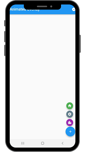
First, create all the necessary objects and variables that we will use in this example. To start, we have an AnimationController and an empty List for animation. Then, we have a list of icons containing three icons and a list of colors that include three different colors associated with the icons:
AnimationController? animationController;
 List animation = [];
 List icons = [Icons.home, Icons.settings, Icons.location_city];
 List colors = [Colors.green, Colors.blueGrey, Colors.purple];
 OverlayEntry? overlayEntry;
 GlobalKey globalKey = GlobalKey();
Next, we have an OverlayEntry object, and we have also initialized the GlobalKey variable that will be attached to the FloatingActionButton's key property.
The main difference between the above and the _showOverlay function here is the RenderBox and Offset widget. The RenderBox and Offset widget and the Positioned widget position the three small icons above the main FloatingActionButton. When the user clicks the main FloatingActionButton, the three small icons open upward and close in a downward trend after the stipulated time mentioned in the animation:
_showOverLay() async {
   RenderBox? renderBox =
       globalKey.currentContext!.findRenderObject() as RenderBox?;
   Offset offset = renderBox!.localToGlobal(Offset.zero);

   OverlayState? overlayState = Overlay.of(context);
   overlayEntry = OverlayEntry(
     builder: (context) => Positioned(
       left: offset.dx,
       bottom: renderBox.size.height + 16,
       child: Column(
         mainAxisSize: MainAxisSize.min,
         mainAxisAlignment: MainAxisAlignment.center,
         children: [
           for (int i = 0; i < animation.length; i++)
             ScaleTransition(
               scale: animation[i],
               child: FloatingActionButton(
                 onPressed: () {
                   Fluttertoast.showToast(msg: 'Icon Button Pressed');
                 },
                 child: Icon(
                   icons[i],
                 ),
                 backgroundColor: colors[i],
                 mini: true,
               ),
             )
         ],
       ),
     ),
   );
   animationController!.addListener(() {
     overlayState!.setState(() {});
   });
   animationController!.forward();
   overlayState!.insert(overlayEntry!);

   await Future.delayed(const Duration(seconds: 5))
       .whenComplete(() => animationController!.reverse())
       .whenComplete(() => overlayEntry!.remove());
 }
In Example 1, we did not attach the Overlay widget with the suffix icon and displayed the widget at our convenient position. But in Example 2, we had to connect to the Overlay widget with FloatingActionButton to serve its primary purpose, giving more options when the user clicks the FAB button:
@override
 Widget build(BuildContext context) {
   return Scaffold(
     appBar: AppBar(
       title: const Text('Animated Overlay'),
     ),
     floatingActionButton: FloatingActionButton(
       key: globalKey,
       onPressed: _showOverLay,
       child: const Icon(Icons.add),
     ),
   );
 }
}
 The full code is available on the GitHub repository.
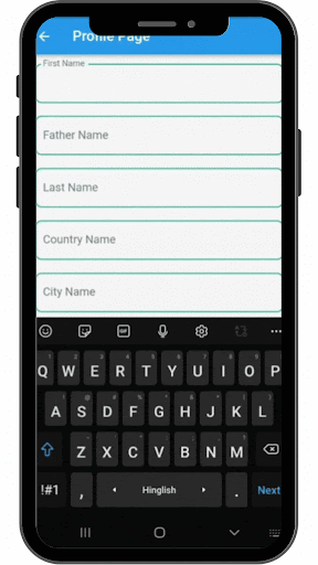
Example 3: The Overlay widget follows while scrolling
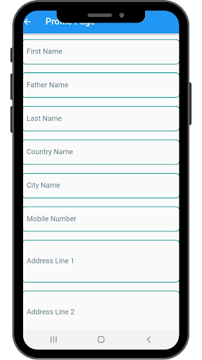

Similar to the previous example, we are attaching the Overlay widget with the TextFormField. It appears when a user clicks on it to enter some text and disappears when one clicks away from it. To be more precise, when TextFormField has focus, the Overlay widget appears with suggestions. When it loses focus or if the user scrolls and the TextFormField is not visible on the screen, the Overlay disappears.
Here we have created a separate stateful widget for the country TextFormField and then called it inside our Profile Page, which is a stateless widget.
A few points to remember:
- We have assigned
FocusNodeto theTextFormFieldand added a listener to it insideinitStateto detect when theTextFormFieldgains or loses focus - Based on
FocusNode, we are creating and inserting theOverlayEntrywidget - Again, we use
RenderBoxto know the exact position, size, and other rendering information needed for our widget - We also use
RenderBoxto get the widget's size and the widget's coordinates on the screen - We set those coordinates to the
Positionedwidget - Inside the
Positionedwidget, we display a list of countries inside aColumnwidget using aListTile. (I have hardcoded a few entries for this example):
final FocusNode _focusNode = FocusNode();
     OverlayEntry? _overlayEntry;
     GlobalKey globalKey = GlobalKey();
     final LayerLink _layerLink = LayerLink();

     @override
     void initState() {
       super.initState();
       OverlayState? overlayState = Overlay.of(context);
       WidgetsBinding.instance!.addPostFrameCallback((_) {
         globalKey;
       });
        _focusNode.addListener(() {
         if (_focusNode.hasFocus) {
                 _overlayEntry = _createOverlay();

           overlayState!.insert(_overlayEntry!);
         } else {
          _overlayEntry!.remove();
         }
       });
     }
Now we want our Overlay to follow our TextFormWidget while the user scrolls.
Flutter provides two unique widgets:
- CompositedTransformFollower
- CompositedTransformTarget
Basically, we link the follower to the target, and then the follower will follow the target widget. To do that, we have to provide both widgets with the same LayerLink.
Important points to remember
- Wrap the
Materialwidget with theCompositedTransformFollower - Wrap the
TextFormFieldwithCompositedTransformTarget - Provide offset to
CompositedTransfromFollowerso that it does not cover theTextFormField - Set the
showWhenUnlinkedproperty tofalseto hide theOverlaywhenTextFormFieldis not visible when the user scrolls
And now, the OverlayEntry will follow the TextFormField:
OverlayEntry _createOverlay() {
   RenderBox renderBox = context.findRenderObject() as RenderBox;

   var size = renderBox.size;
   return OverlayEntry(
       builder: (context) => Positioned(
             width: size.width,
             child: CompositedTransformFollower(
               link: _layerLink,
               showWhenUnlinked: false,
               offset: Offset(0.0, size.height + 5.0),
               child: Material(
                 elevation: 5.0,
                 child: Column(
                   children: const [
                     ListTile(
                       title: Text('India'),
                     ),
                     ListTile(
                       title: Text('Australia'),
                     ),
                     ListTile(
                       title: Text('USA'),
                     ),
                     ListTile(
                       title: Text('Canada'),
                     ),
                   ],
                 ),
               ),
             ),
           ));
 }

 @override
 Widget build(BuildContext context) {
   return CompositedTransformTarget(
     link: _layerLink,
     child: TextFormField(
       focusNode: _focusNode,
       keyboardType: TextInputType.text,
       textCapitalization: TextCapitalization.words,
       textInputAction: TextInputAction.next,
       decoration: kTextInputDecoration.copyWith(labelText: 'Country Name'),
     ),
   );
 }
}
 The Profile Page is a stateless widget, and you can find the full code for it here.
Conclusion
That is all for this tutorial. I hope I was able to impart new knowledge to your existing experience in Flutter development. I know I have learned some great new features about Flutter and its widgets, and I hope to use them in future projects. I usually end with this quote that I love: "Discovery requires experimentation."
Thank you! Take care and stay safe.
LogRocket: Full visibility into your web apps

LogRocket is a frontend application monitoring solution that lets you replay problems as if they happened in your own browser. Instead of guessing why errors happen, or asking users for screenshots and log dumps, LogRocket lets you replay the session to quickly understand what went wrong. It works perfectly with any app, regardless of framework, and has plugins to log additional context from Redux, Vuex, and @ngrx/store.
In addition to logging Redux actions and state, LogRocket records console logs, JavaScript errors, stacktraces, network requests/responses with headers + bodies, browser metadata, and custom logs. It also instruments the DOM to record the HTML and CSS on the page, recreating pixel-perfect videos of even the most complex single-page apps.


Top comments (0)