
Written by Njong Emy✏️
With recent evolutions to the web, things are getting better both for developers and users. User experience is a vast topic beyond current measures because new ways of improving user experiences continue to evolve with time.
One part of improving UX are skeleton screens. In this article, we’ll explore skeleton loaders, their importance, and how to build one for your site using React and vanilla CSS.
To jump ahead:
- What is a CSS skeleton?
- Why are skeleton loaders important?
- When to use skeletons loaders
- Building a skeleton loader with React and CSS
What is a CSS skeleton?
Let’s examine a case study, and then three scenarios.
Case study: You see the link to this article, and decide to click on it. The data needs some time to arrive.
Scenario 1: As you wait for the site to display the article, all you see is a blank screen. You don’t know how the screen will be displayed when it loads, and you don’t know when either.
Scenario 2: As the data loads, all you see is a spinner to indicate that data is on its way. You know that something is coming after the load, but you don’t know what it will look like or when it will arrive, either.
Scenario 3: As the page loads, you notice these gray shapes that take on the structure of what the page is supposed to look like. As you wait, you already know what the page might look like. You don’t know when the data will come, but the situation keeps you expecting that it’ll arrive sooner than it actually does.
The last scenario is part of something called Perceived Performance. This is the impression that a site is loading faster than it actually is because the user already has an idea of what it will look like.
Below is an example of a skeleton loader for Facebook.
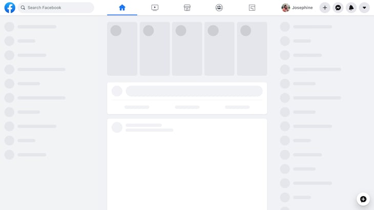
As you can see, the gray shapes represent how the data will be displayed once it loads. When the data finally arrives from the server, it replaces the gray shapes on the screen.
Skeleton loaders don’t exactly increase the performance or loading speed. They’re just there to give the user something to see while the page loads, and give them the feeling that the page is loading faster.
Why are skeleton loaders important?
Now, let’s see why skeleton loaders are important and when you should use them.
- Users want fast and optimized sites. Loaders make for great user experiences because they let the user know that data has been fetched and is on its way
- They are designed to make it feel as if data is loading faster than it actually is
The question now is, when should you use skeleton loaders for your site?
When to use skeletons loaders
You might choose to use skeleton loaders if:
- Your site deals with too much traffic. If too many users are constantly using your site, then the experience can feel slow at some point. Loaders are a great way to keep users on the site
- Some processes take a while to finish. For example, fetching data from some database or server
- Your site is used in remote locations with not-so-great internet connections. Some people argue that loaders should not be used when data loads in under 3s
Building a skeleton loader with React and CSS
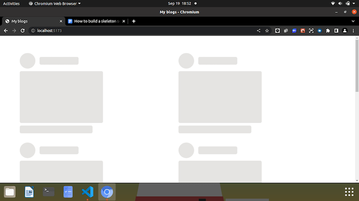
For the tutorial of this article, we are going to create a simple page that displays articles in the form of cards for a particular blogger. Our end result is going to look like the following. The skeleton view:
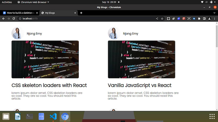
The actual site:

Prerequisites
This tutorial is very beginner friendly, but there are some details you need to check so that you can freely follow.
- Have Node installed on your computer. You can check Node out here to get the latest version or download it if you don’t have it
- A text editor. I use VS Code
- Basic knowledge of concepts in React, such as components
- A computer with a working browser… because if not, what are we doing here?
Setting up your React app
We are going to be set up our React app pretty differently in this tutorial. But first, let’s get our directories set up nicely.
- Run
mkdir cssLoader-Reactand thencd cssLoader-Reactto navigate into the newly created directory - Instead of the good ole fashioned
npx create-react-app, we will use a tool called Vite to set this up. Vite is a build tool that helps you optimize your developer environment. It is lightweight and very fast - To set Vite up, type
npm create vite@latest vite-project -- --template reactinto the terminal.npm create vite@latestadds Vite to our project, and the lines following it describe the name of our project and install React for us

The following instructions ask us to run cd vite-project to navigate into the newly created directory, npm install to add a node_modules so that our dependencies are installed, and npm run dev to start the server.
If you’ve used Vite to set this up, then you’ll realize how amazingly fast it is to whip up a React app from scratch.
Open the folder in any text editor of your choice. Our app is set up, and now it’s time to add and remove what we don’t need from our boilerplate. We start by clearing up everything from the App component and the default index.css file. We want to create two new folders: a folder called components inside the /src folder and another called server in the root directory. Our new project structure looks like this:

The reason we have a server folder is that we are going to set up a database-like structure where we can store data about the blogs. Don’t worry, we won’t be going into any backend. We will set up a fake REST API with JSON Server.
So in the /server folder, let’s create a file called db.json and populate it with some random data you would normally see on a blog like an avatar, author name, thumbnail, title, and description. Notice that the /server folder is created in the top-level directory, or root directory.
Back in our db.json file, the contents should look a bit like this:

Each top-level property is considered a resource, and endpoints are created for each resource.
Using the JSON Server package, we need to watch this file so that we can create endpoints to it, and other operations like POST, GET, DELETE, etc., that we may want to perform (not covered in this article).
To do that, open a new terminal and run npx json-server -watch server/db.json -port 5000. If it runs successfully, then the terminal should start the server on port 5000, and start watching any changes.
If you copy and paste the http://localhost:5000 in a browser, you’ll see that the JSON file has been hosted on localhost. You should also see http://localhost:5000/blogs as a resource.
That being done, we can then get to the coding. To follow up alongside the code, you can check out the complete files and folders here.
HTML/CSS and React for the site
To start off, let’s fetch the data from our local server first. After successfully fetching and handling any fetch errors, we will create a template to display the data.
So, in our app.jsx:
import { useState, useEffect } from 'react';

const App = () => {
   const [blogs, setBlogs] = useState(null);
   const [error, setError] = useState(false);
   const [loading, setLoading] = useState(true);
   useEffect(() => {
       setTimeout(() => {
           fetch(' http://localhost:5000/blogs')
           .then(response => {
               if(!response.ok){
                   throw Error('Sorry, some error occurred while fetching your blogs.');
               }
               return response.json();
           })
           .then(data => {
               setBlogs(data);
               setLoading(false);
               setError(false);
           })
           .catch(err => {
               console.log(err.message);
               setError(true);
           })

       }, 4000)
   })

   return(
       <div>
          {blogs && <Blogs blogs = {blogs} /> }
          {error && <div className='container'><span className='error'>Error connecting to the server. Connection failed.</span></div>}
       </div>
   )
}

export default App;
There are going to be a few elements on our page that change as we fetch and display data, and so we need the useState hook to track these elements. We start by initializing our blogs to null. If the data does not come back, then we need to get an error. Using useState again, we set the initial state of error to false. Another thing we need to initialize is the loading state. This was set to true beforehand because the data needs to be loaded before it comes back to us.
We use the useEffect hook to now fetch our data once the page first renders. We wrap everything in a setTimeOut function, so as to simulate the fetch process. Normally, you wouldn’t do this in a real-life situation. We need that small window of four seconds to see the skeleton loader.
We use a traditional fetch to get data from our resource, and tackle an error if the status code is anything other than 200. If the data is in good form, we parse the response to JSON. Since this is another promise, we need to resolve it using another .**then** method. Here, we change the state of blogs from null to the actual data received from the server. Since the data has been received and is no longer ‘loading’, we change the state of loading from true to false. If data is returned, then there is no error, so the state of error also changes.
Inside the return() of the component, we have:
 <div>
        {blogs && <Blogs blogs = {blogs} /> }
        {error && <div className='container'><span    className='error'>Error connecting to the server. Connection failed.</span></div>}
 </div>
The first line simply means that, if blogs has been returned and is true, render the component <Blogs /> with the returned data (in this case, blogs) passed to it. The logical AND (&&) makes sure that the second statement is only executed if the first statement is true. The same goes for the second line. If the state of error is true, we have a div that will display an error message.
We will come back to the aspect of loading shortly.
Now, we’ll create an actual Blogs component. Inside the /components folder, create a new component file called blogs.jsx.
 const Blogs = ({blogs}) => {
   return(
       <div className="container">
           {blogs.map(blog => (
               <div className="blog">
                   <header>
                       <div className="avatar">
                           <img src={blog.avatar} alt="black and white photo of smiling man infront of laptop" />
                       </div>

                       <div className="author">
                           <p className="name">{blog.author}</p>
                       </div>
                   </header>

                   <main className="image">
                       <img src={blog.thumbnail} alt="black screen with code over it" />
                   </main>

                   <footer>
                       <p className="title">{blog.title}</p>
                       <p className="text">{blog.description}</p>
                   </footer>
               </div>
           ))}
       </div>

   );
}

export default Blogs;
In this component, we pass in blogs as a prop, and go further to create a template for the different properties of our blog like blog.title, blog.description, etc.
We got rid of the styling in our index.css, so we can replace it with:
 @import url('https://fonts.googleapis.com/css2?family=Poppins:wght@300&display=swap');

/* blogs display */
.container{
 display: grid;
 grid-template-columns: 6fr 6fr;
 margin: 4em;
 font-family: 'Poppins', sans-serif;
}
.blog{
 margin-bottom: 2em;
}
header{
 display:flex;
 align-items: center;
}
.author .name{
 font-weight: bold;
 font-size: large;
 margin-left: 1rem;
}
.title{
 font-weight:bold;
 font-size:30px;
}
.text{
 font-weight: lighter;
 font-size: large;
 line-height:1em;
 width: 25em;

}
footer{
 line-height: 1rem;
}
.avatar img{
  height: 80px;
  width: 80px;
  border-radius: 50%;
  object-fit: cover;
}

.image img{
 height: 70%;
 width: 70%;
 border-radius: 8px;
}
.error{
 color: red;
}
This is nothing but a grid layout and font. Import the Blog component inside the App component, and our blog site should now look like this:
The skeleton loader
For the skeleton loader, we’ll need to create a skeleton structure first. Inside the /components folder, let’s create a new component called skeleton.jsx.
const Skeleton = () => {
   return(
           <div className="skeleton-blog">
               <header>
                   <div className="skeleton-avatar">
                   </div>

                   <div className="skeleton-author">
                   </div>
               </header>

               <main className="skeleton-image">
               </main>

               <footer className="skeleton-footer">
               </footer>
           </div>

);
};

export default Skeleton;
These are nothing but empty divs that we will style to take the shape of our actual site.
Still in our index.css:
/* Skeleton styles*/
.skeleton-blog{
 margin-bottom: 2em;
 animation: scale 4s infinite;
}
.skeleton-avatar{
 background: #E5E4E2;
 height: 60px;
  width: 60px;
  border-radius: 50%;
}
.skeleton-author{
 background: #E5E4E2;
 height: 30px;
 width: 150px;
 margin-left: 1rem;
 border-radius: 6px;
}
.skeleton-image{
 height: 200px;
 width: 320px;
 border-radius: 6px;
 background: #E5E4E2;
 margin-top: 10px;
}
.skeleton-footer{
 height: 30px;
 width: 280px;
 border-radius: 6px;
 background: #E5E4E2;
 margin-top: 10px;
}
Back in our App component, we want to do two things. The first thing is to import the skeleton component at the top, and the next is to find where and how to add the skeletons.
<div className="container">
               {loading && [1,2,3,4,5,6,7].map((n) => <Skeleton    key={n}/>)}
</div>
Just as we implemented the AND operator before, we will do the same here. Remember that loading was initially set to true. So while loading is true, we want to display the skeletons as we wait for the data to arrive. We wrap it in a div with a class of container, so that it links to the .container in our index.css and gives our skeleton cards the same grid layout.
You will notice that we have an array situation going on. Your array can contain any number of elements you want. In our case, we want to display seven skeleton cards while our data is loading. Note that skeleton loaders are not there to exactly replace elements on your page – they are just temporary placeholders. If your site fetches 1000 articles, displaying 1000 cards seems pretty ambitious.
In effect, our skeleton loaders should look like this while the page loads:
After 4000 milliseconds (4 seconds), as set by our setTimeOut function, the actual blogs should be loaded from the server and displayed.
Skeleton loader animations
Some skeleton loaders have nice, shimmering animations that swiftly breeze over the page. Let’s try to add a simple scaling animation to our loader to give it a nice zoom-in and out effect.
We can achieve this by adding one line of CSS to our .skeleton-blog class and then adding a @keyframe.
.skeleton-blog{
    animation: scale 4s infinite;
}
The above will animate each skeleton card with some animation called scale, which we have defined below.
/* Skeleton animation*/
@keyframes scale {
    0% {transform: scale(0.9)}
    100% {transform: scale(1)}
 }
These combined will create a scaling animation infinitely (as long as you wait for the data), with a duration of four seconds.
All these put together give us the following result:

Conclusion
I hope that this article has made creating a skeleton loader easier and much more comprehensible. We have gone over what loaders are, why they are important, and a nice, simple way to make your own.
You can check out the code for this tutorial here. Feel free to make customizations, style it however you please, and make improvements to the code.
Is your frontend hogging your users' CPU?
As web frontends get increasingly complex, resource-greedy features demand more and more from the browser. If you’re interested in monitoring and tracking client-side CPU usage, memory usage, and more for all of your users in production, try LogRocket.
 (https://lp.logrocket.com/blg/signup)
LogRocket is like a DVR for web and mobile apps, recording everything that happens in your web app or site. Instead of guessing why problems happen, you can aggregate and report on key frontend performance metrics, replay user sessions along with application state, log network requests, and automatically surface all errors.
Modernize how you debug web and mobile apps — Start monitoring for free.


Top comments (0)