
Written by Nitin Ranganath✏️
Tailwind CSS is a utility-first CSS framework that has shown tremendous growth in its adoption, making it a popular choice for all your styling needs. While it allows you to build modern websites without writing a single line of CSS, styling a website is only part of providing a positive user experience.
Crafting meaningful interactions via animations plays an important role in capturing the visitor’s attention, too, and they can take your website to the next level. In this post, you'll learn how to use CSS animations with Tailwind CSS, explore the built-in animations it comes with, and create custom animations for that extra flair.
Using built-in CSS animations with Tailwind CSS
CSS animations is a CSS module that lets you animate the values of CSS properties through keyframes. The nature of these keyframe animations can be altered by tweaking its properties such as duration, easing function, direction, delay, and more.
Just like other CSS properties and modules, Tailwind CSS also ships with some utility classes for CSS animations. By default, it comes with four basic animations: spin, pulse, ping, and bounce.
These utility classes are prefixed by the animate keyword, such as animate-spin or animate-pulse. Let’s take the animate-spin utility as an example.
This utility class is used to add a linear and infinite spin animation to your HTML elements. This is especially useful for loading indicators, such as the ones that you might find on a button in forms.
Here’s a code snippet that shows you how to add an infinite spinning animation to an SVG. You can toggle this utility class depending upon the state of your app.
<button type="button" class="bg-indigo-500 ..." disabled>
  <svg class="animate-spin h-5 w-5 mr-3 ..." viewBox="0 0 24 24">
    <!-- ... -->
  </svg>
  Loading...
</button>
Using animation in such cases helps the user understand that their action has been acknowledged and the appropriate response is being triggered. Besides functionality, animations can also be used just for aesthetics.
To check out the other built-in animations in action, I recommend you to check out the official Tailwind CSS documentation. Using built-in CSS for animations is ideal for projects that already have a dedicated stylesheet linked to the markup and do not require Tailwind CSS as a dependency.
Creating custom animations in Tailwind CSS
While the four built-in CSS animations might be sufficient for some general use cases, you might not want to be restricted to only these. Animations are highly project-specific, and perhaps you want to use custom animations instead.
Thankfully, there’s no need to create a new stylesheet and link it to your markup just to add a new animation to your app. Instead, define the keyframes of your animation and extend the theme configuration to create a new animation.

Let’s assume we want to create a custom waving hand animation like the one above and use it with Tailwind CSS. Here’s how.
Adding @keyframes to a Tailwind CSS config file
First, we must define a keyframes rule for the animation. The @keyframes CSS at-rule is used to define the value of CSS properties of an element during the initial, intermediate and final waypoints of the animation. Through this, you can have multiple different styles at different stages of the animation.
If you’re new to keyframes or unfamiliar with its syntax, check out this blog post.
In plain CSS, here’s what our keyframes for this animation will look like:
@keyframes wave {
  0% { transform: rotate( 0.0deg) }
   10% { transform: rotate(14.0deg) }
   20% { transform: rotate(-8.0deg) }
   30% { transform: rotate(14.0deg) }
   40% { transform: rotate(-4.0deg) }
   50% { transform: rotate(10.0deg) }
   60% { transform: rotate( 0.0deg) }
  100% { transform: rotate( 0.0deg) }
}
Open up the tailwind.config.js file inside the root of your project directory and create an empty keyframes object inside theme.extend. Now, inside this keyframes object, let’s add our new wave animation and define its behavior.
module.exports = {
  content: [
    './pages/**/*.{js,ts,jsx,tsx}',
    './components/**/*.{js,ts,jsx,tsx}',
  ],
  theme: {
    extend: {
      keyframes: {
        wave: {
          '0%': { transform: 'rotate(0.0deg)' },
          '10%': { transform: 'rotate(14deg)' },
          '20%': { transform: 'rotate(-8deg)' },
          '30%': { transform: 'rotate(14deg)' },
          '40%': { transform: 'rotate(-4deg)' },
          '50%': { transform: 'rotate(10.0deg)' },
          '60%': { transform: 'rotate(0.0deg)' },
          '100%': { transform: 'rotate(0.0deg)' },
        },
      },
    },
  },
  plugins: [],
}
The content array in your Tailwind CSS config file might look different for you depending on the frontend framework or library you’re using, if any. But the main thing to focus on in the above snippet is the keyframes object.
Extending the theme in Tailwind CSS
Now that we’ve added the keyframes rule to our theme object inside tailwind.config.js, let’s add our custom animation that uses this rule. We can customize the animation duration, delay, iterations, timing function, and more.
Let’s assume that we want the animation to transition for two seconds linearly in each cycle and keep animating infinitely. Here’s how the CSS animation shorthand property should look:
animation: wave 2s linear infinite;
Wave is the name of the keyframes rule we defined earlier. 2s is used to denote that this animation should transition for two seconds in one cycle, and linear is used to denote that we want the easing function to be linear, and infinite will keep it animating perpetually.
Let’s add this animation inside tailwind.config.js in the theme.extend.animation object:
module.exports = {
  content: [
    './pages/**/*.{js,ts,jsx,tsx}',
    './components/**/*.{js,ts,jsx,tsx}',
  ],
  theme: {
    extend: {
      keyframes: {
        wave: {
          '0%': { transform: 'rotate(0.0deg)' },
          '10%': { transform: 'rotate(14deg)' },
          '20%': { transform: 'rotate(-8deg)' },
          '30%': { transform: 'rotate(14deg)' },
          '40%': { transform: 'rotate(-4deg)' },
          '50%': { transform: 'rotate(10.0deg)' },
          '60%': { transform: 'rotate(0.0deg)' },
          '100%': { transform: 'rotate(0.0deg)' },
        },
      },
      animation: {
        'waving-hand': 'wave 2s linear infinite',
      },
    },
  },
  plugins: [],
}
Utility classes are generated based on the keys of the animation object. Because we’ve used waving-hand as the key for this animation, we need to add animate-waving-hand to the element we want to animate in our markup, like this:
<h1 class="flex font-semibold text-purple-600">
  Hello <span class="animate-waving-hand">👋🏻</span>, LogRocket Blog
</h1>

Voila! You’ve successfully created your custom animation for your Tailwind CSS app. To add more animations, you can follow the same steps: add the keyframes to theme.extend.keyframes object, then add the animation to theme.extend.animation.
Using arbitrary values for one-off custom animations in Tailwind CSS
While defining animations inside the Tailwind CSS config file is the ideal way for reusable animations, you might not want to do that for a one-off animation that you’ll only use once in your entire app.
Sure, you could define another animation inside theme.extend.animation, but Tailwind CSS offers you a better way to tackle such scenarios through arbitrary values. To use them, wrap the animation properties, separated by underscores, inside a pair of square brackets after the animate keyword in the markup, like this:
animate-[animationName_easingFunction_durationInSeconds_iterationsCount_delayInSeconds_direction]
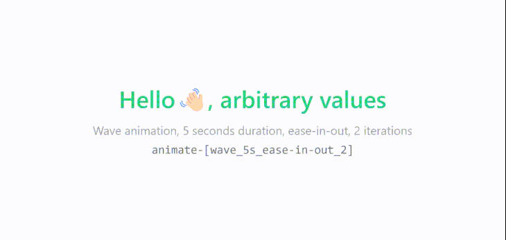
Let’s say you want to use the same wave keyframes rule, but instead of animating it linearly and infinitely for two seconds each time, you want to animate it only two times for five seconds with the ease-in-out timing function.
So, for our new animation, the utility class should look something like this:
<h1 class="flex font-semibold text-emerald-500">
  Hello <span class="animate-[wave_5s_ease-in-out_2]">👋🏻</span>, arbitrary values
</h1>
<p class="text-center text-xs text-gray-400">
  Wave animation, 5 seconds duration, ease-in-out, 2 iterations
</p>
<pre className="text-center text-xs text-gray-500">
  animate-[wave_5s_ease-in-out_2]
Conclusion
Thanks to Tailwind CSS’s theme configuration feature, you can extend the default theme not only to add custom colors, spacing, or breakpoints, but also to your custom animations without any compromises and stylesheets. This is why Tailwind CSS is such a popular choice for developers.
Is your frontend hogging your users' CPU?
As web frontends get increasingly complex, resource-greedy features demand more and more from the browser. If you’re interested in monitoring and tracking client-side CPU usage, memory usage, and more for all of your users in production, try LogRocket.

LogRocket is like a DVR for web and mobile apps, recording everything that happens in your web app or site. Instead of guessing why problems happen, you can aggregate and report on key frontend performance metrics, replay user sessions along with application state, log network requests, and automatically surface all errors.
Modernize how you debug web apps — Start monitoring for free.


Top comments (1)
Great post!