
Written by Ibadehin Mojeed✏️
If you run a podcast or any other sound- or music-related web application, you may want to add an audio player to your project. This guide will teach you how to build an audio player from scratch with React.
The audio player will offer control features like playing or pausing a track, adjusting volume, moving to the next or previous track, moving a progress slider, and so on. We will also customize it to look consistent across browsers.
Jump ahead:
- Setting up the development environment
- Creating the React audio player project structure
- Rendering the
AudioPlayerchild components - Embedding sound content to play in our React project
- Adding custom controls for the React music player
- The
play()andpause()HTML audio methods - Displaying the current track data
- Configuring the progress bar and volume slider
- Displaying time progress and duration
- The
requestAnimationFrameAPI - Navigating tracks in the React audio player
- Adding the volume slider
- Triggering the
onEndedevent
Before beginning the tutorial, ensure you have a basic understanding of React.
Below is a preview of the end product we will build together: 
You can interact with the project, and after that, get started!
Setting up the development environment
Let’s run the following command to set up a development environment with create-react-app:
npx create-react-app react-audio-player
Then do the following to start the project:
cd react-audio-player
npm start
Creating the React audio player project structure
As you can see in the image above, we can break down the user interface into four components. The number labels on the image correspond to the following component names:
-
AudioPlayer— the parent/root component -
DisplayTrack— renders the audio content -
Controls— renders the audio controls and volume slider -
ProgressBar— renders the audio progress bar and time
With this in mind, we will create the component files in the src/components folder. Let’s ensure our project directory follows the following structure:
react-audio-player
   ...
    ├── src
    │    ├── components
    │    │      ├── AudioPlayer.js
    │    │      ├── Controls.js
    │    │      ├── DisplayTrack.js
    │    │      └── ProgressBar.js
    │    ├── data
    │    ├── styles
    │    │      └── index.css
    │    ├── index.js
    │   ...
Notice we also added a data folder and styles/index.css file in the src to hold the audio files and CSS, respectively. Copy the react-audio-player project styles and paste them into the styles/index.css file.
Next, in the components/AudioPlayer.js file, let’s render some simple text:
const AudioPlayer = () => {
  return (
    <div className="audio-player">
      <div className="inner">Audio player content</div>
    </div>
  );
};
export default AudioPlayer;
After that, replace the content of the src/index.js file with the following:
import React from 'react';
import ReactDOM from 'react-dom/client';
import AudioPlayer from './components/AudioPlayer';

import './styles/index.css';

const root = ReactDOM.createRoot(document.getElementById('root'));
root.render(
  <React.StrictMode>
    <AudioPlayer />
  </React.StrictMode>
);
Save the files and see the content of the AudioPlayer component rendered in the browser.
Rendering the AudioPlayer child components
Starting with the DisplayTrack component. In the components/DisplayTrack.js file, let’s render some simple text:
const DisplayTrack = () => {
  return <div>DisplayTrack content here</div>;
};
export default DisplayTrack;
Then, import the component in the components/AudioPlayer.js file:
import DisplayTrack from './DisplayTrack';

const AudioPlayer = () => {
  return (
    <div className="audio-player">
      <div className="inner">
        <DisplayTrack />
      </div>
    </div>
  );
};
export default AudioPlayer;
Save the files to see the component text rendered in the frontend.
Again, let’s render some text for the other child components — Controls and ProgressBar. After that, we will import and render them in the components/AudioPlayer.js file like so:
import DisplayTrack from './DisplayTrack';
import Controls from './Controls';
import ProgressBar from './ProgressBar';

const AudioPlayer = () => {
  return (
    <div className="audio-player">
      <div className="inner">
        <DisplayTrack />
        <Controls />
        <ProgressBar />
      </div>
    </div>
  );
};
export default AudioPlayer;
Save all files and ensure the component's contents are rendered in the front end.
Embedding sound content to play in our React project
We will use the HTML <audio> element to embed audio in our project. This element has a src attribute to specify the audio URL and a controls attribute to display the browser’s specific controls for the audio, such as play, pause, and others:
<audio src=" " controls />
Fetching the audio files
We need audio files to work with to use the <audio> element. So, let’s create a tracks.js file in the src/data folder and add audio tracks as an array of objects like so:
// audio files
import beautiful from './a_beautiful_day.mp3';

// audio thumbnails
import trinix from './trinix.jpeg';

export const tracks = [
  {
    title: 'Trinix ft Rushawn – Its a beautiful day',
    src: beautiful,
    author: 'Trinix ft Rushawn',
    thumbnail: trinix,
  },
  // ...
];
You can copy the sample audio files from the project repo and use them in the src/data folder.
Rendering the audio player
Because we will need the audio data in multiple children components, we will import the playlist file in the AudioPlayer parent component. Then, we will create a state to handle the current audio track. For now, we will assign the first track from the playlist.
The components/AudioPlayer.js file now looks like so:
import { useState } from 'react';
import { tracks } from '../data/tracks';

// import components
import DisplayTrack from './DisplayTrack';
import Controls from './Controls';
import ProgressBar from './ProgressBar';

const AudioPlayer = () => {
  const [currentTrack, setCurrentTrack] = useState(tracks[0]);
  return (
    <div className="audio-player">
      <div className="inner">
        <DisplayTrack currentTrack={currentTrack} />
        <Controls />
        <ProgressBar />
      </div>
    </div>
  );
};
export default AudioPlayer;
In the code, we assigned the first track in the array to a state using the zero [0] index. Notice how we also passed the state to the DisplayTrack component.
Let’s access the state from the components/DisplayTrack.js file and update the src attribute of the <audio> tag:
const DisplayTrack = ({ currentTrack }) => {
  return (
    <div>
      <audio src={currentTrack.src} controls />
    </div>
  );
};
export default DisplayTrack;
If we save all files, the audio should render like so: 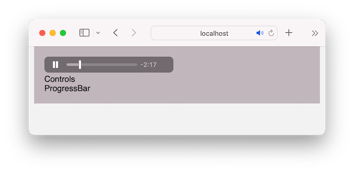
The appearance of the audio control will vary between browsers. Therefore, we will create a custom control to get a consistent look and feel across browsers and add additional features.
Let’s start by removing the controls attribute from the <audio> tag to dismiss the browser’s default control. We should have the following:
<audio src={currentTrack.src} />
Next, we’ll add some custom controls.
Adding custom controls for the React sound player
First, we need control icons. Let’s get icons from the React Icons library by running the following command in our project:
npm install react-icons
After that, open the components/Controls.js file and render the control icons. We should then have the following:
import { useState } from 'react';

// icons
import {
  IoPlayBackSharp,
  IoPlayForwardSharp,
  IoPlaySkipBackSharp,
  IoPlaySkipForwardSharp,
  IoPlaySharp,
  IoPauseSharp,
} from 'react-icons/io5';

const Controls = () => {
  const [isPlaying, setIsPlaying] = useState(false);
  return (
    <div className="controls-wrapper">
      <div className="controls">
        <button>
          <IoPlaySkipBackSharp />
        </button>
        <button>
          <IoPlayBackSharp />
        </button>

        <button>
          {isPlaying ? <IoPauseSharp /> : <IoPlaySharp />}
        </button>
        <button>
          <IoPlayForwardSharp />
        </button>
        <button>
          <IoPlaySkipForwardSharp />
        </button>
      </div>
    </div>
  );
};

export default Controls;
In the code, be aware that we used theuseState() Hook to render the play and pause icons dynamically. Let’s add the functionality to switch the icons when we click the button.
Update the play/pause button to include the onClick event handler like so:
<button onClick={togglePlayPause}>
  {isPlaying ? <IoPauseSharp /> : <IoPlaySharp />}
</button>
Then, add the following handler above the return statement to toggle the Boolean state value when the togglePlayPause button is clicked:
const togglePlayPause = () => {
  setIsPlaying((prev) => !prev);
};
Save your files and ensure the play and pause icons toggle when you click their button.
The play() and pause() HTML audio methods
To play and pause an audio track, the <audio> element exposes the play() and pause() methods. To invoke these methods, we must have access to the <audio> element. In React, we use the useRefHook for that.
Because we will need this <audio> reference in multiple children components, we will create it inside their parent component. Open the components/AudioPlayer.js file and import the useRef Hook:
import { useRef, useState } from 'react';
Then, initialize useRef above the return statement and pass it to the DisplayTrack and Controls components:
const AudioPlayer = () => {
  const [currentTrack, setCurrentTrack] = useState(tracks[0]);

  // reference
  const audioRef = useRef();

  return (
    <div className="audio-player">
      <div className="inner">
        <DisplayTrack
          currentTrack={currentTrack}
          audioRef={audioRef}
        />
        <Controls audioRef={audioRef} />
        <ProgressBar />
      </div>
    </div>
  );
};
export default AudioPlayer;
In the DisplayTrack component, let’s access the reference and assign it to a ref attribute on the <audio> element:
const DisplayTrack = ({ currentTrack, audioRef }) => {
  return (
    <div>
      <audio src={currentTrack.src} ref={audioRef} />
    </div>
  );
};
export default DisplayTrack;
If we save our files, we should now have access to the <audio> element’s methods and properties via the returned object for the ref. You can log the audioRef in the AudioPlayer component and see what it returns in the browser console:
const audioRef = useRef();
console.log(audioRef);
Next, let’s open the components/Controls.js file and access the reference variable. Then, on its current object, we can invoke the play() and pause() methods:
import { useState, useEffect } from 'react';

// icons here

const Controls = ({ audioRef }) => {
  // ...
  useEffect(() => {
    if (isPlaying) {
      audioRef.current.play();
    } else {
      audioRef.current.pause();
    }
  }, [isPlaying, audioRef]);

  return (
    // ...
  );
};

export default Controls;
The focus in the code above is theuseEffect Hook. In the Hook, we checked if the isPlaying state value is true or not to either play or pause the audio track.
If we save the files and visit the front end, we should be able to play and pause the current audio track.
Displaying the current track data
To render the current track title, author, and thumbnail, let’s open the components/DisplayTrack.js file and update the JSX to include the data:
import { BsMusicNoteBeamed } from 'react-icons/bs';

const DisplayTrack = ({ currentTrack, audioRef }) => {
  return (
    <div>
      <audio src={currentTrack.src} ref={audioRef} />
      <div className="audio-info">
        <div className="audio-image">
          {currentTrack.thumbnail ? (
            <img src={currentTrack.thumbnail} alt="audio avatar" />
          ) : (
            <div className="icon-wrapper">
              <span className="audio-icon">
                <BsMusicNoteBeamed />
              </span>
            </div>
          )}
        </div>
        <div className="text">
          <p className="title">{currentTrack.title}</p>
          <p>{currentTrack.author}</p>
        </div>
      </div>
    </div>
  );
};
export default DisplayTrack;
In the code above, the focus is the div wrapper element below the <audio> tag. In this div, we started by checking whether a thumbnail image exists or not to display it or render a custom style.
Notice we imported an icon from the react-icons library to style a default thumbnail. Afterward, we rendered the track title and the author's name right after the thumbnail.
If we save the file, the result should look like so: 
Configuring the progress bar and volume slider
To add these functionalities, we will use the HTML input range element. Starting with the progress bar, let’s open the components/ProgressBar.js file and update the JSX, so we have the following:
const ProgressBar = () => {
  return (
    <div className="progress">
      <span className="time current">00:00</span>
      <input type="range" />
      <span className="time">03:34</span>
    </div>
  );
};

export default ProgressBar;
If we save the file and view the project, we will see the browser’s default input range. Creating a range element that is consistent across browsers requires a bit more work using CSS rules.
For this, let’s create a styles/customize-progress-bar.css file, copy the react-audio-playerproject's CSS rules, and paste them into the newly created CSS file.
Next, import the CSS file inside the src/index.js:
import './styles/index.css';
import './styles/customize-progress-bar.css';
Ensure you save all files.
It is important to note that we have used a CSS variable in the CSS file to assign the progress width dynamically:
input[type="range"] {
  --range-progress: 0;
  /* ... */
}

input[type="range"]::before {
  /* ... */
  background: #f50;
  width: var(--range-progress);
  /* ... */
}
We started with a value of zero. We will dynamically update this value based on the audio progress. For now, let’s temporarily modify the CSS variable value to be 50 percent like so:
input[type="range"] {
  --range-progress: 50%;
  /* ... */
}
We will then have a progress bar that is styled up to 50 percent of the total length:  Let’s return the value assigned to the CSS variable to
 0:
input[type="range"] {
  --range-progress: 0;
  /* ... */
}
Implementing controlled and uncontrolled inputs
In React, form inputs like the range can either be controlled or uncontrolled. With controlled inputs, the component manages the state, and we write a handler for every state update. With uncontrolled inputs, the DOM manages the state, and we use a ref to get input values from the DOM.
We will learn to implement both controlled and uncontrolled inputs. We will implement the uncontrolled logic on the progress bar and a controlled logic on the volume slider.
Back to the progress bar, we will get the reference to the input range. Because we will need this ref in multiple child components, we will initialize it in their parent component.
Open the components/AudioPlayer.js file and initialize a ref above the return statement and pass it to the <ProgressBar />:
const AudioPlayer = () => {
  // ...
  const progressBarRef = useRef();

return (
  <div className="audio-player">
    <div className="inner">
      <DisplayTrack
        currentTrack={currentTrack}
        audioRef={audioRef}
      />
      <Controls audioRef={audioRef} />
      <ProgressBar progressBarRef={progressBarRef} />
    </div>
  </div>
);
};
export default AudioPlayer;
To make our code short, we can rewrite the returned JSX so we have the following:
return (
  <div className="audio-player">
    <div className="inner">
      <DisplayTrack {...{ currentTrack, audioRef }} />
      <Controls {...{ audioRef }} />
      <ProgressBar {...{ progressBarRef }} />
    </div>
  </div>
);
Let’s save our file, open the components/ProgressBar.js file, access the reference, and assign it to a ref attribute on the <input /> element:
const ProgressBar = ({ progressBarRef }) => {
  return (
    <div className="progress">
      <span className="time current">00:00</span>
      <input type="range" ref={progressBarRef} />
      <span className="time">03:34</span>
    </div>
  );
};

export default ProgressBar;
Now that we have a reference to the <input />, we will add an onChange event to get the input values at every point. We will also set the default value to 0 so the range thumb starts at the beginning. The component now looks like so:
const ProgressBar = ({ progressBarRef }) => {
  const handleProgressChange = () => {
    console.log(progressBarRef.current.value);
  };

  return (
    <div className="progress">
      <span className="time current">00:00</span>
      <input
        type="range"
        ref={progressBarRef}
        defaultValue="0"
        onChange={handleProgressChange}
      />
      <span className="time">03:34</span>
    </div>
  );
};

export default ProgressBar;
When changing the progress bar, we will see the corresponding values in the browser console.
We will now take this value and assign it to the currentTime property of the audio playback. This property returns the audio playback's current position using seconds as the unit of measurement.
To get the currentTime property, we need the audio reference. Fortunately, we created it earlier in the components/AudioPlayer.js file. So, let’s pass it down to the <ProgressBar /> component, so we have the following:
<ProgressBar {...{ progressBarRef, audioRef }} />
After that, open the components/ProgressBar.js file and access the audio ref. We will then assign the progress bar value to the currentTime property:
const ProgressBar = ({ progressBarRef, audioRef }) => {
  const handleProgressChange = () => {
    audioRef.current.currentTime = progressBarRef.current.value;
  };
  return (
    // ...
  );
};

export default ProgressBar;
Let’s save all files. When we change the progress bar, the audio playback jumps to the specified position. Be aware that the time is static for now and the range progress color is not progressing. We will get there!
Displaying time progress and duration
We will start by creating states to hold the audio time. In the components/AudioPlayer.js file, add the states and pass the state variables to the <ProgressBar />:
const AudioPlayer = () => {
  // ...
  const [timeProgress, setTimeProgress] = useState(0);
  const [duration, setDuration] = useState(0);

  // reference

  return (
    <div className="audio-player">
      <div className="inner">
        {/* ... */}
        <ProgressBar
          {...{ progressBarRef, audioRef, timeProgress, duration }}
        />
      </div>
    </div>
  );
};
export default AudioPlayer;
Save the file, grab the states from the ProgressBar component, and render them in the JSX:
const ProgressBar = ({
  // ...
  timeProgress,
  duration,
}) => {
  // ...
  return (
    <div className="progress">
      <span className="time current">{timeProgress}</span>
      {/* ... */}
      <span className="time">{duration}</span>
    </div>
  );
};

export default ProgressBar;
Updating audio time
Like the current time, as we saw earlier, we also have access to the track duration via the duration audio property.
Starting with the duration, we want to get and display the track duration as soon as the audio metadata loads. We will use the onloadedmetadata event on the <audio />.
Open the components/DisplayTrack.js file and include this event:
const DisplayTrack = ({ currentTrack, audioRef }) => {

  const onLoadedMetadata = () => {
    console.log(audioRef.current.duration);
  };

  return (
    <div>
      <audio
        src={currentTrack.src}
        ref={audioRef}
        onLoadedMetadata={onLoadedMetadata}
      />
      {/* ... */}
    </div>
  );
};
If we save and open the console, we will see the duration time in seconds.
Next, we will update the duration state variable with the audio duration and ensure the <input> progress bar‘s max attribute matches the duration.
In the AudioPlayer component, let’s pass the setDuration and progressBarRef to the <DisplayTrack />:
const AudioPlayer = () => {
  // ...

  return (
    <div className="audio-player">
      <div className="inner">
        <DisplayTrack
          {...{ currentTrack, audioRef, setDuration, progressBarRef }}
        />
        {/* ... */}
      </div>
    </div>
  );
};
export default AudioPlayer;
Then, in the DisplayTrack component, grab these props and update the onloadedmetadata handler:
const DisplayTrack = ({
  // ...
  setDuration,
  progressBarRef,
}) => {
  const onLoadedMetadata = () => {
    const seconds = audioRef.current.duration;
    setDuration(seconds);
    progressBarRef.current.max = seconds;
  };

  return (
    // ...
  );
};
export default DisplayTrack;
Now, we should see the track duration displayed:  The track duration is currently displayed using only seconds as the unit, but it would be easier to read if it displayed both minutes and seconds. Let’s create a function that formats the time to the desired display.
Formatting the audio time
In the ProgressBar component, add the following code above the return statement:
const formatTime = (time) => {
  if (time && !isNaN(time)) {
    const minutes = Math.floor(time / 60);
    const formatMinutes =
      minutes < 10 ? `0${minutes}` : `${minutes}`;
    const seconds = Math.floor(time % 60);
    const formatSeconds =
      seconds < 10 ? `0${seconds}` : `${seconds}`;
    return `${formatMinutes}:${formatSeconds}`;
  }
  return '00:00';
};
The formatTime function takes a time argument in seconds and reformats it to minutes:seconds. We will then use the function in the JSX like so:
return (
  <div className="progress">
    <span className="time current">{formatTime(timeProgress)}</span>
    {/* ... */}
    <span className="time">{formatTime(duration)}</span>
  </div>
);
Save the file and see the audio time that is formatted the way we want.
The requestAnimationFrame API
We need a mechanism that tells the browser to redraw every update to display the current time and the range progress. While we may think of using setInterval(), requestAnimationFrame is much more efficient and smoother when we want to handle repeated animation.
This API takes a callback that it calls whenever it kicks off. To trigger the API and tell the browser to update the screen, we may call it once the audio starts playing and the current time increases.
Let’s open the components/Controls.js file and trigger this API once the playback is ongoing in the useEffect Hook:
const playAnimationRef = useRef();

const repeat = () => {
  console.log('run');

  playAnimationRef.current = requestAnimationFrame(repeat);
};

useEffect(() => {
  if (isPlaying) {
    audioRef.current.play();
    playAnimationRef.current = requestAnimationFrame(repeat);
  } else {
    audioRef.current.pause();
    cancelAnimationFrame(playAnimationRef.current);
  }
}, [isPlaying, audioRef, repeat]);
The requestAnimationFrame returns the request-id that we have assigned to playAnimationRef.current. The ref will preserve the returned id over time. This id lets us cancel the request once we pause the playback.
Notice how the callback recursively calls itself to repeat the animation. If we save the file and click the audio play button, we will see the repeat function repeatedly run in the browser console.
We will also see a terminal warning that says the repeat function changes the useEffect dependencies on every render. Let’s memorize the definition of the callback by wrapping it in a useCallback Hook. Let’s import the useCallback from React:
import {
  //...
  useCallback,
} from 'react';
Then, update the repeat callback to the following:
const repeat = useCallback(() => {
  console.log('run');

  playAnimationRef.current = requestAnimationFrame(repeat);
}, []);
Next, we will define the following functionality in that callback:
- Update the
timeProgressstate variable with the current audio time - Ensure the progress bar progresses with the current audio time
- Dynamically update the audio progress — i.e., styling the length of the played section
Let’s pass the progressBarRef, duration state variable, and setTimeProgress from the AudioPlayer component into the Controls component:
const AudioPlayer = () => {
  // ...
  return (
    <div className="audio-player">
      <div className="inner">
        {/* ... */}
        <Controls
          {...{ audioRef, progressBarRef, duration, setTimeProgress }}
        />
        {/* ... */}
      </div>
    </div>
  );
};
export default AudioPlayer;
Next, let’s access the props inside the Controls component and update the repeat callback, so we have the following:
const Controls = ({
  audioRef,
  progressBarRef,
  duration,
  setTimeProgress,
}) => {
  // ...

  const repeat = useCallback(() => {
    const currentTime = audioRef.current.currentTime;
    setTimeProgress(currentTime);
    progressBarRef.current.value = currentTime;
    progressBarRef.current.style.setProperty(
      '--range-progress',
      `${(progressBarRef.current.value / duration) * 100}%`
    );

    playAnimationRef.current = requestAnimationFrame(repeat);
  }, [audioRef, duration, progressBarRef, setTimeProgress]);

  // ...
  return (
    // ...
  );
};

export default Controls;
The focus is on the repeat callback. With the setTimeProgress updater function, we update the audio elapse time. We also assigned the current time to the range value so it progresses.
Regarding the length of the played section, we grabbed the CSS variable we declared in the CSS file and dynamically update it.
If we save the file and play the audio track, we should see the following behavior: 
Be aware that if we pause the audio, changing the progress bar will not reflect the animation till we press play again. This is because we called the cancelAnimationFrame in the pause condition to cancel it. We can remove the cancelAnimationFrame and move the requestAnimationFrame out of condition, so we have the following:
useEffect(() => {
  if (isPlaying) {
    audioRef.current.play();
  } else {
    audioRef.current.pause();
  }
  playAnimationRef.current = requestAnimationFrame(repeat);
}, [isPlaying, audioRef, repeat]);
The project should now work as expected.
Navigating tracks in the React music player
Let’s work on the next, previous, skip forward, and skip backward buttons. We‘ll start by attaching onClick events to them. In the components/Controls.js file, update the buttons in the JSX to include onClick events:
return (
  <div className="controls-wrapper">
    <div className="controls">
      <button onClick={handlePrevious}>
        <IoPlaySkipBackSharp />
      </button>
      <button onClick={skipBackward}>
        <IoPlayBackSharp />
      </button>

      <button onClick={togglePlayPause}>
        {isPlaying ? <IoPauseSharp /> : <IoPlaySharp />}
      </button>
      <button onClick={skipForward}>
        <IoPlayForwardSharp />
      </button>
      <button onClick={handleNext}>
        <IoPlaySkipForwardSharp />
      </button>
    </div>
  </div>
);
Then, above the return statement, add their respective handler functions:
const skipForward = () => {};

const skipBackward = () => {};

const handlePrevious = () => {};

const handleNext = () => {};
Handling the next track
To handle the next and previous track, we need to know the index of the current playing track and have access to the playlist. In the components/AudioPlayer.js file, let’s initialize a state for the track index:
const [trackIndex, setTrackIndex] = useState(0);
The currentTrack state should currently look like this:
const [currentTrack, setCurrentTrack] = useState(tracks[0]);
Let’s update it to this instead:
const [currentTrack, setCurrentTrack] = useState(tracks[trackIndex]);
Next, let’s pass the tracks, trackIndex, setTrackIndex, and setCurrentTrack, to <Controls /> component:
<Controls
  {...{
    // ...
    tracks,
    trackIndex,
    setTrackIndex,
    setCurrentTrack,
  }}
/>
We will access them from the Controls component as props and then update the handleNext handler, so we have the following:
const handleNext = () => {
  if (trackIndex >= tracks.length - 1) {
    setTrackIndex(0);
    setCurrentTrack(tracks[0]);
  } else {
    setTrackIndex((prev) => prev + 1);
    setCurrentTrack(tracks[trackIndex + 1]);
  }
};
With the code above, whenever we click the “next” button, we check if we are in the last index — i.e., the last track. Then, we set the index to 0 — i.e., the first track — and reset the track to the first item in the playlist. Otherwise, we set the index and the track to the next one in the playlist.
Save the file and ensure the “next” button works as expected.
Handling previous track
Similar to the “next track” handler, let’s update the handlePrevious handler so we have the following:
const handlePrevious = () => {
  if (trackIndex === 0) {
    let lastTrackIndex = tracks.length - 1;
    setTrackIndex(lastTrackIndex);
    setCurrentTrack(tracks[lastTrackIndex]);
  } else {
    setTrackIndex((prev) => prev - 1);
    setCurrentTrack(tracks[trackIndex - 1]);
  }
};
If the current track index is 0, we reset the index and the track to the last item in the playlist. Otherwise, we set the index and the track to the previous one in the playlist.
Skipping forward and backward
In the respective handlers for skipping forward and backward, we will access the current time from the audio ref and assign a numeric value in seconds:
const skipForward = () => {
  audioRef.current.currentTime += 15;
};

const skipBackward = () => {
  audioRef.current.currentTime -= 15;
};
We have assigned 15 seconds of skipping time, as seen above. Save and ensure the control buttons work as expected.
Adding the volume slider
As we mentioned earlier, we will use the HTML input range element to let us control the volume via a slider. In the Controls component, let’s add the volume container element after the control container:
return (
  <div className="controls-wrapper">
    <div className="controls">{/* ... */}</div>
    <div className="volume">
      <button>icons</button>
      <input type="range" min={0} max={100} />
    </div>
  </div>
);
We also mentioned that we would make this input slider a controlled input.
Let’s start by initializing a state in the Controls component:
const [volume, setVolume] = useState(60);
Then, update the input element to include a value and onChange props:
<input
  type="range"
  min={0}
  max={100}
  value={volume}
  onChange={(e) => setVolume(e.target.value)}
/>
Next, we will attach the returned value of the volume state variable to the volume property of the audio. Let’s do that by adding the following code above the return statement inside the Controls component:
useEffect(() => {
  if (audioRef) {
    audioRef.current.volume = volume / 100;
  }
}, [volume, audioRef]);
In this component, we have access to the audio reference. Because the max value of the audio’s volume property is 1, we divided ours volume state — whose max value is 100 — by 100 so they can be in sync.
Save the file and ensure you can increase and reduce the audio volume.
Styling the volume progress
Let’s capitalize on the volume state variable to style the volume progress dynamically. On the volume input element, let's add a style attribute to style the progress:
<input
  // ...
  style={{
    background: `linear-gradient(to right, #f50 ${volume}%, #ccc ${volume}%)`,
  }}
/>
The code above styles the volume progress bar using the CSS linear gradient. As the volume state increases, the progress bar's orange background color will also match until it takes up the rest of the progress bar’s length. Remember to save the file and ensure it works!
Setting the volume icons
In the Controls component, let’s start by initializing a state to handle when the volume is muted:
const [muteVolume, setMuteVolume] = useState(false);
By default, we gave it a Boolean value of false. Next, let’s locate the following button within the volume container element:
<button>icons</button>
Replace this with the following code:
<button onClick={() => setMuteVolume((prev) => !prev)}>
  {muteVolume || volume < 5 ? (
    <IoMdVolumeOff />
  ) : volume < 40 ? (
    <IoMdVolumeLow />
  ) : (
    <IoMdVolumeHigh />
  )}
</button>
In the code above, we have attached an onClick event that toggles the muteVolume state. We also used conditions to render icons dynamically based on the value of the volume state variable.
Before saving the file, let’s import the following react-icons components at the top of the file:
import {
  IoMdVolumeHigh,
  IoMdVolumeOff,
  IoMdVolumeLow,
} from 'react-icons/io';
Finally, in the useEffect Hook, let's assign the Boolean muteVolume state to the muted property of the audio:
useEffect(() => {
  if (audioRef) {
    audioRef.current.volume = volume / 100;
    audioRef.current.muted = muteVolume;
  }
}, [volume, audioRef, muteVolume]);
Save and test the volume functionality. It should work as expected!
Triggering the onEnded event
When the current track reaches the end, we can trigger the onended event on the <audio> element and act. For this project, we will tell the audio player to start the next track on the playlist.
Since we already have the functionality in the handleNext handler, let’s move the handler from the components/Controls.js file into the AudioPlayer parent component so that we can also have access to it in the DisplayTrack component.
Then pass it down to the <DisplayTrack /> and <Controls /> components:
return (
  <div className="audio-player">
    <div className="inner">
      <DisplayTrack
        {...{
          // ...
          handleNext,
        }}
      />
      <Controls
        {...{
          // ...
          handleNext,
        }}
      />
      {/* ... */}
    </div>
  </div>
);
In the DisplayTrack component, access the handleNext handler as a prop and assign it to the onEnded event on the <audio /> element:
<audio
  // ...
  onEnded={handleNext}
/>
Save the file and go into the Controls component to access the handleNext handler as a prop. Remember, we’ve attached it to the next button icon in the file.
Save all files and test your project. It should work as intended!
Conclusion
I’m glad you are here! Creating audio players can be a tedious task, especially if we aim to include major features.
In this guide, we learned how to create a React audio player that offers necessary features, including the play, pause, volume, next, previous, and progress controls. We also ensured the audio player looks consistent across browsers.
I hope you enjoyed reading this guide. Let me know your thoughts in the comment section, and remember to share the guide around the web if you found it useful.
See the final source code and the live project for reference.
Cut through the noise of traditional React error reporting with LogRocket
LogRocket is a React analytics solution that shields you from the hundreds of false-positive errors alerts to just a few truly important items. LogRocket tells you the most impactful bugs and UX issues actually impacting users in your React applications.

LogRocket automatically aggregates client side errors, React error boundaries, Redux state, slow component load times, JS exceptions, frontend performance metrics, and user interactions. Then LogRocket uses machine learning to notify you of the most impactful problems affecting the most users and provides the context you need to fix it.
Focus on the React bugs that matter — try LogRocket today.


Top comments (0)