
Written by David Omotayo✏️
Svelte is one of the most popular frameworks built on JavaScript. Although it was introduced back in 2016, it is still considered to be a relatively new framework (compared to React, Vue.js, and others) in the frontend space.
Despite arriving later to the party, Svelte's friendly syntaxes and great performance have made it impossible to disregard. But, even with its excellent reputation, the Svelte ecosystem finds itself struggling to keep up with contemporary tools and will need more time to match the toolbox size of its counterparts.
Fortunately, the Svelte community works hard to keep the framework relevant by continually introducing new, useful tools, with the hope of bridging the gap between other frameworks. One example is Svelvet, a recently launched component library that allows for the easy creation of gorgeous, customizable flow diagrams in Svelte.
In this article, we'll introduce Svelvet’s core concepts and demonstrate how to build flow diagrams in Svelte using Svelvet. Jump ahead:
Prerequisites
To follow along with this tutorial, you’ll need to have a foundational knowledge of Svelte and its concepts.
What is Svelvet?
Svelvet is a lightweight component library for rendering interactive node-based flow diagrams in Svelte. The library uses a graph-based editor for transforming, analyzing, and visualizing data. It also utilizes D3.js zoom and selection components to deliver a smooth zooming and panning behavior on the graph.
According to the creators of Svelvet, the library was built to meet the demands for a diagramming tool similar to React flow, a node-based graph renderer for React, in Svelte. As a result, Svelvet has similar functionalities and features to React Flow, such as:
- Ease of use
- Ease of customization
- Interactivity
- Fast rendering
Now that we have a basic understanding of Svelvet, let's see how we can add it to our projects and start rendering flowchart diagrams.
Getting started
You can install Svelvet in your projects via npm or Yarn using one of the following commands:
npm install svelvet
yarn add svelvet
If you don't have a project set up already, you can bootstrap a Svelte project, like so:
npx degit sveltejs/template
Then, install dependencies:
npm install
Next, you can integrate Svelvet into your Svelte project by importing a Svelvet component inside the script section of any component in your project folder:
import Svelvet from 'svelvet';
The Svelvet component accepts several props, but the nodes and edges properties are the actual building blocks of the component. The component’s nodes and edges render graphs according to their assigned values.
Here’s a basic usage of the Svelvet component:
<script>
  import Svelvet from 'svelvet';

  const initialNodes = [
    {
    id: 1,
    position: { x: 350, y: 50 },
    data: { label: 'input Node' },
    width: 175,
    height: 40,
    bgColor: 'white'
    },
    {
    id: 2,
    position: { x: 350, y: 150 },
    data: { label: 'Default Node' },
    width: 175,
    height: 40,
    bgColor: 'white'
    }
];

  const initialEdges = [
    { id: 'e1-2', source: 1, target: 2, type: 'default', label: 'label'},
];
</script>

<Svelvet nodes={initialNodes} edges={initialEdges} background />
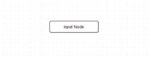
As you can see, the initialNodes and initialEdges array of objects are being passed to the nodes and edges props, respectively. Svelvet will render the graphs according to the values of the object properties in each array.
The code above will render the below graph to the browser: 
This example should give you an idea of how the nodes and edges props work. Next, we'll look at how the object properties define and connect the nodes and edges props.
Nodes
The nodes prop is used to render box-shaped elements, referred to as nodes, to the graph. Each node may contain some text or information describing what the node represents.
The nodes prop takes an array of objects, and the properties of the objects are used to define the width, height, position, and background color (bgColor) of each node. Each object represents a node, so if there are five objects present in a particular nodes array, the component will render five nodes to the graph.
Here's a typical node object:
{
    id: 1,
    position: { x: 350, y: 50 },
    data: { label: 'input Node' },
    width: 175,
    height: 40,
    bgColor: 'white'
}
Now, let’s take a look at each object's properties to better understand what they are used for.
id
The id property is used to assign IDs to each node. The property takes an integer which acts as an identifier for the node. The integers are used to reference each node when defining an edge property.
data
The data property is used to label nodes, it takes an object with a 'label' property that accepts a string value of texts or information to be displayed on the node.
position
The position property is used to position a node on the graph; it takes an object with x and y properties. These properties accept integer values that are used to align the node on the x and y axes.
bgColor
The bgColor property does what its name implies; it is used to change the background colors of nodes.
width and height
The width and height properties are used to control the dimensions of a node; they accept integer values.
Edges
The edges prop is used to construct the lines between nodes on the graph. These lines are called edges, and they act as a connector between two nodes. 
The edges prop takes an array of objects, and the properties of the objects are used to reference and connect nodes.
const initialEdges = [
    {
      id: 'e1-2',
      source: 1,
      target: 2,
      type: 'straight',
      label: 'edge'
    },
];

...
 <Svelvet ... edges={initialEdges} .../>
Let's take a look at the object properties to better understand how they work.
id
The id property also serves as an identifier for edges, but unlike the former, it accepts string values instead of integers. The value describes the nodes being connected by the object. For example, an edge object with an id value of 'e1-2' will connect the node with an id of 1 to another node whose id is 2.
//edge for connecting node 1 and 2
{ id: 'e1-2', ...}
source
The source property is used to set the origin of an edge. The property takes an integer that references the id value of a node and marks it as the source of the edge.
//referencing the node with an id of 1
{
  ...,
  source: 1,
  ...
}
When the target node is set, the component will start drawing the edge line from the source node.
target
The target property is used to set the destination of an edge from the source. The property also takes an integer that references the id value of a node that is different from the source.
For example, if the source property is referencing a node whose id is 1, the target property will reference another node whose id is either 2 or 3.
//node 1 targeting node 2
{
  ...,
  source: 1,
  target: 2,
  ...
}

label
The label property works similarly to the node data property; it is used to add text or information to edges. The label is placed at the intersection between two connecting nodes.
{
  ...,
  label: 'label'
}

animate
The animate property is used to animate edges. It takes a Boolean value which animates the edge when set to true and keeps it static when set to false.
{
  ... ,
  animate: true
}

type
The type property is used to set the appearance of an edge, it takes a default or straight string value. The default edge type is a Bezier curve, whereas the straight edge type is a straight line.
{
  ... ,
  type: ‘default’
}
//or
{
  ... ,
  type: ‘straight’
}

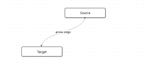
arrow
The arrow property is used to configure the end point of an edge line; it transforms the edge into an arrowhead pointing toward the target node. The arrow property accepts a Boolean value of either true or false.
{
  ... ,
  arrow: true
}
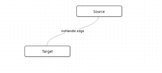
noHandle
This noHandle property is similar to the arrow property; it is used to remove the handle of an edge line towards the target node. The property accepts a Boolean value of either true or false.
{
  ... ,
  noHandle: true
}
Building a flowchart with Svelvet
We’ve reviewed Svelvet’s core concepts; this information is sufficient to help you kickstart your journey of diagramming in Svelvet.
To finish things up, let’s build a flowchart from scratch. As a first step, create a new component in your Svelte project or use the App.svelte main component instead. Next, import the Svelte component inside the script section, create two arrays of objects, and tweak the properties to your preference.
For this example, we’ll use the following:
<script>
Import Svelvet from ‘svelvet’

//nodes array
const nodeArr = [
   {
     id: 1,
     position: { x: 300, y: 20 },
     data: { label: "Input Node" },
     width: 175,
     height: 40,
     bgColor: "#127369"
   },
   {
     id: 2,
     position: { x: 80, y: 150 },
     data: { label: "bezier" },
     width: 70,
     height: 40,
     bgColor: "#8AA6A3"
   },
   {
     id: 3,
     position: { x: 282, y: 190 },
     data: { label: "straight" },
     width: 70,
     height: 40,
     bgColor: "#F2BE22"
   },
   {
     id: 4,
     position: { x: 494, y: 150 },
     data: { label: "animated" },
     width: 140,
     height: 40,
     bgColor: "#BFBFBF"
   },
   {
     id: 5,
     position: { x: 120, y: 225 },
     data: { label: "no handle" },
     width: 80,
     height: 40,
     bgColor: "#03A678"
   },
   {
     id: 6,
     position: { x: 390, y: 225 },
     data: { label: "arrow handle" },
     width: 100,
     height: 40,
     bgColor: "#F27405"
   }
 ];

 //edges array
 const edgeArr = [
   {
     id: "e1-2",
     source: 1,
     target: 2,
     type: "bezier",
     label: "default edge"
   },
   {
     id: "e1-3",
     source: 1,
     target: 3,
     type: "straight",
     label: "straight edge"
   },
   {
     id: "e1-4",
     source: 1,
     target: 4,
     type: "bezier",
     animate: true,
     label: "animated edge"
   },
   {
     id: "e1-5",
     source: 1,
     target: 5,
     type: "bezier",
     noHandle: true,
     label: "noHandle edge"
   },
   {
     id: "e1-6",
     source: 1,
     target: 6,
     type: "bezier",
     arrow: true,
     label: "arrow edge"
   }
 ];
</script>
Next, add the Svelvet component to the template section of the component and pass the nodeArr array to the nodes prop and the edgesArr array to the edges prop, like so:
<Svelvet nodes={nodeArr} edges={edgeArr} />
Now, save the code and start the development server by running the following command:
npm run dev
You’ll notice that it’s hard to perceive the boundaries of the Svelvet renderer, and nodes will often overlap beyond the boundaries. This is due to the renderer’s default white background.
To fix this issue and make the renderer less vague, you can add a background prop to the component, like so:
<Svelvet nodes={nodeArr} edges={edgeArr} background />
The background prop will add a dotted background to the renderer, this will make it much easier to perceive the size of the renderer. 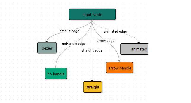
We can also increase the size of the renderer by adding width and height props to the component:
<Svelvet nodes={nodeArr} edges={edgeArr} background width={900} height={800} />

That’s it; we’ve created a flow diagram in no time!
Svelvet is interactive out of the box. You, and those viewing your flow diagram, can select and move nodes around in the graph, as well as zoom and pan. 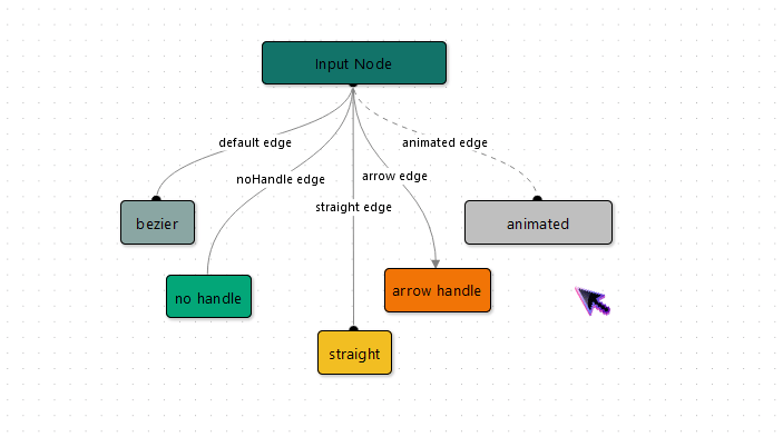
Conclusion
In this article, we investigated Svelvet’s core concepts, studied the node and edge object properties, and demonstrated how to use Svelvet to set up a basic flow diagram.
Svelvet is still in its infancy, and lacks some of the features offered by its counterpart, React flow. The Svelvet team has promised to make the library more extensive by integrating additional customization, testing, and error handling features in the future.
Regardless, the library’s base functionality is built out and is ready for production; you can use it in your projects. Even without additional functionality, Svelvet is an intuitive solution for building beautiful flow diagrams in Svelte.
To learn more about Svelvet, refer to the documentation or the GitHub repo.
Is your frontend hogging your users' CPU?
As web frontends get increasingly complex, resource-greedy features demand more and more from the browser. If you’re interested in monitoring and tracking client-side CPU usage, memory usage, and more for all of your users in production, try LogRocket.

LogRocket is like a DVR for web and mobile apps, recording everything that happens in your web app or site. Instead of guessing why problems happen, you can aggregate and report on key frontend performance metrics, replay user sessions along with


Latest comments (1)
Svelvetdefault component doesn't exists anymore