
Written by Rahul Padalkar✏️
Are you a developer looking for an alternative to react-beautiful-dnd? Look no further! dnd kit is here, and we’ll be talking about how to use it in this walkthrough guide.
Jump ahead:
- dnd kit as an alternative to react-beautiful-dnd
- What is dnd kit?
- Getting started with dnd kit
- Installing
dnd-kit/core - The building blocks of dnd kit
-
KanbanCardcomponent -
KanbanLanecomponent -
KanbanBoardcomponent
dnd kit as an alternative to react-beautiful-dnd
One of the most popular UI patterns used for designing web interfaces is the drag-and-drop pattern. It’s an easy-to-use and intuitive pattern to include in a project and is most commonly used for processes like uploading files and reordering or moving items.
There are several packages that make implementing the drag-and-drop feature simple, with a popular choice among React developers being react-beautiful-dnd.
Unfortunately, it is no longer maintained and there are no plans for any development in the future. This has left developers like me looking for a solid alternative, and it has also given me one more reason to dislike Atlassian (the first being Jira 😅!)

Enter dnd kit.
What is dnd kit?
dnd kit is the new “kit” on the block (blame the creators for this joke 🤣) and it certainly looks promising for those seeking an alternative to react-beautiful-dnd.
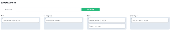
In this tutorial, we will create a basic Kanban board while learning about dnd kit and its features.
Here is an image of what our board will look like once we've completed it:
Getting started with dnd kit
We will start by setting up a React project using Create React App. We will use the Chakra UI component library for the sake of simplicity, as it is easy to set up and use.
To create and set up a React project, run the following command:
npx create-react-app react-kanban-app --template @chakra-ui   # create project
cd react-kanban-app   # move into the project directory

# If you prefer TS over JS and yarn over npm
npx create-react-app react-kanban-app --template @chakra-ui/typescript
yarn create react-app react-kanban-app --template @chakra-ui
yarn create react-app react-kanban-app --template @chakra-ui/typescript
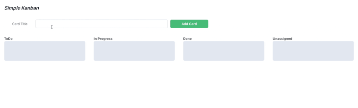
This will create a folder with the name react-kanban-app. Use the command line to cd into the project directory and run:
npm run start
This will start the app on port 3000. Open localhost:3000 in your browser and you will be greeted with this screen: 
Installing dnd-kit/core
Now we have a base project set up, let’s start by installing dnd kit; the lightweight, performant, and extensible drag-and-drop toolkit for React we will be using today.
To install the package, run:
npm install @dnd-kit/core

# If you run into peer dependencies issues (esp. npm 7+)
npm install --legacy-peer-deps @dnd-kit/core
This command will install the core package from dnd-kit.
The core package comes with the building blocks required to create a drag-and-drop feature in your React app. The package ships with the DndContext, Draggable, and Droppable core components.
Along with these, it also comes with a DragOverlay component to improve the user experience with a smoother look — we’ll take a more detailed look at the core components later in the article.
For more advanced use cases, we can also install other packages that dnd kit provides.
Modifiers
The package ships with useful modifiers that can be used to change the behavior of core components.
Here are some of the key features of modifiers:
- Restrict motion to a single axis (horizontal or vertical)
- Restrict motion to a window or the parent element of a draggable item
- Snap draggable items to a grid
- Create custom modifiers
Presets (sortable preset)
The dnd-kit toolkit ships with a sortable preset. This preset can be used to build sortable drag-and-drop interfaces in React.
For this tutorial, we will stick to the core package, so let’s take a closer look at it before we get our hands dirty.
The building blocks of dnd kit
DndContext
This is the root component of our drag-and-drop feature and all other blocks are nested inside.
The component accepts around a dozen props that help modify behavior or run code when a specific event occurs.
For the purposes of this tutorial, we will be using the collisionDetection and onDragEnd props.
N.B., learn more about other props.
Draggable
The core package exports the useDraggable hook, which can be used in our React component to make it a draggable component (more on this later).
//exampleDraggable.jsx
import {useDraggable} from "@dnd-kit/core"
import {CSS} from "@dnd-kit/utilities"

export const MyDraggableComponent = () => {
const {attributes, listeners, setNodeRef, transfrom} = useDraggable({
  id: 'draggable-1',
  data: {
    ....
    parent: 'ToDo',
    title: 'Complete blogpost.'
    ....
  }
  return <div
          {...attributes}
          {...listeners}
          ref={setNodeRef}
          styles={{transfrom: CSS.Translate.toString(transform) }}>Drag Me!</div>
})
Droppable
Much like the useDraggable hook, we can use the useDroppable hook to make our React component a droppable target.
//exampleDroppable.jsx
import {useDroppable} from "@dnd-kit/core"

export const MyDroppableComponent = () => {
  const {setNodeRef} = useDroppable({
    id: 'droppable-1'
  })

  return <div ref={setNodeRef}> Drop on me! </div>
}
Sensors
Sensors are different input methods that can be used to initiate the dragging of draggable items.
There are a few built-in sensors that we can use:
- Pointer
- Keyboard
- Touch
- Mouse
The DndContext defaults to a Pointer and Keyboard sensor. If you want to use another sensor, this can be done by initializing a sensor and then passing it to DndContext.
//sensors.jsx
import {MouseSensor, TouchSensor, useSensor} from '@dnd-kit/core';

export const DragDropContainer = () => {

  const mouseSensor = useSensor(MouseSensor); // Initialize mouse sensor
  const touchSensor = useSensor(TouchSensor); // Initialize touch sensor
  const sensors = useSensors(mouseSensor, touchSensor)

  return (<DndContext sensors={sensors}>.....</DndContext>) // Pass the 2 sensors
}
Now that we’ve covered these bases, we can now start building our Kanban board with dnd kit, so let’s get straight into it. 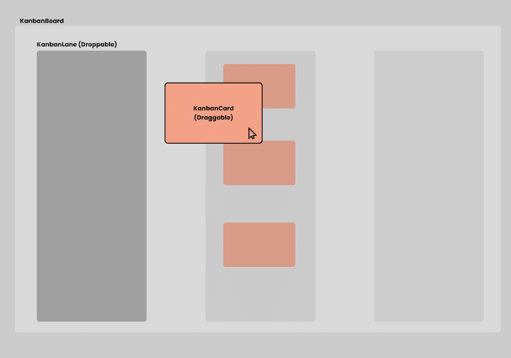
Shown above is the component breakdown of the Kanban board that we will be building.
There are three major components that we will be exploring today:
-
KanbanCard: A draggable KanbanItemthat can be dropped in a droppable area -
KanbanLane: A droppable area where theKanbanCardcan be dropped -
KanbanBoard: The component that holds it all together
KanbanCard component
Let’s start with the KanbanCard component:
// KanbanCard.tsx
import { Flex, Text } from "@chakra-ui/react";
import { useDraggable } from "@dnd-kit/core";
import { CSS } from "@dnd-kit/utilities";

const KanbanCard = ({
  title,
  index,
  parent,
}: {
  title: string;
  index: number;
  parent: string;
}) => {
  const { attributes, listeners, setNodeRef, transform } = useDraggable({
    id: title,
    data: {
      title,
      index,
      parent,
    },
  });
  const style = {
    transform: CSS.Translate.toString(transform),
  };
  return (
    <Flex
      padding="3"
      backgroundColor="white"
      margin="2"
      borderRadius="8"
      border="2px solid gray.500"
      boxShadow="0px 0px 5px 2px #2121213b"
      transform={style.transform}
      {...listeners}
      {...attributes}
      ref={setNodeRef}
    >
      <Text>{title}</Text>
    </Flex>
  );
};
There are a few things to note here, which I will bullet-point below. The component takes three props:
-
title: Title of the card -
index: The index of the card in the current lane -
parent: The name of the lane where the card currently is
To make the component draggable, we must use the useDraggable hook. In the above example, we need to pass a couple of things as arguments:
-
id: A unique value to identify a draggable node in aDndContext -
data: Data that can be used in event handlers
The hook also returns a number of things we must consider:
-
attributes: Attributes for accessibility that need to be added to the draggable DOM node -
listeners: A number of event handlers are necessary for dragging to work -
setNodeRef: A function that dnd-kit uses to keep track of the DOM node -
transform: An object that holds the position and scales the values of the draggable element
Finally, for visually updating the component, we must update the transform CSS property of the card. To get the card position, we need to pass the transform value that the useDraggable hook returns to the helper function provided by dnd-kit.
KanbanLane component
Now, let’s take a look at the KanbanLane component:
// KanbanLane.tsx
import { Flex, Text } from "@chakra-ui/react";
import { useDroppable } from "@dnd-kit/core";

interface KanbanLaneProps {
  title: string;
  items: Cards[];
}

export default function KanbanLane({ title, items }: KanbanLaneProps) {
  const { setNodeRef } = useDroppable({
    id: title,
  });
  return (
    <Flex flex="3" padding="5" flexDirection="column" minH="10rem">
      <Text fontWeight="bold">{title}</Text>
      <Flex
        ref={setNodeRef}
        backgroundColor="gray.200"
        borderRadius="8"
        flex="1"
        padding="2"
        flexDirection="column"
      >
        {items.map(({ title: cardTitle }, key) => (
          <KanbanCard title={cardTitle} key={key} index={key} parent={title} />
        ))}
      </Flex>
    </Flex>
  );
}
This is a pretty lean component, as all it does is render multiple KanbanCard components. One thing to note is that it uses the useDroppable hook, which makes it a droppable area.
We need to pass in an id that is unique in a DndContext.
KanbanBoard component
Finally, let’s take a closer look at the KanbanBoard component that ties it all together:
// KanbanBoard.tsx
import { DndContext, rectIntersection } from "@dnd-kit/core";
import KanbanLane from "./KanbanLane";
import AddCard from "./AddCard";
import { Flex } from "@chakra-ui/react";
import { useState } from "react";
import { Cards } from "./types";
export default function KanbanBoard() {
  const [todoItems, setTodoItems] = useState<Array<Cards>>([]);
  const [doneItems, setDoneItems] = useState<Array<Cards>>([]);
  const [inProgressItems, setInProgressItems] = useState<Array<Cards>>([]);
  const [uItems, setuItems] = useState<Array<Cards>>([]);
  const addNewCard = (title: string) => {
    setuItems([...uItems, { title }]);
  };
  return (
    <DndContext
      collisionDetection={rectIntersection}
      onDragEnd={(e) => {
        const container = e.over?.id;
        const title = e.active.data.current?.title ?? "";
        const index = e.active.data.current?.index ?? 0;
        const parent = e.active.data.current?.parent ?? "ToDo";
        if (container === "ToDo") {
          setTodoItems([...todoItems, { title }]);
        } else if (container === "Done") {
          setDoneItems([...doneItems, { title }]);
        } else if (container === "Unassigned") {
          setuItems([...uItems, { title }]);
        } else {
          setInProgressItems([...inProgressItems, { title }]);
        }
        if (parent === "ToDo") {
          setTodoItems([
            ...todoItems.slice(0, index),
            ...todoItems.slice(index + 1),
          ]);
        } else if (parent === "Done") {
          setDoneItems([
            ...doneItems.slice(0, index),
            ...doneItems.slice(index + 1),
          ]);
        } else if (parent === "Unassigned") {
          setuItems([...uItems.slice(0, index), ...uItems.slice(index + 1)]);
        } else {
          setInProgressItems([
            ...inProgressItems.slice(0, index),
            ...inProgressItems.slice(index + 1),
          ]);
        }
      }}
    >
      <Flex flexDirection="column">
        <AddCard addCard={addNewCard} />
        <Flex flex="3">
          <KanbanLane title="ToDo" items={todoItems} />
          <KanbanLane title="In Progress" items={inProgressItems} />
          <KanbanLane title="Done" items={doneItems} />
          <KanbanLane title="Unassigned" items={uItems} />
        </Flex>
      </Flex>
    </DndContext>
  );
There are quite a few things going on here; let’s go over them one by one.
Firstly, the board has four lanes: ToDo, In Progress, Done, and Unassigned.
Secondly, the <AddCard/> component is just a text box with a button. On clicking the button, a card with the title specified in the text box is created and added to the Unassigned lane.
DndContext is at the root of the component, and we need to pass two important props to it:
-
collisionDetection: This dictates which method to use to detect collisions between draggable and droppable components -
onDragEnd: This is an event handler that runs every time we stop dragging a draggable component. In the event handler:- We identify the lane the card was in and remove it
- We identify over which lane the card was dropped and add it to that lane
Finally, this is what it looks like 👇
Conclusion
Though react-beautiful-dnd is not being maintained actively, it is more mature and has a huge community around it. Because of this, it's definitely going to be challenging to convince folks to jump ship. It also has some advanced features like support for multiple dragging, virtual list support, and SSR that dnd kit doesn't offer out of the box.
However, I feel that dnd kit has the potential to reach feature parity with react-beautiful-dnd and go even beyond that. Interested folks can help get there by solving issues and opening PRs!
That’s it! We have built a basic Kanban board using dnd kit with React. You can find the repo for this tutorial here. I tweet about web development and JavaScript, so if you are interested, you can find me @rahulnpadalkar.
Cut through the noise of traditional React error reporting with LogRocket
LogRocket is a React analytics solution that shields you from the hundreds of false-positive errors alerts to just a few truly important items. LogRocket tells you the most impactful bugs and UX issues actually impacting users in your React applications.

LogRocket automatically aggregates client side errors, React error boundaries, Redux state, slow component load times, JS exceptions, frontend performance metrics, and user interactions. Then LogRocket uses machine learning to notify you of the most impactful problems affecting the most users and provides the context you need to fix it.
Focus on the React bugs that matter — try LogRocket today.


Top comments (0)