
Written by Sarthak Duggal ✏️
Navigation bars are probably the best way to allow users navigate around your websites effortlessly without getting lost.
People usually place navbars at the very top of the page, but you can also put a navbar on either side of your webpage if it compliments your design. Navbars can either be a horizontal list of nav items or hamburger-style at the top-left or top-right corners of webpages on smaller screens.
To allow better accessibility to navbars, you can sticky them at the top by using a few lines of CSS and JavaScript. More JavaScript code can become piled up as the complexity of the navbar increases.
In this post, we'll see how you can create a custom sticky navbar that is responsive to all screen sizes with great functionality, using only CSS to create it. We'll also learn how to use the SCSS's syntactic sugar to write our CSS code much faster and cleaner.
So, let's get started.
Table of contents
- Using HTML and SCSS
- Hamburger navbars with CSS
- Styling the navbar with CSS
- Media queries
- Styling the hamburger
Using HTML and SCSS
We'll start with some simple stuff and gradually dive into more complex things as this article shall progress. The first thing we can do to create a nav bar is, write some HTML. So, start by copying this HTML code into your favorite code editor or in a Codepen.
<html>
  <body>
    <header class="header">
      <nav class="header__nav" id="navbar">
        <ul class="header__list">
          <li class="header__item"><a href="index.html" class="header__link">Home</a></li>
          <li class="header__item"><a href="about.html" class="header__link">About</a></li>
          <li class="header__item"><a href="services.html" class="header__link">Services</a></li>
          <li class="header__item"><a href="services.html" class="header__link">Contact</a></li>
        </ul>
      </nav>
    </header>
  </body>
</html>
The above-given HTML code is quite simple, and there's nothing complex going on in it. I'd like you to note the conventions I used for writing the class names for every element. This little convention to write class names for HTML elements is known as BEM, which stands for Block, Element-, Modifier.
We give a block name to every wrapper element in our HTML code. In this case, the wrapper is our <header class="header">. You can also describe it as the parent element. Each child element inside the wrapper or parent has the class name of its parent, followed by two underscores with a unique identifier. As you may have noticed, in our case, it’s:
<nav class="header__nav" id="navbar">
Now, we can give every child element in our wrapper a class name like this. Another thing to note here is that I have started their class names with the word header, even when they are the sub-child of the header. It is done on purpose to maintain consistency, and while writing SCSS code, it will eventually help us a lot. We'll see this in a bit.
To proceed, you can copy the below given SCSS code in your SCSS file:
$color-blue: #00315c;
$color-purple: #6f479f;
$color-black: #202020;
$color-gray: #edebeb;
$color-white: #fcfcfc;

html {
  font-size: 62.5%;
  scroll-behavior: smooth;
}

html,
body {
  width: 100%;
  margin: 0px;
  padding: 0px;
  overflow-x: hidden;
}

body {
  font-family: "Montserrat", sans-serif;
}

.header {
  height: 20vh;
  background-color: $color-gray;
  padding: 1.5rem;
  position: relative;

  &__nav {
    display: flex;
    position: fixed;
    top: 0;
    left: 50%;
    transform: translateX(-50%);
    padding: 4rem 5rem;
    justify-content: space-around;
    align-items: center;
    z-index: 100;
    width: 100%;
    transition: 0.6s;
  }

  &__list {
    list-style: none;
    display: flex;
  }

  &__item {
    &:not(:last-child) {
      margin-right: 5rem;
    }
  }

  &__link {
    font-size: 1.6rem;
    color: $color-blue;
    font-weight: 400;
    text-decoration: none;

    &:hover {
      font-weight: 600;
      transition: all 0.3s;
    }
  }
}
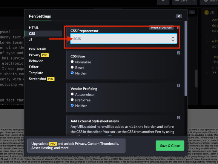
N.B., if you're following along with me in Codepen, you can select the SCSS option in the settings menu in the CSS window. If you're in an editor like VS Code, you can download the SCSS extension; it will compile your SCSS code into CSS code, which you can include in your HTML file.
The first few lines of code are the variables for the colors, which we'll be using most in this tutorial. You can set these variables to any color you like, and then instead of writing the hash value or RGBA value every time you want to use a color, you can write the variable name.
The syntax that I want you to note starts from line 24. I have written the .header to initiate the styling for the header element. But, inside the same brackets, I have also written &__nav, which initiates the styling for our nav element.
In SCSS, you can write the styling of the nested elements in the same brackets. In addition, the & sign holds the value of your parent identifier. In this case, it’s .header If we were using IDs instead of class names, the & would mean #header.
You can also see, in line 61, how I have used the &:hover because I wanted to apply the pseudo-hover class on my link elements. So, this makes it easy for us to write the nested styling and remove the redundant code. If you'd like, you can read more about SCSS and its syntax.
As you may have noticed, we didn't put much effort into creating a navbar for larger screens because, as per good user experience, it should always be a horizontal list at the top of the screen. We can add the hamburger menu on larger screens, but to prevent extra clicks from users, the hamburger menu always goes on smaller screens, which we'll be doing now.
Hamburger navbars with CSS
Now, we can move our focus on creating a custom hamburger navbar on smaller screens by just using CSS.
To give you an overview of what we are building; it is not feasible to display horizontal nav items on smaller screens. Instead, we'll create a hamburger menu, which will display the items by overlaying the background of the whole screen.
Let's get started by writing some code. Copy the below HTML code after line 10 inside your existing HTML code.
<div class="navigation">
    <input
      type="checkbox"
      class="navigation__checkbox"
      id="navi-toggle"
    />
    <label for="navi-toggle" class="navigation__button">
      <span class="navigation__icon"></span>
    </label>
    <div class="navigation__background"></div>
    <nav class="navigation__nav">
      <ul class="navigation__list">
        <li class="navigation__item">
          <a href="index.html" class="navigation__link">Home</a>
        </li>
        <li class="navigation__item">
          <a href="about.html" class="navigation__link">About</a>
        </li>
        <li class="navigation__item">
          <a href="services.html" class="navigation__link">Services</a>
        </li>
        <li class="navigation__item">
          <a href="contact.html" class="navigation__link">Contact Us</a>
        </li>
      </ul>
    </nav>
  </div>
After copying the code, your HTML file should look something like this: 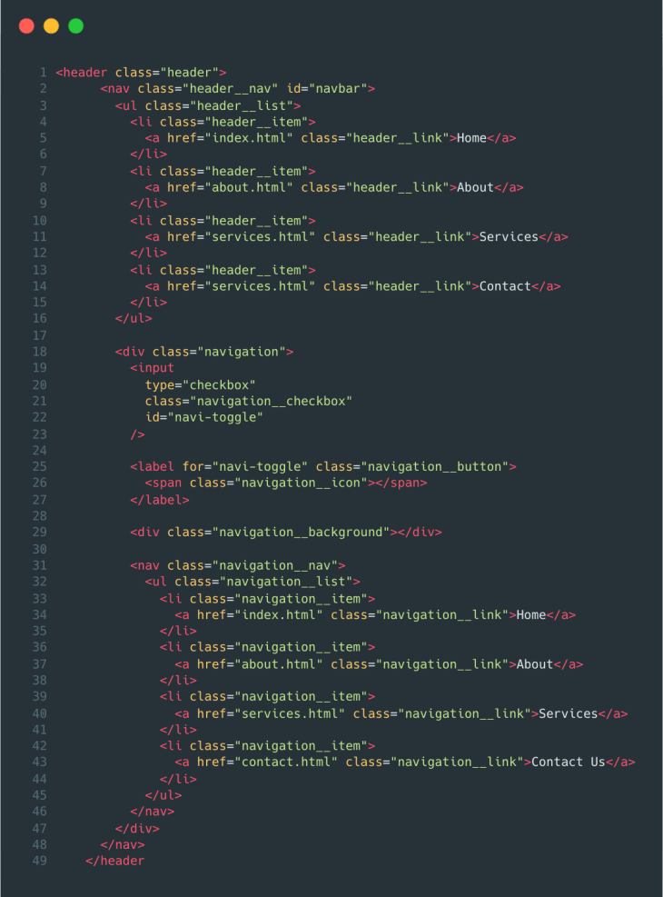
It is the only HTML code we need to make a hamburger menu that looks good on smaller screens. So, let me explain to you some key points in this newly added code:
- We have added a new
<div>element and given that<div>a class name ofnavigation. Inside the div, we have added a checkbox. This checkbox will help us to determine when we want our nav items to show and when we want to hide them - After the checkbox, we have a label which, along with a element inside it, will act as the typical hamburger icon
- The third element is yet another
<div>with a class namenavigation__background. This div will provide a background overlay for our nav items to be displayed clearly on the screen - The last thing is our nav items in a list. We have to add them again because the previous Nav items are for the larger screens, and these nav items are for the smaller ones
N.B., I have used the same BEM naming conventions for writing class names for every element.
Styling the navbar with CSS
Now, all that is left is styling our navigation bar. So, we'll be writing a lot of CSS code. I'll try to explain each block of CSS we write one by one so that it does not cause any confusion.
Firstly, we'll write some media queries because we need to display the hamburger menu at a certain width. For media queries, we'll be using in SCSS mixins, which are essentially functions.
For the argument, you will pass the breakpoint on which you want to see the changes. To make things easier, you can give each breakpoint a name of its own; for example, 400px can be named "phone" because that's the average screen width of a phone.
Once called, you can write your CSS styles inside the curly brackets, and the styles will be applied for that breakpoint. Let's see how we can achieve this by writing those media queries.
Media queries
Copy the following code at the top of your SCSS file, and we'll be ready to use these media queries.
@mixin respond($breakpoint) {
  @if $breakpoint == phone {
    @media only screen and (max-width: 37.5em) {
      @content;
    } //600px
  }
  @if $breakpoint == s-hundred {
    @media only screen and (max-width: 43.75em) {
      @content;
    } //700px
  }
  @if $breakpoint == tab-port {
    @media only screen and (max-width: 56.25em) {
      @content;
    } //900px
  }
  @if $breakpoint == tab-land {
    @media only screen and (max-width: 75em) {
      @content;
    } //1200px
  }
  @if $breakpoint == big-desktop {
    @media only screen and (min-width: 112.5em) {
      @content;
    } //1800
  }
}
Did you get the syntax for these media queries? We created a mixin named respond, which takes any breakpoint as the argument and applies those styles within that media query.
Styling the hamburger
Now, we can start styling our navigation bar based on these media queries. So, let's start by copying this code:
.navigation {
  display: none;
  @include respond(s-hundred){
    display: block;
  }
  z-index: 2000;
  &__checkbox {
    display: none;
  }
}
In the above code, we are setting the display of our hamburger navigation to none because we only want to be visible on smaller screens. So, we have used our respond mixin to attain that functionality.
The z-index is set to 2000 because we want our navigation bar to overlay all the other content. We'll get to see it later in this article.
Since we are displaying our hamburger navigation at 700px, we can remove the display of our horizontal list at the same width. To do this, add this little highlighted media query inside your header__list style:
&__list {
    list-style: none;
    display: flex;
    @include respond(s-hundred){
      display: none;
    }
}
After adding these code blocks, your SCSS file should look like this: 
Screen size more than 700px: 
Screen size less than 700px for comparison: 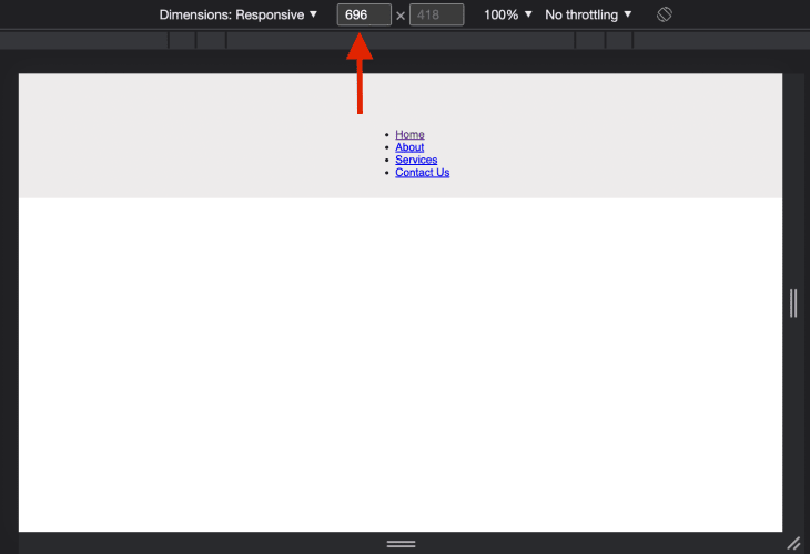
From now on, we have to add all code blocks inside the .navigation style block because everything is nested.
The next piece of the code block is quite simple. This code will style our navigation button to be transparent and circular. We are making it transparent because the navigation icon element inside it will serve as the hamburger icon for this button.
&__button {
    background-color: transparent;
    height: 7rem;
    width: 7rem;
    top: 6rem;
    right: 6rem;
    border-radius: 50%;
    z-index: 2000;
    box-shadow: 0 1rem 3rem rgba($color-black, 0.1);
    text-align: center;
    cursor: pointer;
  }
Now, we will style our hamburger icon. We will use the before and after pseudo-classes with position: absolute. Finally, we'll add a little hover effect on our icon using the hover pseudo-class.
&__icon {
    position: relative;
    margin-left: 2rem;
    &,
    &::before,
    &::after {
      width: 4rem;
      height: 3px;
      background-color: $color-black;
      display: inline-block;
    }
    &::before,
    &::after {
      content: '';
      position: absolute;
      left: 0;
      transition: all 0.2s;
    }
    &::before {
      top: -0.65rem;
    }
    &::after {
      top: 0.65rem;
    }
  }
  &__button:hover &__icon::before {
    top: -1rem;
  }
  &__button:hover &__icon::after {
    top: 1rem;
  }
At this point, our hamburger menu icon should appear on the screen like in the image below: 
Now, on the button press (or check), we want our hamburger icon to transform into an X close icon to indicate that our navigation bar is visible now and that further presses on it will close our navigation bar.
To do this, copy the below given code, and we'll be good to go with our icon.
&__checkbox:checked + &__button &__icon {
  background-color: transparent;
}
&__checkbox:checked + &__button &__icon::before {
  top: 0;
  transform: rotate(135deg);
  background-color: $color-white;
}
&__checkbox:checked + &__button &__icon::after {
  top: 0;
  transform: rotate(-135deg);
  background-color: $color-white;
}
- In the above code block, we are making use of the
checkedpseudo-class that is present on ourcheckboxelement - We are also using the
+CSS selector. The+CSS selector helps us to select the element that is placed immediately after the specified element - Lastly, we are rotating the
beforeandafterpseudo-elements of our icon to make it look like an X
We'll move forward by adding our background overlay. The logic behind our background is quite simple; we'll add the background color on our button and, initially, it won't be visible because its z-index would be behind the checkbox button.
As soon we click the checkbox, we will scale our background to cover the whole screen, and our navigation items become visible.
Copy the below code to achieve this.
&__background {
  background: radial-gradient(
    rgba($color-blue, 1),
    rgba($color-purple, 1)
  );
  height: 6rem;
  width: 6rem;
  position: fixed;
  top: -1rem;
  right: 0rem;
  z-index: -1000;
  display: none;
  border-radius: 50rem;
  }

  &__checkbox:checked ~ &__background {
  @include respond(s-hundred) {
    display: block;
    transform: scale(80);
  }
}
After applying the background overlay, the navbar should look like this: 
The last thing remaining is to style our navigation items. For context, the navigation items should only appear when we click on the hamburger icon. It will cover the whole screen to offer a positive user experience on smaller screens.
Lastly, it should disappear once we click on the icon again. Some basic styling logic has gone into this code block, which is very similar to what we have done in the rest of the tutorial.
&__nav {
    position: fixed;
    margin-top: 1rem;
    padding: 1.2rem;
    font-size: 1.5rem;
    font-weight: 400;
    z-index: 1500;
    @include respond(phone){
      padding: 0;
    }
  }

  &__list {
    list-style: none;
    opacity: 0;
    visibility: hidden;
    margin-top: 50%;
  }

  &__item {
    &:not(:last-child) {
      margin-bottom: 1.5rem;
    }
  }

  &__link {
    text-decoration: none;
    color: $color-white;
    &:hover {
      color: $color-blue;
    }
  }

  &__checkbox:checked ~ &__nav &__list {
    opacity: 1;
    visibility: visible;
    transition: all 0.5s;
  }

  &__checkbox:checked ~ &__nav {
    @include respond(s-hundred) {
      font-size: 4rem;
      position: absolute;
      top: 32rem;
      left: 50%;
      transform: translate(-50%, -50%);
    }
  }

  &__checkbox:checked ~ &__nav &__link {
    @include respond(s-hundred) {
      color: $color-white;
    }
  }
Finally, our custom sticky navigation bar should look like this on smaller screens: 

You can style the navigation bar or its items as you want. I have the X close symbol in the middle, but it usually goes to the top-right side. You are free to do the rest of the styling as you see fit.
Finally, if you want to add some little animation on your navigation bar on scroll, you can add this little block of CSS code inside your header style block:
&__sticky {
    padding: 5rem 10rem;
    background-color: $color-gray;
    box-shadow: 0px 3px 5px rgba($color-blue, 0.5);
}
Also, don't forget to add this JavaScript code:
const navBar = document.getElementById('navbar');
window.addEventListener('scroll', () => {
  navBar.classList.toggle('header__sticky', window.scrollY > 0);
});
The tools and techniques that CSS provides us right now are enough to build super-cool things like our navigation bar without using JavaScript. The full code from this demo is available in Codepen.
Conclusion
You can do tons of stuff with only CSS. If you see tutorials on custom navigation bars or any other fancy stuff, for which you have to download some library or write some JavaScript code, then consider other alternatives first, because JavaScript is not the only way!
Try understanding various concepts of the CSS and maybe you will be able to do all that stuff using just only CSS.
Is your frontend hogging your users' CPU?
As web frontends get increasingly complex, resource-greedy features demand more and more from the browser. If you’re interested in monitoring and tracking client-side CPU usage, memory usage, and more for all of your users in production, try LogRocket.

LogRocket is like a DVR for web and mobile apps, recording everything that happens in your web app or site. Instead of guessing why problems happen, you can aggregate and report on key frontend performance metrics, replay user sessions along with application state, log network requests, and automatically surface all errors.
Modernize how you debug web and mobile apps — Start monitoring for free.


Top comments (1)
I enjoyed the presentation of this article