Do you know that you can draw with CSS box-shadow? Neither did I until I came across a pretty dope pixelated Ralph by Jason Delia. Check out that Wreck a Ralph demo and my ugly Millennium Falcon drawing.
Let's get started!
First, create a block using div.
The box shadow will follow the div's width and height. You can apply multiple shadows to a box-shadow by separating the attributes of a shadow position-x position-y blur-radius color with commas.
Basic building block:
.block {
    width: 10px;
    height: 10px;
    box-shadow: 0 0 0 black, 10px 0 0 black;
}

<div class="block"></div>
Second, plan your image using coordinates.
I patiently drew out the coordinates (x,y) of my perfect heart for your reference. You're welcome. The div starts at the top left box with coordinate (0,0). Each box shadow has the same height (20px) and width (20px) as the div.
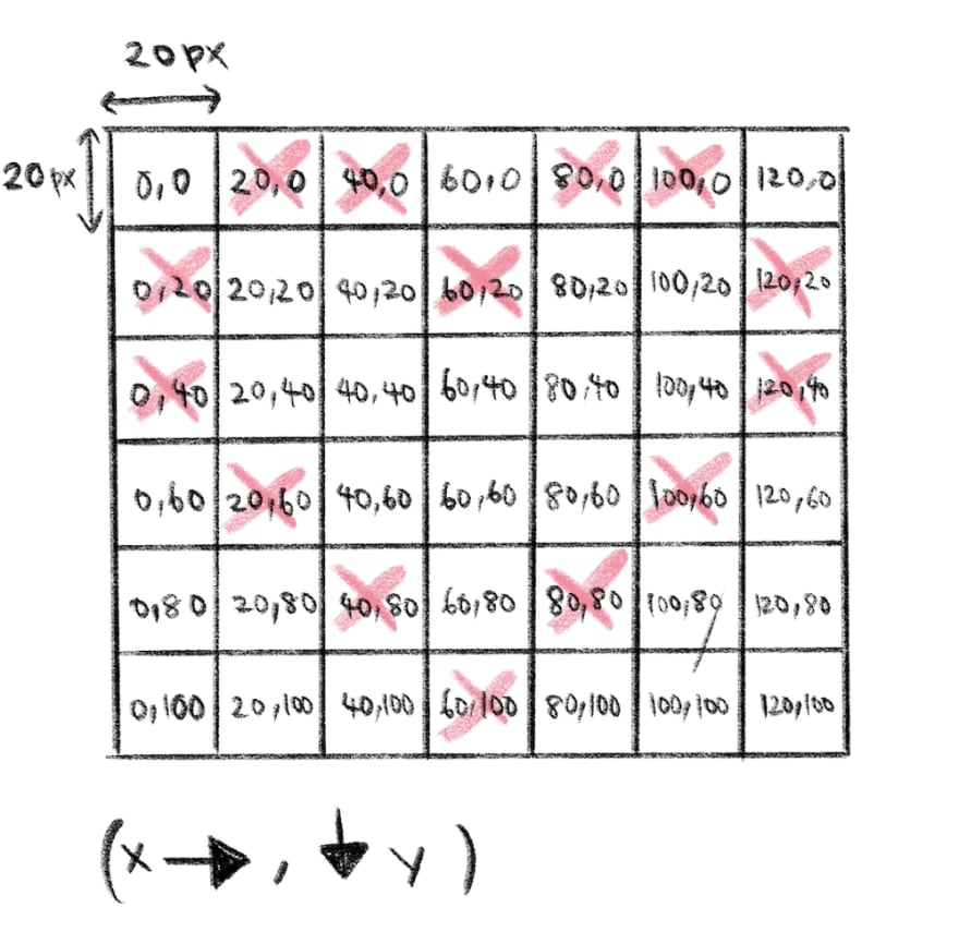
Notice I added margin-bottom in .heart-shadow. As obvious as the name sounds, box-shadow is a shadow that does not increase the size of div. You may want to set margin to prevent covering other DOM elements.
Code snippet in HTML and CSS:
.heart {
                width: 20px;
                height: 20px;
                margin-bottom: 100px;
                box-shadow: 20px 0 0 #60748c, 40px 0 0 #60748c, 60px 20px 0 #60748c,
                    80px 0 0 #60748c, 100px 0 0 #60748c, 120px 20px 0 #60748c,
                    0 20px 0 #60748c, 60px 20px 0 #60748c, 120px 20px 0 #60748c,
                    0 40px 0 #60748c, 120px 40px 0 #60748c, 20px 60px 0 #60748c,
                    100px 60px 0 #60748c, 40px 80px 0 #60748c, 80px 80px 0 #60748c,
                    60px 100px 0 #60748c;
            }
<div class="heart"></div>
We hardcode everything in this tutorial because I am lazy. However in real life, we try not to hardcode anything at all. @vyvit
gave a good suggestion to use CSS var(). For repeated values such as the colour code, you can assign it as a CSS variable using the prefix -- and then add it in the :root element. Now you can use it everywhere since the variable is set in the global scope.
Using CSS var():
:root {
    --pink-color: #d87385;
}

.heart-shadow-with-color-variable {
    width: 20px;
    height: 20px;
    margin-bottom: 100px;
    box-shadow: 20px 0 0 var(--pink-color), 40px 0 0 var(--pink-color),
    60px 20px 0 var(--pink-color), 80px 0 0 var(--pink-color),
    100px 0 0 var(--pink-color), 120px 20px 0 var(--pink-color),
    0 20px 0 var(--pink-color), 60px 20px 0 var(--pink-color),
    120px 20px 0 var(--pink-color), 0 40px 0 var(--pink-color),
    120px 40px 0 var(--pink-color), 20px 60px 0 var(--pink-color),
    100px 60px 0 var(--pink-color), 40px 80px 0 var(--pink-color),
    80px 80px 0 var(--pink-color), 60px 100px 0 var(--pink-color);
}
More detailed explanation over here:
There're many pixel box-shadow generators available online to help you calculate the coordinates of your drawing. I drew the offline dinosaur with the most beautiful generator I could find online, the Pixelator. Good to have features for Pixelator would be a history of previous drawings (undo, redo) and the ability to drag and color the pixels. I wanted to animate the dinosaur but I kept forgetting the coordinates. We shall see.
Check out my dino here. My dinosaur blinks. 😂
(@vms20591 hope you are seeing this, this is for you! Sorry it took freaking long.)
P/S: Anyway,


Top comments (2)
Cool, also instead of repeating color, you can define a CSS variable, so that it's easier to change the color.
Cool, also updated with your cool suggestion var() 😉