
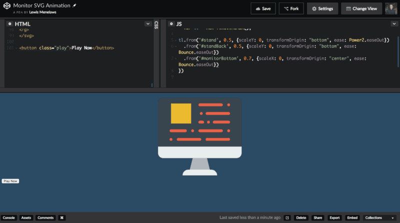
Final version of what we will be creating!
Animating on the web has never been more simple. SVG (Scalable Vector Graphics) uses XML markup to help render things into the browser. Here is an example. If you were to download a png or a jpeg you would get just the image which then you would have to render with to the browser using an <img /> tag. Nothing wrong with this but if I wanted to make it animate I am very limited. How does SVG change this?
<svg width=”100" height=”100">
 <circle cx=”50" cy=”50" r=”40" stroke=”green” stroke-width=”4" fill=”yellow” />
</svg>
Here is a sample SVG. It uses XML which is very similar to HTML. For animating, this makes things super simple.
To animate we first need 2 libraries, TweenMax and TimelineMax from GSAP. Here is more information in case you haven’t heard of them. For the lazy, here is the CDN.
For the sake of tutorial, we aren’t going to be creating our own SVG’s. We will just grab one from online. One of my favourite sites for icons and beautiful images is Flaticon. They have lots of different options but since we are coders I chose a monitor. Real original, I know.
Flaticon hooks us up with an SVG because they know we want to animate 🙏
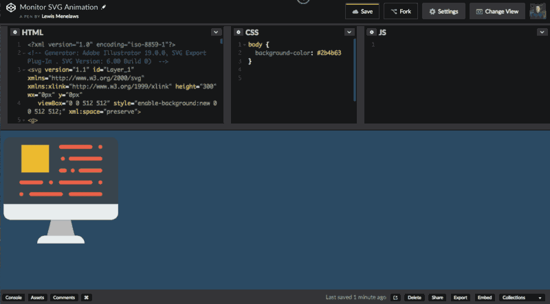
Once you have the file downloaded, open it and copy the code into a website like CodePen or JSfiddle… or if you don’t trust these hard working websites then you can just use your own code editor. Let’s go!!
Throwing on a Little Makeup
This step is optional but I personally hate (Sorry, strong word) how the SVG is not centered. The background colour isn’t that nice either. Let’s change it. Change the body to whatever colour you would like and then add these CSS properties to the ID of the SVG element (in my case it’s called “Layer_1”). To center, you just add display: block; and margin: 0 auto;.
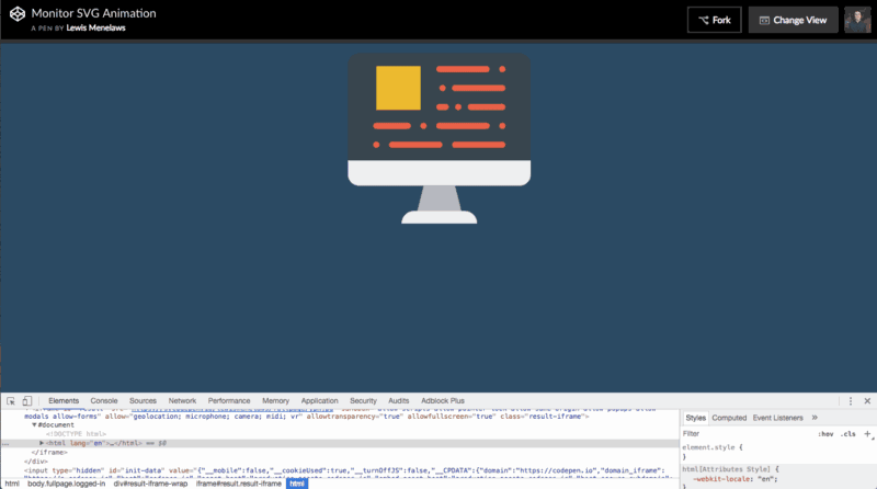
Wait a minute, this looks familiar….
Analyzing our SVG
In the last section you probably noticed that we used CSS to center our SVG. Let’s have a look at our SVG file real quick…
<svg version="1.1" id="Layer_1" xmlns="
" xmlns:xlink="
" height="300" wx="0px" y="0px"
  viewBox="0 0 512 512" style="enable-background:new 0 0 512 512;" xml:space="preserve">
<g>
 <path style="fill:#E8EDEE;" d="M361.931,494.345H150.069c0-19.5,15.81-35.31,35.31-35.31h141.241
  C346.121,459.034,361.931,474.845,361.931,494.345"/>
 <polygon style="fill:#B0B6BB;" points="317.793,459.034 194.207,459.034 211.862,388.414 300.138,388.414  "/>
Interesting… We can apply ID’s to individual SVG elements… but what do they even represent?
Wait a minute… this is rendering out to be a lot like HTML code…
My calculations were correct… all of these polygons and paths are different elements within the SVG image. This surely will make things much easier. If you have noticed in the gif, I have located all of the paths and polygons and set an ID to them accordingly. For example, the first path element was the stand for the monitor so I named it stand . For the sake of tutorial, I will tell you what I am naming each element, that way it works if you are following along.
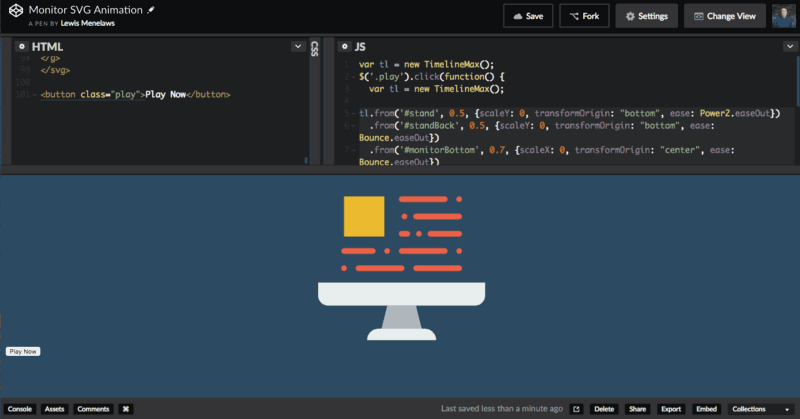
Animating our First Element
Let’s just start off with the element we set the ID for. Make sure you have the 2 GSAP libraries imported. First let’s initiate a timeline instance. Here’s how to do it in your JavaScript file:
var tl = new TimelineMax();
Now that we have a timeline instance. Let’s use it.
tl.from('#stand', 0.5, {scaleY: 0, transformOrigin: "bottom", ease: Power2.easeOut})
This will make it do this:

The screen didn’t render properly in my gif making software. Don’t worry!
Groundbreaking animation! Let’s breakdown what the code has done so far.
var tl = new TimelineMax();
This initializes a timeline on the variable tl.
tl.from('#stand', 0.5, {scaleY: 0, transformOrigin: "bottom", ease: Power2.easeOut})
We use the tl variable to add animations on the timeline. It has some
parameters we must enter.
tl.from the from function let’s you define where the animation starts and it will animate to where the browser rendered the SVG before the JavaScript was present. Another popular option is tl.to but that’s for another day. Think of tl.from defining a race car at the starting line before it heads to an already defined ending line.
tl.from('#stand' Here we target what element we are looking to animate. In this case it is the element with the ID stand.
tl.from('#stand', 0.5 This defines the length of the animation. In this case, it is half a second.
tl.from('#stand', 0.5, {} Everything inside these curly braces are the animation parameters. Inside these parameters we have…
{scaleY: 0 scales the element to disappear by being extremely thin.
{scaleY:0, transformOrigin: “bottom" The transformOrigin section tells you at what position of the element do you want it to transform. For example, if we never selected the bottom option then it would stretch from the top which ruins the illusion of the computer building itself.
And last but not least ease: Power2.easeOut . This is a lot of fun to use. The ease parameter let’s you determine the ease of how it is being presented. Notice how it slowly came to the end rather than making a complete 100% stop? A little hard to explain but GSAP has an ease visualize tool to help you with this.
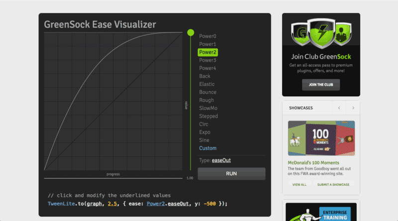
And it even gives you code to copy!!!!
Moving On…
Wow that was a lot to take in… Realistically, you now have everything you need to know about animating SVG’s. Now we are just going to finish our project and call it a day together. I have a couple of other neat tricks that I think you are going to dig. Let’s move on folks!
Use your browser’s dev tools to locate the back of the stand. I set the ID for standBack as in standBack because these animations are going to blow your mind.
This animation is also fairly straight forward as we are just going to do the same animation as last time. This time we use the Bounce ease. I think it looks really cartoonish which is the vibe I am going for. To demonstrate how the timeline works. I will paste the final code of this step:
var tl = new TimelineMax();

tl.from('#stand', 0.5, {scaleY: 0, transformOrigin: "bottom", ease: Power2.easeOut})
To play an animation right after the other, you just use another .from function underneath it. Don’t even have to do a callback function or anything.

Another beautiful animation. My girlfriend would be so proud!
Transform Origin
If you didn’t understand the transformOrigin section, then this will hopefully make it more clear. Notice how in the last 2 animations they cleared from the bottom up? For this animation I want the bottom of the monitor to stretch from the middle to the sides. This is where transformOrigin comes into play before we did the bottom value but this time we will do center. Since we are also stretching it out vertically rather than horizontally, we will also use the scaleX method instead. This is self explanatory. I set the ID for this element for monitorBottom
var tl = new TimelineMax();

tl.from('#stand', 0.5, {scaleY: 0, transformOrigin: "bottom", ease: Power2.easeOut})
  .from('#standBack', 0.5, {scaleY: 0, transformOrigin: "bottom", ease: Bounce.easeOut})
Wow! Do you get paid over 100K a year for knowing this?
Taking a Breather
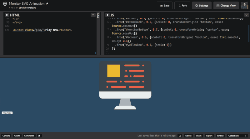
Alright those animations were way too cool for the human to intake. We need a bit of a delay from the next animation otherwise I might have a panic attack. Luckily GSAP has us covered. We will now animate the screen coming up.
Let’s give the screen an ID of screen. We will now use this code to animate it.
tl.from('#stand', 0.5, {scaleY: 0, transformOrigin: "bottom", ease: Power2.easeOut})
  .from('#standBack', 0.5, {scaleY: 0, transformOrigin: "bottom", ease: Bounce.easeOut})
  .from('#monitorBottom', 0.7, {scaleX: 0, transformOrigin: "center", ease: Bounce.easeOut})
Everything there is pretty straightforward. However, we added another parameter…
what could it be? Delay! This delay function will trigger how long to wait before playing this animation. I set it to 0.4 seconds. Let’s see what this looks like.
A bit of a delayed was added! Thank goodness.
It Doesn’t Have to be Complex
Let’s animate the yellow box now. For this animation, I just want it to appear. However, adding lots of different parameters for each element gets tedious… if only it was simple. Let’s set the ID of the yellow box to yellowBox
var tl = new TimelineMax();

tl.from('#stand', 0.5, {scaleY: 0, transformOrigin: "bottom", ease: Power2.easeOut})
  .from('#standBack', 0.5, {scaleY: 0, transformOrigin: "bottom", ease: Bounce.easeOut})
  .from('#monitorBottom', 0.7, {scaleX: 0, transformOrigin: "center", ease: Bounce.easeOut})
  .from('#screen', 0.6, {scaleY: 0, transformOrigin: "bottom", ease: Circ.easeOut, delay: 0.4})
Wait, that’s it? Surely it must not work!?
Easy Peasy Lemon Squeezy.
I guess it’s that simple.
Quality in Quantities
So we have been animating everything by each individual element… now we are at the last moment with all the red lines. This will take me forever…
Hold on friend, don’t be so pessimistic just yet, there is an easy way to beautifully animate these red lines with only one line of code. Let me know you the process. First let’s go to our dev tools and find the selector for these red paths.
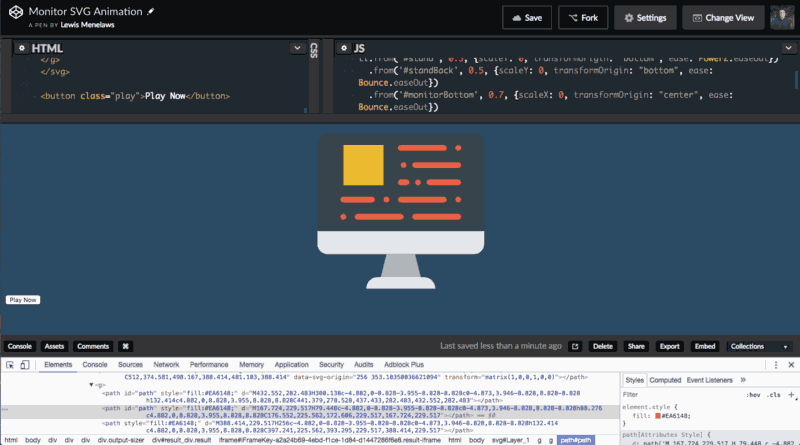
Enhance!!!
Interesting, so it seems like all of the red lines have a parent element of <g> . Using the dev tools I will copy the selector which is:
#Layer_1 > g:nth-child(1) > g
Now to get all child elements of this parent element I just need to add on the path to the end of the selector. This will work:
#Layer_1 > g:nth-child(1) > g path
Great. Now we have a list of all the elements that are under red.
Now we could use the tl.from function to animate these but it will animate them all at the same time. Wouldn’t it be cool if they all animated at a different time consistently? You probably are seeing this trend of my rhetorical questions by now. tl.staggerFrom will do exactly this! Let’s look at this last part of the code together.
.staggerFrom('#Layer_1 > g:nth-child(1) > g path', 0.2, {scaleX: 0}, -0.1)
As you can see it’s fairly straight forward. We put in the selector that we identified before, we set the duration, we also added the properties but wait, what’s this? -0.1? What does this mean?
On the .staggerFrom function, we need to define at what point we want each path to animate after another. In this case, we are going to do 0.1 seconds The reason we added the - in there was to make it go from left to right rather than vice versa. Let’s see what this looks like when implemented.

Now that’s beautiful, but not as beautiful as you.
Wow, that’s perfect. What makes GSAP so amazing is that you can make such amazing animations with HTML elements as well as SVG elements fast. Once you understand the syntax, something like this only takes you 10 minutes.
Fork my Pen and DM me on Twitter to show me what you made yourself 😸.
If you liked this post and found it helpful, feel free to follow me on Twitter! Thanks
😸


Top comments (4)
Excellent article! I enjoyed the breakdown of each step in the animation process. I'd like to suggest mentioning or highlighting GSAP's licensing as this created an issue for me in the past. The link you provided definitely gives the user a great start, but I believe it's important for the community to understand the licensing for their work. This is especially true if they plan to use GSAP on commercial work. Nonetheless, wonderful explanation of how to harness GSAP with SVG!
Thanks for letting me know Patrick. You are right. This does let them play around with it but doesn't mention anything in terms of licensing. Thanks for the heads up!
This is super easy to follow, fun to read, and now I feel like an SVG wizard! Thanks!
Thanks for reading :)