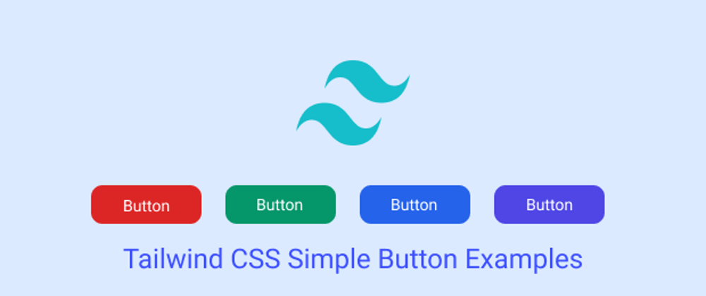
In this tutorial we will see simple button, rounded button , hovered button , outline button, button with Icon, examples with Tailwind CSS
Tool Use
Tailwind CSS 2.x
Heroicons Icons
Setup Project
Using CDN
<link href="https://unpkg.com/tailwindcss@^2/dist/tailwind.min.css" rel="stylesheet">
or
The Easiest way to install Tailwind CSS with Tailwind CLI
How to Install Tailwind CSS with NPM
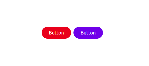
Example 1
Simple Button
<button class="px-6 py-2 text-white bg-red-600" type="button">
     Button
</button>
<button class="px-6 py-2 text-white bg-indigo-600" type="button">
     Button
 </button>

Example 2
Rounded Button
<button class="px-6 py-2 text-white bg-red-600 rounded-full" type="button">
    Button
</button>
<button class="px-6 py-2 text-white bg-indigo-600 rounded-full" type="button">
    Button
</button>
Example 3
Hovered Effect Button
<button class="px-6 py-2 text-white bg-red-600 rounded-full hover:bg-red-400 hover:text-red-200"
        type="button">Button
</button>
<button class="px-6 py-2 text-white bg-indigo-600 rounded-full hover:bg-indigo-400 hover:text-indigo-200"
        type="button">Button
</button>

Example 4
Outline Button
<button class="px-6 py-2 text-indigo-700 border-2 border-indigo-500 rounded-full hover:bg-indigo-500 hover:text-indigo-100">Button</button>
<button class="px-6 py-2 text-red-700 border-2 border-red-500 rounded-full hover:bg-red-500 hover:text-red-100">Button</button>

Example 5
Button With Icon
<button class="inline-flex items-center px-6 py-2 text-indigo-100 bg-indigo-700 rounded-full hover:bg-indigo-800">
    <svg xmlns="http://www.w3.org/2000/svg" class="w-4 h-4 mr-2 text-green-800 bg-white rounded-full" fill="none"
        viewBox="0 0 24 24" stroke="currentColor">
        <path stroke-linecap="round" stroke-linejoin="round" stroke-width="2" d="M5 13l4 4L19 7" />
    </svg>
    <span>Button</span>
</button>
<button class="inline-flex items-center px-6 py-2 text-red-100 bg-red-700 rounded-full hover:bg-red-800">
    <svg xmlns="http://www.w3.org/2000/svg" class="w-4 h-4 mr-2 text-green-800 bg-white rounded-full" fill="none"
        viewBox="0 0 24 24" stroke="currentColor">
        <path stroke-linecap="round" stroke-linejoin="round" stroke-width="2" d="M5 13l4 4L19 7" />
    </svg>
    <span>Button</span>
</button>

See Also 👇
Tailwind CSS Simple Responsive Image Gallery with Grid
Tailwind CSS Simple Alert Components Examples
Tailwind CSS Simple Card Examples
Tailwind CSS Badge Examples
Tailwind CSS Simple Modals Examples
Tailwind CSS Simple Avatar Examples


Top comments (0)