In this tutorial, we will create blog section, responsive blog section, blog section with image, examples with Tailwind CSS.
Tool Use
Tailwind CSS 2.x
Heroicons Icons
unsplash images
Setup Project
Using CDN
<link href="https://unpkg.com/tailwindcss@^2/dist/tailwind.min.css" rel="stylesheet">
or
The Easiest way to install Tailwind CSS with Tailwind CLI
How to Install Tailwind CSS with NPM
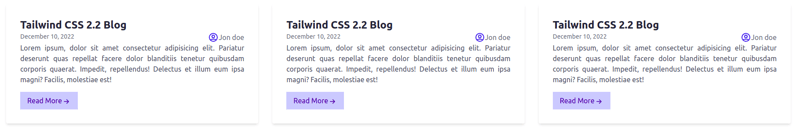
Example 1
Tailwind CSS Simple Responsive Blog Section
<!DOCTYPE html>
<html lang="en">

    <head>
        <meta charset="UTF-8">
        <meta http-equiv="X-UA-Compatible" content="IE=edge">
        <meta name="viewport" content="width=device-width, initial-scale=1.0">
        <title>Tailwind CSS Simple Blog </title>
        <link href="https://unpkg.com/tailwindcss@^2/dist/tailwind.min.css" rel="stylesheet">
    </head>

    <body>
        <section>
            <div class="m-4 lg:flex lg:flex-wrap">
                <div class="p-4 md:w-1/3">
                    <div class="p-8 bg-white rounded shadow-md">
                        <h2 class="text-2xl font-bold text-gray-800">Tailwind CSS 2.2 Blog</h2>
                        <div class="flex justify-between">
                            <span class="text-sm text-gray-500">December 10, 2022</span>
                            <span class="inline-flex text-gray-500"><svg xmlns="http://www.w3.org/2000/svg"
                                    class="w-6 h-6 text-blue-600" fill="none" viewBox="0 0 24 24" stroke="currentColor">
                                    <path stroke-linecap="round" stroke-linejoin="round" stroke-width="2"
                                        d="M5.121 17.804A13.937 13.937 0 0112 16c2.5 0 4.847.655 6.879 1.804M15 10a3 3 0 11-6 0 3 3 0 016 0zm6 2a9 9 0 11-18 0 9 9 0 0118 0z" />
                                </svg>Jon doe</span>
                        </div>
                        <p class="text-justify text-gray-600">Lorem ipsum, dolor sit amet consectetur
                            adipisicing
                            elit. Pariatur
                            deserunt
                            quas repellat facere dolor blanditiis tenetur quibusdam corporis quaerat. Impedit,
                            repellendus!
                            Delectus et illum eum ipsa magni? Facilis, molestiae est!</p>
                        <div class="flex items-center mt-4">
                            <a
                                class="inline-flex items-center px-4 py-2 text-indigo-800 bg-indigo-200 cursor-pointer md:mb-2 lg:mb-0">Read
                                More
                                <svg xmlns="http://www.w3.org/2000/svg" class="w-5 h-5 mt-1" fill="none"
                                    viewBox="0 0 24 24" stroke="currentColor">
                                    <path stroke-linecap="round" stroke-linejoin="round" stroke-width="2"
                                        d="M13 7l5 5m0 0l-5 5m5-5H6" />
                                </svg>
                            </a>
                        </div>
                    </div>
                </div>
                <div class="p-4 md:w-1/3">
                    <div class="p-8 bg-white rounded shadow-md">
                        <h2 class="text-2xl font-bold text-gray-800">Tailwind CSS 2.2 Blog</h2>
                        <div class="flex justify-between">
                            <span class="text-sm text-gray-500">December 10, 2022</span>
                            <span class="inline-flex text-gray-500"><svg xmlns="http://www.w3.org/2000/svg"
                                    class="w-6 h-6 text-blue-600" fill="none" viewBox="0 0 24 24" stroke="currentColor">
                                    <path stroke-linecap="round" stroke-linejoin="round" stroke-width="2"
                                        d="M5.121 17.804A13.937 13.937 0 0112 16c2.5 0 4.847.655 6.879 1.804M15 10a3 3 0 11-6 0 3 3 0 016 0zm6 2a9 9 0 11-18 0 9 9 0 0118 0z" />
                                </svg>Jon doe</span>
                        </div>

                        <p class="text-justify text-gray-600">Lorem ipsum, dolor sit amet consectetur
                            adipisicing
                            elit. Pariatur
                            deserunt
                            quas repellat facere dolor blanditiis tenetur quibusdam corporis quaerat. Impedit,
                            repellendus!
                            Delectus et illum eum ipsa magni? Facilis, molestiae est!</p>
                        <div class="flex items-center mt-4">
                            <a
                                class="inline-flex items-center px-4 py-2 text-indigo-800 bg-indigo-200 cursor-pointer md:mb-2 lg:mb-0">Read
                                More
                                <svg xmlns="http://www.w3.org/2000/svg" class="w-5 h-5 mt-1" fill="none"
                                    viewBox="0 0 24 24" stroke="currentColor">
                                    <path stroke-linecap="round" stroke-linejoin="round" stroke-width="2"
                                        d="M13 7l5 5m0 0l-5 5m5-5H6" />
                                </svg>
                            </a>
                        </div>
                    </div>
                </div>
            </div>
        </section>
    </body>

</html>
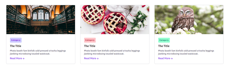
Example 2
Tailwind CSS Responsive Blog with image Section
<!DOCTYPE html>
<html lang="en">

    <head>
        <meta charset="UTF-8">
        <meta http-equiv="X-UA-Compatible" content="IE=edge">
        <meta name="viewport" content="width=device-width, initial-scale=1.0">
        <title>Tailwind CSS Blog with image </title>
        <link href="https://unpkg.com/tailwindcss@^2/dist/tailwind.min.css" rel="stylesheet">

    </head>

    <body>
        <section>
            <div class="m-4 lg:flex lg:flex-wrap">
                <div class="p-4 md:w-1/3">
                    <div class="border-2 border-gray-200 rounded-lg">
                        <img class="object-cover object-center w-full lg:h-48 md:h-36"
                            src="https://source.unsplash.com/collection/190728/1000x900" alt="blog">
                        <div class="p-6">
                            <span
                                class="inline-block p-2 mb-2 text-xs font-medium tracking-widest text-indigo-800 bg-indigo-200 rounded">Category
                            </span>
                            <h1 class="mb-2 text-lg font-medium text-gray-900">The Title</h1>
                            <p class="mb-2 text-sm tracking-wide text-gray-700">Photo booth fam kinfolk cold-pressed
                                sriracha
                                leggings
                                jianbing microdosing tousled waistcoat.</p>
                            <div class="flex items-center ">
                                <a class="inline-flex items-center text-indigo-500 cursor-pointer md:mb-2 lg:mb-0">Read
                                    More

                                    <svg xmlns="http://www.w3.org/2000/svg" class="w-5 h-5 mt-1" fill="none"
                                        viewBox="0 0 24 24" stroke="currentColor">
                                        <path stroke-linecap="round" stroke-linejoin="round" stroke-width="2"
                                            d="M13 7l5 5m0 0l-5 5m5-5H6" />
                                    </svg>
                                </a>

                            </div>
                        </div>
                    </div>
                </div>
                <div class="p-4 md:w-1/3">
                    <div class="border-2 border-gray-200 rounded-lg">
                        <img class="object-cover object-center w-full lg:h-48 md:h-36"
                            src="https://source.unsplash.com/collection/190727/1000x900" alt="blog">
                        <div class="p-6">
                            <span
                                class="inline-block p-2 mb-2 text-xs font-medium tracking-widest text-red-800 bg-red-200 rounded">Category
                            </span>
                            <h1 class="mb-2 text-lg font-medium text-gray-900">The Title</h1>
                            <p class="mb-2 text-sm tracking-wide text-gray-700">Photo booth fam kinfolk cold-pressed
                                sriracha
                                leggings
                                jianbing microdosing tousled waistcoat.</p>
                            <div class="flex items-center ">
                                <a class="inline-flex items-center text-indigo-500 cursor-pointer md:mb-2 lg:mb-0">Read
                                    More

                                    <svg xmlns="http://www.w3.org/2000/svg" class="w-5 h-5 mt-1" fill="none"
                                        viewBox="0 0 24 24" stroke="currentColor">
                                        <path stroke-linecap="round" stroke-linejoin="round" stroke-width="2"
                                            d="M13 7l5 5m0 0l-5 5m5-5H6" />
                                    </svg>
                                </a>
                            </div>
                        </div>
                    </div>
                </div>
                <div class="p-4 md:w-1/3">
                    <div class="border-2 border-gray-200 rounded-lg">
                        <img class="object-cover object-center w-full lg:h-48 md:h-36"
                            src="https://source.unsplash.com/collection/190726/1000x900" alt="blog">
                        <div class="p-6">
                            <span
                                class="inline-block p-2 mb-2 text-xs font-medium tracking-widest text-green-800 bg-green-200 rounded">Category
                            </span>
                            <h1 class="mb-2 text-lg font-medium text-gray-900">The Title</h1>
                            <p class="mb-2 text-sm tracking-wide text-gray-700">Photo booth fam kinfolk cold-pressed
                                sriracha
                                leggings
                                jianbing microdosing tousled waistcoat.</p>
                            <div class="flex items-center ">
                                <a class="inline-flex items-center text-indigo-500 cursor-pointer md:mb-2 lg:mb-0">Read
                                    More

                                    <svg xmlns="http://www.w3.org/2000/svg" class="w-5 h-5 mt-1" fill="none"
                                        viewBox="0 0 24 24" stroke="currentColor">
                                        <path stroke-linecap="round" stroke-linejoin="round" stroke-width="2"
                                            d="M13 7l5 5m0 0l-5 5m5-5H6" />
                                    </svg>
                                </a>
                            </div>
                        </div>
                    </div>
                </div>
            </div>
        </section>
    </body>

</html>
See Also 👇
Tailwind CSS Real Estate Template 🏨
10+ Free Tailwind CSS Colors Tools Resources for 2021
Tailwind CSS Simple Table Example
Tailwind CSS Simple Button Examples


Top comments (0)