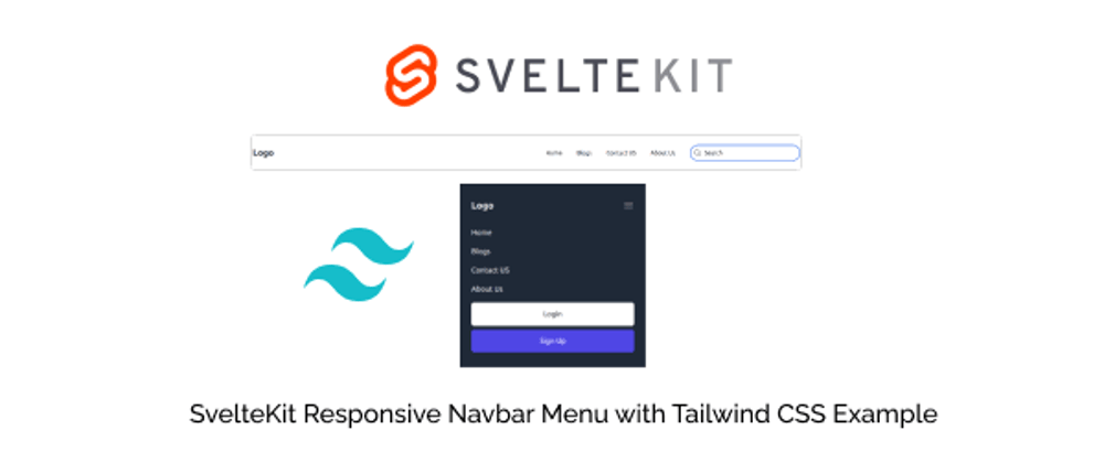
In this tutorial, we will create responsive navbar menu in SvelteKit using tailwind css. We will see navbar with hamburger menu with SvelteKit, sveltekit tailwind navbar component, navbar with sign in and signup examples with Tailwind CSS & SvelteKit. You can also use this code in svelte.
Tool Use
SvelteKit / Svelte
Tailwind CSS 3.v
Heroicons Icon
view
First you need to setup react project with tailwind css. You can install manually or you read below blog.
Install Tailwind CSS in Sveltekit + Vite + Typescript
Install Skeleton Svelte UI with Tailwind CSS in Svelte + SvelteKit
Example 1
SvelteKit responsive navbar menu with tailwind css.
<script>
  let showMenu = false;

  function toggleNavbar() {
    showMenu = !showMenu;
  }
</script>

<div>
  <div>
    <nav
      class="container px-6 py-8 mx-auto md:flex md:justify-between md:items-center"
    >
      <div class="flex items-center justify-between">
        <a
          class="text-xl font-bold text-gray-800 md:text-2xl hover:text-blue-400"
          href="/home"
          >Logo
        </a>
        <!-- Mobile menu button -->
        <div on:click={toggleNavbar} class="flex md:hidden">
          <button
            type="button"
            class="text-gray-800 hover:text-gray-400 focus:outline-none focus:text-gray-400"
          >
            <svg xmlns="http://www.w3.org/2000/svg" fill="none" viewBox="0 0 24 24" stroke-width="1.5" stroke="currentColor" class="w-6 h-6">
            <path stroke-linecap="round" stroke-linejoin="round" d="M3.75 6.75h16.5M3.75 12h16.5m-16.5 5.25h16.5" />
          </svg>
          </button>
        </div>
      </div>

      <!-- Mobile Menu open: "block", Menu closed: "hidden" -->
      <div
        class="flex-col mt-8 space-y-4 md:flex md:space-y-0 md:flex-row md:items-center md:space-x-10 md:mt-0 {showMenu
          ? 'flex'
          : 'hidden'}"
      >
        <a class="text-gray-800 hover:text-blue-400" href="/home">Home</a>
        <a class="text-gray-800 hover:text-blue-400" href="/blog">Blogs</a>
        <a class="text-gray-800 hover:text-blue-400" href="/contact">Contact US</a>
        <a class="text-gray-800 hover:text-blue-400" href="/about">About Us</a>
      </div>
    </nav>
  </div>
</div>

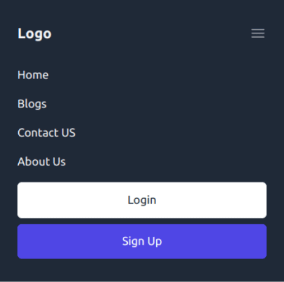
Example 2
SvelteKit responsive hamburger menu with tailwind css login and sign up button.
<script>
  let showMenu = false;

  function toggleNavbar() {
    showMenu = !showMenu;
  }
</script>

<div>
  <div class="bg-gray-800">
    <nav
      class="container px-6 py-8 mx-auto md:flex md:justify-between md:items-center"
    >
      <div class="flex items-center justify-between">
        <a
          class="text-xl font-bold text-gray-100 md:text-2xl hover:text-blue-400"
          href="/home"
          >Logo
        </a>
        <!-- Mobile menu button -->
        <div on:click={toggleNavbar} class="flex md:hidden">
          <button
            type="button"
            class="text-gray-100 hover:text-gray-400 focus:outline-none focus:text-gray-400"
          >
            <svg
              xmlns="http://www.w3.org/2000/svg"
              fill="none"
              viewBox="0 0 24 24"
              stroke-width="1.5"
              stroke="currentColor"
              class="w-6 h-6"
            >
              <path
                stroke-linecap="round"
                stroke-linejoin="round"
                d="M3.75 6.75h16.5M3.75 12h16.5m-16.5 5.25h16.5"
              />
            </svg>
          </button>
        </div>
      </div>

      <!-- Mobile Menu open: "block", Menu closed: "hidden" -->
      <div
        class="flex-col mt-8 space-y-4 md:flex md:space-y-0 md:flex-row md:items-center md:space-x-10 md:mt-0 {showMenu
          ? 'flex'
          : 'hidden'}"
      >
        <a class="text-gray-100 hover:text-blue-400" href="/home">Home</a>
        <a class="text-gray-100 hover:text-blue-400" href="/blog">Blogs</a>
        <a class="text-gray-100 hover:text-blue-400" href="/contact"
          >Contact US</a
        >
        <a class="text-gray-100 hover:text-blue-400" href="/about">About Us</a>
        <div class="space-y-2">
          <a
            href="/login"
            class="py-3 px-4 text-center border text-gray-800 bg-white hover:text-indigo-600 rounded-md block lg:inline lg:border-0"
          >
            Login
          </a>
          <a
            href="/signup"
            class="py-3 px-4 text-center text-white bg-indigo-600 hover:bg-indigo-700 rounded-md shadow block lg:inline"
          >
            Sign Up
          </a>
        </div>
      </div>
    </nav>
  </div>
</div>
Example 3
SvelteKit navbar menu with search using tailwind css.
<script>
  let showMenu = false;

  function toggleNavbar() {
    showMenu = !showMenu;
  }
</script>

<div>
  <div>
    <nav
      class="container px-6 py-8 mx-auto md:flex md:justify-between md:items-center"
    >
      <div class="flex items-center justify-between">
        <a
          class="text-xl font-bold text-gray-800 md:text-2xl hover:text-blue-400"
          href="/home"
          >Logo
        </a>
        <!-- Mobile menu button -->
        <div on:click={toggleNavbar} class="flex md:hidden">
          <button
            type="button"
            class="text-gray-800 hover:text-gray-400 focus:outline-none focus:text-gray-400"
          >
            <svg
              xmlns="http://www.w3.org/2000/svg"
              fill="none"
              viewBox="0 0 24 24"
              stroke-width="1.5"
              stroke="currentColor"
              class="w-6 h-6"
            >
              <path
                stroke-linecap="round"
                stroke-linejoin="round"
                d="M3.75 6.75h16.5M3.75 12h16.5m-16.5 5.25h16.5"
              />
            </svg>
          </button>
        </div>
      </div>

      <!-- Mobile Menu open: "block", Menu closed: "hidden" -->
      <div
        class="flex-col mt-8 space-y-4 md:flex md:space-y-0 md:flex-row md:items-center md:space-x-10 md:mt-0 {showMenu
          ? 'flex'
          : 'hidden'}"
      >
        <a class="text-gray-800 hover:text-blue-400" href="/home">Home</a>
        <a class="text-gray-800 hover:text-blue-400" href="/blog">Blogs</a>
        <a class="text-gray-800 hover:text-blue-400" href="/contact"
          >Contact US</a
        >
        <a class="text-gray-800 hover:text-blue-400" href="/about">About Us</a>

        <form class="flex items-center space-x-2 border-2 border-blue-600 rounded-full p-2">
          <svg
            xmlns="http://www.w3.org/2000/svg"
            fill="none"
            viewBox="0 0 24 24"
            stroke-width="1.5"
            stroke="currentColor"
            class="w-6 h-6 text-gray-800"
          >
            <path
              stroke-linecap="round"
              stroke-linejoin="round"
              d="M21 21l-5.197-5.197m0 0A7.5 7.5 0 105.196 5.196a7.5 7.5 0 0010.607 10.607z"
            />
          </svg>

          <input
            class="w-full outline-none placeholder-gray-800 text-gray-800"
            type="text"
            placeholder="Search"
          />
        </form>
      </div>
    </nav>
  </div>
</div>


Top comments (0)