In this tutorial, we will create hero section in react js with tailwind css. We will see simple hero section react, responsive hero section with image examples with Tailwind CSS & React.
Tool Use
React JS
Tailwind CSS 3.v
First you need to setup react project with tailwind css. You can install manually or you read below blog.
How to install Tailwind CSS in React
Install & Setup Vite + React + Typescript + Tailwind CSS 3
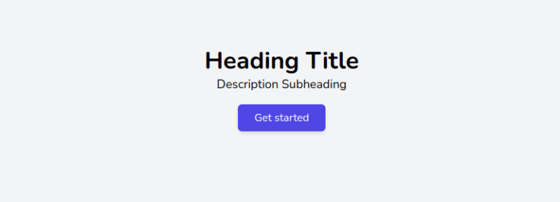
Example 1
Simple hero section using tailwind react.
import React from "react";

export default function HeroComponent() {
    return (
        <div className="w-full p-20 bg-gray-100 h-96">
            <div className="flex flex-col items-center justify-center">
                <h1 className="text-4xl font-bold">Heading Title</h1>
                <p className="text-lg">Description Subheading</p>
                <div className="mt-4">
                    <button className="px-6 py-2 text-center text-white bg-indigo-600 rounded-md shadow-md">
                        Get started
                    </button>
                </div>
            </div>
        </div>
    );
}
Example 2
Tailwind css hero section with background image.
import React from "react";

export default function HeroComponent() {
    return (
        <div className='bg-[url("https://cdn.pixabay.com/photo/2022/10/03/23/41/house-7497001__340.png")] h-96 w-full bg-cover bg-center p-20'>
            <div className="flex flex-col items-center justify-center">
                <h1 className="mb-2 text-4xl font-bold text-center">
                    Hero section with background image
                </h1>
                <p className="text-lg text-center text-white">
                    This isLorem ipsum dolor sit amet consectetur adipisicing
                    elit.
                </p>
                <div className="mt-4">
                    <button className="px-6 py-2 text-center text-white bg-indigo-600 rounded-md shadow-md">
                        Get started
                    </button>
                </div>
            </div>
        </div>
    );
}
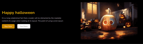
Example 3
Tailwind css responsive hero section with image.
import React from "react";

export default function HeroComponent() {
    return (
        <div className="bg-black">
            <section className="container items-center px-4 pb-12 mx-auto mt-20 lg:flex md:px-40">
                <div className="flex-1 space-y-4 sm:text-center lg:text-left">
                    <h1 className="text-4xl font-bold text-yellow-500">
                        Happy halloween
                    </h1>
                    <p className="max-w-xl leading-relaxed text-gray-300 sm:mx-auto lg:ml-0">
                        It is a long established fact that a reader will be
                        distracted by the readable content of a page when
                        looking at its layout.
                    </p>
                    <div className="items-center justify-center space-y-3 sm:space-x-6 sm:space-y-0 sm:flex lg:justify-start">
                        <a
                            href="javascript:void(0)"
                            className="block px-6 py-2 text-center text-white bg-yellow-600 rounded-md"
                        >
                            Buy Now
                        </a>
                        <a
                            href="javascript:void(0)"
                            className="block px-6 py-2 text-center text-gray-500 bg-white rounded-md"
                        >
                            See More
                        </a>
                    </div>
                </div>
                <div>
                    <img
                        src="https://cdn.pixabay.com/photo/2022/09/29/17/15/halloween-7487706__340.jpg"
                        className="w-full mx-auto mt-6 sm:w-10/12 lg:w-full"
                    />
                </div>
            </section>
        </div>
    );
}

Read Also
👉 Tailwind CSS Halloween Buttons Tutorial Example
👉 Tailwind CSS List Style Marker Example
👉 Create a Google Clone UI using Tailwind CSS
👉 Tailwind CSS Use Custom Fonts Example
👉 Tailwind CSS Line Chart Example
👉 Tailwind CSS Gradient Button Example
👉 Tailwind CSS Text Gradient Example
👉 Tailwind CSS Simple POST CRUD UI Example
👉 Tailwind CSS Thank You Page Example
👉 Tailwind CSS 3 Breadcrumb Example
👉 Tailwind CSS 3D Button Example
👉 How to Use Custom Colors in Tailwind CSS
👉 How to Use Strike Tag (cut text) in Tailwind CSS
👉 Tailwind CSS Headings Typography Examples


Top comments (0)