Hello friend, Today we will see tailwind css 3 new features that i personally like most. before we start you need to know Tailwind CSS 3 isn’t officially released yet, but the adamwathan has released the Alpha version for us developers to use some of the features. for this article we will not talk about all new feature in tailwind css v3. We will see 3 new features that help to application productivity.
What new in Tailwind CSS 3
1. Just-in-Time CDN
2. Using first-party plugins support
3. Adding custom CSS
1. Just-in-Time CDN
In Tailwind CSS v3.0 support Just in time CDN, it is helpful for developer. It save our time to test new feature like w-[600px]. So with the help of tailwind css 3 jit we can create backgound section, hero section for more height and width like w-[custom px] h-[custom px].
Tailwind CSS 3 CDN
<script src="https://cdn-tailwindcss.vercel.app/"></script>
Note: The Just-in-Time CDN is intended for development purposes only, and should not be used in production.
Example
<!DOCTYPE html>
<html lang="en">
  <head>
    <meta charset="utf-8" />
    <meta name="viewport" content="width=device-width, initial-scale=1.0" />
    <title> Just-in-Time CDN</title>
    <script src="https://cdn-tailwindcss.vercel.app/"></script>
  </head>
  <body>
    <div class="bg-blue-600 h-[600px] flex items-center justify-center">
      <div>
        <h1 class="text-2xl font-bold text-blue-100">
          What new features in Tailwindcss 3
        </h1>
      </div>
    </div>
  </body>
</html>
Hero Section

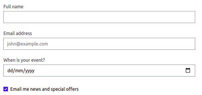
2. Tailwind CSS first-party plugins support
The good thing about Tailwind CSS 3.x, you use first part plugin with CDN. First-party plugins can be automatically loaded using the plugins query parameter:
<script src="https://cdn-tailwindcss.vercel.app/?plugins=forms,typography,aspect-ratio,line-clamp"></script>
Example
<!DOCTYPE html>
<html lang="en">
  <head>
    <meta charset="utf-8" />
    <meta name="viewport" content="width=device-width, initial-scale=1.0" />
    <title>tailwindcss first-party plugins support</title>
    <!-- plugins=forms support -->
    <script src="https://cdn-tailwindcss.vercel.app/?plugins=forms"></script>
  </head>
  <body>
    <div class="container mx-auto mt-12">
      <div class="max-w-2xl">
        <div class="flex flex-col gap-6">
          <label class="block">
            <span class="text-gray-700">Full name</span>
            <input type="text" class="block w-full mt-1" placeholder="" />
          </label>
          <label class="block">
            <span class="text-gray-700">Email address</span>
            <input
              type="email"
              class="block w-full mt-1"
              placeholder="john@example.com"
            />
          </label>
          <label class="block">
            <span class="text-gray-700">When is your event?</span>
            <input type="date" class="block w-full mt-1" />
          </label>
          <div class="block">
            <div class="mt-2">
              <div>
                <label class="inline-flex items-center">
                  <input type="checkbox" checked />
                  <span class="ml-2">Email me news and special offers</span>
                </label>
              </div>
            </div>
          </div>
        </div>
      </div>
    </div>
  </body>
</html>
3. Adding custom CSS
Adding custom css in feature is very useful for dry your code, it help to create small classes, So you can rename tailwind class you can use like bootstrap or your own naming conventions.
Example
<!DOCTYPE html>
<html lang="en">
  <head>
    <meta charset="utf-8" />
    <meta name="viewport" content="width=device-width, initial-scale=1.0" />
    <title>tailwindcss Adding Custom CSS support</title>
    <script src="https://cdn-tailwindcss.vercel.app/"></script>
    <style type="text/tailwindcss">
      .btn {
        @apply px-4 py-2 rounded;
      }
      .btn-blue {
        @apply bg-blue-500 text-blue-100 hover:bg-blue-600;
      }
      .btn-slate {
        @apply bg-slate-800 text-slate-100;
      }
      .btn-fuchsia {
        @apply bg-fuchsia-800 text-fuchsia-100;
      }
    </style>
  </head>

  <body>
    <div class="flex justify-center mt-8 space-x-2">
      <button class="btn btn-blue">Button</button>
      <button class="btn btn-slate">Button</button>
      <button class="btn btn-fuchsia">Button</button>
    </div>
  </body>
</html>


Top comments (0)