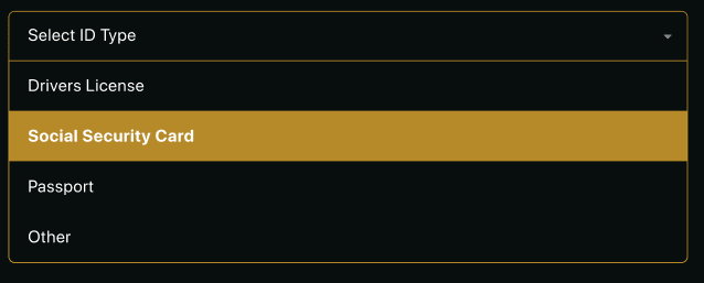
Customizing the design of a select tag is notoriously difficult. Sometimes its impossible without building your own from scratch using a combination of styled divs with custom JavaScript. In this article you will learn how to build a Vue.js component that can be styled using completely custom CSS.
Demo: https://codesandbox.io/s/custom-vuejs-select-component-8nqgd
The HTML
<template>
  <div
    class="custom-select"
    :tabindex="tabindex"
    @blur="open = false"
  >
    <div
      class="selected"
      :class="{open: open}"
      @click="open = !open"
    >
      {{ selected }}
    </div>
    <div
      class="items"
      :class="{selectHide: !open}"
    >
      <div
        class="item"
        v-for="(option, i) of options"
        :key="i"
        @click="selected=option; open=false; $emit('input', option)"
      >
        {{ option }}
      </div>
    </div>
  </div>
</template>
Important things to note here:
- The ‘tabindex’ property allows our component to be focused, which in turn allows it to be blurred. The blur event closes our component when a user clicks outside of the component.
- By emitting the selected option using the ‘input’ parameter, the parent component can react to changes easily.
The JavaScript
<script>
export default {
  props:{
    options:{
      type: Array,
      required: true
    },
    tabindex:{
      type: Number,
      required: false,
      default: 0
    }
  },
  data() {
    return {
      selected: this.options.length > 0 ? this.options[0] : null,
      open: false
    };
  },
  mounted(){
    this.$emit('input', this.selected);
  }
};
</script>
Important things to note here:
- We also emit the selected value on mount so that the parent doesn’t need to set the default value explicitly.
- If our select component is a small part of a larger form, we want to be able to set the correct tabindex.
The CSS
<style scoped>

.custom-select {
  position: relative;
  width: 100%;
  text-align: left;
  outline: none;
  height: 47px;
  line-height: 47px;
}

.selected {
  background-color: #080D0E;
  border-radius: 6px;
  border: 1px solid #858586;
  color: #ffffff;
  padding-left: 8px;
  cursor: pointer;
  user-select: none;
}

.selected.open{
  border: 1px solid #CE9B2C;
  border-radius: 6px 6px 0px 0px;
}

.selected:after {
  position: absolute;
  content: "";
  top: 22px;
  right: 10px;
  width: 0;
  height: 0;
  border: 4px solid transparent;
  border-color: #fff transparent transparent transparent;
}

.items {
  color: #ffffff;
  border-radius: 0px 0px 6px 6px;
  overflow: hidden;
  border-right: 1px solid #CE9B2C;
  border-left: 1px solid #CE9B2C;
  border-bottom: 1px solid #CE9B2C;
  position: absolute;
  background-color: #080D0E;
  left: 0;
  right: 0;
}

.item{
  color: #ffffff;
  padding-left: 8px;
  cursor: pointer;
  user-select: none;
}

.item:hover{
  background-color: #B68A28;
}

.selectHide {
  display: none;
}
</style>
This CSS is just an example, its what we use for the Qvault app. Feel free to completely change the styling to whatever your needs are.
I hope this helps you create your own custom select components, here is a link to a gist of the full component:
Again, check out the demo for a live example: https://codesandbox.io/s/custom-vuejs-select-component-8nqgd
By Lane Wagner @wagslane
Download Qvault: https://qvault.io
Star our Github: https://github.com/q-vault/qvault
The post How to Make a Custom Select Component in Vue.js appeared first on Qvault.


Top comments (0)