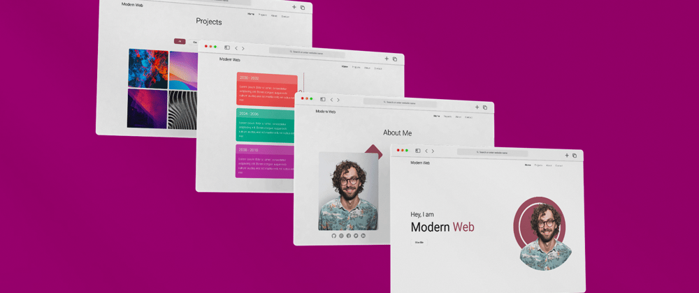
Hello 👋, Hope you all are doing great. Well in this blog you are going to make an awesome modern looking responsive portfolio website which you can proudly you to showcase your projects to your clients. So without wasting time let see what we gonna do today.

So basically in this portfolio we have a one page layout which has home page, about page, project section and contact section. Some of its features are
✅ Modern Looking
✅ Responsive to all screens
✅ TimeLine layout in about section
✅ Interactive Project section with awesome popup
✅ Smooth Scrolling and custom selection in website
Video Tutorial
If you guys interested in watching video tutorial, you can find it below.
If you can just subscribe my channel and like the video it will motivate me to make more awesome contents like this 😊
You can download the source code.
Lets Code
So I guess without wasting more let see how to code the website.
Folder Structure

You can download the images folder from here. You can see we have app.js, index.html & style.css files. But I also have project.js file. This file basically contains an array "projectData" which contains more than 1 "JS Objects" and those objects are nothing but the project card data itself. So basically I have this file here so that we can easily add projects to our site by editing the "Array" instead of editing the HTML file and figuring out why CSS styles are not working on some cards. It will make the life easy.
Project.js
let projectData = [
    {
        image: 'img/project-1.png',
        name: 'project one',
        detail: 'Lorem ipsum dolor sit amet, consectetur adipiscing elit. Donec congue, augue quis rutrum auctor, erat est mattis velit, vel luctus est nisl',
        github: '#',
        live: '#',
        tags: '#javascript, #fullstack, #css'
    },
    more objects like this 👆
]
So let's open index.html and style.css file to start with the site. Go ahead and write the basic HTML5 Template, give it some title and link the CSS files to it too. Also you can link Roboto google font in your html file. Once done with that, let's create the navbar.
So For navbar, code this HTML.
<nav class="navbar">
    <h1 class="logo">Modern Web</h1>
    <ul class="nav-links-container">
        <li class="nav-link"><a href="#home-section" class="links active">home</a></li>
        <li class="nav-link"><a href="#project-section" class="links">projects</a></li>
        <li class="nav-link"><a href="#about-section" class="links">about</a></li>
        <li class="nav-link"><a href="#contact-section" class="links">contact</a></li>
    </ul>
</nav>
The above HTML should make the navbar, Now we just need to style it.
*{
    margin: 0;
    padding: 0;
    box-sizing: border-box;
}

body{
    margin: auto;
    width: 100%;
    position: relative;
    background-color: #fcfcfc;
    font-family: 'Roboto', sans-serif;
}

/* navbar */

.navbar{
    position: fixed;
    top: 0;
    left: 0;
    z-index: 3;
    width: 100%;
    height: 80px;
    padding: 0 10vw;
    display: flex;
    justify-content: space-between;
    align-items: center;
    background: #fcfcfc;
}

.logo{
    font-size: 1.5rem;
    font-weight: 300;
}

.nav-links-container{
    display: flex;
    list-style: none;
}

.links{
    text-decoration: none;
    color: #000;
    margin: 0 5px;
    padding: 10px;
    text-transform: capitalize;
    font-size: 1rem;
    opacity: 0.5;
    transition: .5s;
}

.links.active, .links:hover{
    opacity: 1;
}
After giving these styling, you should see something like this.
Great so its looking cool, now we can work on header section. So basically our header section will have some content on left side and the image of a user on right side. For that you can code HTML structure like this, after navbar.
<!-- header -->
<header class="header" id="home-section">
    <div class="content">
        <h1 class="header-heading">Hey, I am <span class="brand-name">modern <span>web</span></span></h1>
        <a href="#" class="btn">Hire</a>
    </div>

    <div class="header-img-container">
        <div class="circle"></div>
        <img src="img/header-img.png" class="header-img" alt="">
    </div>
</header>
The site is nothing with CSS so let's add that too.
/* header */

.header{
    width: 100%;
    height: 100vh;
    padding: 0 10vw;
    display: flex;
    justify-content: space-between;
    align-items: center;
    gap: 50px;
}

.header-heading{
    font-size: 2.5rem;
    font-weight: 300;
    margin-bottom: 40px;
}

.header-heading .brand-name{
    display: block;
    text-transform: capitalize;
    font-size: 5rem;
    margin: 10px 0;
    font-weight: 400;
}

.brand-name span{
    color: #9f5264;
}

.btn{
    color: #121212;
    text-decoration: none;
    cursor: pointer;
    background: #fff;
    border: 1px solid #cecece;
    border-radius: 10px;
    padding: 10px 30px;
    text-transform: capitalize;
    transition: .5s;
    margin-right: 20px;
}

.header-img-container{
    display: flex;
    justify-content: center;
    align-items: center;
    position: relative;
}

.header-img{
    position: absolute;
    top: 60%;
    left: 60%;
    transform: translate(-50%, -50%);
    width: 500px;
    height: 500px;
    object-fit: cover;
}

.circle{
    width: 400px;
    height: 400px;
    border-radius: 50%;
    background: #9f5264;
    margin-left: 20px;
    position: relative;
    user-select: none;
}

.circle::before{
    content: '';
    position: absolute;
    top: 40px;
    left: 40px;
    bottom: 40px;
    right: 40px;
    border: 10px solid #fff;
    border-radius: 50%;
}
You should see something like this. As we are done with header section too.

Now, let's create about section. But before that, the code is pretty simple to understand but if you don't understand anything you can just go and watch the video tutorial for detail understanding or you can simply ask me in discussions, I'll answer your questions. Okay to the topic, for about section, code something like this.
<!-- about section -->

<section id="about-section">
    <h1 class="heading">about me</h1>
    <!-- about -->
    <div class="about-container">
        <div class="image-container">
            <div class="square"></div>
            <img src="img/about.png" class="about-img" alt="">
            <div class="social-links">
                <a href="#"><img src="img/github.png" class="social-img" alt=""></a>
                <a href="#"><img src="img/insta.png" class="social-img" alt=""></a>
                <a href="#"><img src="img/fb.png" class="social-img" alt=""></a>
                <a href="#"><img src="img/twitter.png" class="social-img" alt=""></a>
                <a href="#"><img src="img/linked.png" class="social-img" alt=""></a>
            </div>
        </div>

        <!-- info part -->
        <div class="info">
            <p>Lorem ipsum dolor, sit amet consectetur adipisicing elit. Repudiandae voluptate a magni aut expedita, aliquid, eveniet recusandae mollitia explicabo consequatur dignissimos quidem atque quas dicta eligendi odio iusto fuga reiciendis. Labore maxime dignissimos provident saepe veniam ullam at laboriosam culpa enim. Unde laborum enim, nulla fugiat officiis atque. Ducimus consectetur voluptas praesentium rerum facere recusandae blanditiis necessitatibus repellat ullam vitae reprehenderit harum ex ipsam enim molestias voluptatibus illum repellendus animi doloribus minus, tempora atque? Excepturi vel consectetur facere consequuntur atque reprehenderit quis tempore fugit voluptates iusto aliquid ad dignissimos, alias ut, soluta similique praesentium non cum quidem laborum enim debitis.</p>
            <a href="#" class="btn">hire me</a>
            <a href="#" class="btn">download CV</a>
        </div>
    </div>
</section>
Give it styling.
/* about section */

#about-section{
    position: relative;
    padding: 100px 10vw;
}

.heading{
    text-align: center;
    text-transform: capitalize;
    font-size: 3rem;
    font-weight: 300;
    margin-bottom: 100px;
}

.about-container{
    width: 100%;
    margin: 50px 0 100px;
    display: flex;
    gap: 100px;
}

.image-container{
    width: 40%;
    position: relative;
}

.about-img{
    width: 90%;
    height: 500px;
    display: block;
    object-fit: cover;
    margin: 10px auto;
    border-radius: 10px;
}

.square{
    width: 100px;
    height: 100px;
    border-radius: 10px;
    background: #9f5264;
    position: absolute;
    right: 10px;
    top: -30px;
    z-index: -1;
    transform: rotate(45deg);
}

.social-links{
    margin-top: 20px;
    display: flex;
    gap: 20px;
    justify-content: center;
}

.social-img{
    width: 30px;
    height: 30px;
    opacity: .4;
    transition: .5s;
}

.social-img:hover{
    opacity: 1;
}

.info{
    width: 50%;
}

.info p{
    font-size: 1.2rem;
    line-height: 2rem;
    margin: 30px 0;
}

If you notice, we have the id of the section inside href of navbar a links. That is because so that when we click on the link it will take you to that section, but if you click on that now, you'll get not smooth scrolling effect. So to get smooth scrolling effect add this in CSS file.
html{
    scroll-behavior: smooth;
}

::selection{
    background: #9f526430;
}
The above code will make smooth scrolling and change the background colour of text on selection.
Now let's create the skills and time line, since these are also a part of about section make sure you add the HTML structures inside #about-section section.
<!-- skills part -->
<h2 class="sub-heading">skills</h2>

<div class="skills">
    <p class="skill-name">HTML</p>
    <p class="skill-name">CSS</p>
    <p class="skill-name">JavaScript</p>
    <p class="skill-name">React.js</p>
    <p class="skill-name">Node.js</p>
    <p class="skill-name">PSQL</p>
    <p class="skill-name">MongoDB</p>
    <p class="skill-name">Firebase</p>
    <p class="skill-name">Fullstack Development</p>
    <p class="skill-name">Frontend Development</p>
    <p class="skill-name">APIs</p>
    <p class="skill-name">React Native</p>
    <p class="skill-name">More</p>
</div>

<!-- time line -->

<h2 class="sub-heading">education and experiences</h2>

<div class="timeline-container">
    <div class="card-container">
        <div class="card">
            <h1 class="card-title">2000 - 2002</h1>
            <p class="card-body">Lorem ipsum dolor sit, amet consectetur adipisicing elit. Quam, rerum obcaecati. Fuga officiis at libero dolore. Necessitatibus numquam ipsum rem?</p>
        </div>
    </div>
    +4 more cards.
</div>
/* skills */

.sub-heading{
    font-size: 2.5rem;
    font-weight: 300;
    margin: 40px 0;
    text-transform: capitalize;
}

.skills{
    display: flex;
    flex-wrap: wrap;
    gap: 20px;
    margin-bottom: 60px;
}

.skill-name{
    padding: 10px 20px;
    background: #fff;
    border: 1px solid #cecece;
    cursor: pointer;
    transition: .2s;
    border-radius: 10px;
}

.skill-name:hover{
    color: #fff;
    background-color: #9f5264;
}

/* time line */

.timeline-container{
    width: 100%;
    position: relative;
}

.card-container{
    width: 100%;
    padding: 0 10%;
    margin-top: -100px;
}

.card{
    display: block;
    width: 45%;
    min-height: 200px;
    min-width: 300px;
    background: #000;
    color: #fff;
    border: 1px solid #fcfcfc;
    border-radius: 10px;
    position: relative;
}

.card-container:nth-child(1) .card{
    margin-top: 150px;
    background-color: #fe6666;
}

.card-container:nth-child(2) .card{
    background-color: #ffa654;
}

.card-container:nth-child(3) .card{
    background-color: #18bfa1;
}

.card-container:nth-child(4) .card{
    background-color: #33c0df;
}

.card-container:nth-child(5) .card{
    background-color: #cb3bb4;
}

.card-container:nth-child(even) .card{
    margin-left: auto;
}

.card-title{
    width: 100%;
    height: 60px;
    font-weight: 300;
    background: rgba(255, 255, 255, 0.2);
    padding: 20px;
}

.card-body{
    padding: 20px;
    font-size: 1.1rem;
    line-height: 1.8rem;
    opacity: 0.8;
    font-weight: 300;
}

.card-container:nth-child(odd) .card::after{
    content: '';
    position: absolute;
    height: 120%;
    right: -11%;
    top: 50%;
    border-right: 2px dashed #9f5264;
    transform: translateY(-50%);
}

.card-container .card::before{
    content: '';
    position: absolute;
    width: 10px;
    height: 10px;
    right: -7.5%;
    top: 50%;
    transform: translateY(-50%);
    border-radius: 50%;
    border: 3px solid #9f5264;
}

.card-container:nth-child(even) .card::before{
    left: -8%;
}
You should see something like this.


So great, we are done with the about section too, now let's make project section.
section id="project-section">
    <h1 class="heading">Projects</h1>

    <div class="filter">
        <button class="btn filter-btn active">all</button>
        <button class="btn filter-btn">css</button>
        <button class="btn filter-btn">javascript</button>
        <button class="btn filter-btn">fullstack</button>
    </div>

    <!--  project cards -->

    <div class="project-container">
        <div class="project-card">
            <div class="project-wrapper">
                <div class="project-thumbnail">
                    <img src="img/close.png" class="close-btn" alt="">
                    <img src="img/project-1.png" class="project-img" alt="">
                    <span class="tags">#javascript, #css, #fullstack</span>
                </div>

                <div class="project-body">
                    <h1 class="project-name">project 1</h1>
                    <p class="project-detail">Lorem ipsum dolor sit amet consectetur adipisicing elit. Nulla eum et veniam eos ratione accusantium aut, accusamus deserunt quis dolores.</p>
                    <a href="#" class="btn">github</a>
                    <a href="#" class="btn">see live</a>
                </div>
            </div>
        </div>
    </div>
</section>
This section is hard to understand so I suggest you checkout the tutorial.
/* project section */

#project-section{
    position: relative;
    margin: 50px 0;
    padding: 0 10vw;
}

.filter{
    display: flex;
    justify-content: center;
    gap: 20px;
    flex-wrap: wrap;
    margin-bottom: 50px;
}

.filter-btn{
    margin-right: 0;
}

.filter-btn.active{
    background: #9f5264;
    color: #fff;
}

.project-container{
    width: 100%;
    display: flex;
    flex-wrap: wrap;
    gap: 10px;
    position: relative;
    justify-content: center;
}

.project-card{
    width: 250px;
    height: 250px;
    overflow: hidden;
    display: flex;
    background: #ebebeb;
    transition: .5s;
    border-radius: 5px;
    position: relative;
}

.project-thumbnail{
    width: 100%;
    position: relative;
    border-radius: 5px;
    overflow: hidden;
}

.close-btn{
    position: absolute;
    top: 20px;
    left: 20px;
    width: 20px;
    cursor: pointer;
    display: none;
}

.project-image{
    width: 100%;
    height: 100%;
    object-fit: cover;
}

.project-card.active{
    border: 1px solid #cecece;
}

.project-wrapper{
    transition: 1s;
}

.project-card.blur{
    filter: blur(5px);
}

.project-card.active .project-wrapper{
    position: fixed;
    top: 0;
    left: 0;
    z-index: 2;
    width: 100%;
    height: 100vh;
    display: flex;
    justify-content: center;
    align-items: center;
    gap: 20px;
    background: rgba(0,0,0, 0.1);
}

.project-card.active .project-thumbnail{
    width: 300px;
    height: 300px;
}

.project-card.active .close-btn{
    display: block;
}

.project-card.active .tags{
    position: absolute;
    bottom: 10px;
    z-index: 2;
    left: 10px;
    color: #fff;
    opacity: .9;
}

.project-body{
    display: none;
}

.project-card.active .project-body{
    display: block;
    width: 300px;
    height: 300px;
    background: #fff;
    border-radius: 5px;
    padding: 30px;
    border: 1px solid #cecece;
}

.project-name{
    font-size: 2rem;
    font-weight: 300;
    text-transform: capitalize;
}

.project-detail{
    font-size: 16px;
    line-height: 20px;
    margin: 20px 0;
}

.project-body .btn{
    display: inline-block;
    margin-top: 10px;
    margin-right: 5px;
    padding: 10px 20px;
}
And you'll get something like this at the end

Now its time to write JS to make the project cards from the data we have in "project.js". So just link project.js and then app.js file in the HTML file and let's start.
Inside project.js file
const createProjectCards = (data) => {
    let projectContainer = document.querySelector('.project-container');

    projectContainer.innerHTML += `
            <div class="project-card" data-tags="${data.tags}">
                <div class="project-wrapper">
                    <div class="project-thumbnail">
                        <img src="img/close.png" class="close-btn" alt="">
                        <img src="${data.image}" class="project-img" alt="">
                        <span class="tags">${data.tags}</span>
                    </div>

                    <div class="project-body">
                        <h1 class="project-name">${data.name}</h1>
                        <p class="project-detail">${data.detail}</p>
                        <a href="${data.github}" class="btn">github</a>
                        <a href="${data.live}" class="btn">see live</a>
                    </div>
                </div>
            </div>
    `;
}

projectData.forEach(data => createProjectCards(data));
So first comment the project card in HTML file and then code this in project.js file. This is basically we made a function which will select the project container elements and adding the HTML of our product card using inner.html method. We have used template literals for adding the HTML structure to the container.
And at the last line its simple forEach loop which is calling the function for each object present in the array to create the cards.
It will create the cards, so now let's add the popup and close effect along with the filters.
Code this inside app.js file
// project cards open and close functions

let projects = document.querySelectorAll('.project-card');

projects.forEach((card, index) => {

    let closeBtn = card.querySelector('.close-btn');
    closeBtn.addEventListener('click', () => {
        projects.forEach((item, i) => {
            item.classList.remove('blur')
        })
        card.classList.remove('active');
    })

    card.addEventListener('click', (e) => {
        if(e.path[0] != closeBtn){
            projects.forEach((item, i) => {
                if(i != index){
                    item.classList.add('blur')
                }
            })
            card.classList.add('active')
        }
    })

})

// project filter function

const tags = document.querySelectorAll('.filter-btn');

tags.forEach(btn => {
    btn.addEventListener('click', () => {
        projects.forEach(card => {
            if(btn.innerHTML.toLowerCase() == 'all'){
                card.style.display = 'block';
            } else{
                if(card.getAttribute('data-tags').includes(btn.innerHTML.toLowerCase())){
                    card.style.display = 'block';
                } else{
                    card.style.display = 'none';
                }
            }
        })

        tags.forEach(item => item.classList.remove('active'));
        btn.classList.add('active')
    })
})
If you find it hard to understand let me know in the comments.
So since we are writing the JS, why don't we write the navbar active class toggle thing too. So that when we click on link it will make that link active.
// nav toggle

let links = document.querySelectorAll('.links');

links.forEach(link => {
    link.addEventListener('click', () => {
        links.forEach(item => item.classList.remove('active'))
        link.classList.add('active');
    })
})
So for now our JS is done and everything will work good. So we just need to make the contact form now.
index.html
<section id="contact-section">
    <h1 class="heading">contact</h1>
    <div class="form">
        <input type="text" placeholder="name">
        <input type="email" placeholder="email">
        <input type="text" placeholder="subject">
        <textarea placeholder="message"></textarea>
        <button class="contact-btn">contact</button>
    </div>
</section>
/* contact section */

#contact-section{
    margin: 100px 0;
    padding: 0 10vw;
}

.form{
    width: 100%;
    margin-top: -50px;
}

input, textarea{
    width: 100%;
    height: 5vh;
    font-size: .9rem;
    padding: 1vw;
    background-color: #fff;
    border: 1px solid #cecece;
    border-radius: 5px;
    margin: 10px 0;
    outline: none;
}

::placeholder{
    color: #b4b4b4;
    text-transform: capitalize;
}

textarea{
    height: 20vh;
    font-family: 'roboto', sans-serif;
    resize: none;
}

.contact-btn{
    padding: 10px 20px;
    background: #9f5264;
    color: #fff;
    border: none;
    outline: none;
    font-size: 1rem;
    text-transform: capitalize;
    cursor: pointer;
    border-radius: 5px;
    margin-top: 20px;
}

You'll get something like this. So we are done, we made this awesome modern portfolio website. Since the blog is being too lengthy, I am not adding the "responsive" part here. You can check that in video.
I hope you like this post, you like the website design and the tutorial. If this helped you in someway make sure you follow me on my instagram and youtube.
You can download the code. Thanks for reading 👋


Top comments (3)
Thank you! Although to make the responsive part, I had to watch the video and follow several steps. Very pretty :)
josexs.github.io/
Great, thank you very much :-)
Great article about how to make a portfolio with good old HTML, CSS and JavaScript.
I am wondering why you used the header tag for the hero image and do not use the main tag anywhere?
Wouldn‘t it be best that in this particular example, the nav would be inside the header tags, and all sections are within the main tag?