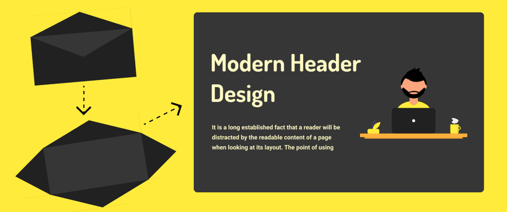
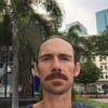
Hello, glad you are here. I am kunaal and today we will see how to make an awesome header with amazing animations only using CSS. You can see demo below.
Demo
Video Tutorial -
For better explanation. You can watch video tutorial.
If you like the video tutorial. Please consider subscribing my youtube channel.
Let's code
Inside HTML file under <body> tag write
<header class="header">
    <span class="cover top"></span>
    <span class="cover left"></span>
    <span class="cover right"></span>
    <span class="cover bottom"></span>
    <div class="col">
        <div class="content">
            <h1 class="heading">modern header design</h1>
            <p class="info">Lorem ipsum dolor sit amet consectetur adipisicing elit. Placeat laboriosam ullam deleniti nisi eos beatae laborum vitae harum quibusdam suscipit!</p>
        </div>
    </div>
    <div class="col">
        <img src="svg.png" class="svg" alt="">
    </div>
</header>
And CSS
@import url('https://fonts.googleapis.com/css2?family=Dosis:wght@600&family=Roboto:wght@300;400;500;700;900&display=swap');

*{
    margin: 0;
    padding: 0;
    box-sizing: border-box;
}

body{
    width: 100%;
    height: 100vh;
    background: #ffeb3b;
    display: flex;
    justify-content: center;
    align-items: center;
    perspective: 1000px;
    overflow: hidden;
}

.header{
    width: 100%;
    height: 100vh;
    position: relative;
    background: #363636;
    display: flex;
    justify-content: center;
    align-items: center;
    padding: 0 50px;
    transform: scale(0.3) rotate(-5deg);
    animation: full-page 1s 3s forwards 1;
}

.cover{
    position: absolute;
    top: 2px;
    left: 2px;
    bottom: 2px;
    right: 2px;
    background: #212121;
}

.cover.top{
    transform-origin: top;
    clip-path: polygon(0% 0%, 100% 0%, 50% 50%);
    animation: open-top 1s forwards 1;
}

.cover.left{
    transform-origin: left;
    clip-path: polygon(0% 0%, 50% 50%, 0% 100%);
    animation: open-left 1s 2s forwards 1;
}

.cover.bottom{
    transform-origin: bottom;
    clip-path: polygon(0% 100%, 100% 100%, 50% 50%);
    animation: open-top 1s 1s forwards 1;
}

.cover.right{
    transform-origin: right;
    clip-path: polygon(100% 0%, 50% 50%, 100% 100%);
    animation: open-left 1s 2s forwards 1;
}

@keyframes open-top{
    100%{
        transform: rotateX(-150deg);
    }
}

@keyframes open-left{
    100%{
        transform: rotateY(-130deg);
    }
}

@keyframes full-page{
    100%{
        transform: scale(1) rotate(360deg);
    }
}

@keyframes fade-in{
    100%{
        opacity: 1;
    }
}

.col{
    width: 50%;
    height: 100%;
    display: flex;
    justify-content: center;
    align-items: center;
    color: #fff9c4;
    opacity: 0;
    animation: fade-in 1s 4s forwards 1;
}

.svg{
    width: 80%;
    height: 80%;
    object-fit: contain;
}

.heading{
    font-family: 'dosis';
    font-size: 100px;
    text-transform: capitalize;
}

.info{
    margin-top: 40px;
    font-family: roboto, sans-serif;
    font-size: 20px;
    line-height: 30px;
}
I hope you understood everything. If you have any doubt or you find any mistake that I made or you have any suggestion feel free to ask me in comment.
If you are interested in programming and want to know how I a 15yr old teen do coding make these design. You can follow me on my Instagram. I am also planning to post my game development stuff on Instagram.


Top comments (1)
Irrespective of how awesome the code or the functionality is, many will not watch a coding tutorial with that beat drops and music.
Some comments have been hidden by the post's author - find out more