![Cover image for How to make an ecom website in 2022 [ with source code ]](https://media.dev.to/cdn-cgi/image/width=1000,height=420,fit=cover,gravity=auto,format=auto/https%3A%2F%2Fdev-to-uploads.s3.amazonaws.com%2Fuploads%2Farticles%2F8ejcg1ulv1obxxbqw682.png)
Hello, Today in this article, we'll learn to create an e-commerce website using HTML, CSS and JS. This is a part of full stack e-commerce website. In this part we'll only create front end page's UI. We'll create 1 pages in this tutorial - Home page the rest 3 pages i.e Product Page, Search Page and 404 page you can see the YT tutorial.
To see demo or you want full coding tutorial video for better understanding. You can watch the tutorial below.
Video Tutorial
I appreciate if you can support me by subscribing my youtube channel.
Code
You can see below, our project's folder structure.
Download Images, Get Source Code
so, let start.
Home Page
To create home page, open index.html file and start with basic HTML 5 template. After done with that, link style.css file to it. And also, link Cinzel, Lato google fonts.
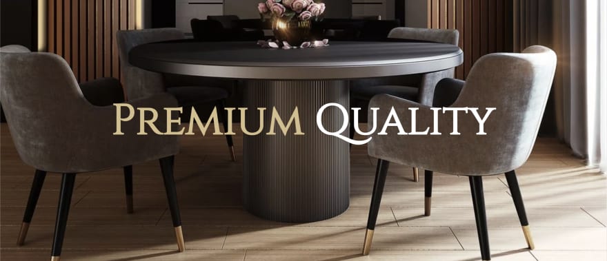
Now let's make header section.
<!-- header -->
<header class="header-section">
    <h1 class="header-heading"><span>premium</span> quality</h1>
</header>
And let's give it some styles.
*{
    margin: 0;
    padding: 0;
    box-sizing: border-box;
}

body{
    font-family: 'cinzel', serif;
}

.header-section{
    width: 100%;
    height: 100vh;
    background: url(../img/header.png);
    background-size: cover;
    display: flex;
    justify-content: center;
    align-items: center;
}

.header-heading{
    font-size: 100px;
    text-transform: capitalize;
    color: #fff;
}

.header-heading span{
    color: #d5be8b;
}
Let's see the output
Output
So now, let's make the navbar.
Navbar
<!-- navbar -->
<nav class="navbar">
    <ul class="links-container">
        <li class="link-item"><a href="#" class="link active">home</a></li>
        <li class="link-item"><a href="#" class="link">product</a></li>
        <li class="link-item"><a href="#" class="link">about</a></li>
        <li class="link-item"><a href="#" class="link">contact</a></li>
    </ul>
    <div class="user-interactions">
        <div class="cart">
            <img src="img/cart.png" class="cart-icon" alt="">
            <span class="cart-item-count">00</span>
        </div>
        <div class="user">
            <img src="img/user.png" class="user-icon" alt="">
        </div>
    </div>
</nav>
And style it.
.navbar{
    width: 100%;
    height: 80px;
    position: fixed;
    top: 0;
    left: 0;
    display: flex;
    justify-content: center;
    z-index: 9;
    transition: .5s;
}

.navbar.bg{
    background: #fff;
}

.links-container{
    display: flex;
    align-items: center;
    list-style: none;
}

.link-item{
    margin: 10px;
}

.link{
    font-size: 20px;
    color: #fff;
    text-decoration: none;
    padding: 10px;
    opacity: 0.7;
    transition: .5s;
}

.navbar.bg .link{
    color: #000;
    opacity: 0.5;
}

.link.active, .link:hover, .navbar.bg .link:hover, .navbar.bg .link.active{
    opacity: 1;
}

.user-interactions{
    display: flex;
    position: absolute;
    right: 5vw;
    top: 50%;
    transform: translateY(-50%);
}

.cart, .user{
    width: 30px;
    height: 30px;
    position: relative;
    margin: 10px;
    cursor: pointer;
}

.cart-icon, .user-icon{
    width: 100%;
    height: 100%;
    object-fit: cover;
}

.cart-item-count{
    font-family: 'lato', sans-serif;
    color: #d5be8b;
    padding: 5px;
    font-size: 15px;
    border-radius: 50%;
    background: #190c05;
    position: absolute;
    bottom: -12px;
    left: -12px;
}
You can notice I also have .navbar.bg in above CSS code. I made that style so we can easily set navbar bg color to white when we scroll down.
It's looking great. Now, make the product card or best selling product section.
Best selling product section
<!-- best selling products -->
<section class="best-selling-product-section">
    <h1 class="section-title">best selling products</h1>
    <div class="product-container">
        <div class="product-card">
            <img src="img/product-1.png" class="product-img" alt="">
            <p class="product-name">lights →</p>
        </div>
        // +3 more product cards
    </div>
</section>
And also style it.
/* best selling product */

.best-selling-product-section{
    position: relative;
    padding: 60px 5vw;
}

.section-title{
    text-transform: capitalize;
    font-size: 30px;
    margin-bottom: 30px;
}

.product-container{
    display: flex;
    justify-content: space-between;
}

.product-card{
    border: 15px solid #d5be8b;
    width: 300px;
    height: 300px;
    overflow: hidden;
    position: relative;
    background: #d5be8b;
}

.product-card:nth-child(even){
    border-color: #190c05;
    background: #190c05;
}

.product-img{
    width: 100%;
    height: 100%;
    object-fit: cover;
    transition: .5s;
}

.product-name{
    position: absolute;
    color: #fff;
    text-transform: capitalize;
    font-family: 'lato', sans-serif;
    font-size: 25px;
    bottom: 20px;
    left: 50%;
    transform: translateX(-50%);
    opacity: 0;
    transition: .5s;
}

.product-card:hover .product-name{
    opacity: 1;
}

.product-card:hover .product-img{
    opacity: 0.5;
}
Output

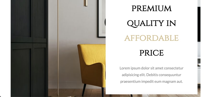
After best selling product section, we have sort of mid section, which basically telling about the company in key points. So let's make it now.
Mid section
<!-- mid section -->
    <section class="mid-section">
        <div class="section-item-container">
            <img src="img/bg-2.png" class="section-bg" alt="">
            <div class="section-info">
                <h1 class="title">premium quality in <span>affordable</span> price</h1>
                <p class="info">lorem 15</p>
            </div>
        </div>
    </section>
/* mid section */

.mid-section{
    width: 100%;
    height: 800px;
    padding: 40px 5vw;
}

.section-item-container{
    width: 100%;
    height: 100%;
    position: relative;
    padding: 20px;
}

.section-bg{
    width: 100%;
    height: 100%;
    position: absolute;
    z-index: -1;
    top: 0;
    left: 0;
}

.section-info{
    width: 50%;
    height: 100%;
    background: #fff;
    display: block;
    margin-left: auto;
    padding: 50px;
    text-align: center;
}

.title{
    font-size: 60px;
    line-height: 100px;
}

.title span{
    color: #d5be8b;
}

.info{
    font-family: 'lato', sans-serif;
    font-size: 25px;
    line-height: 45px;
    margin-top: 30px;
    opacity: 0.5;
}
Output
Isn't it looking great ? Okay, we have another section which is basically a image collage section, in future we'll redirect user to the product page on clicking on those images.
Image Collage
<!-- image collage section -->
<section class="image-mid-section">
    <div class="image-collage">
        <div class="image-collection">
            <img src="img/poster-1.png" class="collage-img" alt="">
            <img src="img/poster-2.png" class="collage-img" alt="">
            <img src="img/poster-3.png" class="collage-img" alt="">
        </div>
    </div>
</section>
/* image collage */

.image-mid-section{
    width: 100%;
    height: 600px;
    padding: 50px 5vw;
}

.image-collage{
    width: 100%;
    height: 100%;
    background: url(../img/bg-1.png);
    background-size: cover;
}

.image-collection{
    position: relative;
    display: block;
    width: 50%;
    height: 100%;
    background: #fff;
    margin: auto;
}

.collage-img{
    position: absolute;
    object-fit: cover;
    transition: .5s;
}

.collage-img:nth-child(1){
    width: 350px;
    height: 350px;
    top: 20px;
    left: 40px;
}

.collage-img:nth-child(2){
    width: 250px;
    height: 250px;
    top: 200px;
    left: 200px;
}

.collage-img:nth-child(3){
    width: 250px;
    height: 250px;
    top: 100px;
    left: 350px;
}

.collage-img:hover{
    transform: translateY(-10px);
}
In the above we added hover effect to .collage-img. But we haven't added that blur effect, we'll do that from JS.
So open home.js file and link it to the home page, using script tag.
And then write some JS.
// image collage

const collageImages = [...document.querySelectorAll('.collage-img')]

collageImages.map((item, i) => {
    item.addEventListener('mouseover', () => {
        collageImages.map((image, index) => {
            if(index != i){
                image.style.filter = `blur(10px)`;
                item.style.zIndex = 2;
            }
        })
    })

    item.addEventListener('mouseleave', () => {
        collageImages.map((image, index) => {
            image.style = null;
        })
    })
})
The above is code is very easy to understand, I just selected all the imaged and loop through each one using map method. Then after I am adding mouseover and mouseleave events to the image. If you didn't understood let me know in the comment.
Output

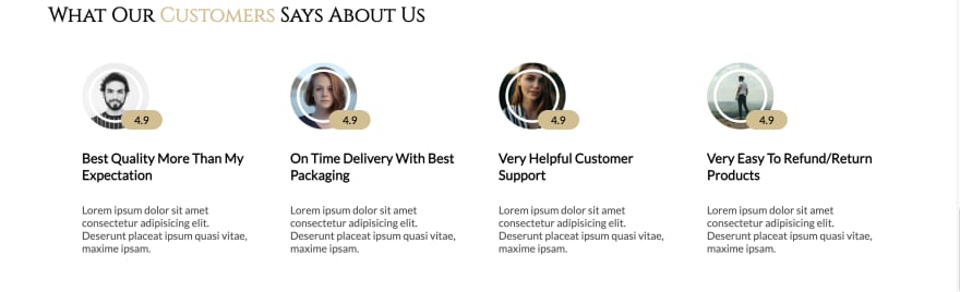
After all of this, let's make review section.
Review section
<!-- review section -->
<section class="review-section">
    <h1 class="section-title">what our <span>customers</span> says about us</h1>
    <div class="review-container">
        <div class="review-card">
            <div class="user-dp" data-rating="4.9"><img src="img/user 1.png" alt=""></div>
            <h2 class="review-title">best quality more than my expectation</h2>
            <p class="review">Lorem15</p>
        </div>
        +3 more reviews
    </div>
</section>
/* review section */

.review-section{
    padding: 50px 5vw;
}

.section-title span{
    color: #d5be8b;
}

.review-container{
    margin: 50px;
    margin-bottom: 0;
    display: flex;
    justify-content: space-between;
}

.review-card{
    width: 250px;
    height: auto;
    font-family: 'lato', sans-serif;
}

.user-dp{
    width: 100px;
    height: 100px;
    border-radius: 50%;
    position: relative;
}

.user-dp img{
    width: 100%;
    height: 100%;
    object-fit: cover;
}

.user-dp::before{
    content: '';
    position: absolute;
    top: 10px;
    left: 10px;
    right: 10px;
    bottom: 10px;
    border: 4px solid #fff;
    border-radius: 50%;
}

.user-dp::after{
    content: attr(data-rating);
    position: absolute;
    bottom: 0;
    right: -20px;
    padding: 5px 20px;
    border-radius: 20px;
    background: #d5be8b;
}

.review-title{
    font-size: 20px;
    line-height: 25px;
    margin: 30px 0;
    text-transform: capitalize;
}

.review{
    opacity: 0.7;
}
Output
So out last section is basically a copy of our mid section. so you can copy it and paste after review section. Then just change the classnames little bit.
End section
<!-- end section -->
<section class="end-section">
    <div class="section-item-container">
        <img src="img/bg-3.png" class="section-bg" alt="">
        <div class="section-info">
            <h1 class="title">order <span>now</span></h1>
            <p class="info">Lorem15.</p>
        </div>
    </div>
</section>

<footer>made by modern web</footer>
Also make the footer section.
.end-section .section-info{
    margin: 0;
}

.end-section .title{
    font-size: 100px;
    line-height: 150px;
    margin: 50px;
}

footer{
    font-family: 'lato', sans-serif;
    color: #d5be8b;
    background: #190c05;
    width: 100%;
    height: 50px;
    line-height: 50px;
    text-align: center;
    text-transform: capitalize;
    font-size: 20px;
}
Output

And the last thing make the "navbar" change its background to white on scroll.
home.js
// navbar

const navbar = document.querySelector('.navbar');

window.addEventListener('scroll', () => {
    if(scrollY >= 180){
        navbar.classList.add('bg');
    } else{
        navbar.classList.remove('bg');
    }
})
Above code it easy If you still don't get it. Ask me in the description.
Output

And finally we are done with the home page. Don't worry about, responsiveness we'll make this site responsive at the end.
We can now make our search page, product page and 404 page, but I think the article is getting long. So you can make those pages from the video.
So that's sit for today. Great work. I know it was a lot. But e-commerce website is not that simple. Don't forget to follow me on youtube and dev.to if you don't want to miss the next part of this series.
I hope you understood each and everything. If you have doubt or I missed something let me know in the comments.
Articles you may find Useful
I really appreciate if you can subscribe my youtube channel. I create awesome web contents.

Source Code
, Buy me a coffee
Your donation really motivates me to do more amazing
Thanks for watching.


Top comments (7)
do not use pixels to set the font size. Comply with user preferences and use
em/reminstead ofpx.OMG I have been doing a 12 hour bootCamp on Youtube, still have along away to go and I can read the section and div's and how they work . Once I have finished the bootcamp and some smaller gaming projects I will build this to the best of my ability. Thanks for the share.
Thank you for share, excelent !!!
Is this production-ready?
Excelente, ya quiero ver los siguientes hace mucho que quería ver algo así 💪
Me bebi lo del mercado y no me quedaron ni pa naranjas pal guayabo.
Good article. I recently read a similar one "How to create your own e-commerce website". I recommend it:
blog.codeharbor.dev/2022/11/16/the...
Some comments have been hidden by the post's author - find out more