Description
I've wanted to check out Observable for a while, but it looked pretty intimidating whenever I started. Enter COVID-19 and this straightforward tutorial and suddenly I had an interesting topic and some tools under my belt to actually do it. I used Vega-lite for visualisations, JS and d3.js for some data wrangling. Data is pulled via the awesome COVID-19 API.
Here's the link to the results:
COVID-19: Pick a country to display data
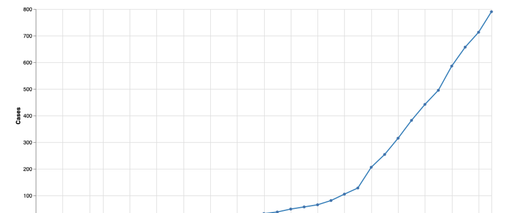
The page displays following results:
- a line chart of cases over time
- a bar chart of new cases compared to the previous day
- the most recent summary of cases
These results are presented based on the following options you can select:
- country you want to see data for
- type of cases you want to see (confirmed, recovered, deaths)
- the scale you want to use for the y-axis of the line chart
Nice Resources I Found Along the Way
Data manipulation, cleaning, and processing in JavaScript:
Website with tutorials on data wrangling with JS (mostly d3.js). I found it while I was researching how to aggregate data by an object property.


Top comments (0)