
This inspiration for this tutorial came from a real estate template that enables us to build fully functional ready to deploy mobile applications that anyone can use to build their own React Native application. This tutorial replicates the coding implementations and designs from the Youtube video tutorial by React UI Kit for the Camping Spots Finder App clone. The video tutorial features speed coding with quick implementations which may be difficult for beginners to grasp. So, this tutorial series breaks down the video into different sections. It also provides step by step guide which will be very easy for anyone to grasp and implement their own app.
In this first part of this tutorial series, we are going to implement the map as well as the setup header and header tabs which will create a base for the overall app UI. The idea is, to begin with implementing map view and then the header section with all the sections separated into different functions.
So, let us begin!!
In this tutorial, we are going to use the EXPO as the React Native project development dependency. So first, we are going to create a boilerplate React Native application using expo client.
Creating Boilerplate React Native project
First and foremost, since we are going to use the expo as a development engine, we need to install it into our system. To install expo globally into our system, we need to have Node Package Manager(NPM) installed first. Then, we need to run the following command:
npm install -g expo
Now, we need to create a boilerplate react native application using expo. In order to do this, we need to run following command in the desired project directory:
expo init <project\_name> // project name==> Camping Spots Finder
After running the above command, we will be asked to choose the template for the boilerplate app. Here, we are going to choose the t** abs **template which has several example screens and react-navigations configured. The selection screenshot is provided below:

As we can see, we choose the tabs template and hit enter. Then, we need to enter the project name and after that, the boilerplate react native app is configured into our directory.
Now, we need to enter the project directory and then run the command:
expo start
Then, we will get the following boilerplate app in our emulator screen:

Configuring Navigation files
We already have navigators set up in our project for the navigation purpose. But now, we need to configure the navigators and navigation files as required for our app.
So first, we need to create a ScreensNavigator.js file in our project’s ‘/navigations’ directory. Then, we need to create a Campings.js file and Settings.js file in our project’s ‘/screens’ directory. Now, our project structure will look something like given in the screenshot below:

Now, we need to copy the code from HomeScreen.js and paste it Campings.js file. Again, we need to do the same from SettingsScreen.js and to Settings.js Screen so that the project runs in the emulator without error for now.
Now in ScreensNavigator.js file, we need to configure the navigator including Camping and Setting screens. In order to do that we need to create a stack navigator using createStackNavigator method from the react-navigation package as shown in the code snippet below:
import React from 'react';
import { createStackNavigator } from 'react-navigation';

import Campings from '../screens/Campings';
import Settings from '../screens/Settings';

export default createStackNavigator({
  Campings: Campings,
  Settings: Settings,
});
Here, we already have the AppNavigator.js file configured to our project files. But, we need to re-configure the AppNavigator.js file with our new ScreensNavigator. In order to do that, we need to configure the main AppNavigator.js file as in the code snippet below:
import React from 'react';
import { createAppContainer, createSwitchNavigator } from 'react-navigation';

import ScreensNavigator from './ScreensNavigator';

export default createAppContainer(createSwitchNavigator({
  Main: ScreensNavigator,
}));
Now, if we re-run the project in the emulator, we will get the same screen as before.
Creating Map View in Camping.js
In this step, we are going to create a Map view for our React Native Camping Spots Finder clone in the Camping.js file. For that, we are going to make use of the react-native-mapspackage which provides us with the MapView component.
First, we need to remove all the code from Camping.js. Then, we are going to import all the necessary components from our React and react-native package which is shown in the code snippet below:
import React from 'react';
import {
  Image,
  Platform,
  ScrollView,
  StyleSheet,
  Text,
  TouchableOpacity,
  View,
} from 'react-native';
Now, we need to install react-native-maps package into our project by using the following command:
expo install react-native-maps
Next, we need to import react-native-maps package into our Camping.js file as follows:
import MapView from 'react-native-maps';
Now, in order to include the map to our Camping screen, we need to use the MapView component provided by react-native-package as shown in the code snippet below:
class Campings extends React.Component{
  render(){
    return (
      <View style={styles.container}>
        <ScrollView
        style={styles.container}
        contentContainerStyle={styles.contentContainer}>
          <View style={styles.map}>
            <MapView style={{flex: 1, height : 200, width : 200}}
            initialRegion={{
              latitude: 37.78825,
              longitude: -122.4324,
              latitudeDelta: 0.0922,
              longitudeDelta: 0.0421,
            }}
            />
          </View>
        </ScrollView>
      </View>
    );
  }
}
Here, we have MapView component bound to some styles as well as initialRegion prop. The initialRegion prop allows us to set map location configurations as shown in the code snippet above. There are several Views components and a ScrollView component wrapping the MapView with some styles in order to position the map properly. The required styles are provided in the code snippet below:
const styles = StyleSheet.create({
  container: {
    flex: 1,
    backgroundColor: '#fff',
  },
  map :{
    flex : 1
  },
  contentContainer: {
    paddingTop: 30,
  },
});
Hence, we get the following result in our emulator screen:
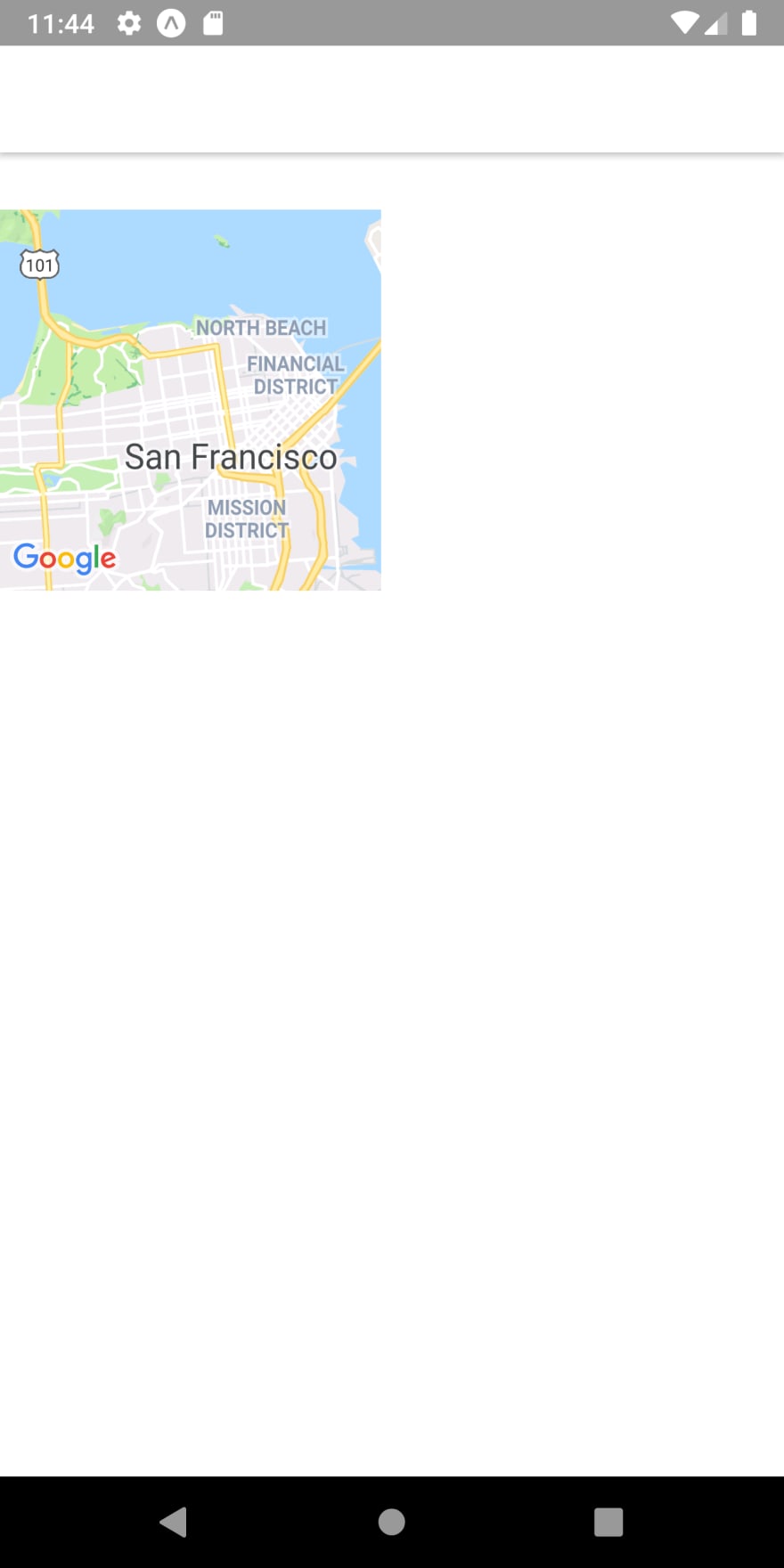
Configuring Map styles
In order to show the map properly on the screen, we are going to use Dimensions component provided by the react-native package. By using Dimensions component, we can get the height and width of the entire app screen. Then, we can configure it with our MapView to show Map properly on the screen. Now, let us import the Dimensions as follows:
import {
  Image,
  Platform,
  ScrollView,
  StyleSheet,
  Text,
  TouchableOpacity,
  View,
  Dimensions
} from 'react-native';
Now, we need to set the height and width constants to our screen dimensions using the get method from the Dimensions component:
const { width, height } = Dimensions.get('screen');
Next, we need to add the height and width dimensions to the MapView component in order to configure it properly onto the screen. The code to do this is provided in the code snippet below:
<MapView style={{flex: 1, height : height * 0.5, width}}
   initialRegion={{
    latitude: 37.78825,
    longitude: -122.4324,
    latitudeDelta: 0.0922,
    longitudeDelta: 0.0421,
   }}
/>
Hence, we get the following result in our emulator screen:
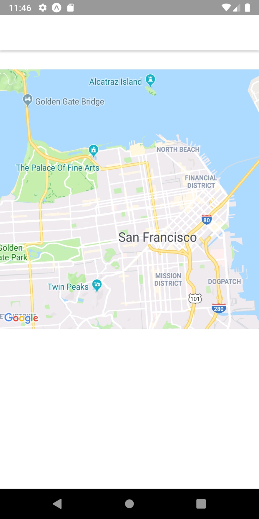
As we can see, we have successfully implemented the map view into our Camping app screen. Now, we are going to add a custom header to the Camping app screen.
Implementing Header Section
In this section, we are going to implement a Header on top of our MapView component. The Header will consist of Camping Spot location name with settings button at the right.
But first, we need to remove the default header bar at the top. In order to do this, we need to add the following code in our Campings.js file:
class Campings extends React.Component{
  static navigationOptions = {
    header: null,
  };
While setting the header value to null in the navigationOptions proivided by navigator stack, the default header at the top disappears. The result is shown in the emulator screenshot below:

As we can see, the default header disappeared. Now, we are going to implement our custom header bar.
Creating a Custom Header
Here, we are going to implement the header section from our Campings Spot Finder app clone. The header section consists of some icons. So, for the icons, let’s import the vector icons provided by expo package itself by using the following code:
import { FontAwesome , Ionicons} from '@expo/vector-icons';
Here, we are importing the FontAwesome icon package and Ionicons icon package from the vector-icons package provided by the expo package.
Now, we are going to create a function called renderHeader() that returns the template. The code to implement this function is provided in the code snippet below:
renderHeader() {
    return (
      <View style={styles.header}>
        <View>
          <FontAwesome name="location-arrow" size={14} color="white" />
          <Text>Detected Location</Text>
          <Text>Northern Islands ()</Text>
        </View>
        <View>
          <Ionicons name="ios-settings" size={24} color="black" />
        </View>
      </View>
    )
}
In the code snippet above, we have added some Text components and Icons wrapped by View components. Then, we need to call therenderHeader() function into our render() function as shown in the code snippet below:
render(){
    return (
      <View style={styles.container}>
        <ScrollView
        style={styles.container}
        contentContainerStyle={styles.contentContainer}>
          {this.renderHeader()}                            //here
Hence, we will get the following result in our emulator screen:
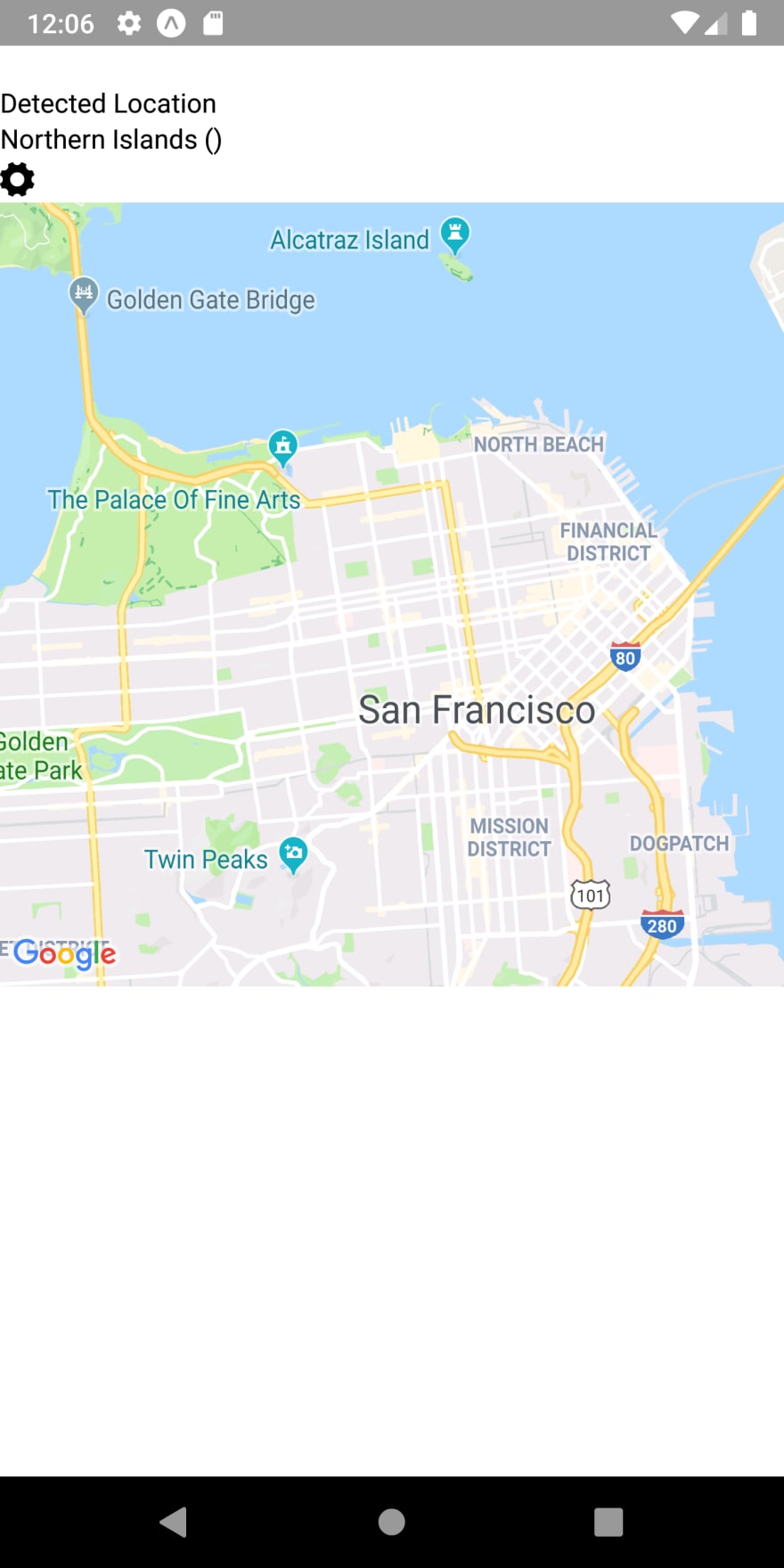
As we can see, we got the header section on top of our MapView but looks very unappealing. So, we need to add some styles to it in order to make it look cool like in the Camping Spots Finder app.
Adding styles and configurations to the header
Here, we are going to add some style configurations to the header section in order to make it look for appealing. In order to do that, we are going to use numerous style bindings. The flex property of react-native styles is used here. So, we can get an insight into how to use flex property as well. Thus, the code to implement this is provided in the code snippet below:
renderHeader() {
    return (
        <View style={styles.header}>
          <View style={{flex: 2, flexDirection: 'row'}}>
            <View style={styles.settings}>
              <View style={styles.location}>
                <FontAwesome name="location-arrow" size={14} color="white" />
              </View>
            </View>
            <View style={styles.options}>
              <Text style={{ fontSize: 12, color: '#A5A5A5', marginBottom: 5, }}>
                Detected Location
              </Text>
              <Text style={{ fontSize: 14, fontWeight: '300', }}>
                Northern Islands
              </Text>
            </View>
          </View>
          <View style={styles.settings}>
            <TouchableOpacity >
              <Ionicons name="ios-settings" size={24} color="black" />
            </TouchableOpacity>
          </View>
        </View>
    )
 }
In the code snippet above, the settings Icon component is wrapped by TouchableOpacity component in order to make it clickable. Then, different style bindings inline as well as from the Stylesheet are used in order to give the header section its proper look. The styles for this section is provided in the code snippet below:
  header: {
    flex: 1,
    flexDirection: 'row',
    alignItems: 'center',
    justifyContent: 'center',
    height: height * 0.15,
    paddingHorizontal: 14,
  },
  location: {
    height: 24,
    width: 24,
    borderRadius: 14,
    alignItems: 'center',
    justifyContent: 'center',
    backgroundColor: '#FF7657',
  },
  settings: {
    alignItems: 'center',
    justifyContent: 'center',
  },
  options: {
    flex: 1,
    paddingHorizontal: 14,
  },
As a result, we get following result in our emulator screen:

As we can see, the header section looks very cool and appealing now with a navigation arrow icon at the left and settings icon at the right. It is used to show the detected location name in the actual app.
Here, we created the header section in the renderHeader() function which returns the header section template. This makes the code in the render() method of our project look more clear and clean. So, let’s implement the MapView as well as other sections that we are going to implement in the function style.
Dividing the UI sections into Functions
This is just the intermediate step where we are going to separate the coding implementations of different UI sections into functions in order to make the render method less populated with codes. This will help us to understand and read the code better. The render() method will become clean and clear of all the coding sections mixed into one. So, let get this done.
First, we are going to move the code for the MapView to the renderMap() function as shown in the code snippet below:
renderMap(){
    return(
      <View style={styles.map}>
          <MapView style={{flex: 1, height : height * 0.5, width}}
          initialRegion={{
            latitude: 37.78825,
            longitude: -122.4324,
            latitudeDelta: 0.0922,
            longitudeDelta: 0.0421,
          }}
          />
      </View>
    )
}
Now, the renderMap() method will return the MapView component template.
Then, we are going to implement the List section below the map component in the coming tutorial. But, let’s first make a separate function called renderList() function for this section which return the template for the list section. The function is provided in the code snippet below:
   renderList(){
    return(
      <View>
        <Text>List of camping site here</Text>
      </View>
    )
  }
Here, I have just added a Text element to the View component which we are going to configure in the next part of this tutorial.
Now, we need to call these functions onto the render() method of our project as shown in the code snippet below:
render(){
    return (
      <View style={styles.container}>
        <ScrollView
        style={styles.container}
        contentContainerStyle={styles.contentContainer}>

          {this.renderHeader()}                              //for header section

          {this.renderMap()}                                 //for MapView section
          {this.renderList()}                                //for List section

        </ScrollView>
      </View>
    );
}
Therefore, we will get the following result in our emulator screen:

As we can see, we got all three sections properly on the screen.
But we are not finished yet for this part of the tutorial. We are going to add one more section that is a header tabs section just between the header section and the MapView section.
Implementing the Tabs section
In this step, we are going to add the tab buttons to our header section as can be seen in the original Campings Spot Finder app. For that, we are going to create another function that returns the template for the tabs section. The function is named renderTabs() and its implementation is provided in the code snippet below:
renderTabs(){
    return (
      <View>
        <View>
          <Text>All Spots</Text>
        </View>
        <View>
          <Text>Tenting</Text>
        </View>
        <View>
          <Text>RV Camping</Text>
        </View>
      </View>
    )
}
Here, we add some Text elements which are wrapped by the View component. Then, we need to call renderTabs() function in our render() function as well:
render(){
    return (
      <View style={styles.container}>
        <ScrollView
        style={styles.container}
        contentContainerStyle={styles.contentContainer}>
          {this.renderHeader()}                               //for header section
          {this.renderTabs()}                                 //for tabs section
          {this.renderMap()}                                  //for MapView section
          {this.renderList()}                                 //for List section

        </ScrollView>
      </View>
    );
  }
Hence, we get the following result in our emulator screen:

As we can see, there is the section between the header and MapView section but does not look like tabs. In order to make it look like a tab we need to add some styles and configurations to it.
Adding styles and configurations to Tab section
Here, we are going to add the style configurations to the tab section in order to make it look like tabs. For that, we need to use different style bindings including flex properties. paddings and font properties. The code to implement this is provided in the code snippet below:
renderTabs(){
    return (
      <View style={styles.tabs}>
        <View style={styles.tab}>
          <Text style={styles.tabTitle}>All Spots</Text>
        </View>
        <View style={styles.tab}>
          <Text style={styles.tabTitle}>Tenting</Text>
        </View>
        <View style={styles.tab}>
          <Text style={styles.tabTitle}>RV Camping</Text>
        </View>
      </View>
    )
}
Here, we can see that the View and Text components are bound to different styles from the StyleSheet. Therefore, the styles required are provided in the code snippet below:
  tabs: {
    flex: 1,
    flexDirection: 'row',
    justifyContent: 'center',
    alignItems: 'flex-end',
  },
  tab: {
    paddingHorizontal: 14,
    marginHorizontal: 10,
    borderBottomWidth: 3,
    borderBottomColor: 'transparent',
  },
  tabTitle: {
    fontWeight: 'bold',
    fontSize: 14,
    marginBottom: 10,
  },
Hence, we get tabs with a more attractive look than before as shown in the emulator screenshot below:

As we can see, we got the tabs between the header and map sections. Now, what we need to do is to add an active tab style as well as a configuration to handle the active style for the tabs.
Configuring Active Tab
Here, we are going to add the coding implementation for determining the active tab. First, we need a state called active to handle the active tab style properties as shown in the code snippet below:
state = {
 active : 'all'
}
Now, we need to create a function that handles the change and state and sets the active style to the correct tab when clicked. For that, we are going to create a function called handleTab()that takes a tab value as a parameter and sets the active state to the tab value when triggered. the coding implementation for the function is provided in the code snippet below:
  handleTab = (tabKey) => {
    this.setState({ active: tabKey });
  }
Now, we need to define some styles for the active tab. Then, this style configurations needs to be bound to both the Text and View in our tab section template inside the renderTabs() function. The required styles for the active tab is provided in the code snippet below:
  activeTab: {
    borderBottomColor: '#FF7657',
  },
  activeTabTitle: {
    color: '#FF7657',
  },
The styles given above will give the active tab text color as well as View component enclosing an active tab a border at the bottom.
Now, we need to include these styles and to the renderTabs() function in whose value depends upon the active state of the tab. Then, we also need to bind the handleTab() function to the onPress event of the Text component of the tab. The function call should also set the parameter to the function as per the selected active tab. The code to implement all this is provided in the code snippet below:
renderTabs(){
    const {active} = this.state
    return (
      <View style={styles.tabs}>
        <View
          style={[styles.tab, active === 'all' ? styles.activeTab : null]}>
           <Text
             style={[styles.tabTitle, active === 'all' ? styles.activeTabTitle : null]}
             onPress={() => this.handleTab('all')}>
               All Spots
           </Text>
        </View>

        <View
          style={[styles.tab, active === 'tent' ? styles.activeTab : null]}>
           <Text
             style={[styles.tabTitle, active === 'tent' ? styles.activeTabTitle : null]}
             onPress={() => this.handleTab('tent')}>
               Tenting
           </Text>
        </View>

        <View
          style={[styles.tab, active === 'rv' ? styles.activeTab : null]}>
            <Text style={[styles.tabTitle, active === 'rv' ? styles.activeTabTitle : null]}
            onPress={() => this.handleTab('rv')}>
               RV Camping
            </Text>
        </View>
      </View>
    )}
Hence, we will get the following result in our emulator screen:
<!--[if lt IE 9]>document.createElement('video');<![endif]-->
Finally, we have successfully implemented the header section, header tabs section and a MapView section in this part of our Camping Spots Finder app clone tutorial series.
Conclusion
This is the first part of our tutorial series to clone Camping Spots Finder app UI. In the part of the tutorial, we first learned how to set up a boilerplate react native app project by using expo. Then, we learned how to configure the navigators, screens in order to prepare for the app UI. After that, we got step by step guidance on how to implement the MapView using a react-native-maps package, a header section with icons and a header tabs section with an active tab style. We also got a bonus guide on how to separate the UI sections into different functions that returns a required template in order to make the code clean. This first part of the tutorial series is a bit long, but we got to learn more stuff and also set up the base UI for future parts which will make the series easier to grasp and implement.
In the next part, we are going to implement the list section that we separated into a function earlier in this tutorial as well as set up navigation to the settings screen.
So, Stay Tuned folks!!
Disclosure
This post includes affiliate links; I may receive compensation if you purchase
products or services from the different links provided in this article.
The post Camping Spots Finder App UI Clone with React Native #1 : Map view UI appeared first on Kriss.


Top comments (4)
Nice dive into how to get maps working in react native! I always found them a bit tricky to work with and design around - though it looks like the process has gotten easier since I've used them last. Thanks!
Do you can start similar course in flutter track ???
may be in the future :)
I hope that because you demonstrate info in simple way.