Vertical Sliders
Vertical sliders have been around in the form of <input type="range"> since IE 10, but vertical sliders remain challenging. This post describes a cross-browser technique for styling vertical sliders. It then dives into building it out as a fully customizable web component.
Browser Support
To the MDN docs! Turns out vertical sliders only recently gained cross-browser support with Chrome being the latest to join the party.
At the time of this writing browser support looks like this:
- Chrome 94 (Sep 21, 2021) (implemented via
-webkit-appearance: slider-vertical) - Safari 15 (Sep 19, 2021) (implemented via
-webkit-appearance: slider-vertical) - IE 10 (2012!) – all versions of Edge via
writing-mode: bt-lr - Firefox (date unknown) (implemented with an attribute:
<input type="range" orient="vertical">
Total support at time of writing based on Can I use is 48%.
That's just not going to cut it and, on top of that, its largely supported through vendor prefixes. Perusing the archives, I stumbled across this article that references orientation, but its from 2017 and doesn't account for these new features. However, it does make a great point: you cant remove default browser styling. To do that, you have to set -webkit-appearance: none on the range.
What does the spec say?
The spec says if the height is greater than the width, make it vertical. Sadly, due to the way browsers have implemented ranges in practice, its not an easy thing to do.
Let's see if we can solve this problem ourselves!
First steps
Let see how the browsers render vertical sliders natively:

Feel free to checkout the example here: https://codepen.io/paramagicdev/pen/QWMYZKK
There's some layout stuff happening. Notably, the default display is inline-block which is important to remember for later. We don't want our vertical slider to unnaturally break up the document flow — we should be able to place things above, below, before, and after the slider.
Recreating the Slider
This gives us an idea of how the vertical slider is intended function. Now we can reimplement it as a custom element. Internally, we'll abstract the vendor-specific details into a single, clean API that Just Works™️ in all browsers.
Since raw custom elements aren't much fun to write, let's use FAST Element for this exercise. To get up and running quickly, I'll also use my FAST Element TypeScript starter.
We're going to need two files, one for logic and one for styles. Let's call them slider.ts and slider.styles.ts.
// slider.ts

import { FASTElement, html, attr, customElement } from '@microsoft/fast-element'
import type { ViewTemplate } from '@microsoft/fast-element'
import { styles } from './slider.styles.ts'

// This is the component's internal template that gets rendered in the shadow root
const template: ViewTemplate = html<VerticalSlider>`
  <div class="wrapper" part="wrapper">
    <input type="range" class="slider" part="slider"
      min="${x => x.min}"
      max="${x => x.max}"
      step="${x => x.step}"
      @input="${(x,c) => x.handleInput(c.event)}"
    >
  </div>
`

// Defines a custom element called <vertical-slider>. This is the "host element."
@customElement({
  name: 'vertical-slider',
  template,
  styles
})
export class VerticalSlider extends FASTElement {
  // Defines attributes that FAST will map to properties, e.g. <vertical-slider min="0" max="100">
  @attr min = 0
  @attr value = 50
  @attr max = 100
  @attr step = 1

  // Called when the internal slider emits the input event. We use this to keep the host element's value in sync.
  handleInput (event: Event): void {
    const input = event.currentTarget as HTMLInputElement
    this.value = Number(input.value)
  }
}

// Add <vertical-slider> so TypeScript "sees" it
declare global {
  interface HTMLElementTagNameMap {
    'vertical-slider': VerticalSlider
  }
}
Since we're using <input type="range"> under the hood, the component accepts the same attributes and passes them through to it. The handleInput() function is in charge of updating the value of the web component when the slider moves.
Basic Styling
Now that we have the logic in place, let's give the slider some styles.
// slider.styles.ts

// Normalize is a variable that comes from the fast-element-typescript-starter.
import { normalize } from '../normalize'
import { css } from '@microsoft/fast-element'

export const styles = css`
  ${normalize}

  :host {
    display: inline-block;
    position: relative;
    --width: 16px;
    --height: 175px;

    /* Native vertical sliders have increased rightward margin. */
    margin-right: calc(var(--width) / 2);
  }

  .wrapper {
    width: var(--width);
    height: var(--height);
    position: relative;

    /* center the slider */
    margin: 0 auto;
  }

  .slider {
    /* width and height get swapped due to how the transform
    gets calculated, they will get reversed when turned vertical */
    width: var(--height);
    height: var(--width);
    left: 0;

    /* Pushes the slider slightly upward off the bottom of the line */
    bottom: -0.75em;

    /* Rotation -90deg makes sliding upward increase, and
    downward decrease. TranslateY centers us since we're
    absolutely positioned */
    transform: rotate(-90deg) translateY(calc(var(--width) / 2));
    transform-origin: left;
    position: absolute;
  }
`
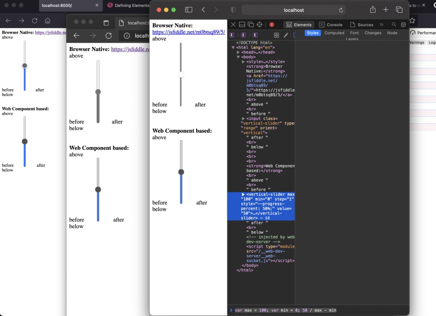
Let's see how our custom element compares to the native slider we started out with.

Here's what it looks like in various browsers.

(From left to right: Firefox, Chrome, Safari, Edge)
Advanced Styling
This is a good start, but there are two problems we're facing now.
- Our slider looks different in all 4 browsers (Chrome, FF, Edge, and Safari)
- The slider's styles aren't easy to customize
Let's solve both of these problems by disecting the slider into two parts: the thumb and the track. The thumb is the indicator you grab and move around. The track the long axis that the thumb moves along. We want to make both of these easy to customize.
Styling the thumb
It's important to note that we have to seperate vendor-specific selectors to accommodate polyfills. We can't do:
.slider::ms-thumb,
.slider::-moz-range-thumb {
  /* nope! */
}
To keep things dry, we'll bake our thumb styles into a variable and reuse them in each vendor-specific selector.
// slider.styles.ts

const thumbStyles = `
  cursor: pointer;
  height: var(--thumb-size);
  width: var(--thumb-size);
  border-radius: 50%;
  border: none;
  outline: 1px solid var(--thumb-outline);
  margin-top: calc((var(--thumb-size) / -2 + var(--track-width) / 2) - 1px);
  background-color: var(--thumb-color);
`

export const styles = `
  :host {
    --thumb-border: rgb(80, 80, 80);
    --thumb-color: rgb(80, 80, 80);
    --thumb-size: 16px;

    /* Allows us to style the slider our own way */
    -webkit-appearance: none;
  }

  /* https://css-tricks.com/styling-cross-browser-compatible-range-inputs-css/ */
  /* Special styling for WebKit/Blink */
  .slider::-webkit-slider-thumb {
    -webkit-appearance: none;
    ${thumbStyles}
  }

  /* All the same stuff for Firefox */
  .slider::-moz-range-thumb {
    ${thumbStyles}
  }

  /* All the same stuff for IE */
  .slider::-ms-thumb {
    ${thumbStyles}
  }
`

The thumb now looks like this. Now we'll focus on the track.
Styling the Track
We'll split the track up since each browser implements them a bit differently.
// slider.styles.ts

const trackStyles = `
  width: var(--track-height);
  height: var(--track-width);
  background-color: var(--track-color);
  border: 1px solid var(--track-border-color);
  border-radius: var(--track-radius);
`

export const styles = `
:host {
  --track-height: 100%;
  --track-width: 6px;
  --track-radius: 6px;
  --track-color: rgb(225, 225, 225);
  --track-border-color: rgb(105, 105, 105);
}

.slider::-webkit-runnable-track {
  ${trackStyles}
}

.slider::-moz-range-track {
  ${trackStyles}
}
`
Now we have a styled thumb and a track!
Bonus Feature
Since we have more control over how the slider is being styled, we can take things a step further and make the track reflect the current value by styling it differently above and below the thumb. Unfortunately, most browsers don't make this easy for us, but Firefox exposes a progress pseudo selector. Let's start with that.
export const styles = `
:host {
  --progress-color: rgb(20, 122, 255);
  --progress-border-color: rgb(20, 122, 255);

  /* ... */
}

/* ... */

.slider::-moz-range-progress {
  width: var(--track-height);
  height: var(--track-width);
  background-color: var(--progress-color);
  border: 1px solid var(--progress-border-color);
  border-radius: var(--track-radius);
}
`
This covers us for Firefox, but we need to target the remaining browsers. Fortunately, we can use a linear gradient and make use of CSS custom properties to tap into the slider's value.
.volume-slider::-webkit-slider-runnable-track {
  background: linear-gradient(to right, var(--progress-color) 0%, var(--progress-color) var(--progress-percent), var(--track-color) var(--progress-percent), var(--track-color) 100%);
}
Astute readers may have noticed that we haven't defined --progress-percent yet. This value needs to reflect the thumb's position along the track as a percentage. Let's go back to the component and make it set this variable when the value changes.
Go to src/vertical-slider/index.ts. Here we will add the logic that will update our progress-percent as the value of the slider changes.
// slider.ts

export class VerticalSlider extends FASTElement {

  // ...

  connectedCallback (): void {
    super.connectedCallback()
    const progressPercent = `${(this.value / this.max) * 100}`
    this.updateProgress(progressPercent)
  }

  valueChanged (_oldValue: number, newValue: number) {
    const progressPercent = `${(newValue / this.max) * 100}`
    this.updateProgress(progressPercent)
  }

  updateProgress(value: string) {
    this.style.setProperty('--progress-percent', value + '%')
  }
}
At last, the fruit of our labor! A cross-browser, consistent vertical slider custom element that uses the browser's built-in <input type="range">!
And heres a codepen of everything in 1 file.
https://codepen.io/paramagicdev/pen/LYjqXrZ?editors=1010
Closing Thoughts
There are even more features we could bake into the component such as a disabled state, tooltip values, and a wide array of other things you can find present in something like Shoelace's Range Component. However, those are outside the scope of this post. I'll consider them an exercise for the reader. In addition, if you need a fully customizable slider, you may be better off constructing your own not using an <input type="range"> purely because it is fairly inflexible. It doesn't accept nested children. Styling is difficult due to browser prefixes, and using custom thumbs is also challenging.
If you'd like to see the <vertical-slider> component's full source, check out the repo on GitHub. This component is not currently released as an NPM package.


Latest comments (0)