Update 07.02.2023: It's been a moment since I made this sample, and I see it still has readers =) Thank you!
I improved it in the meantime (see GitHub), and I am updating this post accordingly.
Important: The new version is now usingSPFx 1.16
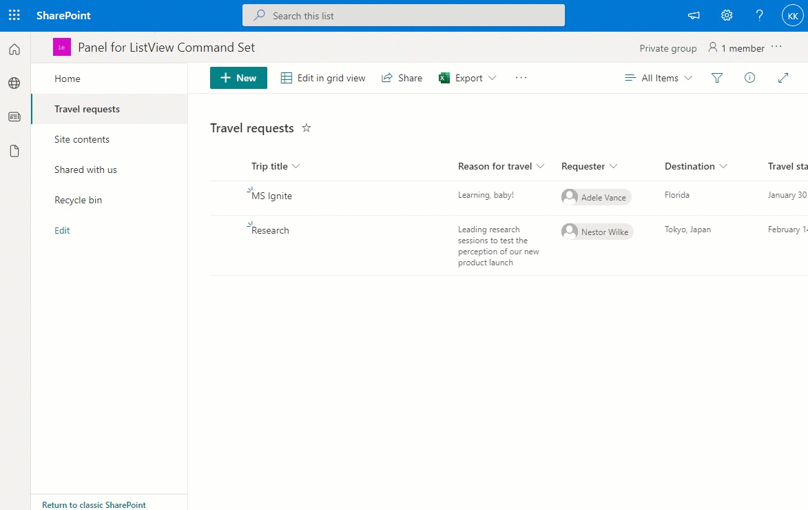
Although SharePoint Online displays list forms in a panel, all the examples and samples for ListView Command Sets are using dialog controls.
Typically, it's a no-brainer to open/close panel if it's controlled by a parent component. In the case of ListView Command Set, this requires slightly more effort.
StatefulPanel
The StatefulPanel component is using isOpen state to control Panel state. Once it's dismissed, the isOpen is set to false, and a props.onDismiss() method is executed. This is important if you need to refresh the page, after the StatefulPanel is closed.
To make sure the StatefulPanel may be used the same way a regular Panel is, the type of the props is wrapped in React.PropsWithChildren.
IStatefulPanelProps.ts
import { IPanelProps } from "@fluentui/react";

export interface IStatefulPanelProps extends IPanelProps {
    panelTop: number;
}
StatefulPanel.tsx
import { IPanelStyles, Panel, PanelType } from "@fluentui/react";
import { useBoolean } from "@fluentui/react-hooks";
import { loadStyles } from "@microsoft/load-themed-styles";
import * as React from "react";
import { IStatefulPanelProps } from "./IStatefulPanelProps";

export default function StatefulPanel(props: React.PropsWithChildren<IStatefulPanelProps>): JSX.Element {
    const IframePanelStyles: Partial<IPanelStyles> = {
        root: { top: props.panelTop },
    };
    const [isOpen, { setTrue: setPanelOpen, setFalse: setPanelClosed }] = useBoolean(false);

    React.useEffect(() => {
        loadStyles("panel");
        setPanelOpen();
    }, []);

    const _onPanelClosed = (): void => {
        setPanelClosed();

        if (props.onDismiss !== undefined) {
            props.onDismiss();
        }
    };

    return (
        <Panel className="od-Panel" headerText={props.title} isOpen={isOpen} type={PanelType.medium} isLightDismiss={false} styles={IframePanelStyles} onDismiss={_onPanelClosed}>
            {/* Ensure there are children to render, otherwise ErrorBoundary throws error */}
            {props.children && <>{props.children}</>}
        </Panel>
    );
}
Custom component
MyComponent wraps all the Forms/Lists/Controls in the StatefulPanel.
MyComponent.tsx
export interface IMyComponentProps {
    selectedRows: readonly RowAccessor[];
    context: ListViewCommandSetContext;
    panelConfig: IStatefulPanelProps;
}

export default function MyComponent(props: IMyComponentProps) {
    const [refreshPage, setRefreshPage] = useBoolean(false);

    const _onPanelClosed = () => {
        if (refreshPage) {
            //Reloads the entire page since there isn't currently a way to just reload the list view
            location.reload();
        }
    };

    return <StatefulPanel
        title={props.panelConfig.title}
        panelTop={props.panelConfig.panelTop}
        shouldOpen={props.panelConfig.shouldOpen}
        onDismiss={_onPanelClosed}
    >
        <Toggle
            label="Refresh the page when panel closes:"
            inlineLabel
            onChange={setRefreshPage.toggle}
            onText="Yes"
            offText="No"
            defaultChecked={refreshPage} />
    </StatefulPanel>;
}
CommandSet
The CommandSet code requires minimal changes to replace Dialog with a Panel.
PanelCommandSet.ts
export default class PanelCommandSet extends BaseListViewCommandSet<IPanelCommandSetProperties> {
  private panelPlaceHolder: HTMLDivElement = null;
  private panelTop: number;

  private _showComponent = (props: IMyComponentProps): void => {
    ReactDOM.render(React.createElement(MyComponent, props), this.panelPlaceHolder);
  }

  @override
  public onInit(): Promise<void> {
    this.panelTop = document.querySelector("#SuiteNavWrapper").clientHeight;
    this.panelPlaceHolder = document.body.appendChild(document.createElement("div"));
    return Promise.resolve();
  }

  @override
  public onExecute(event: IListViewCommandSetExecuteEventParameters): void {

    switch (event.itemId) {
      case 'COMMAND_1':
        this._showComponent({
          panelConfig: {
            panelTop:this.panelTop,
            shouldOpen:true,
            title: "Panel",
          },
          selectedRows: event.selectedRows,
          context: this.context,
        });
        break;
      default:
        throw new Error('Unknown command');
    }
  }
}
Application Insights
The new version of SPFx Panel is using ApplicationInsights and a React plug-in for Application Insights JavaScript SDK.
One important thing to remember when using the React plug-in is that you need to set allowSyntheticDefaultImports to true in your tsconfig.json file:
tsconfig.json
{
  "extends": "./node_modules/@microsoft/rush-stack-compiler-4.5/includes/tsconfig-web.json",
  "compilerOptions": {
    "allowSyntheticDefaultImports": true,
  }
}
@fluentui/react
The @microsoft/office-ui-fabric-react-bundle package is now deprecated and since SPFx 1.16, it's recommended to use @fluentui/react instead.
If, just like me, you were already using @fluentui/react in your project, make sure that you update the package version to v8. Only @fluentui/react v8 supports React v17.0.1 (which is required for SPFx 1.16)
Source code
You can see the source code here: https://github.com/kkazala/spfx-Panel
Or, if you prefer to try it our right away, the packaged solution is here.
UPDATE 17.01.2022: I just created a suggestion to update @microsoft/generator-sharepoint, to create Panel instead of Dialog. Please vote it up if you agree =)


Latest comments (0)