Does the word really need yet another post on how to create SPFx solutions? For sure not, and it's not my goal here. But things are changing faster than the SPFx project generator, and tips&tricks are all over the place.
This Quick Start focuses on SPFx v1.13+ projects, and references documentation (because who reads the manuals before diving head-first into development) and blogs to help you start right from the beginning.
First things first
Know your target
SPFx 1.13.1
Before setting up your SharePoint Framework development environment, decide which SharePoint and SPFx versions you want to target. Here, I'm going to focus on the latest, SPFx v1.13.1.

Node Version Manager
Different SPFx versions require different node runtimes, and the easiest way to switch between them is to use Node Version Manager. This allows you installing and switching between multiple node.js and npm versions.
Don't feel tempted to update to npm v7 just yet, it's still not supported.
Package Manager
If you target SPFx v1.5+, and want to speed installation up, you may use pnpm, which will save disk space and speed installation up. Have a look here for a comparison.
Wrap up:
[ ] Install nvm for Windows or unix, macOS, and windows WSL
[ ] Install NodeJS on Windows
[ ] Install pnpm
[ ] Set up your SharePoint Framework development environment
Quick check:
> node --version
v14.15.0
> npm --version
6.14.8
> pnp --version
6.30.0
> yo --version
4.3.0
We are good to go!
Toolchain: good to know
@microsoft/generator-sharepoint vs @pnp/spfx
One of the npm packages included in the SharePoint Framework toolchain is
@microsoft/generator-sharepoint, a Yeoman plugin used to create new SPFx projects.
You may also consider using @pnp/spfx which extends the Microsoft's generator with additional features (VueJS, anyone? Jest? Pipelines?).
@microsoft/sp-lodash-subset
Another important one is @microsoft/sp-lodash-subset which is a custom bundle of lodash. It includes only the most essential functions.
@microsoft/office-ui-fabric-react-bundle
@microsoft/office-ui-fabric-react-bundle is a custom bundle of office-ui-fabric-react that is optimized for SharePoint Framework.
SPFx v1.13.1 is using "office-ui-fabric-react" v7. As of version 8, the office-ui-fabric-react package has been discontinued in favor of @fluentui/react but don't feel tempted to upgrade, it is recommended to use the Office UI Fabric React package included in by default.
Scaffold a new project
yo @microsoft/sharepoint options
Starting with SPFx v1.5, there's a support for additional package managers: PNPM and Yarn, with pnpm being my personal favorite:
yo @microsoft/sharepoint --package-manager pnpm
When creating a monorepo, you may want to
yo @microsoft/sharepoint --skip-install
to allow your monorepo build orchestrator to manage common node_modules folder and to create symlinks.
I'm going to create a Quick Start WebPart using React.
ESLint as static analysis tool for TypeScript
The generator is still using TSLint, which has been deprecated since, like, forever. It will be eventually updated, but for now we need to do the job ourselves.
To replace it with ESLint, follow the SharePoint Framework with ESLint article.
But wait, gulp-eslint7 is already deprecated as well. Use gulp-eslint-new instead:
Remember to use PNPM :
pnpm install eslint @typescript-eslint/parser @typescript-eslint/eslint-plugin gulp-eslint-new eslint-plugin-react --save-dev
And just as Sergei mentioned in his post, you will receive an error after running gulp build for a WebPart using React: error Don't use{}as a type.{}actually means "any non-nullish value.
Instead of changing {} to 'unknown', how about using functional components instead?
QuickStart.tsx
export default function QuickStart(props: IQuickStartProps) {

    return (
      //...
              <p className={ styles.description }>{escape(props.description)}</p>
      //...
    );
}
Oh wait, but why am I still receiving tslint errors?
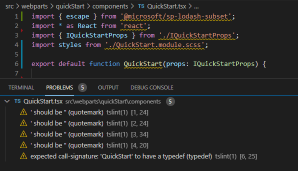
One of the packages comprising SharePoint Framework is @microsoft/sp-tslint-rules which defines custom tslint rules for usage with SharePoint client-side projects. They are still part of the solution, whilst tslint.json, disabling some of the rules, is not.
I don't feel adventurous today, I'm restoring the tslint.json.
See what changed: GitHub.
Developer information
Update developer information in the package-solution.json; if the WebPart will be used in Microsoft Teams, users will see this information when installing the app in Teams.
Ain't time to lose
Tired of waiting for the serve command to complete, after each change you make? Use spfx-fast-serve, "a command line utility, which modifies your SharePoint Framework solution, so that it runs continuous serve command as fast as possible".
After installing the spfx-fast-serve globally, navigate to your solution's folder and run the following commands:
spfx-fast-serve
pnpm install
If you are using ESLint instead of TSLInt, you need to add the following configuration:
fast-serve/config.json
  "serve": {
    "eslint": true
  }
Now you can simply run pnpm run serve to start working with your solution. Make a change in your code and see how fast the page will refresh. What a difference!
Remember, that SPFx 1.13+ does not support local workbench. See Debugging SPFx 1.13+ solutions
See what changed: GitHub.
Error logging
Add error logging with @pnp/logging. Define Log level as a property to enable Verbose logging only when needed.
pnpm install @pnp/logging
Errors returned by @pnp/sp commands are handled using Logger.error(e), which parses and logs the error message. If the error message should be displayed in the UI, use custom errorhandler function implemented based on Reading the Response example.
Users shouldn't see this setting, as it provides no value for them. Simply don't include it in the property pane.
QuickStartWebPart.ts
import {
  ConsoleListener, Logger
} from "@pnp/logging";

export interface IQuickStartWebPartProps{
  logLevel?: number;
}
export default class QuickStartWebPartextends BaseListViewCommandSet<IQuickStartWebPartProps> {
  @override
  public onInit(): Promise<void> {
    Logger.subscribe(new ConsoleListener());
    if (this.properties.logLevel && this.properties.logLevel in [0, 1, 2, 3, 99]) {
      Logger.activeLogLevel = this.properties.logLevel;
    }
    Logger.write(`${LOG_SOURCE} Initialized QuickStartWebPart`);
    return Promise.resolve();
  }
}
You may define the logLevel to error (3) in WebPart's manifest:
QuickStartWebPart.manifest.json
{
  "preconfiguredEntries": [{
  //...
    "properties": {
      "description": "QuickStart",
      "logLevel":3
    }
  }]
}
and set it to verbose (0) when troubleshooting is needed using Set-PnPClientSideWebPart.
Set-PnPClientSideWebPart -Page Home -Identity xxx -PropertiesJson '"properties": {""description"": ""QuickStart"",""logLevel"":0}'
See what changed: GitHub
In case you are using this approach with Custom Actions, you may define the logLevel using Add-PnPCustomAction command
Add-PnPCustomAction -Title "Panel" -Name "panel" -Location "ClientSideExtension.ListViewCommandSet.CommandBar" -ClientSideComponentId "xxxxxxxx-xxxx-xxxx-xxxx-xxxxxxxxxxxx" -ClientSideComponentProperties "{""logLevel"":""3""}" -RegistrationId 100 -RegistrationType List -Scope Web
Updating the logLevel in an already deployed solution is done with:
$ca=Get-PnPCustomAction -Scope Web -Identity "xxxxxxxx-xxxx-xxxx-xxxx-xxxxxxxxxxxx"
$ca.ClientSideComponentProperties="{""logLevel"":""1""}"
$ca.Update()
See Working with modern client-side pages using PnP PowerShell for examples on how to obtain your WebPart's identity.
Missing peer dependencies
If, like me, you are using pnpm, you have seen a lot of ✕ missing peer typescript@ during pnpm install:
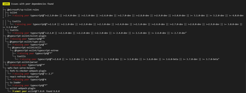
This is simply becasue pnpm is less forgiving, compared to npm or yarn. Once you add typescript to your devDependencies, the warning will dissapear:
  "devDependencies": {
    //...
    "typescript": "^3.9.0"
  }
Imports done right
When it comes to optimizing your solution, there's one low-hanging fruit: imports.
Instead the whole library, reference only specific method(s) you want to use.
And it it's going to be used only in specific cases, use dynamic imports
Localizing
Localize your solution as described here. You can get the currentUICultureName from spPageContextInfothis.context.pageContext.legacyPageContext property.
Using different values in development and production?
Don't hard code, use this approach instead.
Using React?
Functional Components vs. Class Components
The React component created by the generator is using a class component: React.Component. Consider using functional components instead. It's cleaner, easier and use hooks.
And although there are no plans to remove classes from React, even @fluentui/react v8 converted some components from class components to function components.
Error Boundaries
Use Error Boundaries to catch JavaScript errors in the component tree, and to display a fallback UI.
There's already an react-error-boundary component you can download
Strict mode
Consider using strict mode for highlighting potential problems in an application. Strict mode checks are run in development mode only; they do not impact the production build.
Fluent UI React
Use Fluent UI's controls to build user interface, and ThemeProvider to apply contextual theming.
To style specific component using colors from current theme:
import { getTheme, Stack, IStackStyles} from "office-ui-fabric-react";
const theme = getTheme();

const stackStylesParent: IStackStyles = {
    root: {
      background: siteTheme.palette.themeLighter
    },
};

export default function MyComponent(props: IMyComponentProps) {
  return <Stack styles={stackStylesParent} >
  </Stack >;
}
I realize this list could go on and on, but let me stop here.
Or did I forget something really important? Please share your tips in the comments below! :)


Top comments (0)