This week I have been playing around a lot with CSS Grid and learning different ways to implement simple, responsive layouts. I always found it difficult to wrap my head around styling. It would always take me multiple days of trial and error trying to get things where I wanted them, and even then there would always be a stubborn element or two that would just never fall in place exactly where I wanted it. As a consequence CSS quickly became my least favorite part about web development, and I always dreaded having to do it. I decided that maybe it was time to take that challenge head on and get a little more comfortable with how things work. After all, how can we grow our skills if we don't expand into areas we aren't comfortable with.
In this post, we are going to be talking about the layout below, and the ways that I found to implement it that made sense for me. Keep in mind that there are so many ways to style in CSS, and you should take the approach you are most comfortable with. For me, I found a more visual approach much easier to understand as I was trying to get a better understanding of how Grid works.

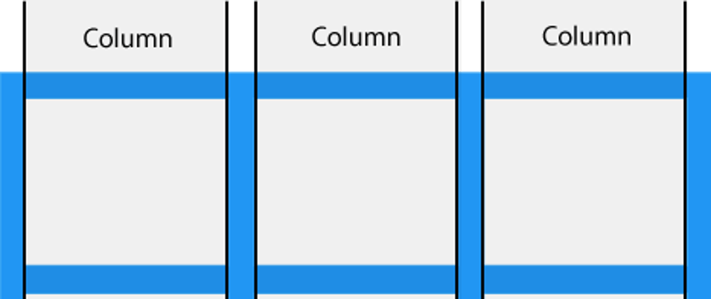
The layout is very simple, but a common design choice for a lot of different websites. We have a navigation bar at the top, a footer at the bottom, and between those are a main middle column and a smaller side column to each side.
The HTML for this is very simple, as it is just a demo template:
<body class="container">
   <nav class="navbar">
       <ul class="nav-links">
           <li class="nav-item">Home</li>
           <li class="nav-item">About</li>
           <li class="nav-item">Contact</li>
           <li class="nav-item">Logout</li>
       </ul>
   </nav>
   <section class="left-side">Left Side</section>
   <main class="middle">Middle Section</main>
   <section class="right-side">Right Side</section>
   <footer class="foot">Footer</footer>
</body>
In order to use Grid, you will need to have a parent element to act as the container. In this case, I used the body, but in a real use case you may want to opt for a div or something similar. Set a class (I used a simple container) that can be used in the CSS file, and give it the property display: grid;. This will allow the container to act as a big grid and you will be able to align all of the child elements inside using the power of CSS Grid.
From here, there are many different ways you can start putting the children elements where you want them. You could use grid-template-rows and grid-template-columns. You could also try grid-template-area. For me, the most visual solution was to use grid-template which allows you to simply give each element a name and type out where you want them to go. It also allows you to specify heights and widths of columns and rows all in one property.
So the first step is to give each element a name with the grid-area property. This is what my code looks like:
.navbar {
    grid-area: nav;
}

.left-side {
    grid-area: left;
}

.middle {
    grid-area: middle;
}

.right-side {
    grid-area: right;
}

.foot {
    grid-area: foot;
}
Great! Now that all of our elements have names, we can use them in the grid-template property of our container element to lay out how we want them to be placed. If we look at our layout we can see that the grid itself has 3 rows and 3 columns. Let's lay out our first row:
grid-template:
   "nav nav nav" 10%
This basically tells the browser, I have one row with three columns. In this one row, have the element called nav take up all three columns, and give it a height of 10%. You can scale this process to however many rows and columns you want. For me, I find using relative units better for responsiveness, but however you chose to implement that is up to you. You can use pretty much any method of specifying column height.
Let's see what it looks like with all of the rows and columns defined:
body {
   display: grid;
   grid-template:
    "nav nav nav" 10%
    "left middle right" 70%
    "foot foot foot" 20%
}
You can see how this strategy might be advantageous. It's very simple to just place all of the elements where you want them within the grid and then specify the column height. If you've been following along though, you might notice that everything is not quite how it should be yet though. That's because we forgot one last thing: the row widths. Using the grid-template property, just separate out your columns and rows with a /. All you have to do is add your row widths:
body {
   display: grid;
   grid-template:
    "nav nav nav" 10%
    "left middle right" 70%
    "foot foot foot" 20%
    / 15% 70% 15% ;
}
And that's it! At the end we have three rows: the first 15%, second 70%, and third 15%.
Implementing the layout this way really helped me visualize what was going on with Grid as I was placing my elements. It also helped me understand better how the other properties you can use instead work. If you'd like to take a look at the video I used to help understand this, you can check it out here. The video does a great job building up from basic grid to this implementation.
If you liked this post, feel free to follow me elsewhere on Twitter, Github, or LinkedIn. Happy Coding!


Oldest comments (4)
What's up, Kevin! Thanks for your insight on CSS Grid and how to easily get started. I've been tinkering with Grid and Flexbox myself these past few weeks... Codepen has been my best friend for testing styles. Good job, man!
Thanks so much, I'm glad you enjoyed it! I've had a general aversion to CSS, but I'm finding the more I give myself opportunities to understand it more, the more I'm enjoying working with it.
Love CSS Grid! I found that it only took a week or two to get well accustomed to it.
Nice post! I have been trying to figure out how to better use Grid lately, and this is the best write-up/basic overview that I have seen.