With the ever-growing jungle that is the web, the need for web design standards only grows with it. Gaining more awareness and a better understanding over accessibility is tantamount.
My club, KPMD, or Korean pop Music and Dance, is one of the K-pop communities and organizations on Penn State University. Inherently, we are not a dance club, but we aren't not a dance club? We have two essential bodies that come together to make KPMD. We have our discussion-side leaning more on culture, talk, and simple socializing. On the other hand we have the option for people to dance, no experience is required and most people do it for fun as a way to exercise.
With that intro out of the way, I was curious after learning about a11y, web.dev, WAVE, and other web performance, accessibility, SEO, and more:
- There's actual standards for web design?
- Some people actually care about websites being accessible by all people?
- How well was KPMD doing in terms of it?
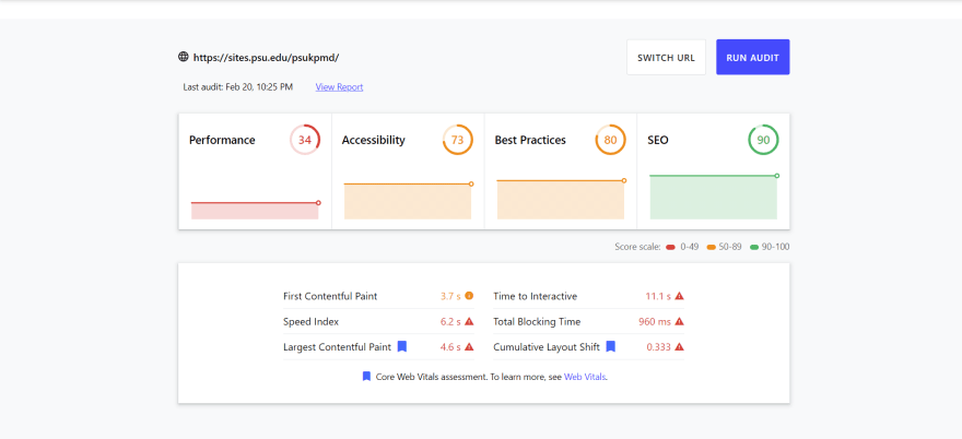
Here were the audit results:
KPMD web.dev
KPMD Lighthouse Report

KPMD WAVE extension

On initial impression, I didn't really understand why anyone would implement any of the reported errors when viewing Lighthouse and web.dev. WAVE showed off direct point outs on the website itself though it may be hard to orient content when modified like so. Another worry was that inherently this the foundation for sites.psu.edu utilizing WordPress may have had a lot of dependencies to begin with. So I chose to double check their home site's results as well.
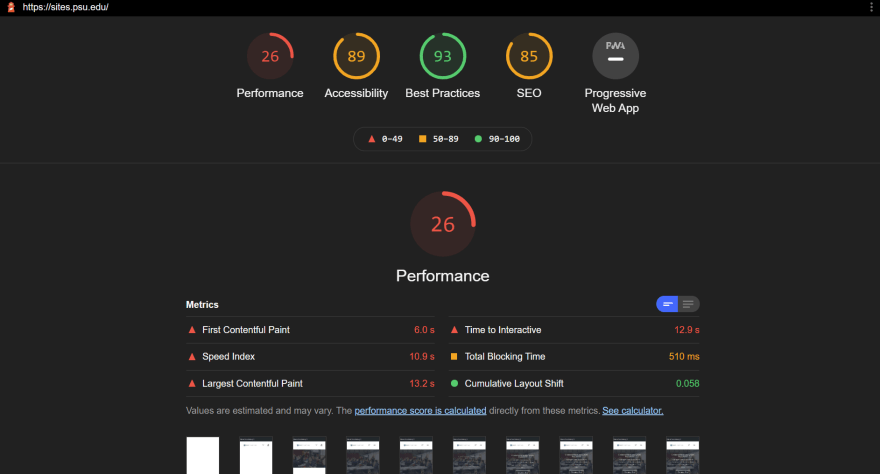
Here are sites.psu.edu results:
Sites web.dev

Sites Lighthouse Report
Sites WAVE extension

While the accessibility score is higher, the performance score is somehow lower.
While some pieces of the audit may seem self intuitive, it's not always good to assume things about stuff you're not an expert in. So in the end I tried going in more depth research over a few elements. Some of the ones I chose to delve into were:
- Total Blocking Time
- Eliminate render-blocking resources
- ARIA element and content (in general)
Regardless the ability to being open to updates and aware whether change is needed are both tantamount to future web standards that can help cater to those of differing levels of necessary accessibility.
Total Blocking Time
This is essentially used to indicate how long the site loads until interactivity and responsiveness are available to the user. It is measured by when the main thread is blocked by "Long Tasks" or basically whenever a task runs longer than 50 milliseconds. The main thread being where the browser loads and paints events. For both the root psu.edu site as well as KPMD's, both had rather large TBTs, all exceeding 500ms, and the rest being between 700-900ms. Usability-wise this is rather low, with the average TBT of sites according to web.dev being <300ms.
Eliminate render-blocking resources
What Total Blocking Time was was what I thought Render Blocking Resources were at first. Render blocking resources are apparently URLs blocking the first paint of your page (according to web.dev). Basically while it may affect responsiveness, it is more geared toward just the first contentful paint.
ARIA (Accessible Rich Internet Applications)
I was most interested in this because it was completely unknown and related to accessibility. Plus the things around it I also didn't know. Other acronyms that popped up were WAI (Web Accessibility Initiative) and WCAG (Web Content Accessibility Guidelines) which are all inter-related. From just googling it, the gist I got was it being a standard by W3C and assistance for web developers to create accessible website. It helps with alternate navigation and user interaction as well as accessibility on tech like screen readers providing descriptions for elements on a web page.
Overall the sites.psu.edu and my own club KPMD's websites were both lacking and had room for improvement granted most college kids tend to make sites based on artistic choices rather than accessibility I believe. Accessibility and performance in relation to each other are definitely important to consider.
Video on Topic: https://www.youtube.com/watch?v=uyVb1o2VThE
YouTube Channel: https://www.youtube.com/channel/UCjR8IqMXgs6H69ZQqrsS1Vw
Tools Used:
- web.dev measuring tool https://web.dev/measure/
- WAVE google chrome extension https://chrome.google.com/webstore/detail/wave-evaluation-tool/jbbplnpkjmmeebjpijfedlgcdilocofh
- Lighthouse google chrome extension https://chrome.google.com/webstore/detail/lighthouse/blipmdconlkpinefehnmjammfjpmpbjk
Regarding that, an interesting read was one where someone attempted to maintain a perfect accessibility score on Lighthouse while absolutely messing up accessibility in reality. Basically they wanted to point out to not always rely or become dependent on only tools like such as discrepancies and things good in theory can still happen (though this is hyper specific haha). Here's the link! https://www.matuzo.at/blog/building-the-most-inaccessible-site-possible-with-a-perfect-lighthouse-score/


Top comments (1)
Great to see someone getting interested in performance and accessibility (two subjects I care greatly about!)
I currently have an Ask Me Anything post about accessibility and performance that is very quiet so feel free to ask any questions over there as you learn about / don't quite understand something.
I had a quick look at the site, here is a list of the immediate issues for you to research and fix for accessibility (happy to give hints if you need them).
hrefand as such it is not focusable.Useful Resource: W3 "fly-out menus" page
Along the same lines your focus indicator needs improving, it is very easy to get lost when using a keyboard. (just Tab around the page and you will see what I mean!)
Heading structure - your page uses a lot of heading level 1s
<h1>and then jumps to heading level 4s<h4>. Headings are important for screen reader users and so should only increase by one level at a time due to the way they use them to orientate themselves on a page (it is expected to have 1<h1>to describe the current page and then section the information with headings in a logical structure after that (so<h2>for sections,<h3>for subsections within each section etc.)Those are 3 "fun" ones to get you started!
Oh and last thing,
ariais wonderful but most of the time semantic HTML elements are far better so spend your time researching which is the correct HTML element to use for a scenario first, think ofariaas your last resort if you can't use a native HTML element.As for performance:
Inlining critical CSS, although your biggest win is also really difficult. There is a decent introduction to critical CSS on smashing magazine if you want to understand about that (beware the plugins that claim to do it for you, I haven't seen one work properly as of yet but your mileage may vary).
With the YouTube video scripts, you can lazy load them after everything important as loaded (as it is off the page). The simplest way is to wrap the initialisation script in a
setTimeout. The better way is to initialise it after everything else.One super quick way to improve overall performance would be to add defer to your JavaScript script tags (use
defernotsyncunless you know what you are doing,asynccan mean scripts load out of order so if one depends on another your site may break!).Also combining and minifying your CSS and JS would be a super quick win. For that there are loads of plugins for WordPress (I don't do WordPress sites anymore but I used to use W3 Total Cache - not sure if it is still good but it used to be).
Anyway just a few things to get you started, I hope you fall in love with accessibility and performance like I did as they are really interesting and important subjects few people know enough about!