So when I decided to build a new website and resume, I made the decision to use the same design in both. As I wanted to start applying for jobs and the first thing it is always asked is the resume, I decided to do that first.
I got inspiration from some websites online (as I am not a designer) and I decided to keep it simple: one accent color, two shades of gray and a light color for text. So I chose these ones:
html {
  --accent-color: #5addf3;
  --page-background-color: #191919;
  --content-background-color: #525659;
  --text-color: #ffffff;
}
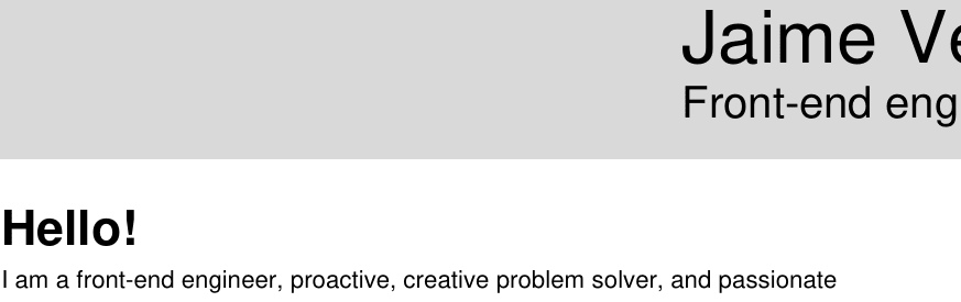
So this is how my resume would look like:

I know many companies still print resumes for interviews etc., so I decided to create a printer-friendly-version as well. Trying to be as environment-friendly as possible:
I know what you are thinking: how could you chose those colors, it is pretty obvious that there is no enough contrast!!! And yes, I suspected that but I didn't pay so much attention to it until I started building the website and started checking accessibility... You can do that very easily in your browser dev-tools:

Firefox web dev tools

Chrome dev tools
Yeap, too bad :(. Does Microsoft Word have any tools to check the accessibility of your document? I have no idea but maybe they should.
So I guess better late than never, so, unfortunately, I would have to make changes in the color palette and change my resume to use the new ones.
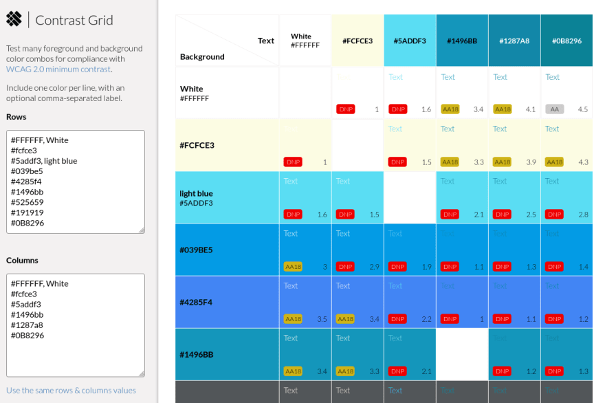
Searching on the Internet I came across this really useful website:
And it really really really helped. You set the color and background colors and show you how it looks and the contrast score:
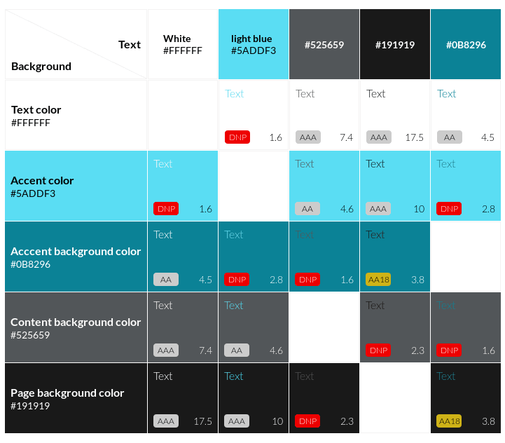
After spending some time choosing the colors I realized that I would have to extend the palette to add one additional color, as a darker blue would not work with a gray background. And I made a compromise not targetting 100% AAA contrast and settling only in AA. One of the ideas I have is to provide multiple themes for the website, so I might introduce later a high-contrast theme to hit AAA. I settled on this color palette for now:
html {
  --accent-color: #5addf3;
  --accent-backgroud-color: #0B8296;
  --page-background-color: #191919;
  --content-background-color: #525659;
  --text-color: #ffffff;
}
And...

Of course, this is just the beginning. My goal is to make sure the final website keeps the same score.


Latest comments (0)