👋 It's a me! Ma-... Just kidding, Mario is a plumber, not a Software Developer... right?
Topic of the day
Anyway, today I want to talk about a very popular CSS property -> border-radius. This property allows you to create awesome looking elements with nice curved edges/corners. You can use it to create nice circular border for profile images or buttons, for example.
The typical usage may be using one argument as a percentage or other units to round the corners, as below:
One value
border-radius: 25px;

border-radius: 50%;

More than one argument
But recently, I learnt that you could have more control over the individual corners with more arguments. This can result in some interesting shapes!
Lets take a look at how providing different numbers of arguments affect the roundness of each corners. But first, take a look at the below image, it shows the order the values applies to the corners. It starts from TOP LEFT moving clockwise to BOTTOM LEFT.

Two values
When you use two values, the first represents the TOP LEFT and BOTTOM RIGHT and the second represents the TOP RIGHT and BOTTOM LEFT (like what I color-coded in the above picture).
border-radius: 50px 20px;

Three values
When you use three values, the first represents... TOP LEFT (remember it always starts there), the second represents the TOP RIGHT and BOTTOM LEFT (they are a pair) and the third represents the BOTTOM RIGHT.
border-radius: 50px 20px 100px;

Four values
You might be able to guess which four values represents which corners... The first value represents the TOP LEFT and it moves clockwise.
border-radius: 10px 30px 50px 80px;

This concludes the basic options that you can use to control the roundness of each corners. But wait...there's more! 😮
More than four values! 8 Values
🤯 Not only can you control each corners individually, if you use 8 values (4 / 4) you can control the horizontal and vertical axes (the semi-major and the semi-minor axes) of each ellipse (circle is a special kind of ellipse) that creates the border radius. This can get a little complicated, but the maths nerd in me found it super fascinating and I spent some time playing (graphing) with the ellipse equation and CSS border-radius to learn more, it was fun.
Lets start simple, any values on the left of the slash represents the horizontal axis of the ellipse and the corresponding value on the right of the slash represents the vertical axis.
Note: Remember one value applies to all corners, so we are setting here, all horizontal axis of the ellipse to be 100px and the vertical to be 20px.
border-radius: 100px / 20px;

You can see that if we provide different values for the horizontal and the vertical, the "roundness" of our corner looks a little off, this is due to the ellipse. As mentioned above, a circle is a special type of ellipse, where both the major and minor axes have the same length, this means that if we set the horizontal and vertical values to be the same, we will get a nice circular border radius.
Note: Here, I used the value 0 for the 3rd and 4th corners so we can see a clear comparison. You will notice that if you leave out the right-hand side values of the slash, it will take the same value as the left.
border-radius: 100px 50px 0 0/ 20px 50px;


Summary
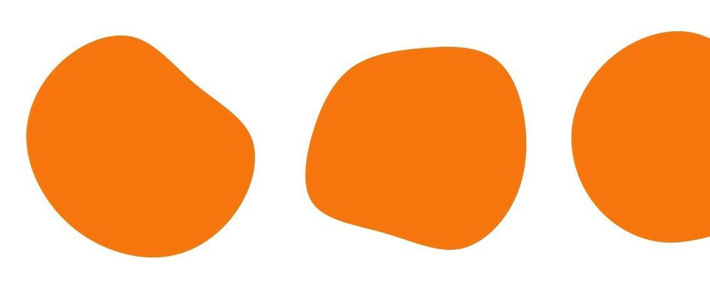
With this, we can fully control how we would like each corner to look like, whether it be fully nice and round or bent out of shape. You can end up with cool blob-like shapes, see below:

To learn more about it, I created a project Border Radius Playground which was inspired by the 8 point full control. I wanted to see how using px would affect the end shape, especially if the values of each point can be much bigger than the size of the container. Please check out "8 Point Full Control" if you want to read their documentation on border-radius and use this tool to create percentage border-radius for your next fancy border!


Latest comments (4)
8 values 🤯, CSS never fails to suprise you.
I know right! I thought it was just circles and ellipses... cool stuff :D
Nice. Could be fun to animate it too.
Cs_office