The segregated UI
After all the codebase we’ve been designing we can start with our UI development.
Our domain is set and we should be able to code the front of the front, sort of speak.
I provide to you two examples. The first one uses styled-components as third party library.
I think is the best choice because it could be combined with many other style tools (Tailwind, Material UI, and almost every one of them).
Bear in mind we are trying to have the less amount of UI components.
Our DOM should not be frequently updated and the solution to address this necessity relies mostly in a reusable grid component.
Like a film set of a TV show, we need a thin layer that leaves space to the children like windows in a wall.
Those children are the ones that update when UI events take place, but the grid keeps in cache until that happens reducing computing efforts at maximum.
I made my choose for an atom design folder architecture inside UI folder which distributes component in increasing granularity.
My personal choice is to gather the atoms I will reuse in a molecule in a single file with the same name, but you could organize it differently.
Let’s see the case of Grid atoms (src\UI\atoms\Grid.tsx) most precisely the main container:
const Container = styled.div`
  display: grid;
  height: 100vh;
  grid-template-rows: 0.2fr 0.5fr 2fr 0.2fr;
  grid-template-areas:
    'nav nav nav nav'
    'sidebar content content content'
    'sidebar main main main'
    'footer footer footer footer';
  text-align: center;
  grid-gap: 0.25rem;
  transition: all 0.25s ease-in-out;
  @media (max-width: 550px) {
    grid-template-columns: 1fr;
    grid-template-rows: 0.4fr 0.4fr 2.2fr 1.2fr 0.5fr;
    grid-template-areas:
      'nav'
      'content'
      'main'
      'sidebar'
      'footer';
  }
  color: white;
Styled components allows us to handle the display property like a grid defining the template grid areas which is extremely useful for our purpose.
Also, we could manage at the same component file the media queries to define how that template areas will behave in different viewports according to each device type. This is a very simple example this media queries should be robust enough to deliver a nice UX.
The rest of the children will have our Grid as parent and will perform as our static layout conforming one single molecule.
These are nothing else but empty boxes which its main concern is to layout our view once for all at the first load.
Our first UX molecule looks like this:
import { GridTemplateProps } from '../../common/models/props'
import { NavBar, ContentBox, Details, Main, SideBar, Footer, Container } from '../atoms/Grid'

const Grid = ({
  nav,
  main,
  details,
  side,
  footer,
}: GridTemplateProps): JSX.Element => {
  return (
    <Container>
      <NavBar>{nav}</NavBar>
      <ContentBox>
        <Details>{details}</Details>
      </ContentBox>
      <Main>{main}</Main>
      <SideBar>{side}</SideBar>
      <Footer>{footer}</Footer>
    </Container>
  )
}

export { Grid }
In almost every case this children are static components without any particular implementation because routes or pages names, title of the app, and footer data won’t change.
The Page Template, our only element to be render as a container component will then have a return statement that looks like this:
  return (
    <Grid
      nav={<Title/>}}
      main={!atHomeView() && <ItemsList items={items} />}
      details={<Details currentPage={currentPage} />}
      side={<SideMenu setView={setView} />}
      footer={<Title/>}
    />
  )
That component encapsulates the entire logic of render of our App.
But in order to make it work correctly we need to make a few observations regarding the effect hooks that the optimum update requires.
First thing we must implement is the correct consumption of the data stored in context.
This feature implies the use of the context which is not a big deal if you already have work with useContext before:
const { state, dispatch } = useContext(QueryContext)
A good practice could be returning the data of the context as well as exposing the functions declare inside with a custom hook, to avoid several definitions of this useContext.
In our case where we only have one single element as page it doesn’t represent any trouble.
Remember: declaring variables just once and calling only as needed is essential to obtain a performant product in React.
We are able to access the whole state, but we want just part of it to be available at our PageTemplate component’s state according to the view.
That’s the reason why we need to implement a logic to dynamically retrieve that relevant section automatically. This is the concern of the getViewState function:
  /* retrieve the relevant section of state by current view */
const getViewState = (state: BaseState) => {
    return state[state?.view as keyof BaseState]
}
A simple function using computed properties passed as parameter to return that particular entity state and not the whole object which still at our context available for every component tree of our App.
We want to populate the state of the page component only with the items that should be displayed in that route.
We want this to happen only in two scenarios. By the time of mounting, of course, populating state with the “allQuery” of that view. And any time that the state suffers a change. This should only happen after a dispatch to the store (e.g.: a user sets a parameter and the value of that parameter on state changes).
Just like this (src\pages\home\Home.tsx):
  const [items, setItems] = useState<AnyBusinessEntity[]>([])

  useEffect(() => {
    if (state) {
      setItems(getItemsByView())
    }
    // eslint-disable-next-line react-hooks/exhaustive-deps
  }, [state])
Nothing different from what you already know about useEffect. However, this is a good opportunity to make an observation.
You might find that I disabled the exhaustive dependency from my lintern.
That’s because following the common criteria we should include the getItemsByView signature.
In our case that will lead to an infinite loop and crash. This way anytime state changes (e.g.: the user chooses other view) the relevant children of our page component will re-render.
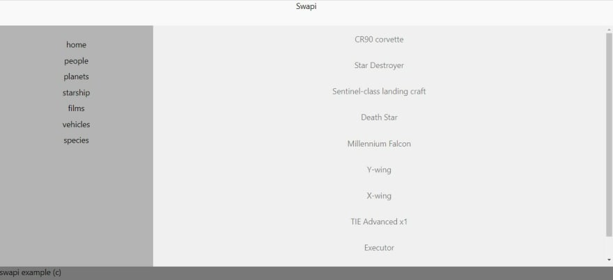
And there it is our layout first shot at “/starship”, rendering only names of each starship:
I told you that all the cool details on UI will be missing, but decoupling is done already. The green square shows the only two components that re-render any time the view changes.
I suggest you tracking this behaviour with the react devtools in your browser at “components”. From this point you could improve the UX as much as you want.
Owning your atoms
One thing I consider useful is to own your atoms, specifically boxes or containers.
That’s because we are considering huge UI changes such as a migration from a library or total redesign in case of our clients’ rebranding, etc.
Could be really annoying to “lose” your most simple div containers and re start from zero ground again.
Also, we can take advantage of the effort of designing of our base components to make development better experience: faster, easier to test, and more legible.
Let’s see (because of reasons of extension) the return statement of our BaseBox component (src\UI\atoms\Box.tsx):
  return (
    <div
      style={{
        display: "flex",
        width: `${w?.toString()}vw`,
        height: `${h?.toString()}vh`,
        flexDirection: setFlexDir(column, row),
        placeItems: placeItems ? placeItems : none,
        justifyContent: setJustifyContent(),
        alignItems: setAlignItems(),
        background: bg ? bg : none,
        borderRadius: rounded ? "7px" : none,
        padding: p ? px(p) : none,
        paddingTop: pt ? px(pt) : none,
        paddingBottom: pb ? px(pb) : none,
        paddingLeft: pl ? px(pl) : none,
        paddingRight: pr ? px(p) : none,
        margin: m ? px(m) : none,
        marginTop: mt ? px(mt) : none,
        marginBottom: mb ? px(mb) : none,
        marginLeft: ml ? px(ml) : none,
        marginRight: mr ? px(mr) : none,
        fontSize: px(fs),
        overflowY: "scroll"
      }}
    >
      {children}
    </div>
  );
This way we are making an abstraction that release us from using stylesheets separately and including a lot of code in each case.
Let’s suppose we want to right a container that has justify-content: space-around, scrollable on the “y” axis, a grey background, full height, and rounded borders.
Using our abstraction, we could define this type of box for containing list in our app. Then might looks like this:
const ListBox = ({ children }: any) => {
  return (
    <BaseBox justifySpaceAround h={100} bg="grey" scrollY rounded>
      {children}
    </BaseBox>
  )
}
Memoizing the list of items
One last thing to make all this example work right is required: memoization.
The ItemList component could lead us to an infinite loop if we let it go just like that.
Because state changes much more times than we want our item list to change. The solution to this is using Memo higher level API.
This enhancement is not only saving us from a preventive error is also allowing us to optimize our app.
Every time that a list of items is retrieved if that list doesn’t change, after all the reactive updates we designed, the already stored in cache list will be rendered.
This means that if a user visits a view, goes to another, and then come back, our view won’t re-render. React will show the already computed values saving a lot of effort to the client browser.
We declare our component in the usual way. This is a good opportunity to handle the loading scenario to give the user feedback during load.
And then we wrap up that component with the memo high order component a default export it to be injected in our PageTemplate and Grid component. Like this:
const ItemsListComponent = ({ items }: ItemsListProps): JSX.Element => {
  if (!items?.length) {
    return <div>loading...</div>
  }

  return (
    <BaseBox h={66} scrollY justifySpaceAround>
      {items?.map((i: any) => (
        <p key={setKeyByType(i)}>{i.name}</p>
      ))}
    </BaseBox>
  )
}

const ItemsList = React.memo(ItemsListComponent)

export { ItemsList }
Do not forget to set the View!
As I told you before despite we are leaving to react-router-dom the routing of our app we must set the view while our user clicks and redirects to another view.
We need two changes for that. The atom of our links in the side menu should receive a click function that dispatches the current view to our query provider state:
const SideMenu = ({ setView }: SideMenuProps) => (
  <SideContainer>
    {RoutesStack?.map((i) => (
      <SideLink
        style={{ paddingTop: "5vh" }}
        key={i.name}
        onClick={() => setView(i.name)}
        to={i.path}
      >
        {i.name}
      </SideLink>
    ))}
  </SideContainer>
);

export { SideMenu };
Finally, we obtained a UI that looks like this

Material UI example
As I told you this is a raw layout without any look and feel. The equivalent of the Grid we worked with styled-components but now with Material UI, with all the differences regarding implementation and library’s boiler plate, looks like this:
const Layout = ({ nav, sideMenu, main, footer }: LayoutProps) => {
  const classes = useStyles()

  return (
    <div className={classes.root}>
      <Grid container spacing={0}>
        <Grid item xs={12}>
          <Box className={classes.nav}>{nav}</Box>
        </Grid>
        <Grid item xs={3}>
          <Box className={classes.sideMenu}>{sideMenu}</Box>
        </Grid>
        <Grid item xs={9}>
          <Box className={classes.main}>{main}</Box>
        </Grid>
        <Grid item xs={12}>
          <Box className={classes.footer}>{footer}</Box>
        </Grid>
      </Grid>
    </div>
  )
}

export { Layout }
Then this is the look & feel with Material UI
Conclusions
You must realize by now that much of the logic that we implemented these the same that third-party libraries use the practice.
ReactQuery, Redux, Recoil, and many others work just the same as the logic that we've implemented in our monolith.
Why not just inject those dependencies?
Libraries always have a cost: slower deploys, peer-dependencies issues, risk of deprecation, and finally in a small project like our example too many code blocks that will never be called with a performance leak and memory waste. The last ones also imply much money earned if we are working serverless.
On the other hand, the approach that we chose leaves to us the responsibility of unit testing. The object literals structure make things easier also in that matter, because we just need to test that a value in an object is a function signature or a call.
Most of it is static allowing simple assertions to cover all scenarios repeating the same test approach.
Scalability with coverage results to be easier because of the same reason, pure repetition. You can also use features like jest.Each with a table.
A webapp split in several micro-frontends is also a good reason to avoid too much dependency injection from third parties reducing maintenance cost.
I am convinced that this approach is useful because each single view project should be small and recurrently deploy and in cases where the UI components come from an internal library but in an external project a decoupling will prevent too much refactoring.
In the end this is just a prove of how flexible React is and invitation to try innovative architecture following the most accepted principles.
Thanks!


Top comments (0)