React Iconly - Based on Iconly v2 icons
One of the phases in which we invest more time when we are developing or designing a web or mobile application is in choosing the icon pack that best suits the brand and what we want to convey, even creating our own set of icons if none of them fits or we want it to be unique and identify your brand.
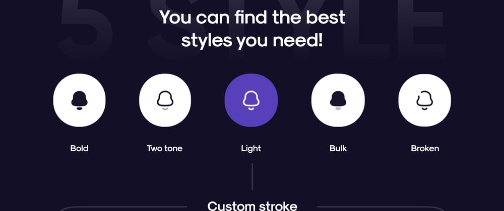
Iconly is one of the options that is being used by designers and developers today, so I decided to create a library for React / Next.js / Gatsby that facilitates its use and that also allows us to customize any icon according to our needs.
On the Website, you can find all the icons sorted by sets
Integrating into your project is quite simple just by following these steps:
Installation
yarn add react-iconly
or
npm install react-iconly
Usage
import React from 'react';
import { Home } from 'react-iconly';

const App = () => {
  return <Home />
};

export default App;
You can also wrap your app inside an IconlyProvider component, this will make all the icons that are within the context use the Provider properties
If you set specific props for each Icon the Provider properties will be overwritten
import React from 'react';
import { IconlyProvider, Home, Notification } from 'react-iconly';

const App = () => {
  return (
    <IconlyProvider set="bulk" primaryColor="blueviolet" secondaryColor="blue" stroke="bold" size="xlarge">
      <Home />
      <Notification primaryColor="yellow" />
    </IconlyProvider>
  )
};

export default App;
Icons can be configured with inline props:
<Home set="two-tone" primaryColor="blueviolet" secondaryColor="blue" stroke="bold" size="xlarge"/>
You can also include the whole icon pack:
import React from 'react';
import * as Iconly from 'react-iconly';

const App = () => {
  return <Iconly.Home set="bulk" primaryColor="blueviolet" secondaryColor="blue" stroke="bold" size="xlarge"/>
};

export default App;
Custom style example
import React from 'react';
import { Send } from 'react-iconly';

const App = () => {
  return <Send style={{ transform: 'rotate(45deg)' }} primaryColor="red" stroke="bold" size="xlarge"/>
};

export default App;
For more instructions visit:
Thanks for reading!


Top comments (2)
Awesome! Thanks for sharing!
You're welcome! 🙋🏻♂️