
Hi everyone, this is my first post and I wanted to point some issues that I have while scrolling on the dev.to homepage.
As someone once said "Complaining about a problem without proposing a solution is called whining." so I felt need to design solution for some of the issues I have. If you want to skip all reading and just see final design scroll to the bottom of the post.
First and biggest issue for me is typography for posts title. It's too big and it feels like a little bit too 'pushy' so I need to try hard to read it. The thing I did to fix this is changing the color of title to little brighter dark (#444444) and font-family to "Zilla Slab". I also change font-family and color of the post author to gray (#95989A) because I felt like I don't need to know first who is an author but a title is very important to me because based on it I will decide if I want to read the post or not. Bellow is an image of the first post on the homepage.

Before I show you the design of rest of the posts on the homepage I need to tell you something. While scrolling on the homepage it would be helpful to first see a thumbnail of posts so I can decide faster what is it about and then if I'm not clear I would read the title. The first post is without a #tag that is now in some posts before title and second is with it.
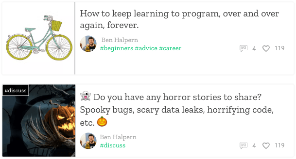
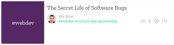
But, what about posts without thumbnail? I doubted what solution to use, this that already exist on dev.to or instead of image to put div with #tag title and background of that tag. Look at the image below for my decision.
Other things that I didn't explain are rounded images of authors, colors of tags that look more like links, and smaller icons for likes and comments on non-first posts. There are like that for aesthetical reasons.
Also, sidebars with discussions and podcasts are little distracting when I want to just look through posts and for that reason I changed links with more brighter color (#95989A). For an aesthetical reason, I changed regular button to 'flat' one. Look at the image below.

Cards for posts, sidebar, etc are #ffffff with box-shadow of 0, 0, 3, rgba(0,0,0,0.12), background color of page is brighter (#F8F8F8) and all user images are rounded. Almost everywhere font is "Zilla Slab" except for numbers (Roboto). I didn't redesign the whole homepage because I don't think that others things have an influence on experience.
The image below is homepage without footer and elements that I think don't have an influence on experience.

SVG file with better resolution
For end,
I want you to leave the comments if is there something that I didn't explain, do you agree with me or maybe there is no need for this changes. If something I didn't explain right just asks because this is not just my first post on dev.to, this is my first blog post ever.
Also, I want to say thanks to people that allow me using their posts and info in my design.


Top comments (2)
Ooh thanks a lot. This is all great to consider. We have some design changes in the works and some of these suggestions are close and it's all great to consider. @arakodesigner is helping out on the design. Ara, you should check out these concepts.
No problem, I'm glad that you like some of the ideas.