
Tailwind is a CSS framework. When you use it, you don't have to write custom CSS to style your application. Tailwind provides a deep catalog of CSS tools and classes to control the padding, margin, color, font, and more, to build beautiful custom designs.
Let's see how we can create a sidebar, using Tailwind.
The first tag, inside which all the other tags will be included, is a div, to which we will write the classes:
min-h-0 (min-height: 0px)flex-1 (flex: 1 1 0%)-
overflow-hidden (overflow: hidden)
<div class="min-h-0 flex-1 flex overflow-hidden">
....
</div>
The second tag, inside of the first div is nav with the following classes:
-
hidden lg:block(to hide the sidebar on mobile and will make it visible on larger screens) -
flex-shrink-0(to prevent a flex item from shrinking) bg-gray-800 (background-color: rgb(31 41 55))-
overflow-y-auto(to allow vertical scrolling if needed)
<div class=" min-h-0 flex-1 flex overflow-hidden">
    <nav aria-label="Sidebar" class="narrow-sidebar hidden lg:block lg:flex-shrink-0 lg:bg-gray-800 lg:overflow-y-auto">
....
    </nav>
</div>
The third tag, inside nav is another div, with the following classes:
relative (position: relative)w-20 (width: 5rem; /* 80px */)flex (display: flex)space-y-16 (margin-top: 4rem; /* 64px */)flex-col (to position flex items vertically)-
p-3 (padding: 0.75rem; /* 12px */)
<div class=" min-h-0 flex-1 flex overflow-hidden">
    <nav aria-label="Sidebar" class=" hidden lg:block flex-shrink-0 bg-gray-800 overflow-y-auto">
        <div class="relative w-20 flex space-y-16 flex-col p-3">
....
        </div>
    </nav>
</div>
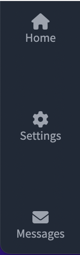
Now all that needs to be done is to add the icons and their naming. In this post I have made a sidebar with only three icons to show a basic example. The final code for the given example would be:
<div class=" min-h-0 flex-1 flex overflow-hidden">
    <nav aria-label="Sidebar" class="hidden lg:block flex-shrink-0 bg-gray-800 overflow-y-auto">
        <div class="relative w-20 flex space-y-16 flex-col p-3">

            <a href="#" class="text-gray-400 hover:text-red-700">
                <div class="flex-shrink-0 inline-flex items-center justify-center w-14">
                    <i class="fa fa-house"></i>
                </div>
                <div class="text-center text-xs font-normal ">Home</div>
            </a>

            <a href="#" class="text-gray-400 hover:text-red-700">
                <div class="flex-shrink-0 inline-flex items-center justify-center w-14">
                    <i class="fa fa-cog"></i>
                </div>
                <div class="text-center text-xs font-normal ">Settings</div>
            </a>

            <a href="#" class="text-gray-400 hover:text-red-700">
                <div class="flex-shrink-0 inline-flex items-center justify-center w-14">
                    <i class="fa fa-envelope"></i>
                </div>
                <div class="text-center text-xs font-normal ">Messages</div>
            </a>

        </div>
    </nav>
</div>
As we can see, using Tailwind means writing all the necessary code in html. The end result will be the same as if it were written with CSS.
The final sidebar looks like this:


Oldest comments (0)