“CSS Grid or CSS Framework? What should I use for my next project?” It is a question often asked by web developers, specifically new ones after they are introduced to the CSS Grid layout. CSS Grid layouts allow developers to build custom complex layouts with absolute control only by using Native CSS properties without relying on any frameworks which are bound by basic 12 column grid layouts plagued with default styling rules and do not offer a lot of room for customization.
On the other hand building grid layouts with frameworks like Bootstrap feels like a breeze without the need of writing any CSS style rules or media queries to make the layout responsive.
What Are CSS Frameworks?
A CSS framework is also interchangeably referred to as a CSS library The basic purpose is to bring a more standardized practice for web development. Using a CSS Framework or CSS library you can fast-track your web development effort as it allows you to use predefined web elements. Meaning, if you wish to add a UI element for your web-application then all you need to do is include the framework CSS and JS file in your project and specify the HTML class for the element you want to style. This is how a CSS framework works.
Almost every CSS Framework has a grid, few of them have more grids to offer, few CSS frameworks even offer advanced JavaScript functions around interactive UI patterns.
To make it clear, we can take an example of a Bootstrap framework which is, in my opinion, one of the most famous CSS frameworks.
Cross-Browser Compatibility Of CSS Frameworks
Cross-browser compatibility is a headache for web developers to face every day. With such an overwhelming advancement in browser development, the need to develop a web page that delivers a uniform cross-browser experience is increasing day-by-day.
Gone are those days when everyone was on Safari and Internet Explorer. Many other browsers have taken the internet by storm like Google Chrome, Mozilla Firefox, Opera. Millions of people prefer different browsers, and every browser focuses on being different.
CSS Frameworks lifts this burden for you. A framework is not coded for a single browser. If it is, how do you think it will get popular? A framework developer already knows that it will be used by millions of people who will be using many different browsers. Hence, frameworks are neutral and resolve cross-browser compatibility issues. You can just focus on the designing and creative parts of the website while using each framework.
Keep in mind though, that irrespective of which CSS framework you use and no matter how much cross-browser compatible it may be, it's always recommended to perform end-to-end integration testing of your web application across different browsers.
When Should You Use CSS Frameworks?
If you are a beginner in frontend web development and haven’t yet mastered CSS, then using a CSS framework is the right fit for you. Frameworks like Bootstrap are super easy to master and can be used to create complete web page layouts within seconds without the need of writing any CSS code.
Offering unprecedented ease of use, lightning-fast deployment, close to 100% cross-browser support, standardization of the codebase, and easy learning curve makes CSS frameworks an attractive choice for you. If your aim to build standard cross-browser compatible layouts at a lightning fast-pace rather than complex cutting edge layouts, you should pick CSS frameworks over CSS grid.
Moreover, CSS frameworks like Materialize or Bootstrap are much more than Grid systems. In fact, grids are just a tiny feature of a CSS framework. If you want to build different UI components like navbar, carousel, sliders, cards, accordions, tabs, pop-ups, modals, buttons, etc at lightning pace with a minimum CSS styling, then you should be using CSS frameworks.
Now, that we have a good understanding of what a CSS Framework is! It is time to dwell on a CSS Grid layout.

What Is CSS Grid?
CSS Grid is a layout technique to create a grid on your web page. It is a technique that is only described in CSS and not in HTML. So, to adhere to the needs of web developers, CSS grids provide the ease of developing complex and responsive web pages. If you are a web developer or web tester, then you already know the relevance of a responsive website.
A simple CSS Grid example looks like below:
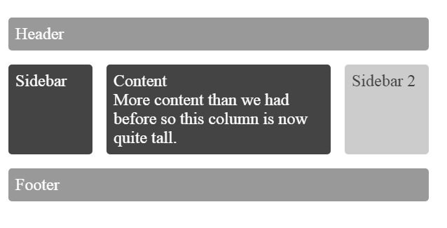
The above image shows different grids for different elements of a web page like Header, Sidebar, etc.
While there is no way that CSS Grid can match the versatility of CSS Frameworks, there are some times when a developer has to think about the two for one particular project or certain parts of a project.
Considering you have to build a layout that is visually appealing, it is very easy if you go for CSS Grid. Using CSS Grid minimizes the efforts and layout complexities. So, if you need to change the structure anytime afterward, the other structures won’t be affected to a greater extent.
For example, let’s say you have two grids side-by-side and an image after the grids in the same plane. Now, in the future, if you want to add another grid in the same plane, CSS Grid will divide the required space equally without affecting the coordinates of the image.
Grids are very adaptable to the space assigned to them. It helps the elements never overlap or create certain layout problems.
Cross-Browser Compatibility of CSS Grid
The largest hurdle faced by CSS Grid on the path to wider adoption by the web developer community was its poor cross-browser compatibility and support. Until 2017, CSS Grid was only supported by Google Chrome and Firefox.
Using CSS Grid in production-ready code would mean either serving a massive user base still using legacy browsers' messy and broken webpages or wasting hours to somehow code feasible float/flexbox fallbacks. This is why the majority of developers were stuck with using either Float or Flexbox based Grid layouts or relying on CSS frameworks like Bootstrap, Materialize or Bulma to create 12 column grid layouts. This is where CSS frameworks held a key advantage over CSS Grid and continued their dominance.
However, since 2017, CSS Grid has witnessed a massive improvement in browser support. This has completely eroded the key advantage CSS frameworks enjoyed before. As of November 2019, CSS Grid is supported by 93.85% browsers. Previously unsupported browsers like IE (v10-11), Edge (v16+), Opera(v44+) and Safari(v10.1+) now support the CSS Grid, including mobile browsers for both Android and iOS.
When Should You Use CSS Grid?
One of the biggest arguments against the use of CSS frameworks, like Bootstrap, Materialize or Bulma is excessive code bloating — introducing tons of needless CSS styling rules that will never be used will weigh down your project. If you want to keep your website compact in size to boost load speed and performance, CSS Grid is the better choice.
Another reason to pick CSS Grid over CSS framework is that with frameworks like Bootstrap, you’ll be stuck with a primitive 12 column grid system. Achieving a 5 or 7 or 9 column layout would be very difficult. This problem is completely eliminated by the CSS grid. If your project requires a highly custom layout that cannot be achieved by a basic 12 column grid, then CSS Grid is the right fit for your needs. The third argument in favor of the CSS grid is that it offers you unmatched flexibility to rearrange sections/areas.


Top comments (11)
Interesting discussion Johnathon!
So I'm the creator of AgnosticUI which is a much lesser known of these frameworks (hopefully only because it's new!) and I started the project with a Flexbox abstraction. It was very nice as abstractions go and for devux and what not, but it in fact added an insane amount of classes! It was also a nightmare to maintain, so I ditched it entirely.
I'm also a very reluctant user of css utility classes for similar reasons — but also have to acknowledge how popular they've become and how many solid devs choose to use them (JavaScript devs generally hate CSS and even sometimes fear it!). My issue with that is that you're literally learning an entirely new DSL (domain specific language) which also requires that you actually DO understand some CSS in the first place. That said, I sprinkled a few utilities into AgnosticUI very selectively in efforts not to explode generated CSS (
.flexbox,items-center, etc.) as I found myself wanting to code these into fast prototypes so often where I didn't have convenient access to a stylesheet (think Storybook, or Vitepress, or some other controlled env). But these too can "explode" and bloat as well so it's a very tricky dance!CSS grid itself is amazingly powerful and I believe your thesis and primary point is to show that it's now mostly available to the user agents we'd care about. I'd also point out to folks that Microsoft has announced IE11 end of life coming in June 15 and that's a huge factor because it means stodgy IT departments will be forced to upgrade many folks. Unfortunately, governmental health departments (of all places) likely will continue to lag behind so I have empathy for those that cannot use it. But, we at some point have to move forward! AgnosticUI uses no
margin-leftas simply using logical properties likemargin-inline-startgives you support for languages across the globe for free! So, am I for example being less inclusive by choosing to not support IE11? Or, more inclusive because I'm using these more inclusive but newer features?When folks consider being inclusive by supporting backwards compatible browsers and customers, they should also consider the inverted price of excluding progressively enhanced features like logical properties.
Oh they other thing I finally wanted to mention which prompted me to start writing this comment is you can most definitely (and should!) use Bootstrap and really most any CSS frameworks in a modular way.
Most folks that just include the entire thing are basically getting what's in this script assuming they're in an SCSS environment otherwise they're pulling in a final CSS dist. But, the point is simply this:
I retroactively did this for a site that was already well under way at work and it was easy to do global searches for things like
.carouseland determine if the module was in use or not (especially with the builder errors if you take it out yet it's needed).Gosh, I really wish developers would work this way. I can tell from many years of real life experience almost all shops are just dumping these top-level files into their codebase. I can honestly say and will debate anybody, Bootstrap's code is quite good, very customizable, and absolutely does NOT have to "look like Bootstrap" one bit -- user error! And I say this as someone who's decided to compete with Bootstrap and create my own framework.
Last point, if you were to say snag only the few CSS scripts from my AgnosticUI and custom roll your own because you're anal about performance and like to mainly code things yourself...I would probably buy you a beer if I saw you in a bar :-) I too like to do my own stuff by hand. But, also have come to enjoy the ROI of strategically leveraging boilerplate from others. Just be strategic! Be modular. Use the damn
importstatement ❗ 💥 😄Thanks again Johnathon. I hope you don't mind the long comment.
css grid has an issue in chrome, row limit is 999
More: bugs.chromium.org/p/chromium/issue...
Empiezo a amar CSS grid/ está lectura me re sulto útil gracias.
Some comments may only be visible to logged-in visitors. Sign in to view all comments.