
I got a hilarious message from my friend about Go's new look & logo announcement. It went something like this:
Friend: LOOK AT THIS BULLSHIT
Friend: WHERE DAT GOPHIE
Then I sent her the fine print:
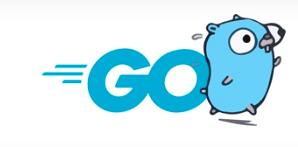
Rest easy, our beloved Gopher Mascot remains at the center of our brand.


Top comments (37)
Looks like a gas station logo.
I came here to say this.
I hate to admit it because I like Golang but you are right. Haha
First look feels like a new brand to overthrow Uber and Amazon. O_O
Second look feels like its a modern entity. Something that promotes professionalism.
Even though it looks nice but somehow it lacks the programming context. Hmm, what could be missing? There, it misses the
thing. And, the vertical stripes are too small.This should be the new logo!
SEND THAT TO THEM!
This might be unpopular. While I think the Go Gopher is a super fun character, I also really like the updated logo and professional look. I'm also getting some of those classic "Hot Wheels" vibes, in a good way. Speed, speed, speed.
I think it's a bit boring, doesn't really have the gopher's personality, but is clean and probably serves its purpose.
I'm sure they feel that Go has established itself enough that they can get away from cutesy gimmicks.
On the logo, ultimately
Gopher hasn't stopped being the mascot, though. The old logo was very similar to the new logo, but a pencil sketch version instead of the more formal version it is now.
I dislike it personally.
However I feel like if you look past your own feelings, this can mark an
important step in the development of the language.
The first time I looked at Go, the website look and feel made it seem more like a research project / niche language rather than the reliable, solid language that it is, neither did it reflect how rich and vibrant it's community is.
Perhaps this will help newer developpers pick up the language, and make picthing it internally easier in some companies.
And for that, ultimately, having good branding is useful.
I dislike it on the basis of my own taste and nostalgic bias. But that doesn't mean we should throw it out with the bath water.
Reminds me of the New Balance logo a bit.
But as long as they keep the Gopher I'm cool with it. To me the Gopher is on the same level as octocat...also there are sooo many cool Gopher designs that it would just be a shame
No a fan. It does not indicate that Go is a programming language. It only indicates that Go is fast; it kind of beats you over the head with it. It's like the whole design spec was "wooosh, but minimalist"
I'll never be able to look at this and not just think of my prior ISP: Wave G waveg.wavebroadband.com
Fair point. On the other hand, I've never written a single line of Go, but what I know about it is that it's fast. It powers my static site generator of choice, Hugo, and I swear that thing breaks warp speed. So a "this is a thing that is fast" logo is pretty on-brand.
Seems straight out of the Cars movie.
My favorite version is the black and white one.
Not that big of a fan. The logo looks more like it's for a toy car brand than a programming language, and it doesn't fit well with the Gopher.
Looks like a brand of running shoes. Even with the fine print, bring back the gopher! I need my boy!
It's totally the New Balance logo.
I like it. Very clean and simple just like the language.
That's why design should be approved by engineering.
The best comment here.
Without Gopher on it... this new logo has no special meaning, it could be anything except Golang
I saw this on my twitter feed. I did not know this was about the Go language so I read past it. I guess that says enough.
Does it mean I can now use the previous Go gopher logo as my brand logo?