honestly the development work is really good. A big thumbs up.
On the other hand, I think that imagined the interface of a potential Windows 12 could be too ambitious. It's a different job than being a developer, where you seem genuinely good at. This is a very thorough job of ui / ui designer. And we can find small flaws in this ux / ui work.
For example I think it is unlikely that windows 12 readopt the bar fixed to the left while windows 11 pushes the bar centered. Similarly, it is unlikely to see applications like "groove music" when its support is already decreasing (yes I know it is very precise as a default but it is this kind of point that makes the diference between a cool project, andan excellent project).
Likewise, it is probable, given the direction taken by windows 11, that interactions lead to ever smoother animations, whereas on your project we find a lot of change of aspects without real transitions. Finally, the differences in vertical alignments in the task bar appear to be a fairly notable defect.
Okay it's time to jump to the conclusion, and I know my comment sounds harsh. But in truth I am quite admiring. It's a really great job, especially for someone so young. You really have potential and I want to encourage you. I think you can become a really good dev. If I have brought you so many points that appear to be flaws, it is above all because everything else is very, very clean. Suddenly, the defects are necessarily visible. My conclusion will therefore be: "BRAVO"
what I meant was than if i draw the line of the icones' top and bottom (windows and middle ones), the ones of the searchbar, the is a lot of line.
Ideally, it should have one at the botom of both icons, serach bar and notif block on right, on for the top of those elements, and of for both text and icon of the searchbar

honestly the development work is really good. A big thumbs up.
On the other hand, I think that imagined the interface of a potential Windows 12 could be too ambitious. It's a different job than being a developer, where you seem genuinely good at. This is a very thorough job of ui / ui designer. And we can find small flaws in this ux / ui work.
For example I think it is unlikely that windows 12 readopt the bar fixed to the left while windows 11 pushes the bar centered. Similarly, it is unlikely to see applications like "groove music" when its support is already decreasing (yes I know it is very precise as a default but it is this kind of point that makes the diference between a cool project, andan excellent project).
Likewise, it is probable, given the direction taken by windows 11, that interactions lead to ever smoother animations, whereas on your project we find a lot of change of aspects without real transitions. Finally, the differences in vertical alignments in the task bar appear to be a fairly notable defect.
Okay it's time to jump to the conclusion, and I know my comment sounds harsh. But in truth I am quite admiring. It's a really great job, especially for someone so young. You really have potential and I want to encourage you. I think you can become a really good dev. If I have brought you so many points that appear to be flaws, it is above all because everything else is very, very clean. Suddenly, the defects are necessarily visible. My conclusion will therefore be: "BRAVO"
Amazing response I agree with everything (thought I don't understand the vertical alignments thingy)
what I meant was than if i draw the line of the icones' top and bottom (windows and middle ones), the ones of the searchbar, the is a lot of line.
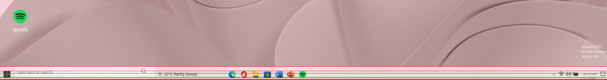
Ideally, it should have one at the botom of both icons, serach bar and notif block on right, on for the top of those elements, and of for both text and icon of the searchbar
Thank you