Login and signup forms are probably the single most common use case across apps of all types. Yet, building a login/signup flow with complete validation is always a pain. Here, I will show you how to create a login and signup form with complete validation quickly with the open-source NPM library I created @jeremyling/react-material-ui-form-builder.
The motivation behind the library was to create a low-code, config-only method to create and manipulate forms. It is built on top of Material UI in an extensible way that allows you to customise your forms in any way you want. A quick disclaimer on the package size — do not be alarmed if you see a large unpacked size on NPM. The actual gzipped library is only ~23kb if you exclude all the peer dependencies. (Proof here: https://bundlephobia.com/package/@jeremyling/react-material-ui-form-builder@0.8.9) When using the various components of the library, you only need to install the peer dependencies you actually need.
OK, enough talk. Where’s the code?
I have to admit, I lied. Building the forms in 2 minutes is only achievable with my form building platform FormBlob but more on that later. Let’s dive into the code right now!
We’ll aim to replicate the following forms. The full working example is in the sandbox below.
To begin, a working knowledge of Material UI’s components would be very useful here, but if you’re not familiar, that’s perfectly fine. Let’s start with the Login form and then add the additional components in the Sign up form. But first, install all the libraries we will need for this flow.
npm i @jeremyling/react-material-ui-form-builder react react-dom @material-ui/core @material-ui/icons lodash
1. The Form Builder
To understand how the library works, the main exported component FormBuilder is a React component that accepts 4 props: fields, form, updateForm and refs.
import React, { useRef, useState } from "react";
import { set } from "lodash-es";
import { FormBuilder } from "@jeremyling/react-material-ui-form-builder";
import { Button } from "@material-ui/core";

export function Login(props) {
  const [form, setForm] = useState({}); // This is where form data is stored
  const refs = useRef({}); // This will be used for validation later

  // This updates form state with the values changed in the form
  const updateForm = (updates) => {
    const copy = { ...form };
    for (const [key, value] of Object.entries(updates)) {
      set(copy, key, value);
    }
    setForm(copy);
  }

  const handleSubmit = async (event) => {
    event.preventDefault();
    console.log(form);
  };

  return (
    <form onSubmit={handleSubmit}>
      <FormBuilder
        fields={[]}
        form={form}
        updateForm={updateForm}
        refs={refs}
      />
      <Button
        fullWidth
        type="submit"
        variant="contained"
        color="primary"
        style={{ marginTop: "8px" }}
      >
        Log In
      </Button>
    </form>
  );
}
That’s the core of how the library is used! There is no need to edit the code for the form parts from here on, all other changes are to the config-like fields array.
2. Building the Login Form
To build the parts of the Login form, you add to the fields array. Here, we only need to use the text-field, checkbox-group, display-text and custom components. No additional peer dependencies need to be installed.
import { Avatar, IconButton, InputAdornment } from "@material-ui/core";
import { LockOutlined, Visibility, VisibilityOff } from "@material-ui/icons";
import { red } from "@material-ui/core/colors";

const fields = [
  {
    component: "custom",
    customComponent: () => (
      <div style={{ display: "flex", justifyContent: "center" }}>
        <Avatar style={{ backgroundColor: red[500], color: "white" }}>
          <LockOutlined />
        </Avatar>
      </div>
    )
  },
  {
    component: "display-text",
    title: "Log In",
    titleProps: {
      style: {
        fontSize: "20px",
        fontWeight: "bold"
      }
    },
    titleContainerProps: {
      style: {
        justifyContent: "center"
      }
    }
  },
  {
    attribute: "email",
    component: "text-field",
    label: "Email",
    props: {
      required: true
    },
    validations: {
      required: true,
      email: true
    }
  },
  {
    attribute: "password",
    component: "text-field",
    label: "Password",
    props: {
      type: showPassword ? "text" : "password",
      InputProps: {
        endAdornment: (
          <InputAdornment position="end">
            <IconButton
              aria-label="toggle password visibility"
              onClick={() => setShowPassword(!showPassword)}
            >
              {showPassword ? <Visibility /> : <VisibilityOff />}
            </IconButton>
          </InputAdornment>
        ),
        style: {
          paddingRight: 0
        }
      },
      required: true
    },
    validations: {
      required: true,
      min: 8,
      matches: ["/[a-z]/i", "At least 1 lowercase or uppercase letter"],
      test: {
        name: "specialChar",
        test: (value) =>
          /[0-9~!@#$%^&*()_+\-={}|[\]\\:";'<>?,./]/.test(value),
        message: "At least 1 number or special character"
      }
    }
  },
  {
    attribute: "remember",
    component: "checkbox-group",
    options: [
      {
        label: "Remember Me",
        value: true
      }
    ],
    optionConfig: {
      key: "label",
      label: "label",
      value: "value"
    }
  }
];
I’ll explain each element in the array individually.
- fields[0]: custom component — this is the red lock icon, inserted with jsx.
- fields[1]: display-text — this is the Log In text. titleProps and titleContainerProps are the props to pass into the Typography and div components wrapping the title respectively. View the documentation here.
- fields[2]: text-field — this is the Email input field. The
attributeattribute is the key under which the value of the input is stored withinform. Validations use yup and a good summary of all the suggested validations are here. - fields[3]: text-field — this is the Password input field. This uses the
props.typeattribute to hide/show the input text. Thepropsattribute is passed directly into the Material UI Textfield component as props. TheInputPropsattribute is a prop of Textfield and it is used here to add an end adornment to the input. For the Password input, we require multiple validations: required, minimum length = 8, at least 1 lowercase or uppercase letter and at least 1 number or special character. - fields[4]: checkbox-group — this is the Remember Me checkbox. Since we only need one checkbox, we have only one option. The
optionConfigattribute dictates which attribute of the option(s) to use as the key, label and value of the component.
And there we have it! The completed Login form.
But wait, validation works on blur, but what about at the point of form submission? Remember the refs prop we passed into FormBuilder? Each input’s DOM element is added to refs.current when rendered under its attribute as key. Here’s how we use refs to validate the form on submission.
import { get } from "lodash-es";

async function validate(refs, form) {
  for (const [attribute, ref] of Object.entries(refs.current)) {
    var errors;
    if (ref.validate) {
      errors = await ref.validate(get(form, attribute));
    }
    if (!isEmpty(errors)) {
      console.log(errors);
      return false;
    }
  }
  return true;
}

const handleSubmit = async (event) => {
  event.preventDefault();
  const ok = await validate(refs, form);
  if (!ok) {
    return;
  }
  console.log(form);
};
Now all we are left with is to add the Forgot Password? and Don’t have an account? links and the component is ready. Here’s the complete code for the Login form.
import React, { useRef, useState } from "react";
import { get, isEmpty, set } from "lodash-es";
import { FormBuilder } from "@jeremyling/react-material-ui-form-builder";
import { Avatar, Button, IconButton, InputAdornment } from "@material-ui/core";
import { LockOutlined, Visibility, VisibilityOff } from "@material-ui/icons";
import { indigo, red } from "@material-ui/core/colors";
import PropTypes from "prop-types";

async function validate(refs, form) {
  for (const [attribute, ref] of Object.entries(refs.current)) {
    var errors;
    if (ref.validate) {
      errors = await ref.validate(get(form, attribute));
    }
    if (!isEmpty(errors)) {
      console.log(errors);
      return false;
    }
  }
  return true;
}

export default function Login(props) {
  const { setAuthType } = props;
  const [form, setForm] = useState({});
  const [showPassword, setShowPassword] = useState();

  const refs = useRef({});

  const updateForm = (updates) => {
    const copy = { ...form };
    for (const [key, value] of Object.entries(updates)) {
      set(copy, key, value);
    }
    setForm(copy);
  };

  const handleSubmit = async (event) => {
    event.preventDefault();
    const ok = await validate(refs, form);
    if (!ok) {
      return;
    }
    console.log(form);
  };

  const fields = [
    {
      component: "custom",
      customComponent: () => (
        <div style={{ display: "flex", justifyContent: "center" }}>
          <Avatar style={{ backgroundColor: red[500], color: "white" }}>
            <LockOutlined />
          </Avatar>
        </div>
      )
    },
    {
      component: "display-text",
      title: "Log In",
      titleProps: {
        style: {
          fontSize: "20px",
          fontWeight: "bold"
        }
      },
      titleContainerProps: {
        style: {
          justifyContent: "center"
        }
      }
    },
    {
      attribute: "email",
      component: "text-field",
      label: "Email",
      props: {
        required: true
      },
      validations: {
        required: true,
        email: true
      }
    },
    {
      attribute: "password",
      component: "text-field",
      label: "Password",
      props: {
        type: showPassword ? "text" : "password",
        InputProps: {
          endAdornment: (
            <InputAdornment position="end">
              <IconButton
                aria-label="toggle password visibility"
                onClick={() => setShowPassword(!showPassword)}
              >
                {showPassword ? <Visibility /> : <VisibilityOff />}
              </IconButton>
            </InputAdornment>
          ),
          style: {
            paddingRight: 0
          }
        },
        required: true
      },
      validations: {
        required: true,
        min: 8,
        matches: ["/[a-z]/i", "At least 1 lowercase or uppercase letter"],
        test: {
          name: "specialChar",
          test: (value) =>
            /[0-9~!@#$%^&*()_+\-={}|[\]\\:";'<>?,./]/.test(value),
          message: "At least 1 number or special character"
        }
      }
    },
    {
      attribute: "remember",
      component: "checkbox-group",
      options: [
        {
          label: "Remember Me",
          value: true
        }
      ],
      optionConfig: {
        key: "label",
        label: "label",
        value: "value"
      }
    }
  ];

  return (
    <div style={{ display: "flex", justifyContent: "center" }}>
      <div style={{ width: "60%" }}>
        <form onSubmit={handleSubmit}>
          <FormBuilder
            fields={fields}
            form={form}
            updateForm={updateForm}
            refs={refs}
          />
          <Button
            fullWidth
            type="submit"
            variant="contained"
            color="primary"
            style={{ marginTop: "8px" }}
          >
            Log In
          </Button>
        </form>
        <div>
          <Button
            onClick={() => console.log("Forgot Password")}
            style={{
              textTransform: "initial",
              marginTop: "16px",
              color: indigo[500]
            }}
          >
            Forgot Password?
          </Button>
        </div>
        <div>
          <Button
            onClick={() => setAuthType("signup")}
            style={{
              textTransform: "initial",
              color: indigo[500]
            }}
          >
            Don't have an account?
          </Button>
        </div>
        <div style={{ marginTop: "16px" }}>{JSON.stringify(form, null, 2)}</div>
      </div>
    </div>
  );
}

Login.propTypes = {
  setAuthType: PropTypes.func
};
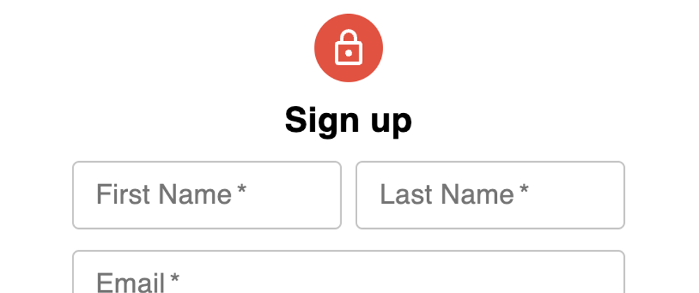
3. The Signup Form
Now that we’re done with the Login form, the Signup form is just a simple extension of it. We add two more components to the fields array and voila!
const additionalFields = [
  {
    attribute: "firstName",
    component: "text-field",
    label: "First Name",
    props: {
      required: true
    },
    col: {
      xs: 6
    },
    validations: {
      required: true
    }
  },
  {
    attribute: "lastName",
    component: "text-field",
    label: "Last Name",
    props: {
      required: true
    },
    col: {
      xs: 6
    },
    validations: {
      required: true
    }
  },
];
The key addition here is the use of the col prop. If you’re familiar with breakpoints, this should come naturally. col is an object with breakpoints (xs, sm, md, lg and xl) as key and grid columns (1–12) as value. The value for each larger breakpoint (xl) defaults to the next largest breakpoint (lg) if not defined. In this case, the component uses a grid column of 6 for all breakpoints.
We’re done with the Signup form as well! Here’s the complete code.
import React, { useRef, useState } from "react";
import { get, isEmpty, set } from "lodash-es";
import { FormBuilder } from "@jeremyling/react-material-ui-form-builder";
import { Avatar, Button, IconButton, InputAdornment } from "@material-ui/core";
import { LockOutlined, Visibility, VisibilityOff } from "@material-ui/icons";
import { indigo, red } from "@material-ui/core/colors";
import PropTypes from "prop-types";

async function validate(refs, form) {
  for (const [attribute, ref] of Object.entries(refs.current)) {
    var errors;
    if (ref.validate) {
      errors = await ref.validate(get(form, attribute));
    }
    if (!isEmpty(errors)) {
      console.log(errors);
      return false;
    }
  }
  return true;
}

export default function Signup(props) {
  const { setAuthType } = props;
  const [form, setForm] = useState({});
  const [showPassword, setShowPassword] = useState();

  const refs = useRef({});

  const updateForm = (updates) => {
    const copy = { ...form };
    for (const [key, value] of Object.entries(updates)) {
      set(copy, key, value);
    }
    setForm(copy);
  };

  const handleSubmit = async (event) => {
    event.preventDefault();
    const ok = await validate(refs, form);
    if (!ok) {
      return;
    }
    console.log(form);
  };

  const fields = [
    {
      component: "custom",
      customComponent: () => (
        <div style={{ display: "flex", justifyContent: "center" }}>
          <Avatar style={{ backgroundColor: red[500], color: "white" }}>
            <LockOutlined />
          </Avatar>
        </div>
      )
    },
    {
      component: "display-text",
      title: "Sign up",
      titleProps: {
        style: {
          fontSize: "20px",
          fontWeight: "bold"
        }
      },
      titleContainerProps: {
        style: {
          justifyContent: "center"
        }
      }
    },
    {
      attribute: "firstName",
      component: "text-field",
      label: "First Name",
      props: {
        required: true
      },
      col: {
        xs: 6
      },
      validations: {
        required: true
      }
    },
    {
      attribute: "lastName",
      component: "text-field",
      label: "Last Name",
      props: {
        required: true
      },
      col: {
        xs: 6
      },
      validations: {
        required: true
      }
    },
    {
      attribute: "email",
      component: "text-field",
      label: "Email",
      props: {
        required: true
      },
      validations: {
        required: true,
        email: true
      }
    },
    {
      attribute: "password",
      component: "text-field",
      label: "Password",
      props: {
        type: showPassword ? "text" : "password",
        InputProps: {
          endAdornment: (
            <InputAdornment position="end">
              <IconButton
                aria-label="toggle password visibility"
                onClick={() => setShowPassword(!showPassword)}
              >
                {showPassword ? <Visibility /> : <VisibilityOff />}
              </IconButton>
            </InputAdornment>
          ),
          style: {
            paddingRight: 0
          }
        },
        required: true
      },
      validations: {
        required: true,
        min: 8,
        matches: ["/[a-z]/i", "At least 1 lowercase or uppercase letter"],
        test: {
          name: "specialChar",
          test: (value) =>
            /[0-9~!@#$%^&*()_+\-={}|[\]\\:";'<>?,./]/.test(value),
          message: "At least 1 number or special character"
        }
      }
    },
    {
      attribute: "remember",
      component: "checkbox-group",
      options: [
        {
          label: "Remember Me",
          value: true
        }
      ],
      optionConfig: {
        key: "label",
        label: "label",
        value: "value"
      }
    }
  ];

  return (
    <div style={{ display: "flex", justifyContent: "center" }}>
      <div style={{ width: "60%" }}>
        <form onSubmit={handleSubmit}>
          <FormBuilder
            fields={fields}
            form={form}
            updateForm={updateForm}
            refs={refs}
          />
          <Button
            fullWidth
            type="submit"
            variant="contained"
            color="primary"
            style={{ marginTop: "8px" }}
          >
            Sign Up
          </Button>
        </form>
        <div>
          <Button
            onClick={() => setAuthType("login")}
            style={{
              textTransform: "initial",
              marginTop: "16px",
              color: indigo[500]
            }}
          >
            Already have an account?
          </Button>
        </div>
        <div style={{ marginTop: "16px" }}>{JSON.stringify(form, null, 2)}</div>
      </div>
    </div>
  );
}

Signup.propTypes = {
  setAuthType: PropTypes.func
};
Concluding Remarks
While straightforward, this process still involves a tedious set up of the fields array manually. I have built https://formblob.com — a commercial solution to construct the fields array in 2 minutes with drag and drop tools which you can then export into your own project. Alternatively, you can even build and deploy the form entirely on FormBlob and embed the form in your own domain. If you use this method, you don’t have to use React in your app and it still works out of the box!
If data privacy is a concern, you can define webhooks to call on each submission to pass the form data to your own backend. If you choose, FormBlob does not store any data on our servers beyond the form structure.
Give FormBlob a go. You won’t regret it.


Top comments (0)