In my recent cyber travels I learned a few CSS tools I wanted to share. They are in no way related, except for being cool.
Place-items
I was no aware of the "place-items" property before this week, and I’m very happy about this. I’ve been copying this code from project to project for years
.parent {
  position: relative;
}
.child {
position: absolute;
top: 50%;
left: 50%;
transform: translate(-50%,-50%);
}
I realize that I could have been using flex-box or a grid to accomplish this, but just let me feel dumb on my own please. Anyway, here's a really slim way to write this
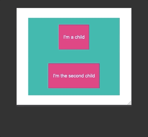
<div class="parent">
       <div class="child">
           <p>I'm the child</p>
       </div>
   </div>
.parent {
   width: 80vw;
   height: 80vh;
   background: #00a0a0;
   margin: 10vh auto;
   color: #ffffff;
   display: grid;
   place-items: center;
}
.child {
   background: #ed0076;
   padding: 5%;
}

Basically, place-items is a shorthand for align-items and justify-items.
Let’s add a second child and see what happens.
Flex Shorthand Property
Admittedly, I am not a big user of flex, so I’m forcing myself to learn more about it. ( Forthcoming blog... )
The flex shorthand property sets how a flex item will grow or shrink to fit the space available in its flex container.
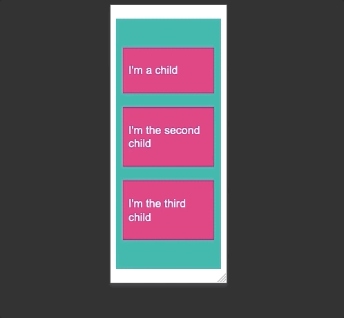
<div class="child first">
           <p>I'm a child</p>
       </div>
       <div class="child">
           <p>I'm the second child</p>
       </div>
       <div class="child">
           <p>I'm the third child</p>
       </div>
.parent {
   width: 90vw;
   height: 90vh;
   background: #00a0a0;
   margin: 5vh auto;
   color: #ffffff;
   display: flex;
   justify-content: center;
   align-content: center;
   overflow: hidden;
}
.child {
   background: #ed0076;
   padding: 5px;
   margin: 10px;
   flex: 1 1 25px;
}
.first {
   flex: 2 1 25px;
}

This is easy to visualize with the elements on one line, so let’s add flex-wrap to our parent and complicate everything
.parent {
    width: 90vw;
    height: 90vh;
    background: #00a0a0;
    margin: 5vh auto;
    color: #ffffff;
    display: flex;
    flex-wrap: wrap;
    justify-content: center;
    align-content: center;
}
.child {
    background: #ed0076;
    padding: 5%;
    flex-basis: 100px; */
    margin: 10px;
}
.first {
    flex: 2 1 100px;
}
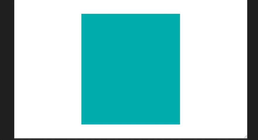
Clamp Function
The CSS clamp function keeps an elements size between upper and lower limits. Clamp() enables selecting a middle value within a range of values between a defined minimum and maximum.
<div class="box">
.box {
   margin: 10vh auto;
   height: 80vh;
   width: clamp(200px, 50vw, 400px);
   background: #00a0a0;
}
Browser support
Clamp doesn’t have universal browser support yet ( which means internet explorer doesn’t support it sigh ). If you’re worried about supporting things for IE you can use:
.box {
   margin: 10vh auto;
   height: 80vh;
   min-width: 200px;
   width: 50vw;
   max-width: 400px;
   background: #00a0a0;
}
Because it’s exactly the same!!!
Let’s try this with text!
Here there are two p tags, one clamped and the other is set at 14px
.clamp {
   font-size: clamp(14px, calc(4vmin), 20px )
}
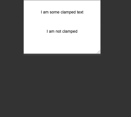
Everything works just like the our previous clamp example, which is awesome. Notice the calc function set for the middle value. I want to set a responsive value for the example, but if I use the calc function to the viewport minimum I receive back an actual value - that way users can zoom in on the text per WCAG.
More on clamp from MDN
https://developer.mozilla.org/en-US/docs/Web/CSS/clamp()
Hopefully this helps


Oldest comments (0)