Making sure your content looks good on all screen sizes is known as responsive design. Layouts, fonts, and images on the website should all automatically adjust to the user’s device.
A matched set of conditions regarding the user’s device, browser, or system settings can change the appearance (and even behaviour) of a website or app.
- The Top 12 Most Stunning Linux Distributions
- 1. Zorin OS
- 2. Deepin
- 3. CutefishOS
- 4. Garuda Linux
- 5. Feren OS
- 6. Pop!_OS
- 7. Manjaro Linux
- 8. KDE Neon
- 9. elementary OS
- 10. Nitrux OS
- 11. Linux Mint
- 12. Solus Budgie
- A Conclusion

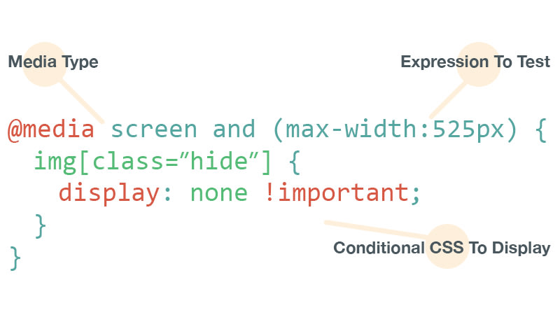
You can use the CSS Media Query to only apply CSS when the browser and device environment comply with a set of rules. To create different layouts depending on the size of the viewport, media queries are an essential component of responsive web design.
Understanding the syntax
@media media-type and (media-feature-rule) {
  /* CSS rules go here */
}
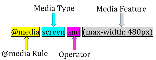
- @media identifies the type of media being used to access a website, the features it supports, and the operators that can be used to combine both simple and complex conditions.
- Tells the browser what kind of media this code is for using Media Type (e.g. print, or screen).
- Operators are supported by media queries, just like they are in many programming languages, allowing us to match media types based on specific criteria.
and
/* Matches screen between 320px AND 768px */
@media screen (min-width: 320px) and (max-width: 768px) {
  .element {
    /* Styles! */
  }
}
or (or comma-separated)
/*
  Matches screens where either the user prefers dark mode or the screen is at least 1200px wide */
@media screen (prefers-color-scheme: dark), (min-width 1200px) {
  .element {
    /* Styles! */
  }
}
not
@media print and ( not(color) ) {
  body {
    background-color: none;
  }
}
A media expression is a rule or test that must be satisfied for the CSS it contains to be applied.
Website in real-time

See the Pen Untitled by Jainil Prajapati (@jainil__1209) on CodePen.
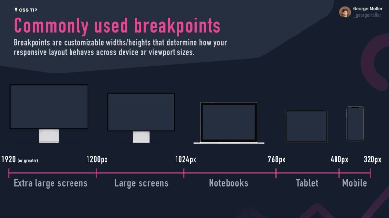
Breakpoints for Devices
CSS breakpoints are the points added to the code, and depending on the screen size of the device, the website content reacts to these points. This aids in providing the user with the ideal layout. Because CSS breakpoints are used in conjunction with media queries, they are also referred to as CSS media query breakpoints.

Read – How to use CSS breakpoints to create responsive designs
Min-Max width
We can apply CSS if the viewport is above or below a certain width — or an exact width — using the min-width, max-width, and width media features. Viewport width is the feature we tend to detect most frequently to create responsive designs (and that is supported by a wide range of browsers).
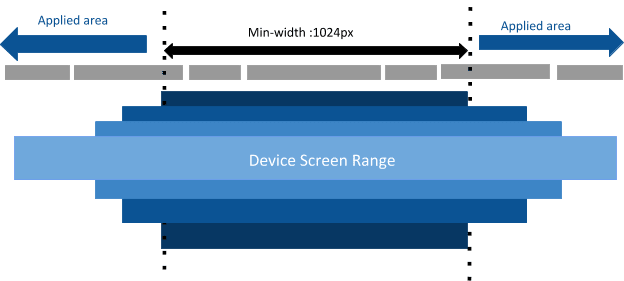
@media only screen and (min-width: 600px)
 {...}
The real meaning of this statement is “Do {} if [device width] is greater than or equal to 600px.”
Therefore, if the email is opened on an iPhone 5S with a 320px screen width, neither the media query nor the styles in {…} will be activated.

@media only screen and (max-width: 600px)
{...}
The real meaning of this statement is “Do {…} if [device width] is less than or equal to 600px.”
The media query will therefore be triggered and all of the styles in {…} will be applied if the email is opened on an iPhone 5S with a 320px screen width.
Essential media features
width and height
These two frequently utilised media features are a requirement for responsive web.
/* Exact width */
@media (width: 360px) {
  body {
    ...
  }
}

/* Maximum width */
@media (max-width: 768px) {
  body {
   ...
}

/* Minimum width */
@media (min-width: 992px) {
  body {
    ...
  }
}

/* Exact height */
@media (height: 360px) {
  body {
    ...
  }
}

/* Minimum height */
@media (min-height: 640px) {
  body {
    ...
  }
}

/* Maximum height */
@media (max-height: 768px) {
  body {
    ...
  }
}

/* All the values can also be in rem, em, vw, vh */
Orientation Two orientation values exist:
When the height is greater than or equal to the width, the viewport is said to be in portrait orientation.
viewport orientation: The viewport is oriented in a landscape mode, meaning that the width is greater than the height.
@media (orientation: landscape) {
    /* landscape styles */
}

@media (orientation: portrait) {
    /* portrait styles */
}
The responsive design benefit from this media feature. It can be combined with other media attributes like width and height.
@media screen and (min-height: 640px) and (orientation: portrait) {
    ...
}
display-mode
applies styles based on an application’s display mode. Fullscreen, standalone, minimal-UI, and browser are the available modes.
@media all and (display-mode: fullscreen) {
  body {
    margin: 0;
    border: 5px solid black;
  }
}
Finishing up
Now that you know what media queries are, why they are helpful, and how to use them, you can use them to improve the user experience for visitors using mobile devices. Additionally, CSS media queries are not the only way to make your website responsive. There are other ways as well, like the aforementioned flexbox and grid, to make your design flexible.
Thank you for reading all the way through; I hope you learned at least a few things. Coding on!


Latest comments (0)