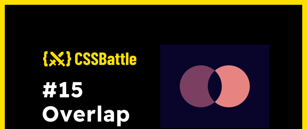
In this article, I will solve a Overlap CSS Challenge on CSS Battle. Let's look at the problem first.
Problem
We need to create the following container by using CSS Properties only:

Solution
So now look at the Solution and how we are going to achieve this.
HTML
<p>
<a>
-
<p>: Circles -
<a>: overlap of both circles
CSS
Now let's style the containers.
* {
  background: #09042a;
}

body {
  margin: 75;
}

p, a {
  border-radius: 1in;
  width: 150;
  height: 150;
}
p {
  background: #7b3f61;
  position: relative;
  overflow: hidden;
  box-shadow: 100px 0 #e78481;
}

a {
  position: absolute;
  left: 100;
}
Note: In CSS Battle you can use
100instead of100px. You don't need to definepxin CSS. However, if you are usingremor%, you need to pass them separately. That's why in the above CSS code there are no units mostly. For more info visit hereMinify the code or CSS by using any CSS Minifier. It helps you to reduce the characters in the code which will increase the score.
Minified Version:
<p><a><style>*{background:#09042A}body{margin:75}p,a{border-radius:1in;width:150;height:150}p{background:#7B3F61;position:relative;overflow:hidden;box-shadow:100px 0 #E78481}a{position:absolute;left:100}
Wrapping up
There are many ways to solve this. You can share your approach in the comments. If you like this then don't forget to ❤️ it. And I'll see you in the next article. See you soon.


Top comments (2)
Very nice solution, I didn't think about using
overflowand so I was stuck with this challenge. ThanksIt's my pleasure. Keep hacking ✨