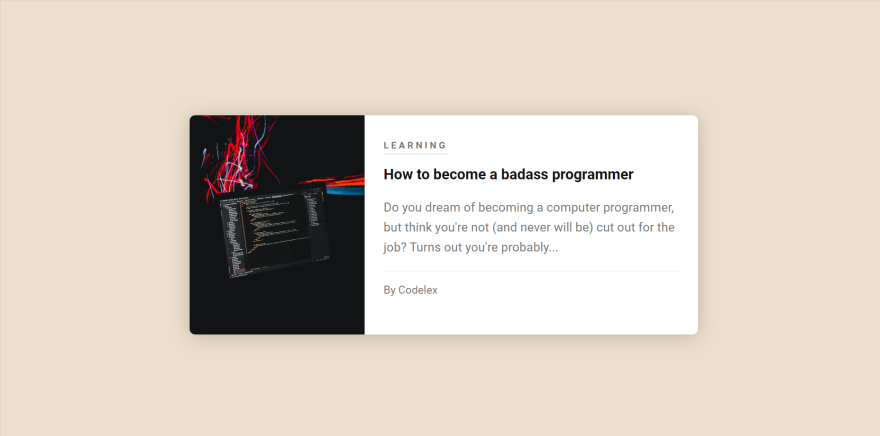
Here's how to make a simple blog card with pure css.
For more CSS Blog Card Examples visit here.
Okay so now lets see the steps to create the Blog card.
Create index.html & Basic Html Format
First create a index.html file using any code editor and after that enter the basic html format in it.
<!DOCTYPE html>
<html lang="en" >
<head>
  <meta charset="UTF-8">
  <title></title>
<style>
<style>
</head>
  <body>
  </body>
</html>
We will not use any external stylesheet and just include the style in the head.
Create the Card Container
  <main>
    <div id="container">
      <a class="card-link" href="#">
        <article class="blog-card">
          <img class="post-image" src="https://images.unsplash.com/photo-1526925539332-aa3b66e35444?ixlib=rb-1.2.1&ixid=eyJhcHBfaWQiOjEyMDd9&auto=format&fit=crop&w=701&q=80" />
          <div class="article-details">
            <h4 class="post-category">Learning</h4>
            <h3 class="post-title">How to become a badass programmer</h3>
            <p class="post-description">Do you dream of becoming a computer programmer, but think you're not (and never will be) cut out for the job? Turns out you're probably...</p>
            <p class="post-author">By Codelex</p>
          </div>
        </article>
      </a>
    </div>
    </main>
The html container has first the main container, after that the article container which contains the things like the title, image and description.
Style the basic Things
First we'll style the main container and import the required fonts.
@import url("https://fonts.googleapis.com/css?family=Roboto:400,700");

* {
  box-sizing: border-box;
}

body {
  margin: 0;
}

main {
  display: flex;
  font-family: 'Roboto', sans-serif;
  color: #777;
  background: #eedfcc;
  font-size: 16px;
  min-height: 100vh;
  line-height: 1.6;
  align-items: center;
  justify-content: center;
}

#container {
  width: 650px;
}
Style the Link and the Blog Card
.card-link {
  display: block;
  color: inherit;
  text-decoration: none;
}

.blog-card {
  display: flex;
  flex-direction: row;
  background: #fff;
  box-shadow: 0 3px 24px rgba(0, 0, 0, 0.2);
  border-radius: 7px;
  overflow: hidden;
  /* for rounded corners */
}

.card-link:hover .post-title {
  color: #e04f62;
}

.card-link:hover .post-image {
  opacity: 0.9;
}
Style the Image
.post-image {
  transition: opacity 0.3s ease;
  width: 40%;
  height: 280px;
  object-fit: cover;
}
Style the Article title, details and author
.article-details {
  padding: 24px;
}

.post-category {
  display: inline-block;
  text-transform: uppercase;
  font-size: 12px;
  font-weight: 700;
  line-height: 1;
  letter-spacing: 3px;
  margin: 0 0 12px 0;
  padding: 0 0 4px 0;
  border-bottom: 2px solid #ebebeb;
}

.post-title {
  transition: color 0.3s ease;
  font-size: 17;
  line-height: 1.4;
  color: #121212;
  font-weight: 700;
  margin: 0 0 8px 0;
}

.post-author {
  font-size: 14px;
  line-height: 1;
  margin: 17px 0 0 0;
  padding: 17px 0 0 0;
  border-top: 1px solid #ebebeb;
}
Use Media Query to Keep the Design Responsive
@media (max-width: 700px) {
  #container {
    width: 330px;
  }

  .post-image {
    width: 100%;
  }

  .blog-card {
    flex-wrap: wrap;
  }
}
That's it, now arrange everything in order and you will get a working css blog card.
Full Code
<!DOCTYPE html>
<html lang="en" >
<head>
  <meta charset="UTF-8">
  <title></title>
<style>
@import url("https://fonts.googleapis.com/css?family=Roboto:400,700");

* {
  box-sizing: border-box;
}

body {
  margin: 0;
}

main {
  display: flex;
  font-family: 'Roboto', sans-serif;
  color: #777;
  background: #eedfcc;
  font-size: 16px;
  min-height: 100vh;
  line-height: 1.6;
  align-items: center;
  justify-content: center;
}

#container {
  width: 650px;
}

.card-link {
  display: block;
  color: inherit;
  text-decoration: none;
}

.blog-card {
  display: flex;
  flex-direction: row;
  background: #fff;
  box-shadow: 0 3px 24px rgba(0, 0, 0, 0.2);
  border-radius: 7px;
  overflow: hidden;
  /* for rounded corners */
}

.card-link:hover .post-title {
  color: #e04f62;
}

.card-link:hover .post-image {
  opacity: 0.9;
}

.post-image {
  transition: opacity 0.3s ease;
  width: 40%;
  height: 280px;
  object-fit: cover;
}

.article-details {
  padding: 24px;
}

.post-category {
  display: inline-block;
  text-transform: uppercase;
  font-size: 12px;
  font-weight: 700;
  line-height: 1;
  letter-spacing: 3px;
  margin: 0 0 12px 0;
  padding: 0 0 4px 0;
  border-bottom: 2px solid #ebebeb;
}

.post-title {
  transition: color 0.3s ease;
  font-size: 17;
  line-height: 1.4;
  color: #121212;
  font-weight: 700;
  margin: 0 0 8px 0;
}

.post-author {
  font-size: 14px;
  line-height: 1;
  margin: 17px 0 0 0;
  padding: 17px 0 0 0;
  border-top: 1px solid #ebebeb;
}

@media (max-width: 700px) {
  #container {
    width: 330px;
  }

  .post-image {
    width: 100%;
  }

  .blog-card {
    flex-wrap: wrap;
  }
}
</style>
</head>
<body>
  <body>
  <main>
    <div id="container">
      <a class="card-link" href="#">
        <article class="blog-card">
          <img class="post-image" src="https://images.unsplash.com/photo-1526925539332-aa3b66e35444?ixlib=rb-1.2.1&ixid=eyJhcHBfaWQiOjEyMDd9&auto=format&fit=crop&w=701&q=80" />
          <div class="article-details">
            <h4 class="post-category">Learning</h4>
            <h3 class="post-title">How to become a badass programmer</h3>
            <p class="post-description">Do you dream of becoming a computer programmer, but think you're not (and never will be) cut out for the job? Turns out you're probably...</p>
            <p class="post-author">By Codelex</p>
          </div>
        </article>
      </a>
    </div>
</main>
</body>
</html>
The Output
Here is the output of the above code -


Oldest comments (1)
Thanks.