
There are a lot of different and efficient ways how to improve web app development speed while implementing and testing new features. One of them is to be able to reuse UI components.
To develop UI elements in isolation and then apply them to the project, I have tried and learned Storybook.
The nice sides of this library that:
- There are integrations for different JavaScript libraries and frameworks
- It doesn’t change the core functionality and structure of the web application
- It’s testable
- It also supports further add-ons (to intersect Storybook with the development flow) and decorators (then to customize components that they work correctly in the app)
How to apply and run Storybook playground to the project depending on the development platform you can find in its official documentation here.
As you read some of the blog posts, you have noticed that my specialization is React web applications. And the next example is also implemented with React ⚛️.
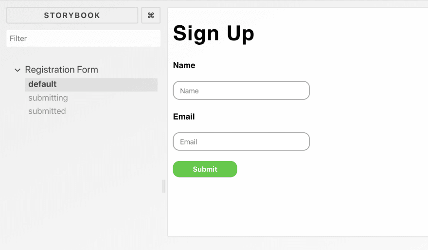
After you finished adjusting, let’s add a few stories to the Storybook. For example, we have a simple sign up form with a title, a status message, two different input fields with belonged labels, and submit button.
Let’s create a simple sign up form, mark up and style its elements in different states.
First we need to add <SignUpForm /> component, import sign-up-form.css with the corresponding styles:
.form {
    font-family: Roboto, sans-serif;
    margin: 0;
    padding: 0;
}

.form__title {
    letter-spacing: 1px;
    font-weight: 600;
}

.form__status {
    color: #666;
    margin-bottom: 20px;
}

.form__label {
    font-size: .8em;
    font-weight: bold;
}

.form__input {
     width: 200px;
    height: 25px;
    padding-left: 10px;
    border-radius: 10px;
    border: 1px solid darkgrey;
}

.form__button {
    width: 100px;
    height: 25px;
    border-radius: 10px;
    color: white;
    background-color: limegreen;
    border: 0;
    cursor: pointer;
    font-weight: bold;
}

.form__button–submitting {
    background-color: darkgrey;
}

.form__button–submitted {
    background-color: limegreen;
}
Our form has three states:
- initial: when form is displayed by default, awaiting for the user input
- submitting: when the HTTP request is performed after submitting the form
- submitted: the API call is finished and the server responded with success.
Depending on the form status, some form elements will be showed/hidden or have different styles like:
- while submitting the form and the submit button would be disabled and grey
- if the form submitted, then the user will be notified about successful sign up through the shown message suggesting them to sign in.
Here there is full implementation of the <SignUpForm /> with the injected props from <SignUpContainer />:
// SignUpForm.js

import React from 'react';

import './sign-up-form.css';

export const SignUpForm = ({onSubmit, state}) => {
    const submitting = state === 'submitting';
    const submitted = state === 'submitted';

    const buttonState = submitting ?
        'form__button--submitting' :
        'form__button--submitted';

    return (
        <form className="form" onSubmit={onSubmit}>
            <h1 className="form__title">Sign Up</h1>
            {
                submitted ?
                    <div className="form__status">
                      You have been signed up successfully. Sign in?
                    </div> : null
            }
            <label htmlFor="name" className="form__label">Name</label>
            <p>
                <input type="text"
                       id="name"
                       placeholder="Name"
                       disabled={submitting}
                       className="form__input"
                />
            </p>
            <label htmlFor="email" className="form__label">Email</label>

            <p>
                <input type="email"
                       id="email"
                       disabled={submitting}
                       placeholder="Email"
                       className="form__input"
                />
            </p>
            <p>
                <button disabled={submitting}
                        className={`form__button ${buttonState}`}>
                    Submit
                </button>
            </p>
        </form>
    );
};
The <SignUpContainer /> component is the parent container component that will manipulate the sign up form though the states and methods onto them. We will omit this component, as it is not related to storybook-based styleguide.
The next step is to write stories for Storybook. It means to make specific functions that describe a specific state of the form UI:
//  ./stories/index.js

import React from 'react';
import {storiesOf} from '@storybook/react';
import {SignUpForm} from "../SignUpForm";

const noOp = (e) => {
    e.preventDefault();
};

storiesOf('Registration Form', module)
    .add('default', () => (
        <div><SignUpForm state="idle" onSubmit={noOp}/></div>
    ))
    .add('submitting', () => (
        <div><SignUpForm state="submitting" onSubmit={noOp}/></div>
    ))
    .add('submitted', () => (
        <div><SignUpForm state="submitted" onSubmit={noOp}/></div>
    ));
And last to load all stories in the Storybook:
// .storybook/config.js

import { configure } from '@storybook/react';

function loadStories() {
    require('../src/stories');
}

configure(loadStories, module);
And now the signup form is entirely “storybooked.” Run your local server to check the result in the storybook. My variant is below:


I hope you are curious now to try out Storybook with React or another library to create a style guide for your app.
Just leave a comment to share the approach how do you implement a style guide for your app?
Thank you for reading!
Code your best 👩💻👨💻
Photo by Goran Ivos on Unsplash


Top comments (2)
Storybook knobs are a great add on. They let you alter props in Storybook at runtime, so you can play with your different form states if you wanted to. 🔥
npmjs.com/package/@storybook/addon...
I love storybook too specially after experiencing the pain when a core component viz Form input has different variations and got new requirements , it's best to document all variations and see if all works fine.