
What is Visual State Manager?
The Visual State Manager (VSM) is a structured way to make some changes on the controls to the user interface from code, and the visual state manager is the concept of visual states. All the user interface is defined in XAML, so we can include visual state manager effects on the XAML. We can apply visual state manager effects on all the XAML controls to make unique controls. Let’s took an example of a Button, a button has different visual appearances like a button pressed, whether it’s disabled, or has input focus.
“CommonStates” is the visual state group named that is defined on the Visual State Manager. They have the following visual states:
- “Normal”
- “Selected”
- “Focused”
- “Disabled”
VisualElement is the base class for Page and View, and the visual state group only support the class those derived from VisualElement.
Triggers and visual state manager both are the same but the difference is, using trigger we can also change the Ui based on the events and property. But in visual state manager we can change the Ui based on states it is easy to use and their structure is less confusing.
Common States
In XAML, if the view is disabled, or normal, or has the input focus these are known as the common states.
                <entry fontsize="15">
                  <visualstatemanager.visualstategroups>
                      <visualstategroup x:name="GroupedStates">
                          <visualstate x:name="Normal">
                          </visualstate>
                          <visualstate x:name="Focused">
                          </visualstate>
                          <visualstate x:name="Disabled">
                          </visualstate>
                      </visualstategroup>
                  </visualstatemanager.visualstategroups>
      </entry>
This is just an example of how we can use visual state manager. Visual state group is a common group state on that we can include pair of visual state. After that, we can define a setter property on the visual state. You can use the setter property with the visual state and inside the VisualState.Setter like the below,
                <entry fontsize="15">
                  <visualstatemanager.visualstategroups>
                      <visualstategroup x:name="GroupedStates">
                          <visualstate x:name="Normal">
                              <visualstate.setters>
                                  <setter property="BackgroundColor" value="Gray">
                              </setter></visualstate.setters>
                          </visualstate>
                          <visualstate x:name="Focused">
                              <visualstate.setters>
                                  <setter property="FontSize" value="30">
                              </setter></visualstate.setters>
                          </visualstate>
                          <visualstate x:name="Disabled">
                              <visualstate.setters>
                                  <setter property="BackgroundColor" value="Green">
                              </setter></visualstate.setters>
                          </visualstate>
                      </visualstategroup>
                  </visualstatemanager.visualstategroups>
      </entry>
Now, we can see a simple Entry example using a visual state manager.
  <contentpage x:class="VisualState.MainPage" xmlns="http://xamarin.com/schemas/2014/forms" xmlns:x="http://schemas.microsoft.com/winfx/2009/xaml">

    <entry placeholder="Write your name">
        <visualstatemanager.visualstategroups>
            <visualstategroup x:name="CommonStates">
                <visualstate x:name="Normal">
                    <visualstate.setters>
                        <setter property="BackgroundColor" value="#FFDBBA">
                        <setter property="TextColor" value="#FF00B6">
                        <setter property="FontSize" value="25">
                    </setter></setter></setter></visualstate.setters>
                </visualstate>
                <visualstate x:name="Focused">
                    <visualstate.setters>
                        <setter property="HeightRequest" value="80">
                        <setter property="TextColor" value="#9700FF">
                        <setter property="BackgroundColor" value="#FFE6FF">
                        <setter property="FontSize" value="35">
                    </setter></setter></setter></setter></visualstate.setters>
                </visualstate>
                <visualstate x:name="Disabled">
                    <visualstate.setters>
                        <setter property="BackgroundColor" value="#9700FF">
                    </setter></visualstate.setters>
                </visualstate>
            </visualstategroup>
        </visualstatemanager.visualstategroups>
    </entry>

</contentpage>
Here we can add Entry control with the visual state group and VisualState.Setter, inside VisualState.Setter we can add some other setter property to set the entry’s background color, font size, text color, and height.
Read More: What Is Xml Manifest In Office Add-in?
In this example, we have created an entry for example when we enter some data they will change the entry’s height and color, and when we remove focus it will change again.
Output
 Image: Entry with Visual State Manager
 Image: Changed Entry Control
 Image: Effect after mouse over
We can create an example with one entry control now and can create an example with three entry control with some conditions.
  <!--?xml version="1.0" encoding="utf-8" ?-->
<contentpage x:class="VisualState.MainPage" xmlns="http://xamarin.com/schemas/2014/forms" xmlns:x="http://schemas.microsoft.com/winfx/2009/xaml">
  <stacklayout>
          <stacklayout.resources><style targettype="Entry" type="text/css"><Setter Property="Margin" Value="20, 0" />
                  <Setter Property="FontSize" Value="18" />
                  <Setter Property="VisualStateManager.VisualStateGroups">
                      <VisualStateGroupList>
                          <VisualStateGroup x:Name="CommonStates">
                              <VisualState x:Name="Normal">
                                  <VisualState.Setters>
                                      <Setter Property="BackgroundColor" Value="Lime" />
                                  </VisualState.Setters>
                              </VisualState>
                              <VisualState x:Name="Focused">
                                  <VisualState.Setters>
                                      <Setter Property="FontSize" Value="36" />
                                      <Setter Property="BackgroundColor" Value="Lime" />
                                  </VisualState.Setters>
                              </VisualState>
                              <VisualState x:Name="Disabled">
                                  <VisualState.Setters>
                                      <Setter Property="BackgroundColor" Value="Pink" />
                                  </VisualState.Setters>
                              </VisualState>
                          </VisualStateGroup>
                      </VisualStateGroupList>
                  </Setter></style><style targettype="Label" type="text/css"><Setter Property="Margin" Value="20, 30, 20, 0" />
                  <Setter Property="FontSize" Value="Large" /></style>
          </stacklayout.resources>
          <label text="Normal Entry:">
          <entry>
          <label text="Entry with VSM: ">
          <entry>
              <entry.triggers>
                  <datatrigger binding="{Binding Source={x:Reference entry3},
                                             Path=Text.Length}" targettype="Entry" value="0">
                      <setter property="IsEnabled" value="False">
                  </setter></datatrigger>
              </entry.triggers>
          </entry>
          <label text="Entry to enable 2nd Entry:">
          <entry placeholder="Type something to enable 2nd Entry" text="" x:name="entry3">
      </entry></label></label></entry></label></stacklayout>
</contentpage>
In this example, we can add three entry controls first entry control will be normal entry control, the second entry control will be disabled when we type something on the third entry control then the second entry control will be enabled and we can remove the text from the third entry control the second entry control will be disabled.
Output
 Image: Multiple Entry Controls with Visual State Manager
 Image: Entry control with some condition
 Image: Enabled second entry control
After this example, we have created one more example with some conditions using the code-behind.
Looking for the Best Custom Software Development Company? Your Search ends here.
MainPage.Xaml
<!--?xml version="1.0" encoding="utf-8" ?-->
<contentpage x:class="VisualState.MainPage" xmlns="http://xamarin.com/schemas/2014/forms" xmlns:x="http://schemas.microsoft.com/winfx/2009/xaml">

  <stacklayout padding="10, 10" x:name="stackLayout">
      <visualstatemanager.visualstategroups>
          <visualstategroup name="ValidityStates">
              <visualstate name="Valid">
                  <visualstate.setters>
                      <setter property="Label.TextColor" targetname="helpLabel" value="Transparent">
                      <setter property="Entry.BackgroundColor" targetname="entry" value="Lime">
                  </setter></setter></visualstate.setters>
              </visualstate>
              <visualstate name="Invalid">
                  <visualstate.setters>
                      <setter property="Entry.BackgroundColor" targetname="entry" value="Pink">
                      <setter property="Button.IsEnabled" targetname="submitButton" value="False">
                  </setter></setter></visualstate.setters>
              </visualstate>
          </visualstategroup>
      </visualstatemanager.visualstategroups>
      <label fontsize="Large" text="Enter phone number:">
      <entry fontsize="Large" margin="30, 0, 0, 0" placeholder="555-555-5555" textchanged="OnTextChanged" x:name="entry">
      <label text="Phone number must have the displayed format, and not begin with a 0 or 1" x:name="helpLabel"><button fontsize="Large" horizontaloptions="Center" margin="0, 20" text="Submit" verticaloptions="Center" x:name="submitButton"></button></label></entry></label></stacklayout></contentpage>
Mainpage.Xaml.cs
  using System;
  using System.Collections.Generic;
  using System.ComponentModel;
  using System.Linq;
  using System.Text;
  using System.Text.RegularExpressions;
  using System.Threading.Tasks;
  using Xamarin.Forms;
  namespace VisualState
  {
      public partial class MainPage : ContentPage
      {
          public MainPage()
          {
              InitializeComponent();
              Validation(false);
          }
          private void OnTextChanged(object sender, TextChangedEventArgs e)
          {
              bool isValid = Regex.IsMatch(e.NewTextValue, @"^[2-9]\d{2}-\d{3}-\d{4}$");
              Validation(isValid);
          }
          void Validation(bool isValid)
          {
              string VSM = isValid ? "Valid" : "Invalid";
              VisualStateManager.GoToState(stackLayout, VSM);
          }
      }
  }
In this example, we can set button visibility using visual state manager when the user doesn’t enter a valid number format the button will be disabled and user entered a valid number the button will be enabled.
Output
 Image: Submit button disable
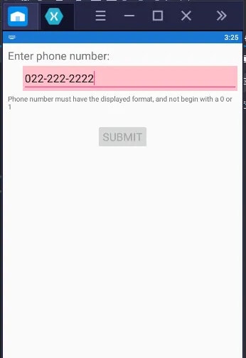 Image: Can’t start with 0 or 1
 Image: Submit button enabled
Conclusion
In this blog, we have learned the visual state manager, which is a structured way to design control. Suppose we want to increase the height of an entry control when we type something on that. And we can also set the text color or entry color based on the conditions. Also, do that, change the color of entry control when control is focused.


Top comments (0)