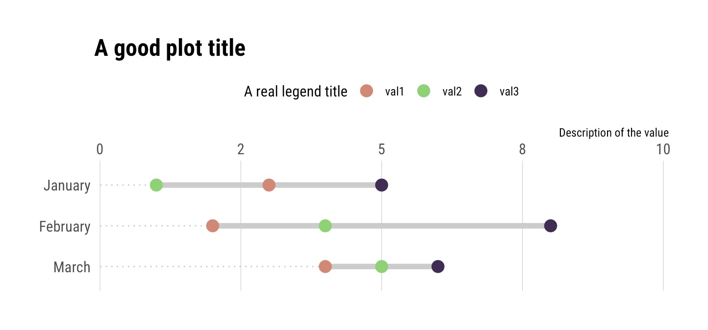
A user of the {ggalt} package recently posted a question about how to add points to a geom_dumbbell() plot. For now, this is not something you can do with geom_dumbbell() but with a bit of data wrangling you can do this in a pretty straightforward manner with just your data and ggplot2. The example below uses 3 values per category but it should scale to n values per category (though after a certain n you should reconsider the use of a dummbell chart in favour of a more appropriate way to visualize the message you’re trying to convey).
Here’s the setup:
library(hrbrthemes)
library(tidyverse)

tibble(
  val1 = c(3, 2, 4),
  val2 = c(1, 4, 5),
  val3 = c(5, 8, 6),
  cat = factor(month.name[1:3], levels = rev(month.name[1:3]))
) -> xdf
Three values per category. The approach is pretty straightforward:
- reshape the data frame & get min value so you can draw an eye-tracking line (this is one geom)
- reshape the data frame & get min/max category values so you can draw the segment (this is another geom)
- reshape the data frame & plot the points
I’ve put ^^ notes near each ggplot2 geom:
ggplot() +
  # reshape the data frame & get min value so you can draw an eye-tracking line (this is one geom)
  geom_segment(
    data = gather(xdf, measure, val, -cat) %>%
      group_by(cat) %>%
      top_n(-1) %>%
      slice(1) %>%
      ungroup(),
    aes(x = 0, xend = val, y = cat, yend = cat),
    linetype = "dotted", size = 0.5, color = "gray80"
  ) +
  # reshape the data frame & get min/max category values so you can draw the segment (this is another geom)
  geom_segment(
    data = gather(xdf, measure, val, -cat) %>%
      group_by(cat) %>%
      summarise(start = range(val)[1], end = range(val)[2]) %>%
      ungroup(),
    aes(x = start, xend = end, y = cat, yend = cat),
    color = "gray80", size = 2
  ) +
  # reshape the data frame & plot the points
  geom_point(
    data = gather(xdf, measure, value, -cat),
    aes(value, cat, color = measure),
    size = 4
  ) +
  # i just extended the scale a bit + put axis on top; choose aesthetics that work
  # for you
  scale_x_comma(position = "top", limits = c(0, 10)) +
  scale_color_ipsum(name = "A real legend title") +
  labs(
    x = "Description of the value", y = NULL,
    title = "A good plot title"
  ) +
  theme_ipsum_rc(grid = "X") +
  theme(legend.position = "top")
And, here’s the result:


Latest comments (0)