
The use of a dark mode has grown in popularity. Many large websites and applications are developing their own version of it which is often done using CSS variables.
In this post, we'll look at how to add support for dark mode to your website in two ways: first with CSS and then with a JavaScript toggle.
Prerequisites
I highly recommend you go ahead and fork a Astro starter from Astro.new.
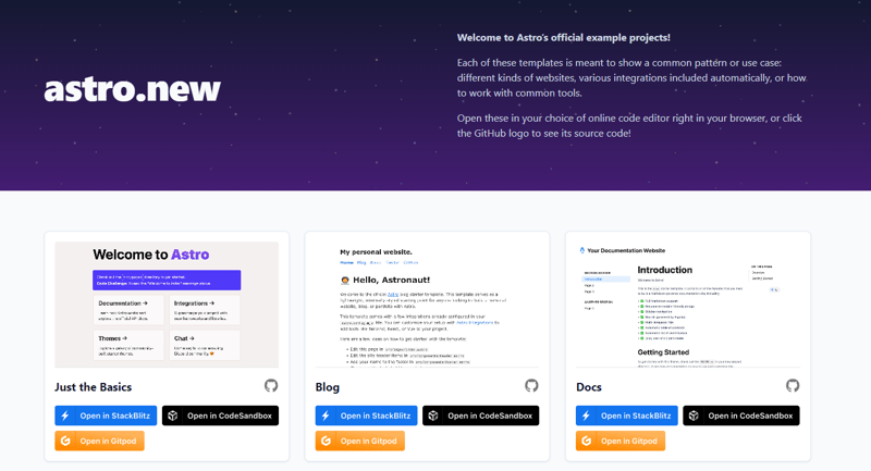
You can choose a template of your choice and then open the template in CodeSandbox which will automatically handle the required dependencies.
Creating our Dark Mode Component
Inside the components folder, I've added a new component called ThemeChange.astro. It's basic functionality includes a clickable element alongside our svg images for our toggle.
<div class="theme-switch-wrapper">
          <label class="theme-switch" for="checkbox">
            <input type="checkbox" id="checkbox" />
            <div class="slider">
              <svg
                xmlns="http://www.w3.org/2000/svg"
                width="16"
                height="16"
                viewBox="0 0 24 24"
                fill="#FCD53F"
                stroke="currentColor"
                stroke-width="2"
                stroke-linecap="round"
                stroke-linejoin="round"
                class="feather feather-sun"
              >
                <circle cx="12" cy="12" r="5"></circle>
                <line x1="12" y1="1" x2="12" y2="3"></line>
                <line x1="12" y1="21" x2="12" y2="23"></line>
                <line x1="4.22" y1="4.22" x2="5.64" y2="5.64"></line>
                <line x1="18.36" y1="18.36" x2="19.78" y2="19.78"></line>
                <line x1="1" y1="12" x2="3" y2="12"></line>
                <line x1="21" y1="12" x2="23" y2="12"></line>
                <line x1="4.22" y1="19.78" x2="5.64" y2="18.36"></line>
                <line x1="18.36" y1="5.64" x2="19.78" y2="4.22"></line>
              </svg>
              <svg
                xmlns="http://www.w3.org/2000/svg"
                width="16"
                height="16"
                viewBox="0 0 24 24"
                fill="#FCD53F"
                stroke="currentColor"
                stroke-width="2"
                stroke-linecap="round"
                stroke-linejoin="round"
                class="feather feather-moon"
              >
                <path
                  d="M21 12.79A9 9 0 1 1 11.21 3 7 7 0 0 0 21 12.79z"
                ></path>
              </svg>
            </div>
          </label>
        </div>
We'll immediately import this component into the Header component.
---
import HeaderLink from './HeaderLink.astro';
import { SITE_TITLE } from '../config';
import Toggle from './ThemeChange.astro';
---

<header>
    <Toggle />
    <h2>
        {SITE_TITLE}
    </h2>
    <nav>
        <HeaderLink href="/">Home</HeaderLink>
        <HeaderLink href="/blog">Blog</HeaderLink>
        <HeaderLink href="/about">About</HeaderLink>
        <HeaderLink href="https://twitter.com/astrodotbuild" target="_blank">Twitter</HeaderLink>
        <HeaderLink href="https://github.com/withastro/astro" target="_blank">GitHub</HeaderLink>
    </nav>
</header>
<style>
    header {
        margin: 0em 0 2em;
    }
    h2 {
        margin: 0.5em 0;
    }
</style>
Using CSS variables for themes
CSS Variables enable us to define reusable values that can be changed at runtime. First, on the root element, define all available colours. Then, using these colours, create two opposing data-themes: light and dark.
:root {
  --color-bg: #f2f2f2;
  --color-text: #444444;
  --bold-text: #222;
  --nav-text: #000000;
  --code: #f2f2f2;
  --block-quote-border: #999;
  --block-quote-text: #222;
  --slider-bg: #dddddd;
  --slider-bg-before: #fff;
  --slider-input-bg: #8758ff;
}

[data-theme="light"] {
  --color-bg: #f2f2f2;
  --color-text: #444444;
  --bold-text: #222;
  --nav-text: #000000;
  --code: #f2f2f2;
  --block-quote-border: #999;
  --block-quote-text: #222;
  --slider-bg: #dddddd;
  --slider-bg-before: #fff;
  --slider-input-bg: #8758ff;
}

[data-theme="dark"] {
  --color-bg: #000;
  --color-text: #dddddd;
  --bold-text: #eeeeee;
  --nav-text: #dddddd;
  --code: #f2f2f2;
  --block-quote-border: #8e32dc;
  --block-quote-text: #dddddd;
}
💡 Note - When the
data-theme="dark"is applied to the<body>element, thebackground-colorof thecomponentchanges from white to black.
Apply this same concept to all of the colours in your web app, and you've got yourself a theme switcher! What's missing is a toggle element that, when checked, adds or removes the data-theme from the body element.
Lastly, we'll apply the rest of our toggle element's styles as shown below.
/* TOGGLE  */
.theme-switch-wrapper {
  display: flex;
  justify-content: flex-end;
  align-items: center;
}

.theme-switch {
  display: inline-block;
  height: 34px;
  position: relative;
  width: 60px;
}

.theme-switch input {
  display: none;
}

.slider {
  background-color: var(--slider-bg);
  bottom: 0;
  cursor: pointer;
  left: 0;
  position: absolute;
  right: 0;
  top: 0;
  transition: 0.4s;
  border-radius: 34px;
}

.slider:before {
  background-color: var(--slider-bg-before);
  bottom: 4px;
  content: "";
  height: 26px;
  left: 4px;
  position: absolute;
  transition: 0.4s;
  width: 26px;
  border-radius: 50%;
}

input:checked + .slider {
  background-color: var(--slider-input-bg);
}

input:checked + .slider:before {
  transform: translateX(26px);
}

.slider svg {
  color: #222;
  position: absolute;
  transition: opacity 0.2s ease 0s, transform 0.35s ease 0s;
  pointer-events: none;
}

.feather-moon {
  opacity: 0;
  left: 9px;
  bottom: 9px;
  transform: translateX(4px);
}

.feather-sun {
  opacity: 1;
  right: 10px;
  bottom: 9px;
  transform: translateX(0px);
}

input:checked + .slider .feather-moon {
  opacity: 1;
  transform: translateX(0);
}

input:checked + .slider .feather-sun {
  opacity: 0;
  transform: translateX(-4px);
}
💡 Note - If you get stuck on picking colors for your CSS variables then discover the newest hand-picked palettes from Color Hunt.
JavaScript
In JavaScript, local storage is an object that is part of the window object, so we can directly access it and try to find an item that is stored inside. We use the getItem function and pass in the property we want to find inside of our ThemeChange.astro component.
<script>
          // Get the theme toggle input
          const themeToggle = document.querySelector(
            '.theme-switch input[type="checkbox"]'
          );

          // Get the current theme from local storage
          const currentTheme = localStorage.getItem("theme");

          // If the current local storage item can be found
          if (currentTheme) {
            // Set the body data-theme attribute to match the local storage item
            document.documentElement.setAttribute("data-theme", currentTheme);

            // If the current theme is dark, check the theme toggle
            if (currentTheme === "dark") {
              themeToggle.checked = true;
            }
          }

          // Function that will switch the theme based on the if the theme toggle is checked or not
          function switchTheme(e) {
            if (e.target.checked) {
              document.documentElement.setAttribute("data-theme", "dark");
              localStorage.setItem("theme", "dark");
            } else {
              document.documentElement.setAttribute("data-theme", "light");
              localStorage.setItem("theme", "light");
            }
          }

          // Add an event listener to the theme toggle, which will switch the theme
          themeToggle.addEventListener("change", switchTheme, false);

</script>
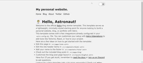
Here's the final result once all the components are in place:
Conclusion
Thank you for reading, and let's connect!
Feel free to subscribe to my email newsletter and connect on Twitter.


Oldest comments (0)