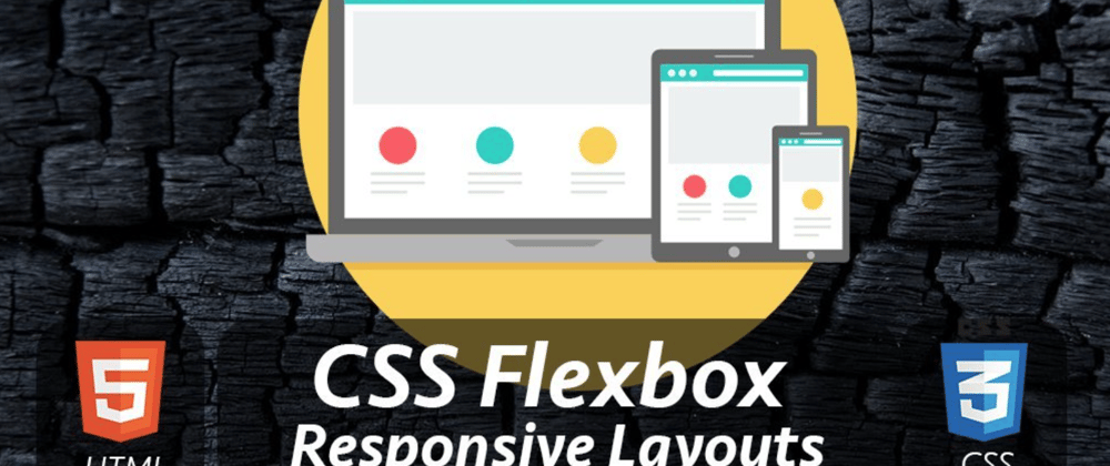
In this article, I’ll be showing you how to easily create responsive multi-column mobile friendly layouts using CSS Flexbox.
If you have a Shopify store, this article will help you design your product description page so that you don’t have to pay a monthly subscription fee for an app that does this.
What are we building?

A lot to cover, so let’s get started!
- Single Column Layout
- Two Column Flexbox Layout
- Two Column Reverse Flexbox Layout
- Two Column Mobile Layout
- Three Column Flexbox Layout
- Three Column Mobile Layout
Single Column Layout
The HTML code for the single column is pretty straight forward.
!-- SINGLE COLUMN -->
<section class="one-column">
  <h2>This beautiful 3-piece comforter set takes the guesswork out of coordinating colors and textures.</h2>
  <img src="https://cdn.shopify.com/s/files/1/0506/3127/8767/files/301500x1500.jpg?v=1611944972" alt="">
</section>
The section is the top-level element that has three children elements:
- section → is a block-level element that spans horizontally across the width of its parent in this case .
- h2 → is also a block level element and has a title content.
- img → is an element where I pulled an image from the URL and set its src attribute (sometimes images comes with fixed width and height which may go beyond its parent width).
To make the image fit to its parent width, add these couple of properties to the img CSS selector:
- width:100% → will fit the image to its parent width.
- height:auto → will adjust the image height proportionate to its width.
/* ONE COLUMN */
.one-column {
  text-align:center;
}

img {
  width:100%;
  height:auto;
}
And the single column layout works right off the bat like the image below, even in the mobile view without using Flexbox. 🙂

That’s nice!
Now let’s take a look at how to create a two column layout using Flexbox.
Recommended
3 Ways To Make A Div Full Screen Using CSS
Two Column Flexbox Layout
The two column HTML markup has a top-level section element with the class name two-column and of course two divs inside representing left and right columns.
<section class="two-column">
  <div>1</div>
  <div>2</div>
</section>
As you know, div is a block-level element so the output with the above code looks like the image below.

To make the two column layout, make both divs appear beside each other instead of below the other.
Traditionally, we use inline-block or float to achieve this.
With Flexbox, we can do it with a couple of CSS Flexbox properties:
- display:flex
- flex-direction:row → is a default behaviour that you often don’t need. It lays its children beside each other, which is exactly what we want to make the two columns.
/* TWO COLUMN FLEXBOX */
.two-column {
  display:flex;
  flex-direction:row;
}

This works.
Now, let’s spread these two divs evenly to fill its parent width horizontally.
To do that, add flex:1 css rule to the inner divs.
/* TWO COLUMN FLEXBOX */
.two-column div {
  flex:1;
  border:1px solid blue;
}
I’ve also added the border to them just for viewing purposes.

Now, let’s add some content on the left column and an image on the right.
<section class="two-column">
<div>
<h2>Comfy & Cozy</h2>
<p>The ultra-soft <strong>300 GSM </strong>hypoallergenic microfiber filling will keep you warm 🔥 for a better sleep during 🥶 cold nights.
</p>
</div>
<div>
<img src="https://cdn.shopify.com/s/files/1/0506/3127/8767/files/2-1.jpg?v=1611450960" alt="">
</div>
</section>
The layout will look like this right away!
And its not bad…

Now, let’s center the content horizontally and vertically using Flexbox.
To do that, we need to add these three Flexbox CSS rules to the inner div:
- Display:flex;
- Justify-content: center;
- Align-items: center;
/* TWO COLUMN FLEXBOX */
.two-column div {
  border:1px solid blue;
  flex:1;

  display:flex;
  justify-content:center;
  align-items:center;
}
As you can see, I use nested 🕸 Flexbox which is more common when using Flexbox.

Wait…
Something is messed up.
Both the heading and paragraph are trying to be in the middle of the div horizontally and vertically.
However, what we want is to keep them one below the other, probably the title at the top and the paragraph at the bottom. Let’s do this first before centering them.
To do that, wrap both elements with a span element.
This way, Flexbox properties will be applied to the span element instead of the heading and paragraph inside.
<section class="two-column">
<div>
<span>
<h2>Comfy & Cozy</h2>
<p>The ultra-soft <strong>300 GSM </strong>hypoallergenic microfiber filling will keep you warm 🔥 for a better sleep during 🥶 cold nights.
</p>
</span>
</div>
<div>
<img src="https://cdn.shopify.com/s/files/1/0506/3127/8767/files/2-1.jpg?v=1611450960" alt="">
</div>
</section>
Next, center the heading and paragraph text as well.
/* TWO COLUMN FLEXBOX */
two-column div {
  ...
  text-align:center;
}

This looks good!
If you look at any landing page layouts, the second two column layout will have an image on the left and content on the right and so on.
Let’s see how to do exactly that.


Top comments (1)
Hi there, we encourage authors to share their entire posts here on DEV, rather than mostly pointing to an external link. Doing so helps ensure that readers don’t have to jump around to too many different pages, and it helps focus the conversation right here in the comments section.
If you choose to do so, you also have the option to add a canonical URL directly to your post.