Hello there, users!
Today I'd like to receive some feedback for my new personal site.
I'm well aware maybe you're busy right now, so I'll publish a few screenshots. However, I'd really appreciate if you can test the functionality of the site too.
My webpage: Here
I'm a self-taught designer&developer, so every feedback is really appreciated.

Thank you 🌹


Top comments (4)
Wow, the page looks really nice! Good job! 💪 You definitely have knack for design.
There are a few things that jump out at me:
Welcome !with a space.mailto:link.I am really impressed by your design. Its one of a kind and very nice too look at.
I hope I did not bash your page too much, but being in the field for a while does give me an eye for these things (code reviews FTW)!
If you need any clarification/help, don't be afraid to reach out.
Hi Luka! First of all, thank you so much for your time answering my post.
1) For the different color style in hovering the links: it is about SEO, if you check it, it'll only hightlight the keywords of the article.
2) About the space is to separate the post from the person who wrote them, I thought it was necessary.
3) I don't have own separated links because the "name" variable, which is because 'welcome' displays a space if not entering any name (because it displays empty), is a local variable, and I wanted to create the webpage as easy as possible, so passing variables between components parent-child was not something I wanted to build right then.
4) "Back/Forward buttons are doing weird things :)" What do you mean with this?
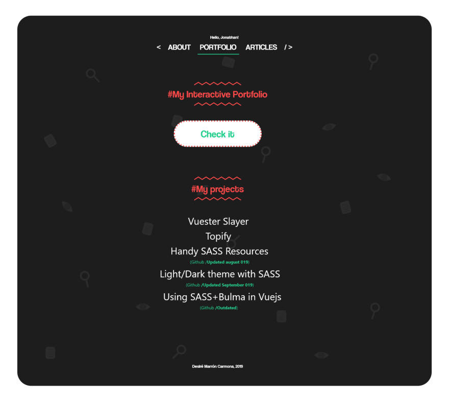
5) I'm using an image for the book because there are plenty of projects that I didn't posted in any other social media, so that's actually my complete portfolio. I didn't wanted to upload a lot of images of different projects there like if it was a "stamp collection".
6) Also, there isn't a "go back" button in the Book page because it is suppoused to open in a new tab, not the same tab. Is that not working?
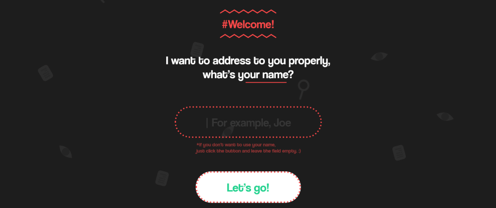
7) The 2 cursos on the input is because one of them is hand-made to display the "intermitent" animation! (And the other cursor is, of course, the native one).
8) As said, there is a space in "Welcome" if you don't enter a name because the name variable should display there, if it's empty it displays empty. Guess I could fix that by not displaying if it's empty but I didn't thought it was hard to look at it.
9) About asking the name... I wanted my page to feel like really getting to know me, and when I know someone new of course I ask their name. It was the kind of a feeling I wanted to give, that's also why I include my childhood. This is not intented to be a professional website but my personal website.
And finally 10) thank you! I'm glad you liked my design!
2) The space itself is ok, but if I position my mouse on that space, it does not highlight the article. Try moving the mouse slowly from the title to the author, there is a small space that is not clickable.
4) I guess this one is related to the 3) point. By having no URLs you can't navigate back to the previously visited page. For example clicking on the 'Lets go' button and then clicking on on the 'Back' browser button takes you to the
/bookpage, which I find unintuitive. If I go from the About page to the Articles page and clicking back I expect to go back to the About page, but instead I'm taken to the/bookpage.6) When clicking on the 'Check it' a new tab with the book opens, so that is working as intended. However it might make sense to add a link to the homepage to the top of the page, which might come in handy if I'm sending the
/bookURL to someone and they want to visit your whole page. As it currently stands, they'd have to edit the URL to delete the/book.9) I see that you've stated in the article that this is your personal website. I missed it! Sorry.
I'm curious, what tools are you using to build the site? :)
Thank you again for your time Luka, I see I might work in a better navigation so the users feel more comfortable, I'll put my hands on it asap! Also I'll try to think for a better presentation for my Book, I see it is also loading slowly in computers with a slower internet connection.
For building the site I used only Vuejs and styled it with SASS, nothing else nothing more!
Again thank you for your time, have a nice day!