Driving a car, walking a flight of stairs, or watching a movie are activities people without a disability do without a second thought. These activities can present barriers to people living with a disability but can be overcome when steps are taken to provide accessibility. Similarly, the worldwide web needs to provide information that is accessible to all users, regardless of their ability to see, read, hear, or interact with a machine.
Web accessibility is a practice focused on ensuring information from a website is accessible by all users. A barrier to information can be caused by a disability, physical or situational, or it may be socio-economic meaning that a user has limited bandwidth.
Web accessibility should be considered by developers throughout the planning, design, and implementation of an application because everyone deserves to have access to information that is largely held on the worldwide web.
In this post I’ll cover four ways to make a website more accessible. To illustrate these four tips I'll build a form to register dogs in a neighborhood. This form will incorporate each tip to create a website available for all users.
1. Clear Layout
Helpful for: screen readers
People with visual ability can gain context by looking at a website and determining the order in which information is meant to be delivered. For users who have a visual disability or no sight use screen readers to interpret information. Screen readers describe the text and user-interface options to a user.
If the DOM elements are not placed in an order that matches visual components, it can create a barrier for the user. In addition to the order, labels and headers should properly describe the content.
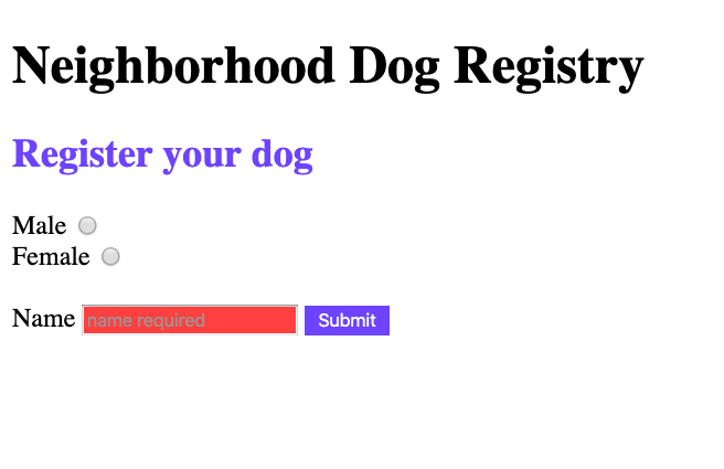
Here we have our form for the neighborhood dog registry website.
The HTML looks like this
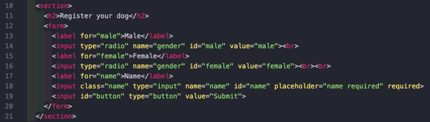
The text starts at the top with an H1 tag that indicates a title followed by an h2 tag. Every input has a label describing the input and an input tag describing what type of input is expected.
2. Text Alternative
Helpful for: users with partial sight, color blindness, older users
Interacting with a website involves text, images, buttons, and inputs. These interactions may use features such as color to indicate an action or missing information. For example if the input is required, the input may be highlighted red. For a user with partial sight or color blindness, this distinction might not be obvious. This problem can be solved with a text alternative.
Adding a text indicator such as the keyword ‘required’ or an icon can let users know the input is required. Images should also incorporate text alternatives to describe the image to users.
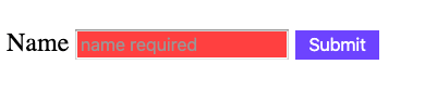
Users without a vision disability may be able to garner that the red box means it's required. For others, it's important that we have a text alternative.
In our HTML we use the keyword 'required' which gives us a pop-up that states the input is required as well as prevents the form from being submitted. A screen reader will identify the input as required and translate to the user.
3. Non-Text Color Contrast
Helpful for: users with partial sight, older users, color blindness
Brands put a lot of energy into making sure their product or service is unique and the color is a large part of marketing. If color contrast is overlooked in this process, a website can leave users with a visual disability unable to distinguish content on the page.
The contrast ratio is the contrast in brightness between two colors. The minimum contrast a website should use is 4.5:1. For reference, white text on a white background has a ratio of 1:1. You can use a contrast checker like the one provided by webaim.com. Exceptions to the best practice for color contrast are large text (over 18pt), logotypes, or incidental text that isn't needed for context.
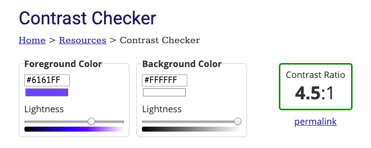
A color contrast checker will tell us what ratio our color contrast is. Now we can apply this color to our button and h2 header.
4. Keyboard Options
Helpful for: people with no vision, speech input software, scanning software, mobility impairments
Without planning, a website can be created to only interact with mouse events meaning a user has to click on buttons to perform actions. Clicking, selecting, and moving items on the screen should be operable through a keyboard or an alternate keyboard allowing for hands-free interaction. A user should also be able to traverse DOM elements by using the up and down arrows on a keyboard.
Using jQuery we can use both a click function and a keypress function to allow a user to submit a form by clicking the button or pressing enter.
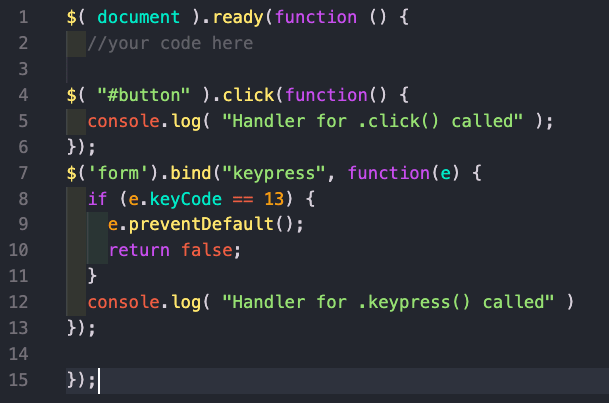
When we click the button or press enter, we get the corresponding message in the console.

Building an Accessible Website
Our end form now has
- Clear structure, with descriptive labels and headings
- Inputs with text alternatives stating information is required
- Color contrast with 4:5:1 ratio
- The ability to press enter to submit the form
This post only covered four ways that a website can be more accessible meaning there are numerous ways to make sure a website is created with all users in mind. It can be easy to forget to incorporate these practices when you are not living with a disability but the world wide web should not create any barriers to knowledge.
If you have any suggestions on how to improve accessibility on a website, drop them in the comments!
Resources Used
Web accessibility - wikipedia.org
Contrast Checker - webaim.org
W3.org


Oldest comments (4)
Step 4 feels a little dated a method, especially as, as long as you're using semantic Web design, such as making sure you use buttons with onClick instead of divs with onClick, the majority of modern browsers send the same event through enter key as they would for a click.
There's also the issue that all of the steps done in jQuery could be done in vanilla JavaScript nowadays.
Thanks for the input! I hadn't thought about what might be handled by modern browsers. I will say my research opened my eyes to actions a person with a disability needs to use a computer such as keystrokes over mouse functions.
Is there a reason to use vanilla JS over jQuery?
Mostly, bundle size, if you can have one less extra thing added to your bundle, you may as well.
And 99.5% of jQuery is now in the es6 JavaScript specification, so it is seen as wasteful to add it.
I see, good to know 👍🏻