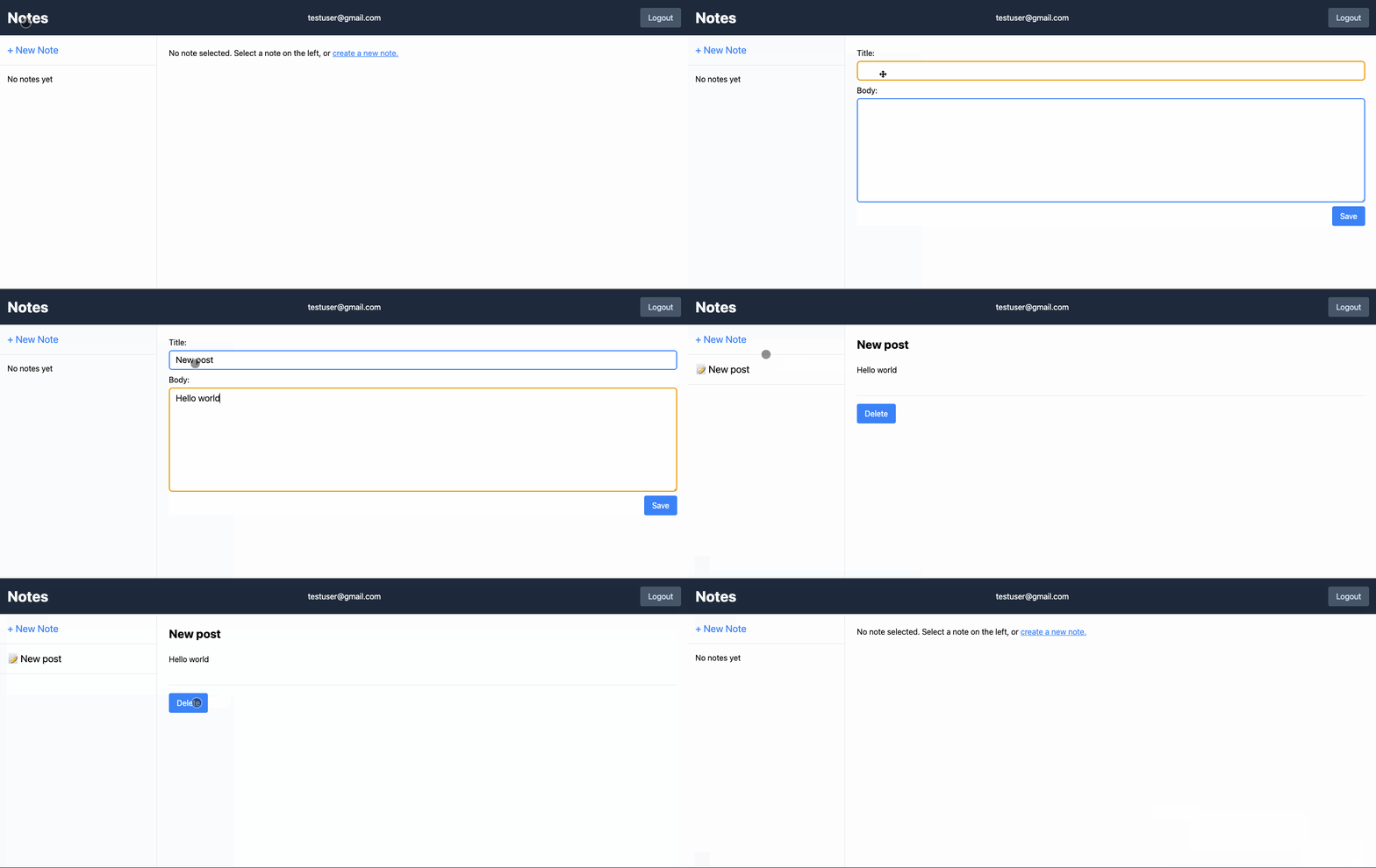
This post is about the spinner at the bottom left corner of the cover image 🤓
Disclaimer: there's a follow-up post for this one
Check it out later: Creating a Github-like Progress Bar for your Remix app
Intro
At Seasoned we are always looking for ways to deliver better UX/DX with less code and that is one of the main reasons we've been investing a lot in Remix.
One very nice recent addition to our Remix apps was a global progress indicator. By leveraging Remix's Form and Fetchers we have a single source of truth for any roundtrip the browser may be doing to the server.
Therefore, by just dropping a little component at our app/root.tsx file we can show a subtle progress indicator - I'm not talking about those obtrusive spinners the "SPA era" got us so used to, but something more similar to the browser's native tab spinner - whenever the page is loading/refreshing.
Got it, show me the code!
Preparation
I bootstrapped a new Remix app using the Indie Stack which already has tailwind installed as we are going to use it in this exercise.
After creating the repo, I added our cx utility function for composing classes and also created a sleep helper so I can better test the spinners locally:
// app/utils.ts
const sleep = (time: number) =>
  new Promise((resolve) => setTimeout(resolve, time));

export { sleep }
Using the sleep method in places I want to simulate a slow backend activity:
// Add this to any loaders and actions
export async function loader({ request }: LoaderArgs) {
  await sleep(1000);
  return json({
    // ..
  });
}

export async function action({ request }: ActionArgs) {
  await sleep(1000);
  return json({
    // ..
  });
}
The GlobalLoading component
I'm just going to add the component code here and explain the important parts later:
import { useNavigation } from "@remix-run/react";
import { cx } from "~/utils";

function GlobalLoading() {
  const navigation = useNavigation();
  const active = navigation.state !== "idle";

  return (
    <div
      role="progressbar"
      aria-valuetext={active ? "Loading" : undefined}
      aria-hidden={!active}
      className={cx(
        "pointer-events-none fixed left-0 bottom-0 z-50 p-4 transition-all duration-500 ease-out",
        active ? "translate-y-0" : "translate-y-full"
      )}
    >
      <svg
        className="h-7 w-7 animate-spin"
        xmlns="http://www.w3.org/2000/svg"
        fill="none"
        viewBox="0 0 24 24"
        width="1em"
        height="1em"
      >
        <circle
          className="stroke-blue-600/25"
          cx={12}
          cy={12}
          r={10}
          strokeWidth={4}
        />
        <path
          className="fill-blue-600"
          d="M4 12a8 8 0 0 1 8-8V0C5.373 0 0 5.373 0 12h4zm2 5.291A7.962 7.962 0 0 1 4 12H0c0 3.042 1.135 5.824 3 7.938l3-2.647z"
        />
      </svg>
    </div>
  );
}

export { GlobalLoading };
The Spinner
First of all, the SVG is the "official" Tailwind spinner from their docs, nothing special about it.
The active state
This is easy. Thanks to Remix and their useNavigation hook, we know that whenever the navigation.state !== 'idle' that means there's some loader/action validating.
aria-* stuff
We added role="progressbar", aria-valuetext and aria-hidden with values based on the active state so we can bring some semantics to any a11y device that may be screening our app.
The Tailwind classes
The core of the component's functionalities lies in tailwind classes.
className={cx(
  "pointer-events-none fixed left-0 bottom-0 z-50 p-4 transition-all duration-500 ease-out",
  active ? "translate-y-0" : "translate-y-full"
)}
Of course, we don't really need TW for this, but I'm going to assume you know a little of it:
-
pointer-events-none fixed left-0 bottom-0 z-50: we want it to be on the bottom-left corner of the app, floating above any content but not blocking any mouse/touch interaction with the rest of the page. -
transition-all duration-500 ease-out: to animate the entrance and disappearance of the spinner. -
active ? "translate-y-0" : "translate-y-full": when the spinner is active it shows up at its original position, otherwise it moves down in the Y axis at a distance equal to the size of the spinner container
Et voilá
Now we just need to import and add this component once and that's it:
// app/root.tsx
import { GlobalLoading } from "./components/global-loading";

export default function App() {
  return (
    <html lang="en" className="h-full">
      <head />
      <body className="h-full">
        <GlobalLoading />
        <Outlet />
        <ScrollRestoration />
        <Scripts />
        <LiveReload />
      </body>
    </html>
  );
}
This component is very simple yet it gives a little boost to the overall UX of your app. We don't ever need to think about it again as we know that even if we forget or don't have time to do progressive enhancement in every feature of our app, our foundational UX is solid.
That is exactly what we love about Remix.
We can dive deeper
In the next post I expand on this subject so we can create a progress bar similar to Github's:


Top comments (3)
FYI for future readers this hook is now useNavigation
This is covered in the remix tutorial
I'm thinking of using react-top-loading-bar myself
TY for the comment. I updated to use
useNavigationinstead ;)Thanks for this, easy to follow/understand and very helpful.