Hey everyone ✌. I am Gautam Tiwari, a front-end developer and... let's get started.
Tip: Follow along with me in this tutorial
Why do we need a responsive menu?
THE MAJORITY OF USERS USE MOBILE PHONES.
Here are few facts to prove that:
- Over one year, mobile users share increased by over 10%.
- As of 2020, here is the global breakdown of internet traffic: 50.88% mobile, 46.39% desktop, 2.74% tablet
If that's not enough, you can check the global mobile traffic data below:

Source: https://bit.ly/3xUVMhp
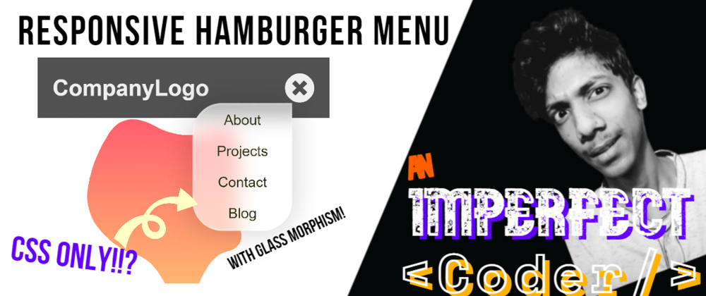
Final Result
The main goal here is to help you out with the hamburger menu for the mobile version.
Here's what we will be building in this tutorial:

Did you notice the glass morphism effect on the menu? We will be doing that too!
The Markup (with explanation)
Let's set up the HTML for the nav and the menu.
<nav class="nav">
  <a href="#" class="nav__logo">CompanyLogo</a>

  <!-- focus on this div -->
  <div class="nav__menucontainer">
    <div class="nav__listcontainer" tabindex="0">
      <ul class="nav__menu" id="navmenu">
        <li class="nav__item">
          <a href="#" class="nav__link">About</a>
        </li>
        <li class="nav__item">
          <a href="#" class="nav__link">Projects</a>
        </li>
        <li class="nav__item">
          <a href="#" class="nav__link">Contact</a>
        </li>
        <li class="nav__item">
          <a href="#" class="nav__link">Blog</a>
        </li>
      </ul>
      <a id="hamburger" href="#navmenu" title="menu" class="nav__hamburger">
        <i class="fa fa-2x fa-hamburger"></i>
      </a>
    </div>
    <a href="#!" title="close menu" class="nav__hamburgerclose"><i class="fa fa-2x fa-times-circle"></i></a>
  </div>

</nav>
Just copy-paste this code (or type it if you an absolute beginner), as its explanation is given below.
Apologies for any semantical mistake and somewhat long class name.
Let's understand what we did and why we did it.
We have a nav element for our fixed navbar on top of our page.
-
The
<nav>element has two child elements:- We have a
<a>tag for the company logo to be placed. - The second child of nav, is our container (
<div class="nav__menucontainer">) for the menu.
- We have a
-
The menu container have two childs:
-
<div class="nav__listcontainer" tabindex="0">to contain the menu list and the hamburger icon -
<a id="hamburger" href="#navmenu" title="menu" class="nav__hamburger">to toggle open state for the menu
-
Last element to consider is the adjacent sibling of our list container. It is the close icon to toggle close state for the menu
NOTE: Do not forget the tabindex="0" on
<div class="nav__listcontainer">
Stylesheet (with explanation)
Now, let's take a look at the CSS styles:
/* most part is for styling, and you can safely ignore it */
/* comments are placed wherever necessary */

*,
*::before,
*::after {
  box-sizing: border-box;
}

body {
  background-color: #f5f5f5;
  margin: 0;
  font-family: sans-serif;
}

a {
  text-decoration: none;
}

/* --- You will know what this is --- */
#blobSvg {
  max-width: 520px;
}

.nav {
  display: flex;
  justify-content: space-between;
  align-items: center;
  position: fixed;
  width: 100%;
  background-color: rgba(51, 51, 51, 0.85);
  color: #efefef;
  z-index: 5;
  padding: 1rem;
}

.nav__logo {
  text-decoration: none;
  color: inherit;
  font-weight: 700;
  font-size: 1.5rem;
}

.nav__menucontainer {
  position: relative;
}

.nav__hamburger {
  color: inherit;
  min-width: 32px;
  min-height: 32px;
  transition: opacity 80ms linear;
  /* hiding the hamburger icon on large screen sizes */
  display: none;
  opacity: 0;
}

.nav__hamburgerclose {
  color: inherit;
  position: absolute;
  top: 0;
  min-width: 32px;
  min-height: 32px;
  transition: opacity 150ms linear;
  /*   hiding the close icon and... */
  display: none;
  opacity: 0;
  z-index: -1; /* pushing it behind the hamburger icon so that hamburger icon can be clicked */
}

.nav__menu {
  padding: 0;
  margin: 0;
  list-style: none;
  display: flex;
  flex-wrap: wrap;
  font-size: 0.95rem;
  font-weight: 500;
}

.nav__item {
  margin-right: 1rem;
}

.nav__link {
  color: inherit;
  text-decoration: none;
  width: 100%;
}

.nav__link:hover,
.nav__link:focus-visible {
  box-shadow: 0 4px 0 -1px #a2e718;
}
This was for the desktop version of our menu. It works for large screen sizes. So, now let's make it responsive with a media query.
Stylesheet (for small screen sizes)
Have a look:
/* ----- smaller screen sizes ----- */
@media (max-width: 520px) {
  .nav__hamburger {
    /* making the hamburger icon visible on smaller screen sizes */
    display: flex;
    opacity: 1;
  }

  .nav__menu {
    /* move menu offscreen */
    opacity: 0;
    position: fixed;
    visibility: none;
    top: -1000px;

    /* just some styles */
    display: flex;
    flex-direction: column;
    justify-content: center;
    align-items: center;
    color: #25310c;
    box-shadow: 0 0 30px rgba(0, 0, 0, 0.19);
    border: 2px solid rgba(255, 255, 255, 0.2); /* part of glass morphism effect */
    border-radius: 2rem 0 2rem 2rem;
    background: rgba(255, 255, 255, 1);
  }

  /* uncomment the line below to activate on hover. */
  /*   .nav__listcontainer:hover .nav__menu, */
  .nav__listcontainer:focus .nav__menu,
  .nav__listcontainer:focus-within .nav__menu {
    position: absolute;
    visibility: visible;
    opacity: 1;
    top: 2rem;
    right: 1.5rem;
  }

  /*   if the browser supports backdrop-filter property,
  then add it (for the glass morphism effect) */
  @supports (backdrop-filter: blur(10px)) {
    /* uncomment the line below to activate on hover. */
    /*     .nav__listcontainer:hover .nav__menu, */
    .nav__listcontainer:focus .nav__menu,
    .nav__listcontainer:focus-within .nav__menu {
      background: rgba(255, 255, 255, 0.7);
      backdrop-filter: blur(10px);
    }
  }

  .nav__item {
    margin-right: 0;
    padding: 0.5rem 1.5rem;
  }

  .nav__link:hover,
  .nav__link:focus {
    opacity: 0.8;
    color: #121212;
  }

  /*  uncomment the line below to activate on hover. */
  /* NOTE: Hover is not recommended, it will have side effects on this */
  /*   .nav__listcontainer:hover .nav__hamburger, */
  .nav__listcontainer:focus .nav__hamburger,
  .nav__listcontainer:focus-within .nav__hamburger {
    opacity: 0;
    z-index: -1;
  }

  /* uncomment the line below to activate on hover. */
  /* NOTE: Hover is not recommended, it will have side effects on this */
  /*   .nav__listcontainer:hover + .nav__hamburgerclose, */
  .nav__listcontainer:focus + .nav__hamburgerclose,
  .nav__listcontainer:focus-within + .nav__hamburgerclose {
    display: flex;
    opacity: 1;
    z-index: 1;
  }
}
Slow down...Slow down. I know it looks like a lot, but you should know that it was written in SCSS, and then the compiled CSS is used for a beginner-friendly explanation.
Tip: Copy-paste all these styles
So what's happening here?
Of course, there is a lot that's happening there, but as the first comment says, you can safely ignore most of it.
As I said in the beginning, we'll focus on the mobile part.
So, let's start from here: @media (max-width: 520px) {
Choose a breakpoint suitable for your menu size
Initially, we had our hamburger and close icon hidden on large screen sizes
display: none; opacity: 0;. But on small screen size, we want to see the hamburger icon. So, we did this:display: flex; opacity: 1;Next, we moved the menu list (
<ul>) off the screen so that we don't click on it mistakenly. Try inspecting<ul>without these (opacity: 0; position: fixed; visibility: none; top: -1000px;) styles for better understanding of what I am saying.-
Now, the crucial part for the functionality:
-
.nav__listcontainer:focus .nav__menu,
.nav__listcontainer:focus-within .nav__menu {
: This selector says, whenever the listcontainer has focus or if any element within this element has focus, then do some styling for.nav__menu. We are just displaying the.nav__menuthat we moved offscreen before. - Skiping to
.nav__listcontainer:focus .nav__hamburger,
.nav__listcontainer:focus-within .nav__hamburger {
selector: This selector also says, whenever the listcontainer has focus or if any element within this element has focus, then do some styling for.nav__hamburger. We are hiding hamburger icon here. - Now, hopefully, you can tell what the succeeding selector does. Yes, you are right about it. It displays the close icon and brings it in front using
z-index: 1;so that it can be clicked.
-
@supports (backdrop-filter: blur(10px)) {: This (@supports (...)) rule checks if the property inside the parenthesis () is supported by the browser. If it is supported, then apply the styles inside it. Here we add a partially white background and add a slightly blurry effect for the GLASS MORPHISM EFFECT.Now, only
.nav_itemand.nav_item:hover, .nav:focusare left. You can ignore them as they are just adding some styling it them.Wait... there is one more selector left,
#blobSvg. To get this element, go to blobs.app make a blob that you like and copy-paste the SVG code inside the.containerlike so:
<nav>
   ...
</nav>

<div class="container">
  <!--   svg is placed to see the glass morphism effect -->
  <svg viewBox="0 0 500 500" xmlns="http://www.w3.org/2000/svg" xmlns:xlink="http://www.w3.org/1999/xlink" width="100%" id="blobSvg">
    <defs>
      <linearGradient id="gradient" x1="0%" y1="0%" x2="0%" y2="100%">
        <stop offset="0%" style="stop-color: rgb(255, 95, 109);"></stop>
        <stop offset="100%" style="stop-color: rgb(255, 195, 113);"></stop>
      </linearGradient>
    </defs>
    <path id="blob" d="M365,286Q374,322,337.5,330.5Q301,339,275.5,410.5Q250,482,221.5,415Q193,348,154.5,337.5Q116,327,82,288.5Q48,
                       250,57,197Q66,144,98,93.5Q130,43,190,76Q250,109,304,86Q358,63,361,123.5Q364,184,360,217Q356,250,365,286Z" fill="url(#gradient)"></path>
  </svg>
</div>
Then, paste the styles for <div class="container"> given below at the end (or somewhere at the top):
.container {
  display: flex;
  flex-direction: column;
  align-items: center; /* centering elements inside .container */
  width: 100%;
  max-width: 720px;
  margin: 0 auto; /* centering container within its parent */
  padding: 2em 1.5em;
  background: #fff;
}
That's it! Check the responsiveness and the glass morphism effect that you just built with me.
If you face any problem following along, then check the Codepen for this below or ping me on Linkedin or Twitter (@gautamtiwari003):
Conclusion
HTML and CSS are underrated but are powerful instead. They can do a lot of magic without even involving JavaScript (Don't get me wrong. I love JS❤).
I hope you learnt and built something with me today.
Keep coding imperfectly. Keep coding experimentally.
Thanks for reading.


Top comments (0)